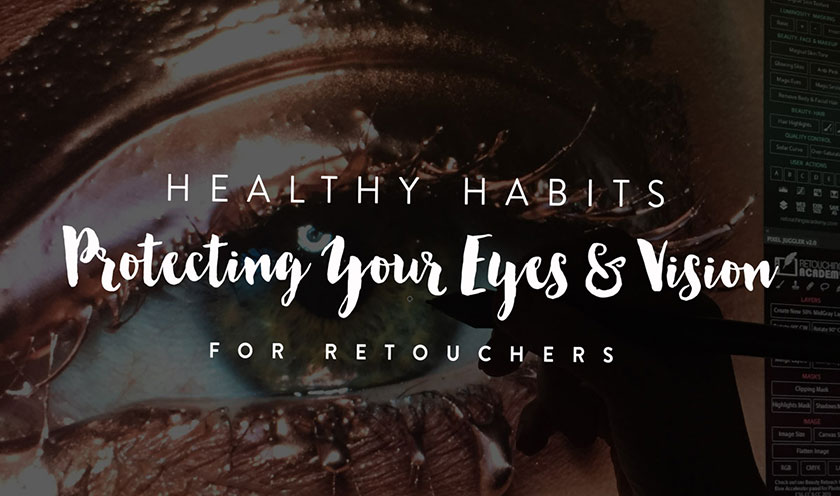
How to prepare your images for print
Nội dung

As photo editors, we enhance, polish and perfect images to produce a beautiful final result. Part of our role is to ensure that wherever images are displayed, they are displayed in the best lighting conditions. Our laser-focused attention should not stop after the image has been retouched, but should continue through the printing phase when our job is to print. 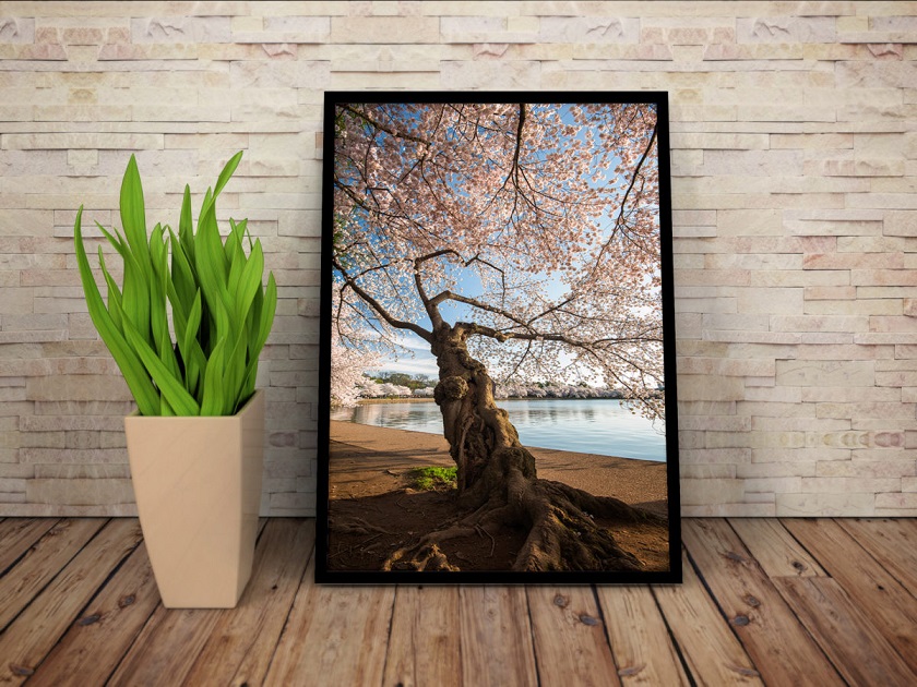 That extra step can mean the difference between seeing your work exactly how you want it to appear in print, or viewing it with chaotic, inaccurate colors that lack contrast. and clear. Any of these will result in an unhappy customer or reduce the quality of your hard work. Follow these steps for a beautiful and standard photo print with color in the online version.
 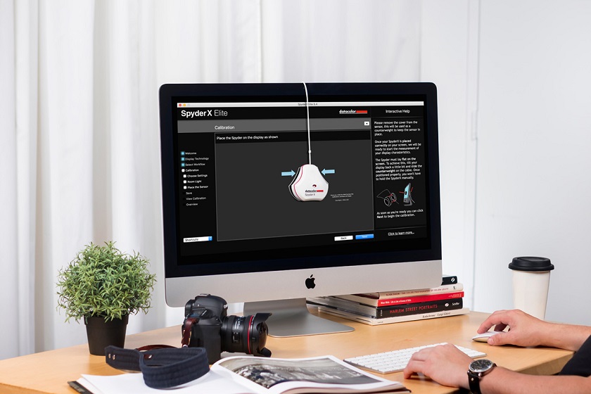 Regular monitor calibration ensures that the colors you see on the screen are properly balanced and closely match the colors in the print. I recommend calibrating your monitor at least once a month. However, the older your monitor is, the more often you may have to calibrate it. Finally, it's important to realize that the light in which your prints will be displayed will affect how the image looks. Light that is too cool will make it look bluer, while fluorescent light will make it appear bluer and tungsten light will make it warmer.
 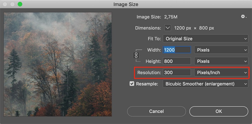 72 dpi is standard for monitors but it's too little for printing. A low-resolution iPhone image may look great on your computer, but when enlarging it for a large print, it will most likely lack detail and look pixelated.
 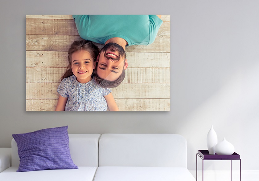 The size of a print also affects how sharp it is; Smaller prints tend to require a bit more sharpness than larger prints. This is because smaller images are more compressed and contain less information (which sounds quite the opposite of what you might think). Print media selection is another factor that affects how sharp an image is: Canvas is the most forgiving material because to some extent it hides imperfections. This means that images that are not sharp can still print well on it. Aluminum prints, on the other hand, are sharper and more detailed, so sharpness (and noise) is more apparent. Traditional paper prints on inkjet printers fall somewhere between the other two mediums. Here, it is important to consider the type of paper (i.e. thick cotton paper may differ from glossy paper).
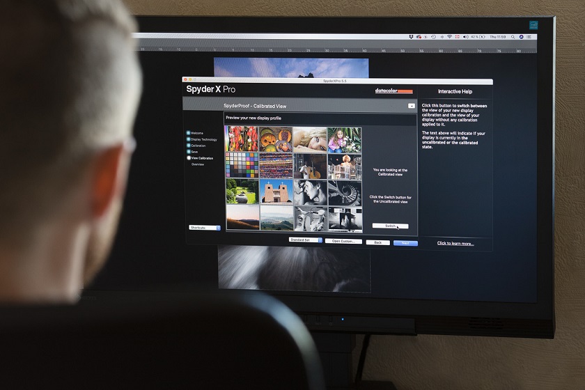
That extra step can mean the difference between seeing your work exactly how you want it to appear in print, or viewing it with chaotic, inaccurate colors that lack contrast. and clear. Any of these will result in an unhappy customer or reduce the quality of your hard work. Follow these steps for a beautiful and standard photo print with color in the online version. #1 Calibrate the screen
When was the last time you calibrated your monitor? Have you done it before? If not, do you know what it means? Having a properly calibrated monitor is of the utmost importance when you want to prepare images for printing. Without a calibrated monitor, you won't know what the picture really looks like. Monitor calibration means balancing and correcting the colors of a monitor, usually done using a spectrophotometer and calibration software. This is something everyone should do even if they don't plan on printing photos. If your screen's colors are off, it means all your pictures look different on other devices. Regular monitor calibration ensures that the colors you see on the screen are properly balanced and closely match the colors in the print. I recommend calibrating your monitor at least once a month. However, the older your monitor is, the more often you may have to calibrate it. Finally, it's important to realize that the light in which your prints will be displayed will affect how the image looks. Light that is too cool will make it look bluer, while fluorescent light will make it appear bluer and tungsten light will make it warmer. #2 Save your print in sRGB or Adobe RGB
I know it sounds tempting to save your print files in ProPhoto because it's a much larger color space, but the reality is that most monitors and printers can't display such a wide range of colors. Printing images stored in a color space larger than the printer can handle can result in a dull-looking image due to the printer running out of color gamut (i.e. not being able to reproduce color on the printer). Most print labs will require your file in sRGB, but certain high-end venues can print on Adobe RGB. This is something you should check with them.#3 Save the image as 8-bit
You may have heard of the terms 8-bit and 16-bit but you may not know what it means or how it affects your photos. Simply put, a bit is the number of tones available for each color; 8-bit images contain 16,000,000 colors compared to 16-bit images containing 28,000,000,000 colors. So why should you save it as 8-bit if there are more colors in 16-bit? Wouldn't you want all that extra information? Yes, I recommend you to edit your images as 16 bit files but when saving them for printing you should choose 8 bit. The truth is that there is no difference in print quality whether you save as 8-bit or 16-bit. Most printers cannot print 16-bit files and convert it to 8-bit automatically; that is, saving images as 8-bit files makes them slightly smaller and transfers to the printer faster.#4 Choose the correct dpi
Dpi (i.e. dots per inch) is a key factor when talking about print resolution as it refers to the number of dots printed in an inch. The more dots you have, the more details you have. This also means that the lower the resolution your file has, the less detail it contains. I recommend saving your images at 300 dpi when printing. You can use a lower dpi for smaller prints but you will lose detail on larger prints. 72 dpi is standard for monitors but it's too little for printing. A low-resolution iPhone image may look great on your computer, but when enlarging it for a large print, it will most likely lack detail and look pixelated. #5 Resize your images
Resizing images may not be a necessary step in preparing images for printing, but I tend not to send full-sized images for printing. Also, when printing large images we need to enlarge the file. Enlargement is a bit more complicated and is too big of a topic to cover in this article. However, resizing the image does not take much time if you do not enlarge the image. Just open the image in Adobe Photoshop, then go to Image -> Image Size and choose the size you want to print (eg 16×24).#6 Crop the photo
When using a full-frame camera or an ASP-C sensor (cropped sensor), you get an aspect ratio of 3:2. This is a perfect ratio for 4×6 or 8×12 prints but aspect ratio changes when printing other standard sizes like 5×7 (7:5) or 8×10 (5:4). Remember that when you crop a photo for print, you may lose some of it due to the aspect ratio. You should always crop images to the correct aspect ratio before sending them to the printer because many print labs automatically crop images without considering the image and layout. Ergo, it might not turn out the way you want.#7 Sharpen the image
The final step of your printing process is to sharpen the image. This will be done after cutting it to the desired size. If you are a Photoshop user and have used Raya Pro, you may already know that you should resize and sharpen an image to make it optimal for the web. When preparing the image for printing you will also need to sharpen the image, but the methods are slightly different. How much you need to sharpen an image before printing varies from image to image. Typically, images with a lot of detail need to be sharpened than images that are mostly skies or soft surfaces like still water (note that we don't want to add unnecessary noise when sharpening). The size of a print also affects how sharp it is; Smaller prints tend to require a bit more sharpness than larger prints. This is because smaller images are more compressed and contain less information (which sounds quite the opposite of what you might think). Print media selection is another factor that affects how sharp an image is: Canvas is the most forgiving material because to some extent it hides imperfections. This means that images that are not sharp can still print well on it. Aluminum prints, on the other hand, are sharper and more detailed, so sharpness (and noise) is more apparent. Traditional paper prints on inkjet printers fall somewhere between the other two mediums. Here, it is important to consider the type of paper (i.e. thick cotton paper may differ from glossy paper). #8 Soft waterproofing
Soft Proofing is a simple method used to visualize what a printed image will look like. You can do this in both Adobe Lightroom and Photoshop as well as in other photography-related software. With Soft Proofing, you can choose between different color spaces and different printers (and create your own presets). With the correct printer and color space selected, you can continue to adjust saturation, color balance, and sharpness until the image resembles the original.Conclusion
As a photographer, there is nothing more rewarding than seeing your work printed, framed and hung on the wall, be it yours or someone else's. Creating the perfect print takes some practice, and if a few key elements are forgotten, the print may not look like what the digital file does. Luckily, following the steps above will help you prepare for printing and have a finished product you're proud to hang on the wall.