Best Selling Products

Adobe Premiere Pro Account
99 USD

Genuine Cheap Canva Pro
39 USD

Copyright Adobe Lightroom Account
59 USD

Plugin Retouch4me
69 USD

Capcut Pro 1 Year
39 USD

Upgrade Genuine Office 365
49 USD

Freepik Premium Account
59 USD

ChatGPT Plus Account (GPT-4)
16 USD

Upgrade Duolingo Super
29 USD

Upgrade genuine Capture One account
120 USD

Genuine Adobe Illustrator account
99 USD

Adobe Photoshop Copyright - Full App
120 USD

MidJourney Account
29 USD

Autodesk All App Account Copyright
120 USD

Windows 10 & 11 Pro Key
36 USD
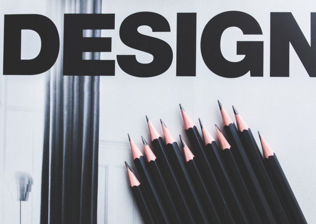
Build Your Own Style Through 6 Basic Design Principles
Nội dung
- 1. What are the principles of graphic design?
- 1.1. Basics and Role in Design
- 1.2. Why are design principles important?
- 2. Basic Design Principles That Designers Cannot Ignore
- 2.1. Principle of Balance
- 2.2. Contrast Principle
- 2.3. Emphasis Principle
- 2.4. White Space Principle
- 2.5. Principle of Alignment & Proximity
- 2.6. Repetition
This article summarizes the indispensable design principles such as balance, contrast, emphasis, white space and repetition, which will help you understand the role of each element in building a perfect layout. Through that, you will know how to use these principles to create visual works that are modern and professional.
Graphic design is not just about creating art, but also a combination of visual thinking, layout science and effective ways to convey messages. A beautiful design not only needs to be impressive and attractive, but more importantly, it must have a harmonious layout, be easy to see and help viewers easily receive information.
Whether you are a new designer or have many years of experience, mastering the basic design principles is still extremely important. Because this is the foundation that helps you create professional products, express your own style and meet the needs of customers. In this article, SaDesign will explore with you the graphic design principles that every designer cannot ignore. If you know how to flexibly apply these principles, you will not only improve your skills but also be able to create works of your own class!
1. What are the principles of graphic design?
Graphic design principles are a set of basic rules and guidelines that help designers organize and arrange visual elements such as color, images, text, and geometry in a logical way to create effective and impressive communication works. These principles are not just fixed "recipes" but also a compass to shape creative ideas, help create harmonious, accessible layouts and convey messages naturally to viewers.
.png)
1.1. Basics and Role in Design
Every graphic design is intended to communicate whether it is advertising, branding, or conveying information and to achieve this effect, visual elements need to be arranged logically and purposefully. Design principles play an important role in:
Create balance and harmony: Elements are arranged so that no part “overwhelms” another, creating a balanced and pleasing composition.
Directing the viewer's eye: Through the use of principles such as emphasis and contrast, designers can guide the viewer's eye to important information.
Ensure consistency: When these principles are applied consistently across products, the brand becomes more recognizable and memorable.
Enhance aesthetic value: A design built according to basic rules always has visual appeal, giving a professional and modern feel.
.png)
1.2. Why are design principles important?
Design principles and guidelines are not just “hard and fast” rules, but also guides for turning ideas into effective visual compositions. Here are the main reasons why they are so important:
Create consistency and brand recognition
Consistency in interface: When you apply a consistent color palette, typography, and design style across different products and platforms, your brand becomes recognizable. Customers can associate it with a familiar element when they see it.
Make a strong impression: Consistency helps create a deep impression in the customer's mind. For example, big brands like Coca-Cola or Apple always maintain a distinctive design style, contributing to creating a difference and long-term memory.
Enhance communication effectiveness
Communicate a clear message: Design principles help arrange visual elements in a logical and reasonable way, thereby helping the main message to be conveyed quickly and clearly.
.png)
Guiding the viewer’s eye: By using principles such as emphasis, contrast, and white space, designers can direct the viewer’s eye to the most important parts of the piece. This not only makes it easier for the viewer to absorb information, but also creates a sense of coherence throughout the design.
Support creativity and the design process
Building a solid foundation: Once you have mastered the fundamentals, designers can be creative without worrying about losing logic or aesthetics in design. These rules act as a “skeleton” to ensure that despite creativity and innovation, the final product must still maintain balance and professionalism.
Save time and effort: Understanding and applying the principles helps reduce common mistakes such as clutter, imbalance, and lack of consistency. This not only improves the quality of the design but also makes the editing process faster and more efficient.
Enhance the aesthetic value of the product
Harmony and balance: A design that applies these principles well will create a sense of harmony, ease of viewing and attraction. Viewers will be easily attracted by the sophistication of the layout, colors and images that are scientifically arranged.
.png)
Create a professional feel: Design based on basic principles always exudes professionalism, contributing to building prestige and brand image in the eyes of customers and partners.
Meet diverse market needs and modern trends
Adapting to Change: Design principles not only help create beautiful works but also flexibly adapt to new trends. No matter how the market fluctuates or customer preferences change, the basic principles remain the foundation for maintaining stability and design quality.
Optimizing User Experience: In the field of user interface design (UI/UX), properly applying principles such as white space, balance, and alignment are key to creating a smooth, understandable, and engaging user experience.
(1).png)
2. Basic Design Principles That Designers Cannot Ignore
2.1. Principle of Balance
A good design not only needs to be creative but also needs to ensure the stability of the layout. This is why Balance is the first principle that every designer needs to remember.
Balance in design is understood as the reasonable distribution of visual elements, colors, and text to create a sense of harmony for the whole. When a design is skewed to one side or has an unreasonable distribution, the viewer may feel uncomfortable and not focus on the main content.
.png)
There are two main types of balance you need to know:
Symmetrical Balance: The two sides of a design are almost identical, creating a sense of stability, formality, and trustworthiness. This type of balance is often found in logo designs, business cards, or websites with a classic style.
Asymmetrical Balance: The elements in the design are not the same but are still arranged in a reasonable way to create harmony. This type of balance makes the design more modern, creative and has more emphasis.
2.2. Contrast Principle
If all the elements in a design are similar in color and size, without any clear distinction, it will be difficult for the viewer to focus on the main content. That is why contrast plays an extremely important role.
.png)
Contrast helps highlight the most important elements in a design, making it easier for viewers to recognize and absorb information faster. There are many ways to create contrast in a design, including:
Color contrast: Use contrasting colors (e.g. white – black, blue – orange) to create highlights.
Size Contrast: A large headline paired with a small description helps viewers identify which content is more important.
Font contrast: Combine bold and thin fonts, serif and sans-serif to create distinction between content sections.
2.3. Emphasis Principle
In a design, not all elements are of equal importance. If you don’t create the right focal points, your viewers won’t know where to focus. This is why the principle of Emphasis is so important.
(1).png)
Effective ways to create highlights:
Increase size: Important elements like headlines or main images should be larger in size.
Use a bright color: A call-to-action button that is brighter than the background will attract attention.
Use good spacing: Giving an important element some white space around it will help it stand out more.
2.4. White Space Principle
White space is not a waste of space, but a powerful tool that makes a design more elegant and pleasing to the eye.
.png)
Benefits of white space:
Helps design to be airy, avoiding confusion.
Guide the viewer's eyes to focus on the main content.
Highlight important elements without using overly complicated effects.
2.5. Principle of Alignment & Proximity
Aligning and arranging elements in an organized manner makes the design look professional and easy to follow.
Two main principles:
Alignment: Elements should be arranged according to a certain system (left, right, center, or grid).
Proximity: Related content should be placed close together to create a strong connection.
2.6. Repetition
The Repetition Principle is the repeated appearance of an object in a design to create an impression. If you have a specific color palette, use it in all your designs. Or if it is a font, remember to only use 1 to 2 fonts for every work. The Repetition Principle is applied by many leading brands in the world. Because this principle brings a very high brand image recognition in the eyes of customers.
.png)
A typical example is the world-famous soft drink brand: Coca Cola. In all publications, packaging, and logos of Coca, the main colors are red and white. In which, red is bright but very prominent, making a strong impression. Regardless of who among us is asked to name a soft drink brand with red color, surely 99% of the time the name Coca Cola will pop up first.
Mastering these basic design principles will help you create professional and engaging products. Whether you are designing a logo, website or advertising banner, applying these principles correctly will help your work become more harmonious and effective.


VIP Products


Best Selling Products
Adobe Premiere Pro Account
99 USD
Genuine Cheap Canva Pro
39 USD
Copyright Adobe Lightroom Account
59 USD
Plugin Retouch4me
69 USD
Capcut Pro 1 Year
39 USD
Upgrade Genuine Office 365
49 USD
Freepik Premium Account
59 USD
ChatGPT Plus Account (GPT-4)
16 USD
Upgrade Duolingo Super
29 USD
Upgrade genuine Capture One account
120 USD
Genuine Adobe Illustrator account
99 USD
Adobe Photoshop Copyright - Full App
120 USD
MidJourney Account
29 USD
Autodesk All App Account Copyright
120 USD
Windows 10 & 11 Pro Key
36 USD