Best Selling Products

Windows 10 & 11 Pro Key
36 USD

Adobe Premiere Pro Account
99 USD

Autodesk All App Account Copyright
120 USD

Upgrade Duolingo Super
29 USD

Plugin Retouch4me
69 USD

ChatGPT Plus Account (GPT-4)
16 USD

Capcut Pro 1 Year
39 USD

MidJourney Account
29 USD

Genuine Adobe Illustrator account
99 USD

Genuine Cheap Canva Pro
39 USD

Upgrade genuine Capture One account
120 USD

Copyright Adobe Lightroom Account
59 USD

Upgrade Genuine Office 365
49 USD

Adobe Photoshop Copyright - Full App
120 USD

Freepik Premium Account
59 USD
Color Terms in Graphic Design
Nội dung
- 1. What is color? The foundation of graphic design
- 2. Color Characteristics Terminology: Understanding the "Language" of Color
- 3. Color Relationship Terminology: Creating Harmony and Impression
- 4. Color Space Terminology: Choosing the Right Color System
- 5. Color Effects Terminology: Creating Accents for Design
- 6. Color Psychology Terminology: Conveying Messages and Emotions
- 7. Basic colors in design
- 7.1. Hue
- 7.2. Saturation
- 7.3. Brightness and Lightness
- 7.4. Tone, Harmony
- 7.5. RGB and CMYK color systems
- 7.6. Neutral Colors
- 8. Tips and tricks for using color effectively in design
- 9. Conclusion
Explore color terminology in graphic design, helping designers understand hue, saturation, brightness, RGB, CMYK color systems, and more.
Color is an important element in graphic design, contributing to creating visual experiences and effectively conveying messages. Mastering color terminology helps designers easily select and combine colors in a consistent and professional manner. The following article by sadesign summarizes the most important terms in graphic design.
1. What is color? The foundation of graphic design
Color is a fundamental and important element in graphic design, playing a role not only in creating aesthetics but also in conveying messages and emotions. The right color choice can highlight ideas, shape a brand and create a deep connection with viewers.
.jpg)
Color Basics: Understanding basic color concepts, such as the color wheel, color combinations, the psychological meaning of each color and how to use them properly, is key to creating professional design products.
Color is the visual perception of light reflected or emitted from an object.
White light consists of a spectrum of different wavelengths, each wavelength corresponding to a different color.
The human eye can perceive millions of different colors.
Colors have a powerful impact on human emotions and moods.
The role of color in graphic design: Understanding color theory, color combinations and the psychological impact of each color gamut is the foundation for designers to create visually appealing and effective products. Therefore, researching and applying color scientifically is an indispensable factor in the professional graphic design process. Color plays an important role in graphic design, not only helping to convey messages effectively but also creating emotions and impressions for viewers.
Attention-Grabbing: Bold colors can make a design appealing and grab the viewer's attention.
Conveying messages: Each color has its own meaning and message, designers can use colors to convey messages effectively.
Make a Difference: Unique colors can help a brand or product stand out from the competition.
Creating Harmony: Using harmonious colors can create a professional and pleasing design.
In addition, considering harmony, contrast and consistency in color selection will contribute to enhancing the aesthetic quality and communication value of the work. Understanding and flexible application of color not only helps designers express creative ideas but also brings impressive visual experiences to the target audience.
Basic color systems: RGB, CMYK, HEX: In graphic design, understanding basic color systems such as RGB, CMYK and HEX is an important factor to ensure product quality and accuracy.
RGB (Red, Green, Blue): The RGB (Red, Green, Blue) color system is commonly used for digital display devices such as:
Additive color system, used in electronic devices such as computer monitors, TVs, phones.
Colors are created by combining red, green, and blue light at varying intensities.
Used when creating digital designs.
CMYK (Cyan, Magenta, Yellow, Key/Black): is more suitable for printed products, thanks to the way the ink is mixed to create the desired colors.
Subtractive color system, used in printing.
Colors are created by subtracting white light using cyan, magenta, yellow, and black inks.
Used when creating print designs.
HEX (Hexadecimal): is a popular color encoding format in web design, helping to define colors precisely through a six-character code representing RGB values.
Hexadecimal color code, used in web design.
The HEX color code consists of six characters, two each representing the intensity of red, green, and blue.
Widely used in color coding of CSS, and HTML.
HEX (Hexadecimal) color system Choosing and using the right color system not only helps optimize the workflow but also ensures the aesthetics and accuracy of the final product.
2. Color Characteristics Terminology: Understanding the "Language" of Color
The terminology of color properties plays an important role in understanding and communicating the meaning of color in fields such as design, art, and marketing. Understanding the “language” of color not only helps you choose the right color, but also creates an emotional connection and effectively conveys a message to your target audience. Elements such as hue, saturation, and brightness must be understood in order to apply them correctly, thereby creating harmony and optimal visual impact.
.jpg)
Hue (Color tone):
Hue is the most basic property of color, determining what color it is (e.g. red, yellow, blue).
Hue is measured in degrees on the color wheel (e.g. red at 0 degrees, yellow at 60 degrees).
Saturation:
Saturation is the purity or intensity of a color.
Highly saturated colors will be vibrant and vivid, while low saturated colors will be pale and dull.
Value/Brightness:
Value or brightness is the lightness or darkness of a color.
Colors with high values will be bright, while colors with low values will be dark.
Tint, Shade, Tone:
Tint: The base color after adding white, making the color brighter.
Shade: The original color after adding black, making the color darker.
Tone: The original color after adding gray, making the color softer.
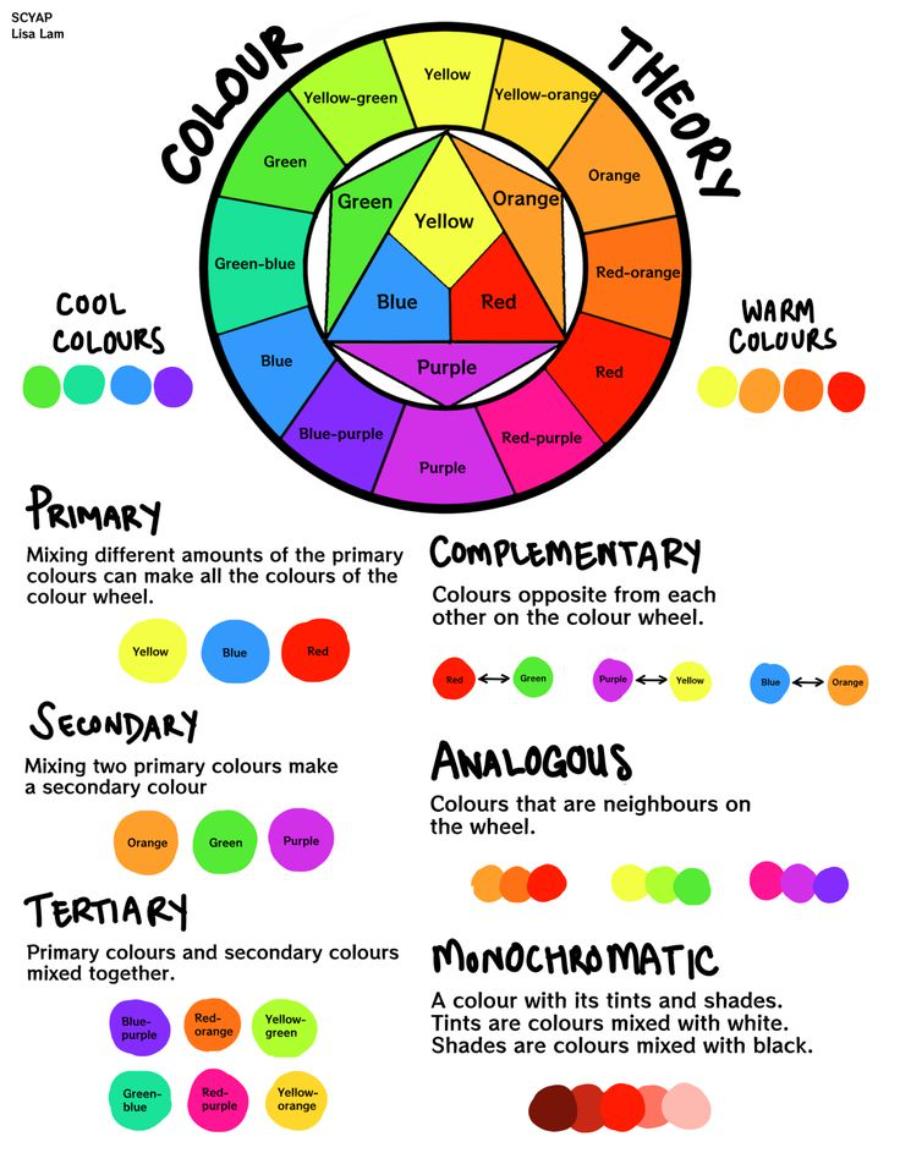
3. Color Relationship Terminology: Creating Harmony and Impression
Understanding the principles of color coordination, such as complementary, analogous, or contrasting colors, not only optimizes aesthetics but also enhances the effectiveness of message delivery. The right color combination can evoke emotions, create accents, and guide the viewer’s gaze, resulting in a visually impressive and professional experience.
.jpg)
Color Wheel:
A circular diagram showing the relationship between colors.
Helps designers understand how colors interact with each other and create harmonious color palettes.
Complementary Colors:
Two colors that lie opposite each other on the color wheel.
Creates a strong contrast and attracts attention.
Analogous Colors:
Colors that are next to each other on the color wheel.
Create harmony and ease the eyes.
Triadic Colors:
The three colors lie at the three corners of an equilateral triangle on the color wheel.
Create balance and vitality.
Tetradic Colors:
4 colors create a rectangle, or square on the color wheel.
Monochromatic Colors:
Use a base color, and the Tint, Shade, and Tone of that color.
4. Color Space Terminology: Choosing the Right Color System
In graphic design, choosing the right color system plays an extremely important role, directly affecting the quality and effectiveness of conveying the product's message. Popular color spaces such as RGB, CMYK or Pantone all have their own unique characteristics, suitable for different purposes.
RGB (Red, Green, Blue): RGB is commonly used in digital products due to its ability to display vibrant colors on screens.
CMYK (Cyan, Magenta, Yellow, Key/Black): is the optimal choice for printing because of its accuracy in reproducing colors on paper.
HSB/HSV (Hue, Saturation, Brightness/Value):
Color systems are based on the properties of color (hue, saturation, brightness/value).
Easier to use and more intuitive than RGB or CMYK.
LAB Color:
Device independent color system, which means colors are defined consistently across all devices.
Used in professional image processing applications.
Understanding the characteristics of each color space and applying them flexibly will help designers optimize the efficiency and quality of graphic products.
5. Color Effects Terminology: Creating Accents for Design
Color effects play an important role in creating highlights and enhancing the aesthetics of a design. Using colors appropriately not only helps attract attention but also contributes to effectively conveying messages. Color effect terms such as gradient, contrast, saturation, or complementary color schemes are all factors that need to be carefully considered during the design process. A design built with a sophisticated color combination not only makes a strong impression but also creates professionalism and class for the product or brand.
.jpg)
Gradients:
The effect of color transition from one color to another smoothly.
Can be used to create depth, light and shadow.
Overlays:
A color layer is placed on top of an image or object to create a color effect.
Can be used to change the hue, saturation or brightness of an image.
Color Correction:
The process of adjusting the colors of an image to achieve the desired color.
Can be used to correct color problems, such as off or inaccurate colors.
Color Grading:
The process of adjusting the color of a video or movie to create a consistent color effect that fits the story.
Often used in video production and professional photo editing.
In Duoton:
technique of using two colors to create an image, creating a vintage effect.
6. Color Psychology Terminology: Conveying Messages and Emotions
The psychology of color plays an important role in conveying messages and emotions, especially in fields such as design, marketing, and art. Understanding color psychology not only helps optimize communication effectiveness but also creates a deeper connection with the target audience. Therefore, studying and properly applying these elements is an essential skill in many modern professions.
Colors and emotions:
Colors can evoke different emotions in people.
Designers can use color psychology to create designs that have a powerful impact on viewers.
Meaning of basic colors:
Red: Energy, passion, danger, power.
Yellow: Happiness, optimism, creativity, intelligence.
Blue: Trust, calm, professionalism, reliability.
Green: Nature, life, freshness, growth.
Purple: Royal, creative, wise, luxurious.
etc., each color has its own meaning.
Applying color psychology in design:
Logo and Brand Design: Choose the right colors to convey your brand message.
User Interface (UI) Design: Use color to guide users and create a better user experience.
Product packaging design: Use color to attract customers' attention and create a positive first impression.
Advertising Design: Use color to effectively convey advertising messages and create memorability.
7. Basic colors in design
Each color has its own psychological meaning, which can influence human feelings and behavior. For example, red often evokes strength, energy and passion, while green is associated with freshness, balance and nature.
7.1. Hue
Hue refers to the nature of a color, defined based on the color wheel. Primary colors include red, green, blue, and secondary colors such as orange, purple, and yellow.
7.2. Saturation
Saturation measures the saturation of a color, determining how vibrant or dull it appears. Highly saturated colors will appear brighter, while less saturated colors will appear grayer.
7.3. Brightness and Lightness
Brightness is the overall brightness of a color, while lightness refers to the brightness of a particular color in the RGB or HSL system.
7.4. Tone, Harmony
Tone is created by adding gray to hue, while harmony is the way to combine colors harmoniously according to principles such as similarity, complementarity, and contrast.
7.5. RGB and CMYK color systems
RGB is the color system for digital screens, including red, green, blue. CMYK is used in printing, including cyan, magenta, yellow, black.
7.6. Neutral Colors
Color groups such as white, gray, black, beige, and brown help balance the design and are easy to combine with other colors.
8. Tips and tricks for using color effectively in design
Using color effectively in design requires careful consideration to ensure it conveys the right message and makes a strong impression on viewers. Specifically:
Choose the color palette that suits your design purpose:
Clearly define the purpose of the design and the target audience. Choosing a harmonious color palette, following principles such as contrast, complementarity or monochromaticity, will help make the design more appealing.
Study color psychology and choose the right colors.
Use online color palette generators to search for and create harmonious color palettes.
Create balance and harmony in the use of colors:
Use the 60-30-10 rule: 60% dominant color, 30% secondary color, 10% accent color.
Create contrast between colors to highlight important elements.
Avoid using too many colors, it is confusing and unpleasant.
Pay attention to the balance between primary and secondary colors to avoid eye-candy. Don't forget to test the visibility of colors on different platforms to ensure consistency and readability.
Pay attention to cultural factors and target audience:
Learn the meaning of colors in different cultures.
Choose colors that match the preferences and tastes of your target audience.
For example, red may symbolize good luck in Chinese culture, but it symbolizes danger in some other cultures.
Use color matching tools:
Adobe Color: Adobe's free online color palette generator.
Coolors: Quick and easy to use color palette generator.
Paletton: Color wheel based color palette generator.
9. Conclusion
Understanding color terminology in graphic design will help improve product quality and increase professionalism. Knowledge of color helps designers create consistent, impressive works.


VIP Products


Best Selling Products
Windows 10 & 11 Pro Key
36 USD
Adobe Premiere Pro Account
99 USD
Autodesk All App Account Copyright
120 USD
Upgrade Duolingo Super
29 USD
Plugin Retouch4me
69 USD
ChatGPT Plus Account (GPT-4)
16 USD
Capcut Pro 1 Year
39 USD
MidJourney Account
29 USD
Genuine Adobe Illustrator account
99 USD
Genuine Cheap Canva Pro
39 USD
Upgrade genuine Capture One account
120 USD
Copyright Adobe Lightroom Account
59 USD
Upgrade Genuine Office 365
49 USD
Adobe Photoshop Copyright - Full App
120 USD
Freepik Premium Account
59 USD