Best Selling Products
Discover the Hidden Messages Behind Logos You Should Know.
Nội dung
A logo is not just a brand identification mark but also a message filled with meaning. Let's explore the hidden messages behind prominent logo symbols and the profound meanings that brands want to convey with SADESIGN.
A logo is not only a symbol of brand identity but also a message, a story that a business wants to tell. In the modern world, a logo is not simply an image, but also contains profound messages, cleverly integrated to create a connection with customers. In the following article, SADESIGN will analyze prominent logo symbols and the hidden messages behind them.
1. Logo: Symbol of Brand Importance
A logo is one of the most important elements in branding. It is not just an image, but also a symbol of the core values, marketing strategy and long-term goals that the company wants to achieve. A logo cannot be simply a random design but must express the unique identity of the business.
Through logos, brands want to convey profound messages, making customers feel closer and more confident with their products. To create an impressive and effective logo, designers must clearly understand the industry, target customers and the values that the brand wants to express.
@old
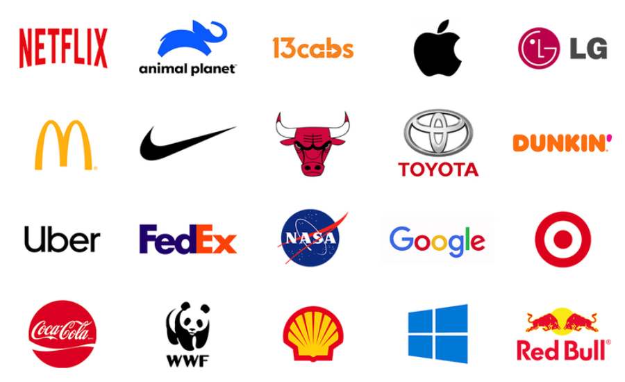
Logos are a powerful tool in branding strategy. The hidden messages in logos help brands connect more deeply with customers, create a lasting impression and affirm their unique identity. Each logo contains a story, a special meaning that if deciphered, customers will feel the sophistication and clever strategy behind it. Big brands such as Amazon, FedEx, Toblerone, Audi or Coca - Cola have used logos as a powerful tool to convey invisible but meaningful messages about quality, innovation and commitment to customers.
2. Hidden Messages in Logos
In this article, we will take a deep dive into some of the most iconic logos and explore the hidden messages behind each design. These symbols are not always obvious, but when deciphered, they reveal interesting stories that few people know about.
2.1. Amazon Logo
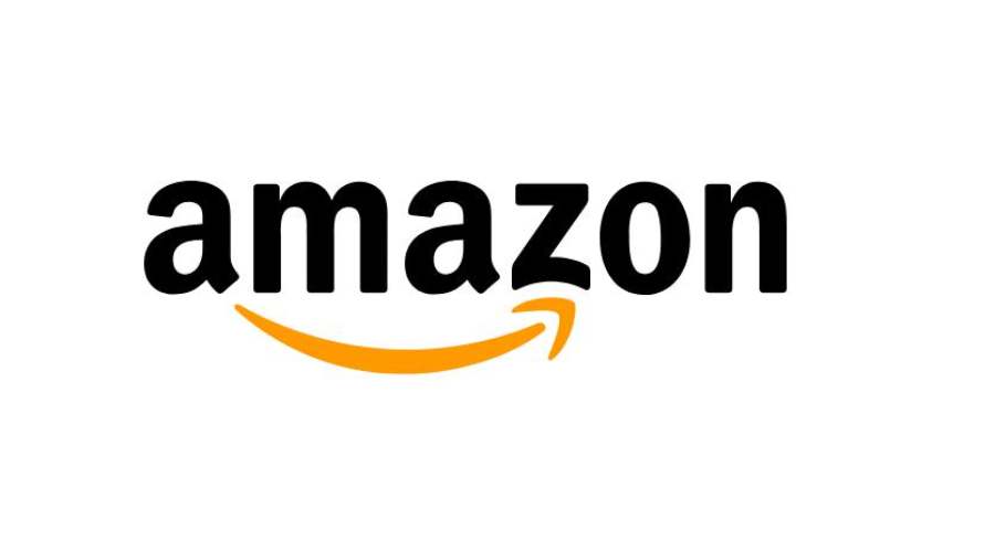
Amazon is one of the most powerful brands in the world, and their logo is no simple matter. Looking at the Amazon logo, you will see an arrow extending from the letter "A" to the letter "Z", which not only represents the completeness of products from A to Z but also a smile that contains the satisfaction of customers when using Amazon's services. This logo represents a strong commitment that Amazon provides everything customers need, with convenience and high quality.
Additionally, the arrow also has a smile-like shape, which represents the great customer experience that Amazon aspires to provide. This conveys a positive message, with satisfaction and trust at the center.
2.2. FedEx Logo
The FedEx logo features an arrow hidden between the letters "E" and "X". This arrow represents the movement, speed and efficiency that FedEx wants to bring to its customers. The subtlety of incorporating the arrow into the letter makes this logo not only visually striking but also contains a strong message about speed and accuracy in delivery services.
FedEx designers created a logo that is not just a visual identity, but also a profound message, affirming the brand as one of the fastest and most reliable shipping services in the world.
2.3. Toblerone Logo
The Toblerone logo is a great example of how a brand can incorporate its signature elements into its logo design. While the Toblerone logo only shows a mountain range and the word “Toblerone,” if you look closely, you will see a hidden image within the mountain range – that of a bear. This image is a reference to the city of Bern, where Toblerone was founded, which is known for its bear symbol.
This logo not only represents the chocolate product in the shape of mountains, but also serves as a symbol that reminds of the brand's roots. The message that Toblerone wants to convey is the combination of quality and history, as well as the commitment to sophistication and innovation in each product.
2.4. Baskin Robbins Logo
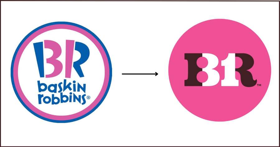
Baskin Robbins, the famous ice cream chain, is not just a simple name, but also a clear representation of the value that this brand wants to convey. The Baskin Robbins logo has two hidden "31"s in the design, corresponding to the 31 flavors of ice cream that they offer – a way to show the variety and richness of the options that customers can experience.
What is interesting here is the creativity in combining numbers with letters, creating a simple yet impressive design. This logo helps to reinforce the message of the abundance and diversity in the products that Baskin Robbins brings to customers.
2.5. Audi Logo
Audi is a famous car brand with four interconnected rings, symbolizing the four companies that merged to form Audi: Auto Union, DKW, Horch and Wanderer. Each of these rings represents a core component of the partnership, and the logo represents Audi's commitment to innovation, quality and the strong connection between the elements of the manufacturing process.
The Audi logo is not only a symbol of brand recognition, but also a message of cooperation and commitment to bringing the best products to customers. It represents the sustainability and prestige of one of the most prestigious car brands in the world.
2.6. Coca-Cola Logo: A Combination of Tradition and Modernity
The Coca-Cola logo, with its distinctive red lettering and italic font, is not only recognizable but also reflects the brand’s subtle blend of past and present. The striking red on a white background is a powerful color combination that feels dynamic, fresh, and full of life. But that’s not all. Let’s take a closer look at the elements of the logo.
2.6.1. Fonts: Symbols of History
The distinctive handwritten font that Coca-Cola has used since its early days has become an integral part of their brand identity. The typeface is curvy and soft, conveying a sense of familiarity and friendliness, while also creating a strong association with a sense of tradition and timelessness. It is a clever design strategy that reminds consumers of the trust and quality that Coca-Cola has built over its 130 years of existence.
2.6.2. Color: Creates Positive Emotions
The red color in the Coca-Cola logo not only attracts attention but also symbolizes excitement and joy. Red is considered a strong, impressive color that increases feelings of excitement and enthusiasm. Coca-Cola has used this color to associate with positive emotions such as joy, happiness and human connection.
2.6.3. Shape: Evoking Connection
The Coca-Cola logo, though simple, carries a deep meaning of connection and attachment. The word "Coca-Cola" is not only the name of the product but also a symbol of meetings, moments of sharing joy with friends and family. The logo conveys a message of strong connection between people, expressed through the sophistication and closeness of the design.
2.6.4. Part of Global Culture
Coca-Cola is more than just a beverage; its logo has become an integral part of global culture. Every time people see the logo, they think of more than just a beverage, they think of happy memories, major sporting events, or inspirational advertising campaigns. The brand has succeeded in creating a strong and recognizable image, not only through its colors and fonts, but also through the message it conveys.
3. Why Are Hidden Messages Important?
Incorporating a message into your logo not only helps your brand stand out, but it also creates a strong emotional connection with your customers. When customers recognize the hidden messages in your logo, they feel like they are being “cared for” and understood. This increases your brand’s value in the eyes of consumers and differentiates it from your competitors.
A logo with a strong message will easily stick in the minds of customers, becoming a part of brand awareness. This is why logo design is not only a creative task but also an important marketing strategy.
Every line and every color carries a profound message, reflecting the company’s identity, vision and core values. From this perspective, a logo is not only an identification tool but also a powerful means of communication, creating a connection with customers and affirming the brand’s position in the market.
@old
Conclude
Surely after learning about the messages behind the Logos, you have realized that a logo is not simply a symbol representing a brand. Therefore, when designing or choosing a logo, understanding the message it conveys will help businesses build a strong and memorable image in the hearts of consumers. A logo is not just a symbol, but a story about the brand - and that story, if told correctly, will be the key to long-term success. You should find a reputable address to support you in designing a Logo and DESIGN is the most reputable unit in the market specializing in providing professional, low-cost graphic design that you can refer to right away.


