Best Selling Products

Plugin Retouch4me
69 USD

Genuine Cheap Canva Pro
39 USD

Genuine Adobe Illustrator account
99 USD

Adobe Premiere Pro Account
99 USD

Copyright Adobe Lightroom Account
59 USD

Autodesk All App Account Copyright
120 USD

Capcut Pro 1 Year
39 USD

Windows 10 & 11 Pro Key
36 USD

Freepik Premium Account
59 USD

Adobe Photoshop Copyright - Full App
120 USD

Upgrade Genuine Office 365
49 USD

Upgrade Duolingo Super
29 USD

Upgrade genuine Capture One account
120 USD

ChatGPT Plus Account (GPT-4)
16 USD

MidJourney Account
29 USD
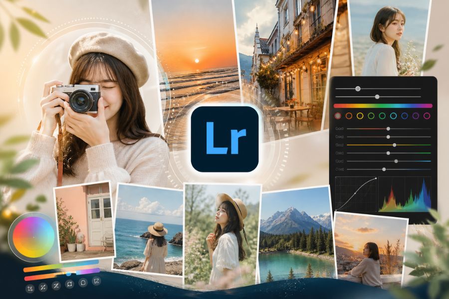
Don’t Waste Money Buying Lightroom Color Presets: Introducing the Hottest Color Grading Formulas of 2026
Nội dung
In the era of image-driven social media, everyone wants to own “million-like” photos with impressive and captivating colors.
1. Why should you color grade using Lightroom formulas?
Color grading with formulas in Lightroom is a smart way to shorten photo editing time while still ensuring consistency and aesthetics. Unlike simply buying Lightroom color presets and applying them mechanically, understanding and using formulas as a “framework” helps you better control light, color, and the mood of your photos. Formulas are not limitations, but foundations for developing your personal style, especially useful for beginners or anyone wanting to build a cohesive and professional photo feed.
Reasons to color grade using Lightroom formulas:
Save editing time, especially when processing multiple photos at once.
Create consistency in color, ideal for building personal branding or social media feeds.
Easy to learn and apply for beginners.
Provide a foundation for understanding how settings like Exposure, Contrast, HSL work.
Can be adjusted flexibly for each image instead of being rigidly applied.
Help you gradually develop your own “color taste” and editing style.
Increase work efficiency if you create content, photography, or visual design.
2. Lightroom orange tone formula
Orange tone is always among the most beloved “universal” colors for photo editing, especially for travel, lifestyle, or outdoor photos. Many people choose to buy Lightroom color presets for a beautiful orange tone, but in reality, you can create it yourself with just a few basic adjustments. Orange tones bring warmth, vibrance, and energy—perfect for sunny landscapes, blue oceans, or romantic sunsets. When applied correctly, this tone not only brightens your photo but also adds depth and a very “cinematic” feeling.
Suggested summer orange tone formula (reference):
Light:
Exposure: +0.3 to +0.7
Contrast: -10 to -20 (keep softness)
Highlights: -40 (reduce blown highlights)
Shadows: +30 (reveal dark details)
Color:
Temperature: +10 to +20 (increase warmth)
Tint: +5 (slight pink shift)
Vibrance: +20 (natural intensity boost)
Saturation: +5
Color Mix (HSL):
Orange: Hue -10, Saturation +15, Luminance +10
Yellow: Hue -30 (push yellow into orange), Saturation -10
Blue: Saturation -20 (reduce blue to emphasize subject)
Effects:
Clarity: -5 (soft feel)
Grain: 10–20 (light film texture)
.jpg)
3. Modern orange-red tone
If orange brings brightness, orange-red is its upgraded version with more personality and depth. It blends classic reddish-brown with modern orange highlights to create a look that feels both warm and luxurious. Many people search to buy Lightroom color presets for this tone because they think it is complicated, but once you understand color balance principles, you can easily master it. Orange-red works especially well for fashion concepts, artistic portraits, or photos with retro-modern vibes. Combined with blue or soft green backgrounds, the overall image becomes extremely trendy and eye-catching.
Suggested modern orange-red formula:
Light:
Exposure: +0.2 to +0.5
Contrast: +10 (increase depth)
Highlights: -50
Shadows: +20
Color:
Temperature: +15 (warmer)
Tint: +8 (slight red shift)
Vibrance: +25
Saturation: +10
Color Mix (HSL):
Red: Hue +10, Saturation +15, Luminance -5
Orange: Hue -5, Saturation +20, Luminance +5
Yellow: Hue -40, Saturation -20
Blue: Hue +10, Saturation -30 (cool contrast)
Color Grading:
Shadows: light blue (Hue ~220, Sat ~10)
Highlights: orange-red (Hue ~25, Sat ~20)
Effects:
Clarity: +5
Vignette: -10 (center focus)
.jpg)
4. Soft pastel color grading
Pastel tones are the “true love” of those who adore airy, sweet, and Korean-inspired aesthetics. There is no need to buy Lightroom color presets—you can create soft pastel photos yourself if you understand how to lower contrast and soften colors. The key feature is “lower saturation while preserving freshness,” making the image bright, gentle, and very pleasing to the eye. Whether for outdoor sunlight shots or indoor lighting, pastel tones deliver elegance and modernity, perfectly aligned with 2026 trends.
Suggested soft pastel formula:
Light:
Exposure: +0.5 to +0.8
Contrast: -20 to -30
Highlights: -30
Shadows: +40
Color:
Temperature: +5
Tint: +5
Vibrance: -10
Saturation: -5
Color Mix (HSL):
Red: Saturation -10
Orange: Saturation -5, Luminance +10
Yellow: Hue -20, Saturation -30
Green: Saturation -40
Blue: Saturation -20, Luminance +15
Effects:
Clarity: -10
Dehaze: -5
Grain: 15–25
.jpg)
5. Eye-catching blue Lightroom tone formula
Blue tones symbolize peace, freshness, and romance, especially suited for beach, travel, or wide-sky photography. Instead of rushing to buy Lightroom color presets for “trendy blue,” you can adjust it yourself to match your personal style. A beautiful blue tone is not just about boosting blue—it is about balancing coolness and brightness so the image does not feel cold but still emotional.
Suggested eye-catching blue tone formula:
Light:
Exposure: +0.3 to +0.6
Contrast: +5 to +15
Highlights: -40
Shadows: +25
Color:
Temperature: -10 to -20
Tint: -5
Vibrance: +20
Saturation: +10
Color Mix (HSL):
Aqua: Hue -20, Saturation +20, Luminance +10
Blue: Hue -15, Saturation +25, Luminance +5
Yellow: Saturation -20
Orange: Luminance +10
Color Grading:
Shadows: blue (Hue ~220, Sat ~15)
Midtones: light cyan (Hue ~200, Sat ~10)
Highlights: pale blue (Hue ~210, Sat ~8)
Effects:
Clarity: +5
Dehaze: +5
.jpg)
6. Korean light gray tone
The Korean light gray tone remains attractive thanks to its minimalist, elegant, and timeless beauty. This style is highly popular for café concepts, street style, or soft portraits. Instead of buying Lightroom color presets, you can create it yourself by reducing contrast and softening the overall palette. The secret lies in keeping the photo bright and clean without oversaturation, delivering that refined premium “K-style” feel.
Suggested Korean light gray formula:
Light:
Exposure: +0.4 to +0.7
Contrast: -25
Highlights: -35
Shadows: +35
Color:
Temperature: -5
Tint: +3
Vibrance: -15
Saturation: -10
Color Mix (HSL):
Red: Saturation -10
Orange: Saturation -5, Luminance +10
Yellow: Saturation -30
Green: Saturation -40
Blue: Saturation -20, Luminance +10
Effects:
Clarity: -10
Dehaze: -5
Grain: 20–30
.jpg)
7. Bright golden sunlight tone
Golden sunlight tone is the perfect choice for bright, energetic outdoor photos. When sunlight hits hair, skin, or the background, this tone enhances vibrance and creates an irresistible “summer vibe.” Many choose to buy Lightroom color presets for this effect, but in fact, understanding color temperature and highlight control is enough to master it yourself. A beautiful golden tone should stay bright while preserving detail and avoiding overexposure.
Suggested golden sunlight formula:
Light:
Exposure: +0.5 to +0.9
Contrast: +10
Highlights: -50
Shadows: +25
Color:
Temperature: +20 to +30
Tint: +5
Vibrance: +30
Saturation: +10
Color Mix (HSL):
Orange: Saturation +20, Luminance +10
Yellow: Hue -20, Saturation +15
Blue: Saturation -30
Effects:
Clarity: +5
Dehaze: +5
Vignette: -10
.jpg)
8. Fresh moss green tone formula
Moss green has been one of the most popular editing trends in recent years and shows no sign of fading in 2026. The blend of muted green and cool undertones creates a vibe that feels both chill and luxurious. If you are considering buying Lightroom color presets for this look, try adjusting it yourself first—because every natural scene requires different green intensity for the best effect. Moss green is especially perfect for travel, forests, resorts, or outdoor greenery concepts.
Suggested fresh moss green formula:
Light:
Exposure: +0.3 to +0.6
Contrast: -5 to +5
Highlights: -40
Shadows: +30
Color:
Temperature: -5 to -10
Tint: -5
Vibrance: +20
Saturation: +5
Color Mix (HSL):
Green: Hue -30, Saturation -20, Luminance +5
Yellow: Hue -40, Saturation -20
Aqua: Saturation +10
Blue: Saturation -10
Color Grading:
Shadows: dark moss green (Hue ~140, Sat ~15)
Highlights: soft yellow (Hue ~50, Sat ~10)
Effects:
Clarity: +5
Dehaze: +8
.jpg)
9. Conclusion
Buying Lightroom color presets may provide short-term convenience, but in the long run, it will not help you develop editing skills or create your own signature style. On the other hand, when you truly understand how colors, light, and Lightroom settings work, you gain the ability to create presets tailored specifically to yourself—something no purchased formula can replace. In 2026, color grading trends are no longer about “copy-paste presets,” but about personalization and limitless creativity. So instead of spending money on ready-made formulas, invest your time in learning, experimenting, and improving your editing “craft.” That is the real key to creating photos that are truly impressive and unique.


VIP Products


Best Selling Products
Plugin Retouch4me
69 USD
Genuine Cheap Canva Pro
39 USD
Genuine Adobe Illustrator account
99 USD
Adobe Premiere Pro Account
99 USD
Copyright Adobe Lightroom Account
59 USD
Autodesk All App Account Copyright
120 USD
Capcut Pro 1 Year
39 USD
Windows 10 & 11 Pro Key
36 USD
Freepik Premium Account
59 USD
Adobe Photoshop Copyright - Full App
120 USD
Upgrade Genuine Office 365
49 USD
Upgrade Duolingo Super
29 USD
Upgrade genuine Capture One account
120 USD
ChatGPT Plus Account (GPT-4)
16 USD
MidJourney Account
29 USD