Best Selling Products

Genuine Cheap Canva Pro
39 USD

Capcut Pro 1 Year
39 USD

Adobe Photoshop Copyright - Full App
120 USD

Upgrade Duolingo Super
29 USD

Plugin Retouch4me
69 USD

Genuine Adobe Illustrator account
99 USD

Upgrade Genuine Office 365
49 USD

Adobe Premiere Pro Account
99 USD

Windows 10 & 11 Pro Key
36 USD

Copyright Adobe Lightroom Account
59 USD

Upgrade genuine Capture One account
120 USD

ChatGPT Plus Account (GPT-4)
16 USD

MidJourney Account
29 USD

Autodesk All App Account Copyright
120 USD

Freepik Premium Account
59 USD
Explore Layout: 5 Secrets to Creating Perfect and Impressive Designs
Nội dung
- 1.What is layout?
- 1.1 Main components of Layout:
- 1.2 The role of layout in design
- 2. Key Elements of a Good Layout
- 2.1. Grid
- 2.2. Balance
- 2.3. Color Scheme
- 2.4. White Space
- 2.5. Images and Typography
- 3. Top 5 "tips" to have a beautiful layout
- 3.1 Grasp the basic principles:
- 3.2 Clearly define your design goals:
- 3.3 Choose the right design style:
- 3.4 Use color and Typography wisely:
- 3.5 Practice and creativity:
- 3.6 Using Grids and Grids to Arrange Elements
- 3.7. Focus on Balance and Symmetry
- 4. Conclusion
Learn about layouts and how to apply 5 tips to design beautiful and effective layouts. This article provides detailed instructions on how to create impressive layouts for design projects.
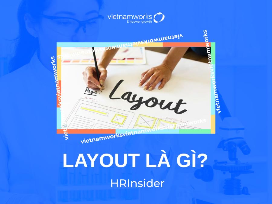
In graphic design, layout is a decisive factor in the visual appeal and ability to convey the message of a design product. A beautiful and reasonable layout not only helps attract attention but also creates balance and harmony in the entire project. In this article, sadesign will help you better understand the concept of layout and share 5 important tips to build a beautiful and effective layout for every design.
1.What is layout?
Layout is the arrangement of design elements such as typography, imagery, color, and white space on a given surface. This surface can be a page, a computer screen, an application interface, or any space where the design is presented.
.jpg)
Layout can be applied to all types of design, from print (posters, brochures) to web design, user interface (UI) or online advertising.
A good layout is not simply about arranging elements in a pleasing way, but also about ensuring its function, that is, helping viewers easily receive information. Layout helps guide the viewer's eyes, leading them from one important part to another in a natural way.
1.1 Main components of Layout:
Typography: Font style, font size, spacing between letters and lines of text.
Imagery: Pictures, charts, icons, and other graphic elements.
Color: Main color, background color, accent color, and color scheme.
White space: The space around elements, which helps create emphasis and increases readability.
1.2 The role of layout in design
Create balance and harmony: A good layout will distribute design elements in a balanced way, creating a sense of harmony and comfort for the viewer.
Guide the viewer: Layout acts as a "map" that guides the viewer's eyes in a logical sequence, from one focal point to another, helping them absorb information effectively.
Increase aesthetics: A beautiful layout will make the design more attractive and appealing, creating a good impression on the viewer.
Conveying messages: Layout is not only about form but also about content. The arrangement of design elements can convey hidden messages, creating deep meanings for the work.
2. Key Elements of a Good Layout
Before going into the secrets to having a beautiful layout, we need to understand the basic elements that make up a layout. These are:
(1).jpg)
2.1. Grid
Grids are an important tool for arranging design elements in a scientific way. Using a grid helps you maintain consistency in design elements, prevents the layout from being confusing and creates harmony.
2.2. Balance
Balance is essential to ensure that the space in a layout is not “overcrowded” in any one area. Balance can be achieved in two ways: symmetrical and asymmetrical balance.
2.3. Color Scheme
Color in your layout helps create emphasis and attract attention. A good color scheme will make your design look professional and easy on the eyes.
2.4. White Space
Negative space is an important element in design. It helps to highlight other elements and prevents the layout from becoming too cluttered or confusing.
2.5. Images and Typography
Typography and images play a huge role in conveying the message of a design. Fonts and images need to be carefully chosen to match the design goals and work together.
3. Top 5 "tips" to have a beautiful layout
Here are 5 tips to help you create a beautiful, impressive layout that is easy to digest.
3.1 Grasp the basic principles:
Rule of Thirds: Divide the design space into nine equal sections using two horizontal lines and two vertical lines. Place important elements at the intersections or thirds of the lines.
Golden Ratio: Use the ratio of 1:1.618 to create symmetry and harmony in your layout. For example, the width of a rectangle can be divided into two parts, with the larger part being 1.618 times longer than the smaller part.
White space: Use white space wisely to create emphasis, help viewers breathe and focus on the main content. White space does not have to be white, it can be any color as long as it creates contrast with other elements.
Eye Paths: Use straight lines, curves, or even the direction of the character's gaze in the image to guide the viewer's eye where you want it to go.
Repetition: Repeat design elements (colors, shapes, typography) to create unity and increase recognition.
3.2 Clearly define your design goals:
Before starting to design a layout, ask yourself:
What is the purpose of the work? (For example: to promote a product, convey information, create an impression)
What message do you want to convey? (For example: trust, creativity, professionalism)
Who is your target audience? (e.g. young people, older adults, potential customers)
3.3 Choose the right design style:
Classic: Prioritizes balance, harmony and uses elaborate lines and decorative motifs.
Modern: Simple, minimalist, using lots of white space and clean lines.
Minimalism: Remove unnecessary elements, focus on main content.
Asymmetry: Create a unique, unconventional look by arranging design elements asymmetrically.
Grid: Divides the design space into even grid cells, helping to arrange components scientifically and easily.
3.4 Use color and Typography wisely:
Color:
Colors can evoke different emotions in viewers. For example, red represents energy, blue represents trust, and yellow represents optimism.
Choose colors that match the message you want to convey and your target audience.
Use a color palette to ensure consistency and harmony in your design.
Typography:
Typography is also an important element in layout. Choose a font that is easy to read, fits the design style and creates emphasis for important titles and content.
Use no more than 2-3 typefaces in a design to avoid confusing the viewer.
Pay attention to font size, letter spacing, and line spacing to ensure readability.
3.5 Practice and creativity:
Refer to beautiful design works: Study and learn from successful layouts of famous designers.
Use support tools: There are many software and tools to support layout design, such as Adobe InDesign, Figma, Canva.
Always put yourself in the viewer's shoes: Think about how the viewer will feel when looking at your layout.
Never stop learning and updating: Design trends are always changing, so never stop learning and updating your knowledge.
Advice from the experts:
Learn about color psychology: Colors can influence viewers' emotions and behavior.
Study the principles of vision: Understanding how the human eye works will help you create more effective layouts.
Practice on different types of projects: This will help you expand your knowledge and skills.
Ask for feedback from colleagues and friends: Sometimes, other people can see mistakes that you don't.
3.6 Using Grids and Grids to Arrange Elements
Using a grid is one of the most important design techniques for creating a beautiful and professional layout. Grids help you position elements like text, images, and icons, creating balance and adequate empty space.
(1).jpg)
Common grids in design include:
12-column grid: This is a popular grid type in web and user interface design. It divides the space into 12 equal columns, giving you flexibility in arranging elements on the page.
Golden Ratio Grid: This is a useful tool in design, helping to create a natural balance that is pleasing to the eye.
When using a grid, you can easily move, resize and arrange elements scientifically while still ensuring aesthetics.
3.7. Focus on Balance and Symmetry
Balance in design ensures that no element in the layout is overshadowed or lacking in any part. You can choose to use symmetrical balance, where the elements are evenly distributed on both sides, or asymmetrical balance, where the elements are unevenly distributed but still maintain overall harmony.
.jpg)
Balance not only improves aesthetics, but also helps viewers easily absorb information in a logical order. For example, in poster design, you can place the title in the middle, with secondary images and text around it so that the overall space remains balanced.
4. Conclusion
Layout is an important element in design, helping to create a harmonious, balanced and attractive work. By mastering the basic principles, clearly defining the design goals, choosing the right style, using colors and typography appropriately, along with practice and creativity, you will be able to create beautiful and impressive layouts.


VIP Products


Best Selling Products
Genuine Cheap Canva Pro
39 USD
Capcut Pro 1 Year
39 USD
Adobe Photoshop Copyright - Full App
120 USD
Upgrade Duolingo Super
29 USD
Plugin Retouch4me
69 USD
Genuine Adobe Illustrator account
99 USD
Upgrade Genuine Office 365
49 USD
Adobe Premiere Pro Account
99 USD
Windows 10 & 11 Pro Key
36 USD
Copyright Adobe Lightroom Account
59 USD
Upgrade genuine Capture One account
120 USD
ChatGPT Plus Account (GPT-4)
16 USD
MidJourney Account
29 USD
Autodesk All App Account Copyright
120 USD
Freepik Premium Account
59 USD