Best Selling Products
Font selection solutions to improve reading experience for people with reading disabilities
Nội dung
- 1. What is Dyslexia?
- 2. Why Is Font Choice Important for People with Dyslexia?
- 3. Characteristics of Easy-to-Read Fonts for People with Dyslexia
- 3.1. Simple and Clear Letter Shapes
- 3.2. Spacing Between Characters
- 3.3. X-height
- 3.4. Thickness of Letters
- 4. Fonts Suitable for People with Dyslexia
- 4.1. OpenDyslexic
- 4.2. Dyslexia Font
- 4.3. Arial
- 4.4. Comic Sans
- 5. Other Considerations When Designing Text for People with Dyslexia
- 5.1. Choosing the Right Font
- 5.2. Larger Font Size
- 5.3 High Contrast Guarantee
- 5.3. Avoid Using Overly Complex Effects
- 6. Conclusion
Explore dyslexia and solutions in choosing the right font to improve the reading experience, helping users easily access information without difficulty.
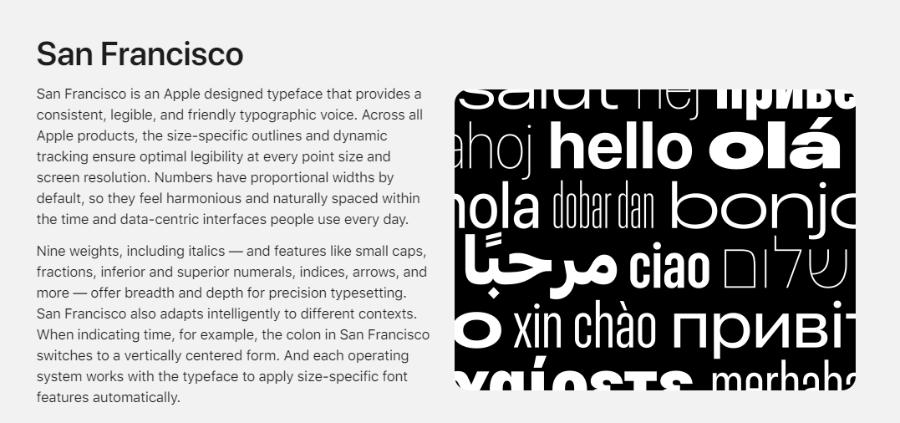
1. What is Dyslexia?
Dyslexia, also known as dyslexia , is a common learning disorder that affects a person’s ability to read, write, and sometimes speak. People with dyslexia often have difficulty recognizing letters, making sounds, and reading fluently, despite their ability to understand and process information. The disorder is not related to intelligence, but rather to how the brain processes language information.
.jpg)
Beautiful Font Warehouse
Signs of dyslexia include:
Difficulty in recognizing and distinguishing letters.
Difficulty reading words, sentences, or paragraphs.
Reading speed is slow and easily tiring when having to read a lot.
Dyslexia does not only affect children but can also continue into adulthood. In particular, the development of technology and media requires effective solutions to alleviate these difficulties.
2. Why Is Font Choice Important for People with Dyslexia?
When it comes to improving reading ability for people with dyslexia, few people think about font selection . However, an inappropriate font can make reading difficult and increase stress levels. On the contrary, a legible, clear font will help readers easily recognize characters and improve reading ability.
Choosing the right font can bring the following benefits:
Reduce eye strain : Easy-to-read fonts help reduce eye strain and fatigue during long reading sessions.
Improve clarity : Fonts with easily distinguishable shapes between characters will help readers easily identify information.
Increase reading speed : A suitable font helps reduce the time spent thinking about how to read words, thereby improving reading speed and understanding of information.
.jpg)
3. Characteristics of Easy-to-Read Fonts for People with Dyslexia
To choose a suitable font for someone with dyslexia, there are several important factors to keep in mind:
3.1. Simple and Clear Letter Shapes
Fonts with simple, easily distinguishable letter shapes are the first thing to consider. Fonts with too many intricate details or unclear curves can confuse readers and make it difficult to recognize characters.
Sans-serif fonts like Arial and Helvetica are generally easier to read than serif fonts because they are less complex. Simple fonts make it easier for readers to distinguish letters and reduce reading errors.
3.2. Spacing Between Characters
Letter spacing (kerning) also plays an important role. If letters are too close together, readers will have difficulty recognizing individual characters. Conversely, if the spacing is too wide, connecting letters into words can cause disruption in the reading process. The spacing between words also needs to be wide enough to be easily distinguishable.
3.3. X-height
X-height is the height of letters without the top or bottom (like a, c, e, o). A high x-height will help with legibility because the letters will be clearer, not blurry or hard to see. This is especially important for people who have trouble distinguishing similar letters like "p" and "q" or "b" and "d".
3.4. Thickness of Letters
Fonts that are too thin can make letters difficult to read, especially if the reader has trouble distinguishing fine details. A font that is not too thin or too bold increases readability. A font that is not too thick increases readability, making the characters clearer without looking “diluted” to the reader’s eye.
4. Fonts Suitable for People with Dyslexia
There are many fonts on the market today that are specifically designed for people with dyslexia. These fonts are visually optimized to make reading easier.
.jpg)
4.1. OpenDyslexic
OpenDyslexic is a font specifically designed to help people with reading difficulties, especially those with dyslexia. With adjusted strokes that increase the distinction between characters, OpenDyslexic reduces confusion when reading and improves concentration. It is a useful solution, widely used in education and support materials, to provide an easier and more comfortable reading experience for users.
4.2. Dyslexia Font
Dyslexia is a common learning disorder that affects the ability to read, write, and remember. To support those with this difficulty, using specially designed fonts such as Dyslexie Font has proven to be very effective.
The Dyslexie Font is designed with unique features such as wider letter spacing, uneven letter weights and bolder letter bases, which help to reduce letter juxtaposition or confusion. These improvements not only improve reading comprehension but also boost user confidence. Using appropriate fonts in study and work is a practical solution to help people with dyslexia integrate better into everyday life.
4.3. Arial
One of the recommended fonts is Arial, as it is a sans-serif font with a simple, clear and easy-to-read design. Arial has reasonable spacing between characters, making it easy for readers to distinguish each letter, thereby reducing confusion. In addition, using larger font sizes along with wide line spacing is also an important factor in supporting people with dyslexia. Applying these design solutions not only improves reading ability but also creates a more comfortable and confident feeling in the learning and working process.
4.4. Comic Sans
While Comic Sans is not a favorite font in professional design, it is an easy choice for people with dyslexia due to its simple and clear letter shapes.
With its simple design, widely spaced characters and easily distinguishable letter shapes, Comic Sans helps reduce confusion when reading, while creating a more comfortable feeling for the eyes. This font not only helps improve letter recognition but also helps increase concentration and information absorption. Therefore, using Comic Sans in learning materials or content that needs to be conveyed to people with dyslexia is an effective and worth considering option.
5. Other Considerations When Designing Text for People with Dyslexia
In addition to font choice, there are a few other factors to keep in mind when designing text for people with dyslexia:
.jpg)
5.1. Choosing the Right Font
Fonts play an important role in improving reading comprehension. Sans-serif fonts such as Arial, Verdana, or Open Dyslexic are recommended because they have clear, easily distinguishable shapes. Avoid using decorative or overly complex fonts such as Times New Roman or script fonts, as they can be confusing and difficult to read.
5.2. Larger Font Size
The font size should be large enough that the reader does not have to squint or strain to see it clearly. Typically, a size of 12 to 14 points is appropriate. Also, make sure that the line spacing is generous, usually 1.5 or 2, to create breathing space and allow the eye to move easily from line to line.
5.3 High Contrast Guarantee
Color also has a big impact on the reading ability of people with dyslexia. Text backgrounds should be light colors, such as cream or light gray, rather than bright white. Text should be dark colors, such as black or dark blue, to create high contrast. Avoid using strongly contrasting colors or backgrounds with complex patterns.
Using colors with high contrast between text and background makes it easy for readers to distinguish letters. Light background colors such as white or light gray combined with black or dark blue text are ideal choices.
5.3. Avoid Using Overly Complex Effects
Effects such as shadows, italics, and underlining can make text more difficult to read, especially for people with dyslexia. Therefore, these effects should be used sparingly in text.
Long paragraphs can be overwhelming for dyslexics. Instead, break your content into short paragraphs, each containing just one main idea. Use subheadings and bulleted lists to organize information in a clear, easy-to-follow manner.
Beautiful Font Warehouse
6. Conclusion
Dyslexia is a common problem that affects many people’s ability to access information. One simple but effective solution to improve the reading experience for people with this condition is choosing the right font. Choosing simple, clear fonts with appropriate spacing between characters can help improve readability and reduce stress when accessing information.
