Best Selling Products

Adobe Premiere Pro Account
99 USD

Windows 10 & 11 Pro Key
36 USD

Capcut Pro 1 Year
39 USD

Upgrade genuine Capture One account
120 USD

Adobe Photoshop Copyright - Full App
120 USD

Copyright Adobe Lightroom Account
59 USD

Autodesk All App Account Copyright
120 USD

Upgrade Duolingo Super
29 USD

Upgrade Genuine Office 365
49 USD

Genuine Cheap Canva Pro
39 USD

Plugin Retouch4me
69 USD

MidJourney Account
29 USD

Genuine Adobe Illustrator account
99 USD

ChatGPT Plus Account (GPT-4)
16 USD

Freepik Premium Account
59 USD
Get Inspired With Unique And Sophisticated Pastel Color Schemes
Nội dung
- 1. Definition and characteristics of pastel colors
- 2. Popular Pastel color schemes
- 2.1. Pink and Navy Blue
- 2.2. Pastel green combined with Pastel yellow
- 2.3. Brown and gray color combination
- 3. Notes when mixing Pastel colors
- 3.1. Balance between colors
- 3.2. Objects and purposes of use
- 3.3. Color matching techniques
- 3.4. Common mistakes when using pastel colors
- 4. Application of Pastel color palette in design
- 4.1. Graphic design and advertising
- 4.2. Website design and user interface (UI/UX)
- 4.3. Interior design and architecture
- 4.4. Fashion design
Let unique pastel color palettes be an endless source of inspiration for your design projects. This article summarizes color suggestions that not only help expand your creativity but also bring beautiful visual effects that create a unique mark and style for each product.
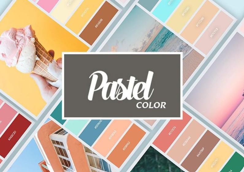
Color always plays a key role in determining the aesthetics, emotions and effectiveness of conveying the message of the product. One of the popular trends is the Pastel color palette - a delicate, gentle but equally modern choice. This article by SaDesign is written for designers or anyone interested in the art of color coordination to provide suggestions and tips for popular Pastel color coordination, thereby helping to create unique and professional design products.
1. Definition and characteristics of pastel colors
Pastel colors are light colors, often diluted with a large amount of white to create a delicate, gentle appearance and bring a soft feeling to the observer's eyes. These colors are not too strong or bold, but on the contrary, create elegance and sophistication, making any space become softer and gentler. For example, pink, mint green, light yellow, peach orange... are all typical colors of the pastel color palette.
.png)
Pastel colors are different but generally have similar characteristics. First, although not required, warm pastel colors are often considered by many to be colors for women. This comes from the gentleness and softness that these colors bring to the viewer. This idea is so popular that even cool pastel colors are not commonly used in men's clothing.
Pastel colors are created by lightening the basic tones, so it is not difficult to understand why pastel colors themselves are not very prominent. This makes using these colors for the purpose of creating highlights often ineffective, making your design dull. This is also the reason why new designers who want to use pastel colors for their designs often find them difficult to match to impress the viewer.
Finally, pastel colors can be combined with other colors quite simply without creating color conflicts. This comes from the neutrality of pastel colors, not too intense and not too pale. This is also the reason why pastel colors become versatile from fashion design to home interiors because it makes color coordination simpler.
.png)
2. Popular Pastel color schemes
The appropriate use of Pastel colors depends on the designer's ability to use colors. However, if you still have no ideas for your designs, the Pastel color schemes below will be great suggestions for you.
2.1. Pink and Navy Blue
This is a color palette that highlights the youthfulness and femininity of the subject. When used in fashion, this color palette will be very suitable for young and somewhat "girly" girls. To highlight the outfit, a pair of navy blue shoes or a handbag will create a highlight for the whole outfit, expressing the personality of the wearer.
In home design, this color scheme is quite suitable for bedroom space, especially bedrooms for women because of the gentle and pleasant feeling that Pastel pink brings.
Media publications about products or events related to women, love… are also very suitable for this Pastel color palette.
.png)
2.2. Pastel green combined with Pastel yellow
This color scheme often creates a contrast between two warm and cool colors to help your design divide the areas that need to direct the user's cool image in the design. Pastel yellow and blue also evoke many associations with summer, the beach... so it is very suitable for publications with content related to sea tourism.
The combination of 2 pastel colors in fashion will also create a youthful dynamism for girls with personality but still have enough necessary femininity. A pair of blue jeans with a pastel yellow crop top with a little dark blue or pastel pink accessories as a highlight will be very suitable for a day of weekend outings.
.png)
2.3. Brown and gray color combination
This is a rather unique Pastel color scheme and is very suitable for home design for homeowners with the Earth element. Brown tones will dominate and gray tones will play a complementary role and balance the colors of the house space. In terms of fashion, this is one of the rare color schemes that men can try to refresh their fashion style. A dark brown shirt with gray pants and embellished with a leather belt or a dark clutch will be a perfect choice to both express personality and still maintain the inherent masculinity.
3. Notes when mixing Pastel colors
Once you have chosen the right color scheme, applying it properly is the key to the success of your design. Here are some things to consider when using pastel color schemes.
3.1. Balance between colors
A beautiful design requires more than just eye-catching colors, it also requires a balance between them. When using pastel colors, you need to pay attention to:
Background and accents: Use neutral background colors like white, gray or cream as the base for your design, then use pastel colors as accents to draw attention.
Contrast: Make sure that text and images stand out from the background, making the message clear. Sometimes, using a little bold color from a bright color palette or special accents will make the overall design more harmonious and approachable.
(1).png)
3.2. Objects and purposes of use
Each color scheme should be chosen to suit the target audience and the purpose of the design:
With youthful, modern products, bright pastel color palettes will bring unexpected effects.
If you aim for a luxurious, sophisticated style, prioritize using basic pastel or cool pastel color palettes.
For designs that aim for warmth and friendliness such as interiors or home product advertising, a warm pastel color palette is definitely the ideal choice.
3.3. Color matching techniques
To ensure your product always achieves optimal aesthetic performance, please:
Use support tools: Applications like Adobe Color or Coolors will be great assistants to help you control saturation and choose color combinations easily.
Experiment and test: Don't be afraid to change things up, test out multiple variations of your color palette to find the combination that best suits your brand message or project style.
Pay attention to lighting and context: Some pastel colors can appear different in different lighting or on different materials. Test carefully before releasing your product to the market.
.png)
3.4. Common mistakes when using pastel colors
Although pastel color palette brings rustic beauty, many designers make some common mistakes such as:
Too many pastel shades: Using too many pastel colors in a design can make the overall look “bland”, losing its prominence and personality.
Not ensuring contrast: When text and images use pastel tones without clear distinction, the information on the design can be “blended” and difficult for viewers to access.
Overuse of effects: Some special effects or excessive shading can take away from the natural, pleasant look of pastel colors.
4. Application of Pastel color palette in design
4.1. Graphic design and advertising
In graphic design, pastel colors are often used to create gentle, attractive but not too "hot" products. For example, an event poster or advertising banner using a pastel color palette will bring a comfortable, close feeling to the viewer. Thanks to the subtle blend of colors such as pink, mint green or light yellow, messages are conveyed in a soft, memorable way and create a deep impression.
.png)
4.2. Website design and user interface (UI/UX)
Web designers today are always looking for a balance between modernity and accessibility. When using pastel color palettes, the interface becomes soft, elegant and does not feel too “heavy” for the user. For example, a website interface using a cream background with pink or light blue accents not only creates an impressive look but also helps users feel relaxed when accessing information.
4.3. Interior design and architecture
Modern living space does not stop at architectural elements, but interior colors also play a very important role. Pastel color palettes such as peach orange, light yellow or turquoise and light gray when applied to the interior space will create a warm, close and modern look. From the living room, bedroom to the office, these color tones help balance the light, expand the space and create a feeling of relaxation.
4.4. Fashion design
The current fashion trend is not only based on tailoring or style but also on color. Pastel colors have affirmed their position in spring and summer fashion collections with their youthfulness and ease of coordination. From street wear to party wear, pastel colors help create a look that is both modern and gentle, suitable for many customers.
The change in the way of looking at color in design has opened a new chapter full of creativity. The pastel color palette with its gentle, soothing beauty is not only a popular trend but also a sophisticated artistic style, suitable for all times. Through this article, we hope you have more useful suggestions and ways to apply the pastel color palette effectively and flexibly.


VIP Products


Best Selling Products
Adobe Premiere Pro Account
99 USD
Windows 10 & 11 Pro Key
36 USD
Capcut Pro 1 Year
39 USD
Upgrade genuine Capture One account
120 USD
Adobe Photoshop Copyright - Full App
120 USD
Copyright Adobe Lightroom Account
59 USD
Autodesk All App Account Copyright
120 USD
Upgrade Duolingo Super
29 USD
Upgrade Genuine Office 365
49 USD
Genuine Cheap Canva Pro
39 USD
Plugin Retouch4me
69 USD
MidJourney Account
29 USD
Genuine Adobe Illustrator account
99 USD
ChatGPT Plus Account (GPT-4)
16 USD
Freepik Premium Account
59 USD