Best Selling Products
Great fonts for PowerPoint Slide presentations
Nội dung
In a PowerPoint presentation, font plays an important role in conveying the message and attracting the viewer's attention. Not only a decorative element, font also directly affects the audience's ability to receive information.
http://sadesign.ai/In a PowerPoint presentation, fonts play an important role in conveying messages and attracting the attention of viewers. Not only is it a decorative element, fonts also directly affect the audience's ability to receive information. A suitable font will help the content become easier to read, more professional and create a better impression. Choosing a font is not only a matter of aesthetics but also must meet the requirements of being easy to see, easy to read and suitable for the style of the presentation.
1. Font sizes
Calibri is a popular sans-serif font designed by Lucas de Groot and first released in 2007. It has been the default font of Microsoft Office since Office 2007, replacing the previous Times New Roman. This font is notable for its gently rounded design, smooth strokes, creating a friendly and easy-to-read feeling on the screen.
With its clean, rounded strokes, Calibri is easy to read at a variety of sizes, from small text to large headlines. Calibri has a modern, sophisticated, and understated look that is suitable for both business and presentation environments. The font is easy to use for a variety of documents including presentations, reports, and text documents. This will be a great choice for users.

2. Arial font
Arial is one of the most popular and recognizable sans-serif fonts, designed by Robin Nicholas and Patricia Saunders in 1982 for Monotype. Arial is widely used across multiple platforms because of its versatility, readability, and ability to display clearly on all screen sizes.
Arial has a simple, sans-serif design that makes text easy to read at both small and large sizes. Used across a wide range of software and platforms, Arial is a friendly, recognizable font. Arial has a neutral, unobtrusive look that works well in a wide range of documents.
3. Roboto Font
Roboto is a modern sans-serif font, designed by Christian Robertson and released by Google in 2011. Roboto is characterized by simple, modern yet fluid strokes, legible and versatile, especially popular in applications and websites.
Roboto has rounded strokes but retains a classic structure, creating a modern yet approachable feel. It is optimized for display, making text easier to read even at small sizes. Additionally, Roboto comes in a variety of weights from thin to bold, giving it the flexibility to present different types of content.
.jpg)
4. Font Century Gothic
Century Gothic is a modern and elegant sans-serif font first released by Monotype in 1991. It features rounded strokes and wide letter spacing, creating a friendly, fresh, and easy-to-read feel. With its unique design, Century Gothic is perfect for headlines and content that need to grab attention.
The letters in Century Gothic are rounded and smooth, making the text attractive and easy to read. This font has a modern and friendly look, suitable for presentations, graphic design, and advertising. The letter spacing is wider, making the font easier to read even at small font sizes.
5. Open Sans font
Open Sans is a modern and easy-to-read sans-serif font designed by Steve Matteson in 2010. It is free, part of Google Fonts, and optimized for digital display, making Open Sans a popular choice for both websites and PowerPoint slides.
Open Sans has a clean, slim, easy-to-read design with delicate strokes that make text look professional and comfortable to read. Kerning is standard, making text easy to read, even at small sizes. Open Sans is suitable for many different types of content thanks to its uncomplicated yet elegant style.
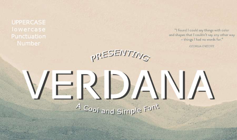
6. Verdana Font
.jpg)
Verdana is a sans-serif font designed by Matthew Carter in 1996 for Microsoft. Optimized for legibility on screen, Verdana is one of the most popular fonts for both digital and print content. It features wide strokes and generous letter spacing, making it easy to read and friendly.
With its screen-optimized design, Verdana is highly legible even at small font sizes, making it ideal for presentations or online content. Wide character spacing makes text easy to read, reducing overlap, which is especially useful when presenting on different screens. Verdana has a simple and neutral design, suitable for a wide range of content from technical documents to PowerPoint slides.
Therefore, Verdana is a reliable choice for PowerPoint slides thanks to its readable, user-friendly design and good display on a variety of screens, especially useful in presentations or online content.
7. Font Times New Roman
Times New Roman is one of the most famous serif fonts, designed by Stanley Morison and Victor Lardent in 1931 for The Times of London newspaper. It is a classic, serif font, traditional in style, elegant and easy to read in print. Times New Roman is widely used in academic documents, administrative documents and official reports.
The thin, serifed strokes create a serious, professional and approachable feel. Times New Roman is designed to be easy to read when used for long text, making it ideal for text-heavy documents. Thanks to its compact design, Times New Roman saves space on a page or slide, making it ideal for presenting a lot of content in a limited space. Therefore, Times New Roman is an ideal font when a formal and easy-to-read style is required, especially useful for academic or official presentations where seriousness and professionalism are required.
8. Font Century Gothic

Century Gothic is a modern and elegant sans-serif font developed by Monotype in 1991. It has a minimalist style, with rounded strokes and generous letter spacing, creating a fresh, readable and friendly feel.
With its rounded and even strokes, Century Gothic feels modern and pleasant. The font has large letter spacing, which improves readability and makes the text appear more spacious. Therefore, Century Gothic is very suitable for titles or short content on slides thanks to its light and easy-to-read aesthetic, creating attraction without making the viewer feel "heavy" when following.
This font brings a modern and attractive look, so it is very popular in advertising, poster or brochure designs. Century Gothic is suitable for creative documents or youthful, dynamic designs.
Conclude
In short, font is an important factor that cannot be overlooked in the process of designing PowerPoint slides. Choosing the right font helps increase professionalism, create an impression and help the audience easily absorb the content. A properly chosen font not only makes the presentation more aesthetic but also contributes significantly to the success of conveying the message. Therefore, carefully considering the font is a necessary step for the presentation to achieve optimal effectiveness.
