
Best Selling Products

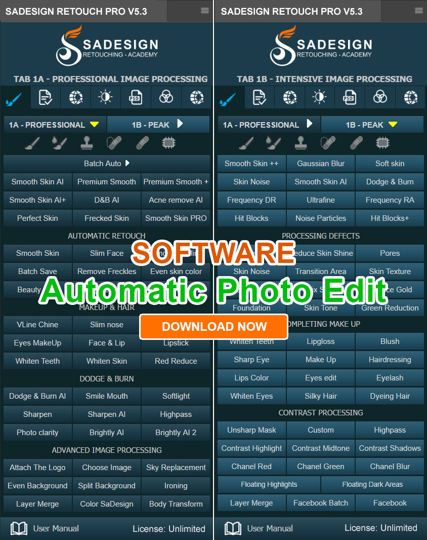
Plugin Retouch4me
69 USD

Genuine Adobe Illustrator account
99 USD

Upgrade genuine Capture One account
120 USD

Upgrade Genuine Office 365
49 USD

MidJourney Account
29 USD

Freepik Premium Account
59 USD

Upgrade Duolingo Super
29 USD

Genuine Cheap Canva Pro
39 USD

Autodesk All App Account Copyright
120 USD

ChatGPT Plus Account (GPT-4)
16 USD
Adobe Photoshop Copyright - Full App
120 USD

Windows 10 & 11 Pro Key
36 USD

Capcut Pro 1 Year
39 USD

Copyright Adobe Lightroom Account
59 USD

Adobe Premiere Pro Account
99 USD
How to create Dark Mode for your website using CSS and JavaScript (detailed guide)
Nội dung
- 1. What is Dark Mode?
- 2. Dark Mode Design Principles
- 2.1. Choose the appropriate color code.
- 2.2. Ensuring contrast
- 2.3. Saturation Control
- 2.4. Creating depth and hierarchy
- 3. Benefits of Dark Mode
- 3.1. Reducing glare in dark environments
- 3.2. Battery life can be saved on OLED screens.
- 3.3. Supporting accessibility
- 4. Create a website with Light Mode and Dark Mode.
- 4.1. Using prefers-color-scheme
- 4.2. Managing Colors Using CSS Variables
- 4.3. Building the Toggle Button
- 5. Notes on implementing Dark Mode
- 6. Conclusion
Dark Mode is becoming a popular choice on modern websites and applications, offering users a more minimalist, modern, and flexible interface.

1. What is Dark Mode?
Dark Mode is a user interface that uses light-colored text, icons, and graphic elements on a dark background. It can be thought of as a change in color palette compared to traditional interfaces that use dark text on a light background.
Dark mode is becoming increasingly popular due to its combination of aesthetics and usability. Dark interfaces often create a modern, minimalist, and elegant feel, especially suitable for technology websites, entertainment platforms, creative applications, or digital products.
Another reason for Dark Mode's popularity is its ability to synchronize with system settings. Operating systems like macOS, Windows, iOS, and Android all support light and dark modes. When websites can recognize this selection, the user experience becomes more seamless.

However, Dark Mode should not be viewed as a simple "color inversion" of Light Mode. Designers need to build a separate color system to ensure readability, content hierarchy, and consistency across the entire interface.
2. Dark Mode Design Principles
2.1. Choose the appropriate color code.
One common mistake when designing Dark Mode is using solid black #000000 as the main background and white #FFFFFF for all the text.
This color combination creates a very high contrast. While high contrast makes content easily recognizable, the large difference between the two colors can be jarring and uncomfortable to look at for extended periods.
Instead of using absolute black, consider very deep shades of gray like #121212 . This background color still creates a dark feel but is softer.
2.2. Ensuring contrast
In Dark Mode, readability is a top priority. Bright text on a dark background must have sufficient contrast for users to easily recognize the content.
According to WCAG standards , the minimum recommended contrast ratio for standard text is 4.5:1 . For larger text sizes, the requirement may be lower depending on the case.

Therefore, color selection shouldn't be based solely on visual perception. Designers should use contrast testing tools to determine if a color pair meets accessibility requirements.
For example, if the background is #121212, not all text necessarily has to use #FFFFFF. Color levels like #F5F5F5, #BDBDBD, or intermediate colors can be used to create a content hierarchy, as long as they still maintain the necessary readability.
2.3. Saturation Control
Highly saturated colors like neon green, deep pink, or vibrant yellow often stand out strongly against a dark background. However, if used excessively, they can make the interface look garish and distracting.
One solution is to reduce the saturation of the brand's colors when switching to Dark Mode. Instead of using the same color code for both modes, designers can create a softer version of the color specifically for dark backgrounds.
This is especially important for elements such as CTA buttons, links, icons, and alert statuses. The colors still need to be prominent enough to convey functionality but should not become a visual distraction.
2.4. Creating depth and hierarchy
In Light Mode, designers often use box shadows to create a sense of depth and separate elements. However, on a dark background, black shadows are often difficult to see.
Instead, use different shades of gray for each interface layer. The main background could use #121212, while cards or surfaces use #1E1E1E. More prominent elements like modals or menus can use slightly lighter shades.
3. Benefits of Dark Mode
3.1. Reducing glare in dark environments
One of the common reasons for using Dark Mode is to reduce glare when viewing the screen in low-light environments.

In a dark room, a bright white interface can create a strong contrast with its surroundings. A dark interface reduces the amount of light emanating from the background, which can make it more comfortable to use under certain conditions.
However, Dark Mode isn't always better than Light Mode. In well-lit environments, such as a daytime office, dark text on a light background often provides good readability for many users.
3.2. Battery life can be saved on OLED screens.
Dark Mode also offers a notable technical advantage for OLED displays.
Unlike LCDs which use a backlight system, OLED screens have self-illuminating pixels. When displaying black, the pixels can be turned off. Therefore, in some cases, an interface with many black areas can help reduce power consumption on OLED devices.
The actual battery savings depend on the device, screen brightness, the proportion of dark areas displayed, and many other factors. Therefore, Dark Mode should not be considered a guaranteed solution for extending battery life in all cases.
3.3. Supporting accessibility
Dark Mode also needs to be considered from an accessibility perspective . Not all users will have the same experience with the dark interface.
Some people, including those with astigmatism, may find bright text harder to read on a dark background or experience a halo effect around the characters.
Therefore, websites should ensure reasonable contrast and allow users to actively switch between Light Mode and Dark Mode. This is a better approach than forcing all users to use a single mode.
4. Create a website with Light Mode and Dark Mode.
After finalizing the color scheme, the next step is to implement Dark Mode using web technologies. A modern solution could combine CSS Media Queries, CSS Variables, and JavaScript .
4.1. Using prefers-color-scheme
CSS provides the media query prefers-color-scheme to allow the website to detect the light or dark mode the user has set on their operating system.

The advantage of this method is that the website can automatically adapt without needing JavaScript.
4.2. Managing Colors Using CSS Variables
When a website has many elements, rewriting each color in the media query makes CSS difficult to manage. CSS Variables help solve this problem.

4.3. Building the Toggle Button
The prefers-color-scheme feature is convenient, but it has one drawback: users cannot actively change the scheme directly on the website if the system settings don't match their current needs.
To solve this problem, a toggle button can be created using HTML, CSS, and JavaScript.
HTML:

CSS:

JavaScript:

5. Notes on implementing Dark Mode
Dark Mode should be viewed as a complete design system, not just a secondary color scheme. When implementing it, test all website elements, including text, links, buttons, forms, cards, modals, icons, images, and error messages.
In particular, don't just test the interface on the designer's screen. Experiment under different lighting conditions and screen sizes. A color might look right on one screen but be too bright or too dim on another.
Additionally, it's important to ensure that both Light Mode and Dark Mode maintain the same content structure. Users switch themes to change the display, not to lose information or functionality.
6. Conclusion
Dark Mode is an important feature in modern website design, meeting aesthetic trends while giving users more control over their experience. However, an effective Dark Mode is not simply a matter of replacing a white background with a black one.
Designers need to choose appropriate background colors, maintain contrast, control saturation, and build visual hierarchy using multiple color layers. At the same time, accessibility should be prioritized so that the interface can serve a wider range of users.
Technically, prefers-color-scheme allows the website to automatically recognize system settings, while CSS Variables help manage the color palette centrally. When combined with JavaScript and localStorage , users can actively switch between Light Mode and Dark Mode and save their choices. A properly designed and implemented Dark Mode will make the website more flexible, modern, and provide a more consistent experience across devices.



















VIP Products







Best Selling Products
Plugin Retouch4me
69 USD
Genuine Adobe Illustrator account
99 USD
Upgrade genuine Capture One account
120 USD
Upgrade Genuine Office 365
49 USD
MidJourney Account
29 USD
Freepik Premium Account
59 USD
Upgrade Duolingo Super
29 USD
Genuine Cheap Canva Pro
39 USD
Autodesk All App Account Copyright
120 USD
ChatGPT Plus Account (GPT-4)
16 USD
Adobe Photoshop Copyright - Full App
120 USD
Windows 10 & 11 Pro Key
36 USD
Capcut Pro 1 Year
39 USD
Copyright Adobe Lightroom Account
59 USD
Adobe Premiere Pro Account
99 USD