Best Selling Products

Genuine Adobe Illustrator account
99 USD

Adobe Premiere Pro Account
99 USD

Capcut Pro 1 Year
39 USD

Freepik Premium Account
59 USD

Copyright Adobe Lightroom Account
59 USD

Upgrade Duolingo Super
29 USD

Adobe Photoshop Copyright - Full App
120 USD

Autodesk All App Account Copyright
120 USD

Genuine Cheap Canva Pro
39 USD

Upgrade genuine Capture One account
120 USD

Windows 10 & 11 Pro Key
36 USD

Plugin Retouch4me
69 USD

Upgrade Genuine Office 365
49 USD

ChatGPT Plus Account (GPT-4)
16 USD

MidJourney Account
29 USD
Interesting Facts Behind Famous Logos: Importance and Untold Stories
Nội dung
- 1.Interesting facts behind famous logos: Little-known stories
- 1.1. Apple Logo: Symbol of Creativity and Innovation
- 1.2. Nike Logo: The "Swoosh" Symbol and the Journey from Difficulty to Success
- 1.3. McDonald's Logo: The Golden "M" and the Story Behind Its Development
- 1.4. Coca-Cola Logo : From Handwritten to Global Icon
- 1.5. FedEx Logo: Conceals a Special Message
- 1.6. Starbucks Logo: The Past and Present of the Coffee Symbol
- 1.7. Logo Amazon:
- 2. Design process and changes over time
- 3. Lessons learned from successful logos
- 4. Conclusion
Discover the fascinating truth behind famous logos and their hidden meanings. The untold stories of top brand symbols will surprise you.
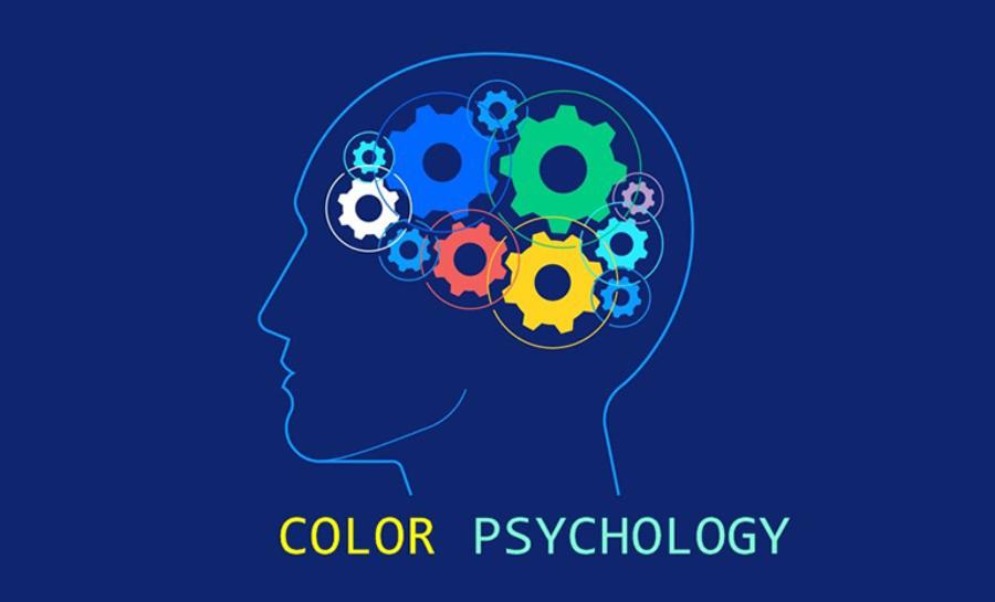
Logos are an indispensable part of brand identity, but few people know that behind the simple, beautiful designs of famous logos are interesting stories. Each logo carries a special meaning and deep message, contributing to creating a strong image for brands. In this article, sadesign will explore interesting facts about famous logos, helping you better understand their role and importance in the marketing world.
1.Interesting facts behind famous logos: Little-known stories
A logo is not just a simple symbol, but also the soul of the brand, the bridge between the business and the customer. A successful logo can convey the message, value and identity of the brand in a powerful and impressive way. Behind the famous logos that we are familiar with, there are often interesting stories, profound meanings, and little-known secrets.
.jpg)
A logo is an important part of a branding strategy, and it acts as a “representative” of the company, helping customers identify it easily. Famous logos like Apple, Nike, or McDonald's are not only beautiful but also carry deep stories and meanings. Behind each of these symbols is a creative process, a sophisticated marketing strategy, and even unexpected elements that make them more special than ever.
1.1. Apple Logo: Symbol of Creativity and Innovation
The Apple logo is one of the most recognizable brand icons in the world. The bitten apple may come as a surprise to many because it is not just a random image. The creation of this logo began in 1977, when designer Rob Janoff created the first design. Interestingly, the bitten apple image is not only memorable but also carries connotations of exploration and freedom. The bitten apple also alludes to the story of Isaac Newton and his discovery of gravity, an image that symbolizes innovation and endless exploration – core values that Apple wants to express.
Origin: Originally, the Apple logo featured Isaac Newton sitting under an apple tree, a rather complex image. Steve Jobs later realized that the logo did not fit Apple's goal of being simple and accessible, so he decided to change it to a bitten apple, a highly iconic image.
Meaning: The “bite” in the apple has several explanations. One is to show the difference and uniqueness of the Apple, creating a strong identity. Two is to avoid confusion with the cherry, a fruit with a similar shape. Three is said to be a tribute to Alan Turing, the father of computer science, who is believed to have committed suicide by poisoning an apple.
Another special point is that, initially, the Apple logo had rainbow colors, representing the company's creativity and multidimensional vision. However, later, this logo was simplified with more minimalist colors, reflecting the true spirit of the Apple brand: simple but sophisticated.
1.2. Nike Logo: The "Swoosh" Symbol and the Journey from Difficulty to Success
The Nike Swoosh logo is perhaps one of the simplest and most recognizable designs in the sports industry. Designed by designer Carolyn Davidson in 1971, the logo was inspired by the wings of the Greek goddess of victory, Nike. The Swoosh represents the wings of the Greek goddess of victory, Nike. It represents speed, momentum, and power, qualities that Nike wants to convey to its customers. The Swoosh symbolizes swift movement and power, perfect for an energetic sports brand.
.jpg)
Interestingly, Carolyn Davidson was only paid $35 for her work on the logo. However, after Nike took off, founder Phil Knight gave Carolyn a special bonus of 500 shares of Nike stock, a move that showed her well-deserved recognition for her work. The “Swoosh” logo is more than just a symbol; it represents the “Just Do It” spirit – a powerful and easily-transmitted message.
1.3. McDonald's Logo: The Golden "M" and the Story Behind Its Development
Origin: The "Golden Arches" were originally part of the architecture of McDonald's restaurants in the 1950s.
Meaning: The two golden arches form the letter "M", the first letter of McDonald's. In addition, they also represent prosperity, luck and joy, values that McDonald's wants to associate with its brand.
The McDonald's logo is one of the most recognizable logos in the world, with its prominent golden "M". However, few people know that this symbol was not always the "M" as it is today. Before the golden "M" logo was created, McDonald's used a prominent bakery owner and different colors. But later, when Ray Kroc joined the company and came up with the idea of the golden "M", it became a globally recognizable symbol.
The yellow color in the logo represents fun, dynamism and comfort, and is also associated with the color of delicious and attractive food. The yellow "M" image is not just a letter, but also a symbol of unity and connection, showing the uniformity and closeness between McDonald's stores around the world. The simplicity and memorability of this logo has contributed significantly to the success of the brand.
1.4. Coca-Cola Logo : From Handwritten to Global Icon
.jpg)
Origin: The Coca-Cola logo was designed by Frank Mason Robinson, accountant of John Pemberton, the creator of Coca-Cola.
Meaning: The unique Spencerian typeface used in the logo gives the brand an elegant, classic and distinctive look. This typeface has become an icon of Coca-Cola, recognized worldwide.
The Coca-Cola logo is one of the oldest and most influential logos in the beverage industry. Designed by Frank M. Robinson in 1885, the logo was originally handwritten in a classic Spencerian font. However, over 100 years of development, the Coca-Cola logo has retained its original basic shape and has become a symbol of freshness and refreshment.
Interestingly, the original Spencerian font was not just a random choice but was designed to be elegant and easy to read, appropriate for the early 20th century when products needed to make a strong impression on customers. Coca-Cola has always focused on protecting and developing its brand image, so their logo has always maintained the value of tradition and prestige.
1.5. FedEx Logo: Conceals a Special Message
Origin: The Fedex logo was designed by Landor Associates.
Meaning: The negative space between the "E" and the "x" forms an arrow, representing speed and precision, key elements of FedEx service.
The FedEx logo is one of the most recognizable and elegant logos in the logistics industry. Designed by Lindon Leader in 1994, the FedEx logo uses a simple yet highly recognizable font. An interesting detail in the logo is the presence of an arrow hidden in the space between the letters “E” and “x”. This arrow not only symbolizes movement but also represents speed and precision, which are important factors in the shipping industry.
Interestingly, this arrow detail is not an easily recognizable part to the average viewer, but it is this subtlety that makes the FedEx logo unique and memorable. This logo has been highly appreciated by many design experts for its creativity and ability to convey a strong message without using many complex elements.
1.6. Starbucks Logo: The Past and Present of the Coffee Symbol
The Starbucks logo, with its mermaid image, has a long story behind its development. Initially, the Starbucks logo was an image of a mermaid with a rather "sexy" appearance and was strongly influenced by Nordic culture. However, over time and the development of the brand, Starbucks decided to change the logo to a simpler direction, with a focus on the mermaid image and simpler colors.
The current Starbucks logo is not only a symbol of coffee, but also a reminder of connection and moments of relaxation. This symbol helps Starbucks build a strong global image and is easily recognizable everywhere.
1.7. Logo Amazon:
Origin: The Amazon logo was designed by Amazon itself. Before the current logo, Amazon had other logos. The current logo was designed by Turner Duckworth. It is important that Amazon always focuses on the logo to represent the spirit and vision of the company.
.jpg)
Symbolic meaning:
Arrows "a" to "z":
This is the key element of the logo. The orange arrow curving up from the “a” to the “z” clearly conveys the message: Amazon offers “everything from A to Z”. This emphasizes the variety and richness of products that Amazon sells.
It also demonstrates Amazon's ambition to meet every customer need.
Satisfied "smile":
The upward curved arrow also forms the image of a smile, representing the satisfaction and positive experience that Amazon brings to customers.
This is a subtle way to convey the message of Amazon's great customer service.
Color:
The orange color of the arrow gives a feeling of warmth, friendliness and dynamism. It also symbolizes the enthusiasm and determination of Amazon.
Font:
The typeface is simple, clear, and modern. It represents the professionalism and approachability of the brand.
2. Design process and changes over time
Simplification
In the digital age, logos need to be flexible enough to display well on a variety of devices and screen sizes. This has led to a trend toward logo simplification. Brands have stripped away extraneous details, keeping the core elements to create a more recognizable and memorable icon. For example, many logos have moved from complex 3D images to flat 2D images, which help them display clearly on small screens and load faster on the internet.
Color change
Color is a powerful element in conveying emotions and messages. When a brand’s values or message change, the logo’s colors can be adjusted to reflect that change. For example, brands can switch to brighter colors to convey dynamism and modernity, or switch to darker colors to convey luxury and trust.
Colors also carry many cultural meanings. Over time, to suit different customer groups, brands also change colors.
Font update
Typography is an important element in creating an impression of a brand’s personality and style. As typography trends change, brands can update their logo typography to keep it current and relevant to their target audience. For example, many brands have switched from traditional serif typefaces to modern sans-serif typefaces that represent simplicity and sophistication.
Examples of change
Pepsi logo:
Pepsi has gone through many logo changes, from the original classic typeface to a circle with text, and then the modern 3D sphere.
These changes reflect changing consumer tastes and Pepsi's efforts to create a youthful and dynamic brand image.
Google Logo:
Google has moved from its original serif typeface to a simple, modern sans-serif typeface.
This change represents Google's innovation and technology, while creating a friendly and approachable brand image.
3. Lessons learned from successful logos
.jpg)
Simplicity: A simple logo is easier to remember and recognize, especially in a digital environment. Simplicity also makes the logo more versatile, allowing it to be used across multiple platforms and sizes.
Uniqueness: A unique logo helps a brand stand out from the crowd and create a strong impression. Uniqueness also makes the logo easily recognizable and memorable.
Relevance: The logo should reflect the brand’s values and message, helping customers better understand what the brand stands for. Relevance also helps create an emotional connection between the brand and the customer.
Flexibility: A logo needs to be able to work across a variety of platforms and sizes, from a small mobile phone screen to a large outdoor billboard. Flexibility also allows the logo to adapt to changes in technology and design trends.
Sustainability: A good logo should be able to last and be recognized over a long period of time, helping to build strong brand recognition. Sustainability also saves the cost of frequent logo redesigns.
The Power of Color: Colors can effectively convey emotions and messages. Brands need to choose colors that align with their values and messages, and are appropriate for their target audience.
The Value of Typography: Typography can create an impression of a brand’s personality and style. Brands need to choose a typeface that fits their values and message, and is appropriate for their target audience.
Cheap Canva Pro Upgrade
4. Conclusion
Famous logos like Apple, Nike, McDonald's, Coca-Cola, FedEx and Starbucks are not just brand symbols, but interesting, creative and passionate stories. They carry deep values and are proof of the success of breakthrough marketing strategies. Logos are not just images but also bridges between brands and customers, creating strong connections and trust. The interesting facts behind each of these logos will surely make you feel the magic of the graphic design world.


VIP Products


Best Selling Products
Genuine Adobe Illustrator account
99 USD
Adobe Premiere Pro Account
99 USD
Capcut Pro 1 Year
39 USD
Freepik Premium Account
59 USD
Copyright Adobe Lightroom Account
59 USD
Upgrade Duolingo Super
29 USD
Adobe Photoshop Copyright - Full App
120 USD
Autodesk All App Account Copyright
120 USD
Genuine Cheap Canva Pro
39 USD
Upgrade genuine Capture One account
120 USD
Windows 10 & 11 Pro Key
36 USD
Plugin Retouch4me
69 USD
Upgrade Genuine Office 365
49 USD
ChatGPT Plus Account (GPT-4)
16 USD
MidJourney Account
29 USD