Best Selling Products

Upgrade Duolingo Super
29 USD

ChatGPT Plus Account (GPT-4)
16 USD

MidJourney Account
29 USD

Capcut Pro 1 Year
39 USD

Upgrade Genuine Office 365
49 USD

Adobe Photoshop Copyright - Full App
120 USD

Genuine Adobe Illustrator account
99 USD

Plugin Retouch4me
69 USD

Upgrade genuine Capture One account
120 USD

Windows 10 & 11 Pro Key
36 USD

Genuine Cheap Canva Pro
39 USD

Autodesk All App Account Copyright
120 USD

Freepik Premium Account
59 USD

Adobe Premiere Pro Account
99 USD

Copyright Adobe Lightroom Account
59 USD
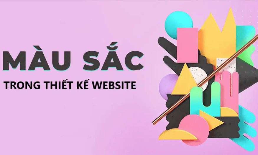
Meaning and use of colors in design
Nội dung
Each color has its own meaning, and understanding them not only helps you convey your message clearly but also maximizes the user experience. Especially in the context of globalization, identifying the culture and meaning of colors in each country becomes extremely important. Understanding colors is not only applied in website design or logo design but also in many other fields such as product design and advertising. Let's explore the meaning and use of colors in design with Sadesign right after this.
Each color has its own meaning, and understanding them not only helps you convey your message clearly but also maximizes the user experience. Especially in the context of globalization, identifying the culture and meaning of colors in each country becomes extremely important. Understanding colors is not only applied in website design or logo design but also in many other fields such as product design and advertising. Let's explore the meaning and use of colors in design with Sadesign right after this.
1. Red
Red stimulates the appetite and has a powerful effect on the mood of the viewer. When exposed to red, people often feel more energetic, stronger and more excited. This explains why red is often used in advertising campaigns to attract attention.
In graphic design, red is often used to emphasize important issues. It not only attracts attention but also creates a sense of urgency, suitable for industries such as electronics, chemicals, medicine and food. When red appears in design, it is not simply a decorative element, it is also part of the message you want to convey, expressing enthusiasm and dedication.
.png)
2. Black
Black symbolizes mystery and powerful power, stimulating curiosity and the desire to explore. In modern conception, black is not just a color; it is also a symbol of luxury and class. High-end brands often choose black to express the sophistication and drama of their products.
In design, black not only creates a sense of solidity but also brings an irresistible charm. Industries such as fashion, cosmetics and jewelry often use black to create an image of class and luxury. When black appears in design, it not only attracts the eye but also conveys a message of strength and confidence.
3. Yellow
Yellow represents dynamism, enthusiasm and creativity. Considered the color of sunshine, yellow represents optimism and warmth, and has the ability to convey a positive message to the viewer. According to research, the human eye often recognizes yellow first, which makes it an ideal choice in advertising design.
Gold also represents wealth and luxury, especially shades of yellow and gold. These colors are often used in high-end products such as jewelry, cosmetics, and fashion. When you use yellow in your design, you create an energetic and intimate space that makes your brand memorable to consumers.
.png)
4. Blue
Blue not only represents youthfulness and enthusiasm but also symbolizes peace and sharing. The associations with the sky and the sea make blue create a peaceful and pleasant feeling for the viewer. In brand design, blue often brings a sense of trust and sustainability, very suitable for the banking and financial industries.
Blue is also a powerful color in building trust with customers. When a brand uses blue, it not only represents stability but also evokes a sense of security in consumers. Industries such as travel, electronics, and purified water often favor this color, as it creates a deep connection with customers and promotes trust in the product or service.
5. Green
Green is a symbol of life, growth and maturity. When we see green, we often feel the power of nature reviving, promising a new generation and a brighter future. Green brings a feeling of freshness, peace and gentleness, like a cool breeze on a hot summer day.
In design, green is well suited to many different industries, from food to travel, fashion and the environment. Dark green often represents wealth and prosperity, while light green represents freshness and youth. Using green in a logo not only brings a sense of closeness but also shows a commitment to a strong future, promising vitality for the brand.
.png)
6. Purple
Purple is a mysterious and alluring color, often associated with loyalty and sophistication. More than just a color, purple represents warmth, care, and nurturing. In design, purple is often used to create a sense of mystery and spirituality, making it a perfect choice for ceremonial wear or religious events.
Purple is also the color of royalty, representing nobility and luxury. That is why purple is often used in creative products, especially in the beauty care and interior decoration industries. Purple not only brings elegance but also shows difference, helping the brand stand out from the crowd.
7. Brown
Brown is the color of the earth, carrying a rustic and simple feeling. It symbolizes stability and tranquility, often used in vintage-style designs. Brown not only reminds us of the natural beauty of wood and earth but also brings a feeling of warmth and closeness, creating a comfortable space for the user.
In the field of interior design, brown is popular because it matches traditional wood products. Especially in the cafe and restaurant industry, brown, earthy orange and dark brown are often used to create a cozy and friendly atmosphere. This color is not only attractive but also reminds of sustainable and natural values, creating a strong connection with the environment.
(1).png)
8. Pink
Pink is a symbol of romantic love and sweetness, expressing flight and dreaminess. It brings a feeling of relaxation, relieves stress, and creates innocence and naivety. Pink is often associated with positive things, and in design, it represents youthful vitality, fun and dynamism.
In Western countries, pink is often considered a representative color for women, bringing a sense of gentleness and charm. Pink is not only used in products for women but also widely applied in living spaces, events and advertising. The combination of pink in design can create a warm and friendly atmosphere, making viewers feel comfortable and relaxed.
9. Gray
Gray, with its neutral beauty, is not simply an intermediate color between black and white, but also carries deep meanings related to imagination and creativity. Unlike black, which is full of power and mystery, gray represents sophistication and modernity. It is the ideal color for those who want to create a serious yet creative space.
The presence of grey in design often represents conservatism and formality. Grey is not only suitable for serious fields such as finance or law, but also suitable for fields related to fashion, cosmetics, sports and automobiles. Designs using grey often exude professionalism and solidity, creating a sense of reliability and stability.
.png)
10. White
White is a symbol of elegance and purity, bringing a sense of freshness and modernity. In design, white not only represents simplicity but also evokes honesty and innocence. It is like a blank canvas, waiting for creative ideas to be painted on, bringing a sense of aspiration and youthfulness.
However, white can also create a feeling of coldness and loneliness if not skillfully combined with other colors. Therefore, in design, white is often combined with warmer colors to create a more balanced and attractive look. White is often preferred in areas such as weddings or clean food, because it brings a feeling of lightness and elegance, highlighting the natural beauty of the product.
11. Orange
Orange is a symbol of joy and dynamism, bringing a sense of vitality and motivation to the viewer. Not as strong as red, orange still exudes positive energy, making it a perfect choice for designs that want to convey enthusiasm and creativity.
In advertising design, orange is often used for call-to-action (CTA) buttons because of its ability to attract attention without being overwhelming. Orange is popular in youth fashion brands, food services, and education sectors where dynamism and creativity are key. Orange not only creates a sense of freshness but also encourages interaction and exploration on the part of consumers.
12. Lemon yellow
Lemon yellow is a refreshing and vibrant color, like a bright summer day. Not only does it create a cheerful feeling, it also stimulates creativity and energy in design. Lemon yellow is often used to attract attention, highlighting important elements in a product or advertisement. With this bright shade, it has the ability to bring a sense of optimism to viewers, making them feel happy and hopeful.
In areas such as fashion, beverages and homeware, lemon yellow is often used to express youthfulness and modernity. However, this color needs to be used skillfully, because if overused, it can lead to a feeling of glare. Combining it with neutral colors such as white or gray will help soften the prominence of lemon yellow, creating balance and harmony for the design.
.png)
13. Light blue
Light blue is symbolic of the sky and the ocean, bringing a sense of peace and serenity. It is often associated with freshness, clarity and freedom. In design, light blue has the ability to create a relaxing space, making the viewer feel light and comfortable. This is why this color is so popular in areas such as interiors, spas and wellness brands.
Although light blue is soothing, it can also become monotonous if not combined properly. Using this color with bright colors like yellow or orange can create a striking and attractive look. This combination not only brings freshness but also makes the design lively and full of life.
14. Turquoise
Turquoise, with its blue hues and green undertones, is a colour that is synonymous with elegance and sophistication. It is often associated with luxury and class, and evokes a sense of calm and elegance. Turquoise is often favoured in interior design, jewellery and high fashion, where sophistication and attention to detail are important.
In branding, turquoise can convey a message of innovation and distinction. When used, a brand can demonstrate its confidence and unique style. However, turquoise also needs to be combined with other colors to create balance, preventing the design from being too heavy or monotonous.
15. Beige
Beige is a warm and cozy color, often giving a feeling of comfort and friendliness. Beige not only represents nature but also reminds of the beauty of earth and wood, creating a cozy and pleasant space. In design, beige is often used to create lively and natural spaces, helping people feel relaxed and peaceful.
Beige is versatile and can be paired with a wide range of colors, from soft pastels to darker tones. When paired with white, beige can create a light and airy feel. Conversely, when paired with darker colors, it can create a warm and cozy feel, making the space feel more welcoming and comfortable.
16. Conclusion
Each color carries its own meaning and emotion, playing an important role in conveying the brand's message and creating a deep impression on viewers. Understanding and applying colors correctly not only helps designers express creative ideas but also creates interesting experiences for consumers. When used skillfully, colors can increase brand value and create strong connections with customers. Therefore, carefully consider the colors in each design to optimize communication effectiveness and leave an impression on consumers' minds.


VIP Products


Best Selling Products
Upgrade Duolingo Super
29 USD
ChatGPT Plus Account (GPT-4)
16 USD
MidJourney Account
29 USD
Capcut Pro 1 Year
39 USD
Upgrade Genuine Office 365
49 USD
Adobe Photoshop Copyright - Full App
120 USD
Genuine Adobe Illustrator account
99 USD
Plugin Retouch4me
69 USD
Upgrade genuine Capture One account
120 USD
Windows 10 & 11 Pro Key
36 USD
Genuine Cheap Canva Pro
39 USD
Autodesk All App Account Copyright
120 USD
Freepik Premium Account
59 USD
Adobe Premiere Pro Account
99 USD
Copyright Adobe Lightroom Account
59 USD