Best Selling Products

MidJourney Account
29 USD

Freepik Premium Account
59 USD

Autodesk All App Account Copyright
120 USD

Adobe Premiere Pro Account
99 USD

Adobe Photoshop Copyright - Full App
120 USD

Copyright Adobe Lightroom Account
59 USD

Windows 10 & 11 Pro Key
36 USD

Genuine Adobe Illustrator account
99 USD

Plugin Retouch4me
69 USD

Genuine Cheap Canva Pro
39 USD

Upgrade Duolingo Super
29 USD

Capcut Pro 1 Year
39 USD

Upgrade genuine Capture One account
120 USD

Upgrade Genuine Office 365
49 USD

ChatGPT Plus Account (GPT-4)
16 USD
Pantone Trends In Recent Years? The Message Behind Peach Fuzz 2024, Decoding Pantone Colors
Nội dung
- 1. What is Pantone color decoding?
- 2. Pantone color trends from 2020 to 2025
- 2.1. Looking back at Pantone trends in 2020
- 2.2. Looking back at Pantone trends in 2021
- 2.3. Pantone Trends 2022
- 2.4. Looking back at Pantone trends in 2023
- 2.5. 2024: Peach Fuzz – The peach color of connection and compassion
- 2.6. Pantone Trends 2025
The Pantone Color Institute has been introducing key colors every year, reflecting the mood and trends of global society. Join Sadesign to explore Pantone's color journey in recent years and the special meaning of Peach Fuzz.
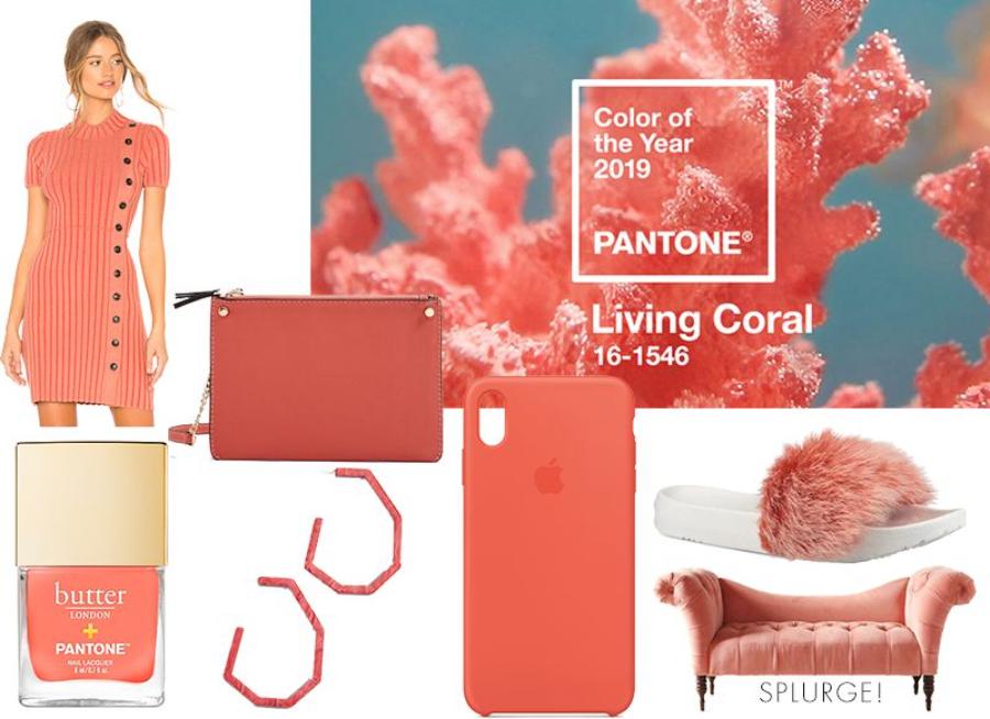
Over the past decade, the Pantone Color Institute has consistently introduced annual color themes that reflect the moods and trends of global society. Each color chosen is not simply a tone, but also carries profound cultural, psychological and social messages. In 2024, Pantone announced the color of the year as Peach Fuzz (PANTONE 13-1023), a soft and warm peach shade that symbolizes connection and kindness. Join Sadesign to explore Pantone's color journey in recent years and the special meaning of Peach Fuzz.
1. What is Pantone color decoding?
Pantone is a color standardization system widely used in the creative industries. Founded in 1963, Pantone developed the Pantone Matching System (PMS), which helps designers and manufacturers ensure color consistency across the production process. Each color in the system is assigned a unique number, making color communication more precise and efficient.
.jpg)
Every year, the Pantone Color Institute conducts research and analysis of global color trends to select the "Color of the Year." The decision is based on many factors, including the economic, social, cultural and psychological situation of the community. The chosen color not only reflects aesthetic trends but also carries deep messages and meanings, influencing design, fashion, art and many other fields.
2. Pantone color trends from 2020 to 2025
From 2020 to 2025, the colors chosen by Pantone not only reflect aesthetic trends but also carry profound messages about the mood and aspirations of society. From the stability of Classic Blue, the combination of strength and hope of Ultimate Gray and Illuminating, the creative spirit of Very Peri, the courage of Viva Magenta, the warmth of Peach Fuzz, to the comfort of Mocha Mousse, each color tells its own story, contributing to shaping the design and lifestyle trends of each year. Understanding and applying these colors in a subtle way will help designers, artists and consumers create products and spaces that
2.1. Looking back at Pantone trends in 2020
For 2020, Pantone has chosen Classic Blue (19-4052) as its color of the year. It is a deep blue shade that evokes feelings of calm, confidence, and connection. Classic Blue is described as “a timeless and enduring blue that is serene and trusting.” The choice reflects the need for stability and reliability in a world facing many uncertainties and challenges.
.jpg)
In the fashion industry, Classic Blue appears frequently on runways and collections, bringing elegance and sophistication. In interior design, this blue color is used to create a peaceful and relaxing space, helping to reduce stress and bring a sense of security to the user.
2.2. Looking back at Pantone trends in 2021
In 2021, for the first time, Pantone has chosen two colors at the same time: Ultimate Gray (color code 17-5104) and Illuminating (color code 13-0647). Ultimate Gray is a neutral gray that symbolizes stability and steadfastness, while Illuminating is a bright yellow that brings a sense of optimism and hope. This combination symbolizes unity and resilience, reflecting the spirit of overcoming difficulties and looking forward to a bright future.
In fashion design, the combination of gray and yellow gives a modern and dynamic look. In interiors, this color duo creates a lively and cozy space, encouraging creativity and optimism.
2.3. Pantone Trends 2022
In 2022, Pantone introduced the color of the year, PANTONE 17-3938 Very Peri. This is the first time in history that Pantone has created a completely new color for its catalog, instead of choosing from existing colors. Very Peri is a subtle combination of traditional blue and purple, creating a unique blue-violet tone. This color symbolizes creativity, innovation and an optimistic attitude towards the future. In a world that is experiencing many changes and uncertainties, Very Peri encourages people to broaden their horizons and embrace new opportunities.
The emergence of Very Peri has not only influenced the design field but also spread strongly in fashion, art and technology. Many designers have used this color to create groundbreaking collections, expressing courage and confidence. In interior design, Very Peri brings a warm, friendly feeling, while promoting creativity and positive thinking.
2.4. Looking back at Pantone trends in 2023
Continuing the spirit of last year, Pantone has announced the color of the year for 2023 as PANTONE 18-1750 Viva Magenta. This is a deep red shade, a blend of red and blue, creating a strong and energetic tone. Viva Magenta symbolizes courage, enthusiasm and resilience. As the world continues to face challenges, this color encourages people to stand up, face and overcome difficulties with optimism.
.jpg)
Viva Magenta has quickly become a source of inspiration for many fields, from fashion, design to art. Fashion designers have actively used this color in their collections, bringing freshness and prominence. In interior design, Viva Magenta is used to create accents, bringing warmth and liveliness to living spaces. This color also appears in technology products, household appliances and even cosmetics, proving its widespread influence.
2.5. 2024: Peach Fuzz – The peach color of connection and compassion
On December 7, 2023, the Pantone Color Institute announced Peach Fuzz (PANTONE 13-1023) as the color of the year 2024. This soft peach shade combines light orange and pink tones, creating a warm and gentle feeling. Peach Fuzz is more than just a color, it carries a message of connection, kindness, and caring for one another.
Meaning of Peach Fuzz
Peach Fuzz was chosen in the context of the world seeking calm and connection after the turmoil and challenges. The color is reminiscent of the softness of peaches, feathers, and smooth satin, bringing a sense of comfort and peace. Leatrice Eiseman, Executive Director of the Pantone Color Institute, shares that Peach Fuzz reflects the basic human need for care and connection in this time.
Applications of Peach Fuzz in life
Fashion and beauty
In the fashion industry, Peach Fuzz brings freshness and elegance. This color is suitable for many skin tones and can be easily combined with other colors, creating gentle but equally outstanding outfits. In makeup, Peach Fuzz is popular in lipsticks, blushes and eyeshadows, bringing a natural and radiant look.
Interior design
Peach Fuzz brings a warm and friendly feeling to living spaces. Using this color in interior design helps create a relaxing and welcoming environment. From wall paint, furniture to decorative accessories, Peach Fuzz easily blends in and highlights other elements in the space.
Communication and graphic design
In the field of communication and graphic design, Peach Fuzz brings a friendly and approachable feeling. This color is often used in branding, product packaging and media publications to create closeness and appeal to customers.
(1).jpg)
2.6. Pantone Trends 2025
In 2025, the Pantone Color Institute has chosen Mocha Mousse (Pantone 17-1230) as the Color of the Year. This warm brown hue is reminiscent of the flavors of chocolate, cocoa, and coffee. It evokes a sense of comfort, ease, and connection to nature. This choice reflects the global trend toward stability and resilience in a rapidly changing world. Mocha Mousse also symbolizes a return to basics, finding joy in the simple things in life.
Applications of Mocha Mousse in design
The brown hue of Mocha Mousse brings warmth and elegance to interior spaces. When combined with natural materials such as light wood, leather and wool, this color creates a cozy and welcoming living space. In fashion, Mocha Mousse is predicted to become the new neutral, replacing colors such as black, white and navy. The versatility of this color allows it to be easily combined with other tones, from bright colors to softer shades.
Message from Mocha Mousse
According to Laurie Pressman, Vice President of the Pantone Color Institute, Mocha Mousse encourages us to enjoy the little pleasures in life, like a cup of coffee in the morning or a piece of chocolate. This color reminds us of the importance of slowing down and appreciating the simple yet meaningful moments. In a world full of uncertainty, Mocha Mousse brings a sense of calm and stability, helping us find balance in our daily lives.


VIP Products


Best Selling Products
MidJourney Account
29 USD
Freepik Premium Account
59 USD
Autodesk All App Account Copyright
120 USD
Adobe Premiere Pro Account
99 USD
Adobe Photoshop Copyright - Full App
120 USD
Copyright Adobe Lightroom Account
59 USD
Windows 10 & 11 Pro Key
36 USD
Genuine Adobe Illustrator account
99 USD
Plugin Retouch4me
69 USD
Genuine Cheap Canva Pro
39 USD
Upgrade Duolingo Super
29 USD
Capcut Pro 1 Year
39 USD
Upgrade genuine Capture One account
120 USD
Upgrade Genuine Office 365
49 USD
ChatGPT Plus Account (GPT-4)
16 USD