Best Selling Products
Paris 2024 Olympic Brand Identity: Lessons for Designers
Nội dung
- 1. Overview of the Paris 2024 Olympic Identity
- 1.1 Explore the Paris 2024 Olympic Brand Identity
- 1.2 The meaning of the Paris 2024 Olympic identity
- 2. Special Elements In The Paris 2024 Olympic Identity
- 2.1. Symbol: Subtle and Creative
- 2.3. Typography: Simplicity and Modernity
- 3. Important Lessons for Designers
- 3.1. Simplicity in Design
- 3.2. Improvement and Innovation
- 3.3. Harmony Between Elements
- 4. The Importance of Brand Identity
- 5. Conclusion: Simple But Impressive
The Paris 2024 Olympic identity has made a strong impression on the design world. Let's explore the outstanding elements of this identity and the lessons that designers can learn.
1. Overview of the Paris 2024 Olympic Identity
General information about the specific Paris 2024 Olympic identity includes related features and meanings:
1.1 Explore the Paris 2024 Olympic Brand Identity
The Olympics is a global sporting event, attracting the participation of thousands of athletes from more than 200 countries and territories. This is a prestigious international arena, where sports talents compete in more than 35 sports and 400 categories. Participating and winning medals at the Olympics is always a great dream of every country. Therefore, the brand identity of each Olympic is not just a symbol. It also represents the noble values of this sporting event.
(1).jpg)
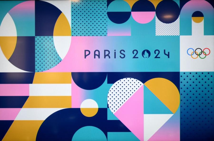
The Paris 2024 Olympic identity has captured attention with its meaningful logo design. The outer circle of the logo represents the gold medal, the highest symbol that Olympic athletes can achieve. Inside the circle, the negative space is cleverly shaped into the shape of the burning Olympic flame. This is both a symbol of the spirit of sport and the face of Marianne - the image of freedom and independence of France. This combination has created a powerful logo that not only represents the cultural identity but also conveys the message of the entire Olympic Games.
In addition, the identity is also strongly influenced by traditional French elements with bright and vibrant colors. Including: Blue, red, green and purple. These colors create a youthful, energetic look for the global sporting event. The Olympic buildings in Paris will also be dressed in vibrant colors such as pink, blue and purple. All bring a joyful and exciting competition space for athletes and spectators.
In particular, the official mascot of the Paris 2024 Olympics is the Phrygian cap - a long-standing symbol of freedom and revolution in France. The Phrygian cap is not only deeply connected to French cultural heritage but also honors the ideals of liberty, equality and fraternity, the core values of the Olympics. This choice affirms the spirit of fighting for freedom and peace of both the event and the host country.
1.2 The meaning of the Paris 2024 Olympic identity
The Paris 2024 Olympic identity is not only a symbolic image of a major sporting event. It is also a powerful message of connection, innovation and international sportsmanship. The design of this identity was done by a team of talented designers in Paris, with the goal of not only impressing the audience but also expressing the creativity typical of French culture.
.jpg)
The most prominent feature of this identity is the official emblem of the Paris 2024 Olympics. An image combining the golden trophy and the image of a woman, expressing the beauty, elegance, and honoring the tradition of the Olympic event. At the same time, this image also reminds of Marianne, the symbol of the French Republic, to honor the cultural and historical values of the host country.
The main logo of the event is designed with the image of a flame and a face, symbolizing the passion, enthusiasm and desire to conquer of the athletes as well as the will of the people. The identity not only creates a strong aesthetic impression but also conveys the message of inclusion, equality and the Olympic spirit, connecting people around the world through sport.
2. Special Elements In The Paris 2024 Olympic Identity
The special elements in the Paris 2024 Olympic identity are shown through the following points:
2.1. Symbol: Subtle and Creative
The emblem of the Paris 2024 Olympic Games is a unique combination of the Olympic flame and a female figure. It is a symbol of freedom, strength and elegance. The combination of these elements not only creates a recognizable image but also carries the cultural imprint of the host country.
This also shows an important trend in modern design: the combination of traditional and modern elements. It shows the flexibility of designers in using familiar logo images but bringing a new, artistic look.
2.2. Color: Subtlety in Every Detail
The colors used in the Paris 2024 Olympic identity are also an indispensable element. The designers have cleverly combined metallic gold with black and white. It creates a powerful and powerful combination while still maintaining elegance and luxury. Gold symbolizes prosperity and the sparkle of glorious moments at the Olympics. While black and white help highlight details and create balance for the overall design.
.jpg)
This reminds designers that choosing colors not only needs to be beautiful but also needs to convey the message they want to send. Because it contains both sophistication and great meaning in each symbol.
2.3. Typography: Simplicity and Modernity
Another notable element is the use of fonts in the identity. The designers chose modern, easy-to-read fonts that still convey the formality needed for an international sporting event. The fonts have a clear contrast between characters, increasing legibility while highlighting the key messages of the campaign.
Designers can learn from this: Simplicity in font choice can sometimes be much more powerful than trying to use overly complex or elaborate fonts.
3. Important Lessons for Designers
Designers will learn many lessons from the Paris 2024 Olympic brand identity, specifically including:
3.1. Simplicity in Design
One of the biggest lessons designers can learn from this identity is the importance of simplicity. Although the Paris 2024 Olympic identity has a lot of detail, every element is designed to be harmonious and easy to understand. There is no redundancy in any element, and each detail contributes to the overall message.
This reminds designers that sometimes, less is more. In graphic design, less is more.
3.2. Improvement and Innovation
The Paris 2024 Olympic identity is not only a legacy but also a strong innovation. Combining traditional Olympic elements with the image of a woman is a breakthrough in design. This teaches designers that innovation, creativity and experimentation with new ideas will always bring surprising results.
.jpg)
In an ever-changing design world, innovation and constant challenge are key to designers’ growth. This will help you continue to innovate and create more innovative designs.
3.3. Harmony Between Elements
The Paris 2024 Olympic identity is a prime example of creating harmony between design elements. Including: Color, images, fonts and layout. Designers must learn to coordinate these elements so that they interact smoothly, not causing confusion, but creating strong appeal.
This is an important lesson in creating designs that are not only beautiful, but also accessible and memorable to viewers.
4. The Importance of Brand Identity
The identity of the Paris 2024 Olympics not only serves as a promotional tool for the biggest sporting event on the planet, but also as a
A testament to the power of design to communicate. Every logo, colour and image has been carefully chosen to reflect not only the values of sport but also of French culture.
Building a successful identity is an essential part of any event, brand or organization’s communication strategy. It not only makes the brand easier to recognize but also creates a strong connection with the audience.
The Paris 2024 Olympic identity is a clear demonstration of sophistication. At the same time, it demonstrates the creativity and innovation of designers in building a strong and recognizable brand image.
Cheap Canva Pro Upgrade
5. Conclusion: Simple But Impressive
The lessons learned from this identity will continue to inspire future designers. This helps them better understand the importance of simplicity, creativity and the harmonious combination of design elements. Looking back at the Paris 2024 Olympic identity, we not only see the talent of the designers. Besides, we also realize an important lesson about how to design that is both beautiful, understandable and accessible to all audiences.
