Best Selling Products
Revealing How to Use Color Effectively in Digital Painting
Nội dung
- 1. Understand the basic principles of color coordination
- 2. Analysis of the context of the work
- 2.1. Classification by genre
- 2.2. Color and emotion
- 3. Do thorough research when encountering new topics
- 3.1. Study actual images and references
- 3.2. Inspiration from famous works
- 4. Good with basic color combinations
- 4.1. Pay attention to brightness and saturation
- 4.2. Consider light and shadow
- 5. Create contrast for your work
- 5.1. Contrast between colors
- 5.2. Contrast between light and dark
- 6. Statistics of 5 effective ways to use color in Digital Painting
- 6.1. Analogous color scheme
- 6.2. Complementary color scheme
- 6.3. Contrasting color scheme
- 6.4. Triangle color scheme
- 6.5. Quadrilateral color scheme
- Conclusion
How to use colors effectively in digital painting to create impressive works. All will be updated in the following article.

Color is one of the most important factors that determine the success of a digital painting. However, choosing colors that are harmonious, impressive and suitable for the emotions that the artist wants to convey is not easy. In this article, Sadesign shares with you the basic principles of color coordination, how to handle colors effectively in each specific situation, helping you create vivid and inspiring works.
1. Understand the basic principles of color coordination
Color in digital painting is not simply a random selection of your favorite colors. It is an important part of conveying emotions, creating space, and even telling a story in each painting. To achieve high efficiency in using color, the first thing is to understand the basic principles of color combination.
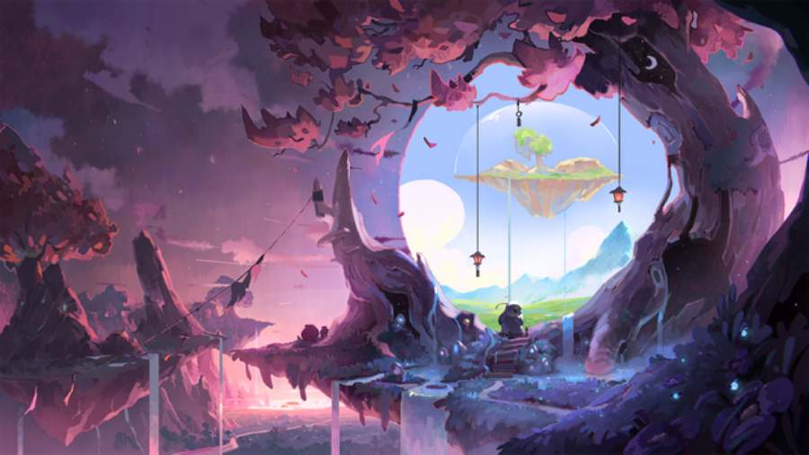
Color coordination is the process of selecting and arranging colors so that they interact harmoniously to create a dramatic and dimensional whole. Artists often use color theory to guide their color selection and use. One of the most common ways is to use the color wheel, where colors are arranged in a specific order, making it easier for artists to see the relationships between colors.
From the color wheel, color matching principles such as analogous, complementary, contrasting, triangular or quadrilateral color matching will help you choose the right color tones to create special effects for your work. Let's explore each of these color matching methods in detail.
2. Analysis of the context of the work
Another important factor in using color in digital painting is the context in which you want your work to be portrayed. Each genre, each story, and even each emotion you want to convey requires a different approach to color.
2.1. Classification by genre
- Works that tend to be quiet and gentle often use pastel, pale and soft colors, creating a peaceful, relaxing feeling.
- Powerful, mysterious works may favor dark, cool tones or strong contrasting colors such as red, black, and dark blue, creating drama and tension.
- The cheerful, vibrant work uses bright, warm colors like yellow, orange, red or soft but striking pastel colors.
Context can also refer to cultural, historical, geographical, or even time and space elements in the work. A painting can have a classic or modern tone depending on the choice of colors.
2.2. Color and emotion
Colors have a powerful impact on the emotions of viewers. For example, cool colors like blue or green can create a peaceful, relaxing feeling, while warm colors like red and yellow bring a sense of dynamism and excitement.

3. Do thorough research when encountering new topics
When working with new or unfamiliar subject matter, it is important to have a thorough understanding of color. Some subjects, such as natural landscapes, mystical characters, or war scenes, require a thorough understanding of color combinations in each situation.
3.1. Study actual images and references
If you want to paint a natural scene, such as an autumn landscape with red and yellow leaves, you will need to learn about how light affects the colors of the scene in natural conditions. Using reference materials will help you have a more intuitive view of color combinations, thereby creating a vivid and realistic painting.
3.2. Inspiration from famous works
In addition to hands-on research, you can also look at famous works to understand how other artists used color in similar subjects. This will not only help you learn more techniques but also broaden your artistic vision.
4. Good with basic color combinations
Mastering primary colors is the first step to creating impressive works. Primary colors such as red, yellow, and blue can be combined in many different ways to create a multidimensional, emotional space.

4.1. Pay attention to brightness and saturation
To make colors more vivid and eye-catching, you need to pay attention to the brightness and saturation of the colors. Bright colors often attract attention, while dark colors can create depth and mystery. The combination of light and dark colors can give your work depth and balance.
4.2. Consider light and shadow
Light and shadow are essential elements in any painting. Colors will change greatly when there is light or shadow. You can use lighter colors in areas that are lit and darker colors in areas that are not directly lit. This will help you create a more realistic and spatial feel.
5. Create contrast for your work
Contrast is an important element in any work of art, and digital painting is no exception. Contrast can highlight details, create emphasis, and draw attention to important parts of the painting.
5.1. Contrast between colors
Using contrasting colors, such as red and green or orange and blue, helps to create a strong highlight for the objects in the painting. However, it is necessary to use contrast reasonably, avoid overusing it so that the painting becomes too confusing.

5.2. Contrast between light and dark
In addition to using contrasting colors, you can also create contrast by using light and shadow. For example, you can brighten the highlights while leaving the background or less important details darker. This not only highlights the important details but also creates the effect of depth in the work.
6. Statistics of 5 effective ways to use color in Digital Painting
Revealing 5 ways to use colors effectively in Digital Painting through basic color matching principles such as similar, complementary, contrasting, triangular and quadrilateral colors to improve the technique and aesthetics of the works, specifically as follows:
6.1. Analogous color scheme
Analogous color schemes use colors that are close to each other on the color wheel. These colors tend to create harmony and are pleasing to the eye. When you use analogous color schemes in digital painting, you create a strong sense of connection between the elements in your painting without making the painting look cluttered or too bright.

Practical application
- Create depth and softness: You can use analogous colors to create a peaceful, soothing space, or highly synchronized scenes. For example, using different shades of green or blue will make the painting feel like it takes place in a cool forest or a bright sky.
- Highlight a main point: If you want to highlight a particular object in the painting, you can use similar colors for the rest of the painting, but let the highlight have a different color, slightly lighter or darker, making that object easily attract attention.
Specific example
A scene with the green of trees, the pale yellow of sunlight and the orange of sunset will create a gentle, pleasant feeling, while highlighting the harmony between natural elements.
6.2. Complementary color scheme
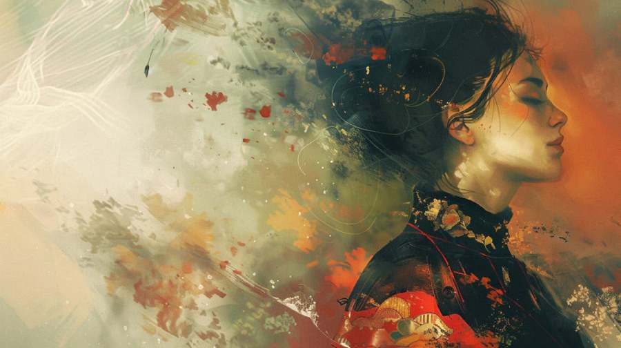
Complementary colors are colors that are opposite each other on the color wheel. Using complementary colors in digital painting will create strong contrast, highlighting elements in the painting. Complementary colors such as red-green, yellow-purple, or blue-orange can all help create strong accents.
Practical application
- Create strong contrast: Complementary color schemes are especially effective when you want to make objects or details in a painting stand out. The contrast between complementary colors makes them come alive and easily attract the eye.
- Make your painting more vivid: If you are painting a scene with a lot of detail, using complementary colors will help each detail become clearer and sharper. The work will not be blurred and will still have clear divisions between areas.
For example
Picture a sunset scene with a red sky and green ground. Red and green are complementary colors, which not only create a sharp contrast but also make the picture more vivid and eye-catching.
6.3. Contrasting color scheme
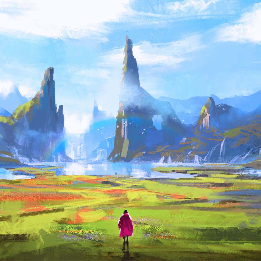
Complementary color schemes are the use of colors that have a marked difference in lightness or shade. This method creates a strong and immediate impact. Complementary color schemes are often used to highlight elements in a painting or to create a focal point in a painting.
Practical application
- Create a depth effect: The combination of light and dark colors will help create a space with more depth, creating a sense of near and far in a scene.
- Heighten Attention: When you need to draw attention to a particular object, using a contrasting color between that object and its background will create a powerful effect.
For example
A picture with an image of a person wearing black clothes standing on a light background will create a clear contrast, highlighting the character and making the picture more attractive.
6.4. Triangle color scheme
The triadic color scheme uses three colors that are 120 degrees apart on the color wheel. When you combine these three colors in a digital painting, you can create a balance between harmony and contrast, making your work interesting without being too distracting to the eye.
Practical application
- Create balance and harmony: The triangular color scheme helps create an even distribution of colors in the painting, making all elements connected to each other while still maintaining independence.
- Diversify color effects: The combination of three colors creates a variety of shades, helping the picture not to be monotonous but still maintain its pleasantness.
For example
Combining blue, red and yellow will create a picture that is rich in color but still maintains harmony, not too chaotic or confusing.
6.5. Quadrilateral color scheme
The tetradic color scheme uses four colors that lie on the color wheel so that they form a tetrahedron. This method offers a wide range of color options and can create a rich, vibrant, yet balanced picture.
Practical application
- Create richness without being confusing: The tetradic color scheme allows you to use a variety of colors without creating a confusing feeling. You might consider using four complementary colors, so that the picture still has unity.
- High Creativity: The tetradic color scheme allows you to experiment with different colors without worrying about losing the overall harmony.

For example
When you combine orange, blue, yellow and purple, you create a picture that is both colorful and not too chaotic, showing creativity and richness in the use of color.
Using color in digital painting is not simple, but by understanding the basic principles of color matching and applying them flexibly, you will create inspiring and impressive works. From analogous color schemes to complementary, contrasting, triangular and quadrilateral color schemes, each method has its own advantages, helping you easily create a vivid and deep painting.
Conclusion
As a smart Designer, you should flexibly apply the effective ways of using colors in digital painting that we have shared in the article to create your own style. If you want to learn more about digital painting, you can refer to Sadesign's website. With many years of experience in the field of graphic design, Sadesign will definitely satisfy all customers.


