Best Selling Products
Revealing The 9 Best Fonts For PowerPoint Slide Presentations
Nội dung
- 1. Font is a decisive factor in PowerPoint slide design
- 2. Top 9 Best Fonts For PowerPoint Slide Presentations You Should Know
- 2.1. Arial: One of the basic but powerful fonts
- 2.2. Calibri: Modern and accessible font
- 2.3. Times New Roman: Classic yet effective font
- 2.4. Helvetica: The perfect choice for modern design
- 2.5. Verdana: The ultimate font for online presentations
- 2.6. Tahoma: Font for clarity and precision
- 2.7. Georgia: A font that gives a formal feel
- 2.8. Cambria: Font with the perfect combination of tradition and modernity
- 2.9. Impact: A bold font for highlights
- 3. Advantages of beautiful font warehouse at Sadesign
- 4. Conclusion
Learn about the 9 best fonts for creating impressive, professional PowerPoint slides. Discover which options are best for each purpose and how to combine them effectively.
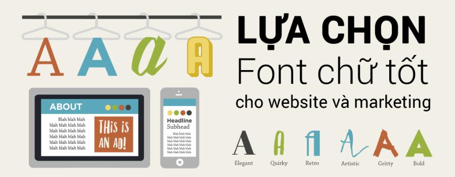
1. Font is a decisive factor in PowerPoint slide design
lonts are not only an aesthetic element in design but also play an important role in effectively communicating messages. A beautifully presented and easy-to-understand PowerPoint slide will attract the attention of the audience, help the presenter stay focused and enhance professionalism.
.jpg)
Beautiful Font Warehouse
Choosing the right font can improve the accessibility of information, making the content clearer and easier to read. In addition, fonts also express the style and personality of the brand, creating a strong impression and easy recognition in the hearts of viewers.
2. Top 9 Best Fonts For PowerPoint Slide Presentations You Should Know
Choosing the right font not only makes your presentation more engaging, but also ensures that your audience can easily absorb the information you want to convey. However, with so many font options available today, not all fonts are suitable for PowerPoint slides. Below is a list of 9 popular and quality fonts that you can apply to your presentations.
.jpg)
2.1. Arial: One of the basic but powerful fonts
Arial is one of the simplest and most readable fonts. It is a top choice for many presentations because of its clarity and ease of information absorption. Arial has clean, uncluttered lines that make it easy to read even in low light or on large screens.
Why choose Arial?
Easy to read : Characters are clear, without complicated details.
Professional : Arial is suitable for many different types of presentations, from business reports to academic presentations.
Good compatibility : Arial is the default font in many software and operating systems, so you don't need to worry about font errors.
2.2. Calibri: Modern and accessible font
Calibri is a great choice for anyone who wants a modern and easy-to-read font. With its clean lines and balanced design, Calibri makes your slides look smooth and clutter-free. It is the default font in Microsoft PowerPoint, so you won't have any compatibility issues when using it.
Advantages of Calibri:
Modern Design : Soft and easy-to-read letters help viewers focus on the content without distraction.
Compatibility : Calibri is always the default choice in many versions of PowerPoint, making it easy to use without worrying about display issues.
Suitable for professional presentations : With a simple yet modern design, Calibri is the ideal choice for business or academic presentations.
2.3. Times New Roman: Classic yet effective font
Times New Roman may not be the first choice when you think of PowerPoint slide design, but it is still one of the fonts that is easy to read and conveys formality and seriousness. Especially if you are doing a formal or academic presentation, Times New Roman will help create credibility and professionalism.
Reasons to choose Times New Roman:
Formal and serious : This font gives a sense of academic and official.
Easy to read : With moderate letter spacing and clear typography, readers can easily absorb information.
Suitable for research presentations : If your presentation is related to academic topics, Times New Roman is the choice that cannot be ignored.
2.4. Helvetica: The perfect choice for modern design
Helvetica is a popular font in the graphic design industry. With its minimalist design, Helvetica can create a clean and highly legible look, which helps to enhance the quality of presentations. Helvetica is often used in presentations that require a high level of aesthetics.
Advantages of Helvetica:
Simple and modern : This font is easy on the eyes and gives off a classy feel.
Readable at any size : Helvetica maintains clarity even as you zoom in or out of text size.
Great for slides that require a focus on design : If you want your presentation to look modern and professional, Helvetica is an excellent choice.
2.5. Verdana: The ultimate font for online presentations
Verdana is a great choice for PowerPoint presentations that are projected on a computer screen or mobile device. Because it is designed specifically for screens, Verdana keeps letters clear and easy to read, even when displayed at small sizes.
Why choose Verdana?
Clear and easy to read on screen : Verdana's characters are designed to be spacious and easy to read, making it easy for viewers to read text from a distance.
Screen-friendly : This font improves readability on digital screens and is widely used in web applications.
Suitable for online presentations : Verdana is perfect when you are presenting your presentation via video call or on an online platform.
.jpg)
2.6. Tahoma: Font for clarity and precision
Tahoma is very similar in style to Verdana but with slightly thinner lines, which helps increase clarity and readability when presenting text in PowerPoint slides. Tahoma is one of the popular fonts in companies, helping to bring seriousness and professionalism to presentations.
Reasons to choose Tahoma:
High Legibility : This font is easy to read with clearly separated letters.
Professional and clean : Tahoma creates a strong and neat impression, well suited for presentations in an office environment.
Good compatibility : Tahoma is supported on most operating systems and software, so you can use it with confidence without worrying about display problems.
2.7. Georgia: A font that gives a formal feel
Georgia is a serif font with an elegant and classic design. This font is great for presentations in seminars or academic discussions, when you need to convey information clearly but still maintain a formal tone.
Reasons to choose Georgia:
Gives a formal feel : Georgia has a polished look, making your presentation look more professional.
Readability : Georgia's characters are clearly designed and easy to read even when displayed at small sizes.
Suitable for academic presentations : If your presentation is research-based in nature, Georgia would be a great choice.
2.8. Cambria: Font with the perfect combination of tradition and modernity
Cambria is a modern serif font that combines traditional and contemporary elements to create an elegant look for your presentations. With its easy-to-read design, Cambria is a popular choice for academic and professional presentations.
Reasons to choose Cambria:
Formal and Readable : With its slender serif style, Cambria strikes the perfect balance between formality and readability.
Suitable for Academic Presentations : If you want your presentation to have an academic yet modern feel, Cambria is the right choice.
2.9. Impact: A bold font for highlights
Impact is a bold and striking font, suitable for important points in presentations. If you want to emphasize a certain part of the content, Impact will help highlight the message you want to convey.
Advantages of Impact:
Prominent Fonts : Thick and bold characters will attract the viewer's attention.
Create emphasis : Use Impact on titles or important parts of the slide to highlight the message.
3. Advantages of beautiful font warehouse at Sadesign
.jpg)
The beautiful font warehouse at Sadesign offers a diverse collection, from modern to classic fonts, suitable for all design needs. Each font is carefully selected, ensuring high aesthetics and ease of use. With outstanding quality, these fonts not only help elevate your project but also save significant time in finding the right font.
In addition to the richness of designs, the font warehouse at Sadesign is also clearly classified, helping users quickly find their favorite fonts in just a few clicks. Fonts are optimized for all platforms, from print to web design, providing maximum flexibility in creative work.
In particular, with a team of experienced creators, fonts at Sadesign are always updated and renewed, ensuring to meet market trends and user needs. The perfect combination of aesthetics and practicality is the strength that makes the font warehouse at Sadesign the top choice of professional designers.
Beautiful Font Warehouse
4. Conclusion
The above article has provided a list of 9 best fonts for presenting impressive and professional PowerPoint slides. You will easily find the right choice for your presentation needs. In addition, if you want to use fonts to design PowerPoint in a more methodical and professional way, choose the beautiful font warehouse at Sadesign to help you improve your skills and unlimited creativity!
