Best Selling Products

Freepik Premium Account
59 USD

Adobe Premiere Pro Account
99 USD

Upgrade Genuine Office 365
49 USD

MidJourney Account
29 USD

Plugin Retouch4me
69 USD

Adobe Photoshop Copyright - Full App
120 USD

ChatGPT Plus Account (GPT-4)
16 USD

Upgrade Duolingo Super
29 USD

Capcut Pro 1 Year
39 USD

Genuine Cheap Canva Pro
39 USD

Autodesk All App Account Copyright
120 USD

Windows 10 & 11 Pro Key
36 USD

Upgrade genuine Capture One account
120 USD

Genuine Adobe Illustrator account
99 USD

Copyright Adobe Lightroom Account
59 USD
Rules In Layout Design You Need To Know To Create The Perfect Layout
Nội dung
- 1. The importance of layout in design
- 1.1 Definition of Layout and its role
- 1.2 Basic Elements of a Good Layout
- 2. Important rules in layout design
- 2.1. Balance rule: Create stability for the design
- 2.2. Contrast rule: Create highlights and differences
- 2.3 Grid System
- 2.4. Golden Ratio and Rule of Thirds: Create harmony and balance
- 2.5. White Space/Negative Space Rules
- 2.6. Visual Hierarchy
- 2.7. Whitespace Rules: Increase clarity and readability
- 2.8. Rule of Odds
- 2.9. Rule of Thirds
- 2.10. Repetition & Rhythm
- 2.11. Alignment Rules: Create Clarity and Professionalism
- 3. Applying layout rules in practical design
- 3.1. In website design
- 3.2. In print design
- 3.3. In brand graphic design
- 4. Tips and tricks for applying Layout rules effectively
- 5. Conclusion
Discover the important rules of layout design to create professional, attractive, and readable layouts. These principles help optimize the visual experience and enhance the design value.
Layout plays an important role in graphic design, helping to create balance, attract and guide viewers visually. A good layout not only meets aesthetic requirements but also ensures the ability to convey messages effectively. Understanding and correctly applying the rules of layout design will help improve the quality of the work, creating a stronger and more professional impression.
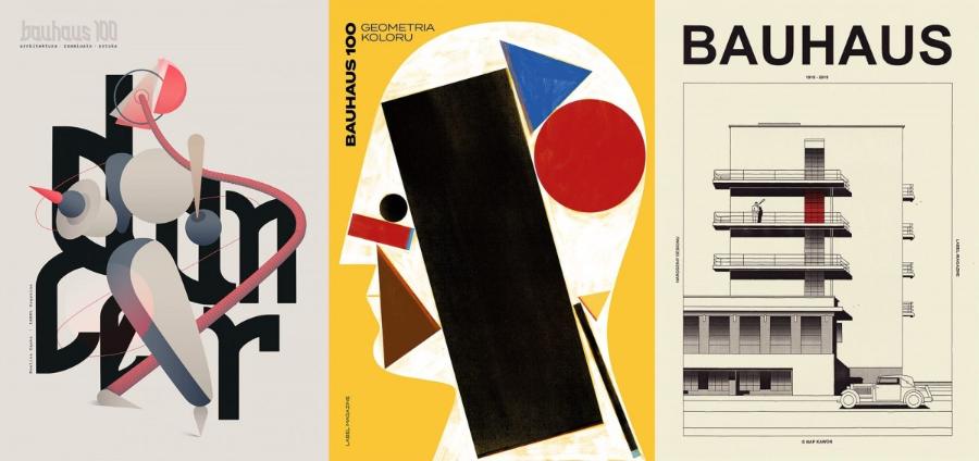
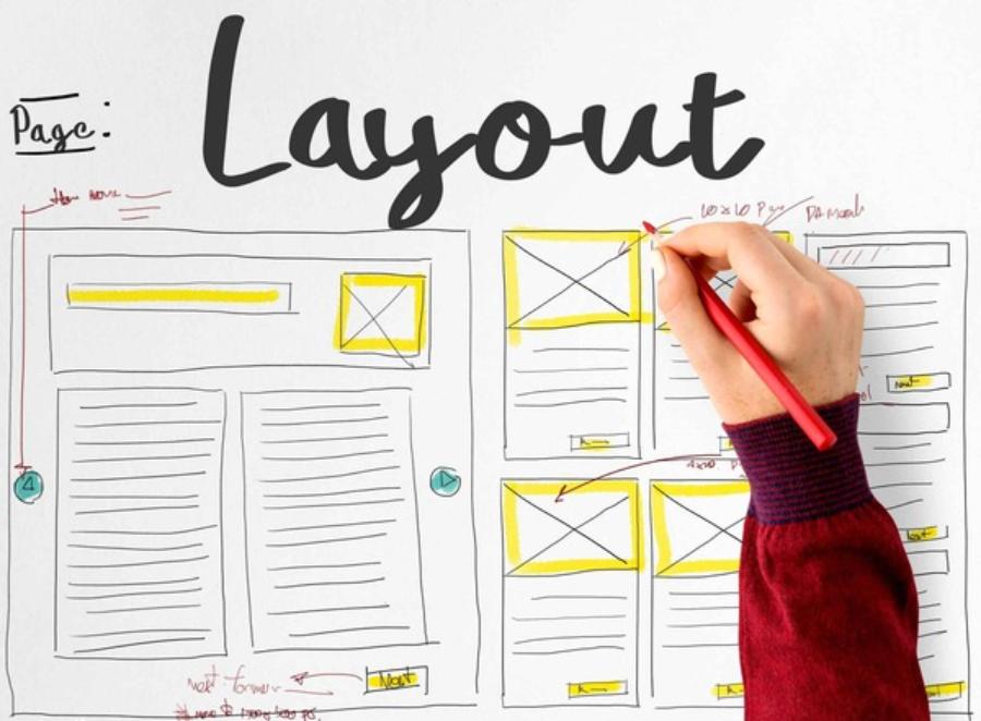
1. The importance of layout in design
Layout is the deciding factor in how viewers perceive content, directly affecting the visual experience and interaction with the design product. A reasonable layout helps convey a clear message, creating a balance between visual elements, text and space.
.jpg)
Layout design is not only limited to the field of graphics but is also widely applied in web design, printing, advertising and visual communication. The reasonable arrangement of elements helps to enhance the aesthetic value and optimize the function of the design product.
1.1 Definition of Layout and its role
Layout is the process of arranging and organizing design elements such as text, images, graphics and other components on a surface, for the purpose of communicating information effectively and aesthetically.
Role of Layout:
Convey information clearly: Layout helps viewers easily receive and understand the content.
Create visual appeal: Good layout helps attract attention and make a strong impression.
Lead the viewer's eye: Layout helps guide the viewer in a logical sequence, thereby optimizing content accessibility.
Create the ultimate user experience.
1.2 Basic Elements of a Good Layout
Clarity and understandability: Information should be organized logically and easily accessible.
Balance and harmony: Elements should be arranged in a balanced way, creating a pleasant feeling.
Contrast and emphasis: Use contrast to highlight important elements.
Logical visual hierarchy: Guide the viewer's eye through the sequence of important information.
Consistency and professionalism: Create a design that is consistent in style and appearance.
Impact of Layout on User Experience:
In web and app design, Layout determines user experience.
A good layout makes it easy for users to find information, navigate, and interact.
Bad layouts are annoying, distracting, and lead to negative experiences.
Layout greatly affects the ease of use of a design product.
2. Important rules in layout design
In layout design, following important rules is key to creating a product that is intuitive, aesthetic, and effective.
2.1. Balance rule: Create stability for the design
First of all, balance and harmony must be ensured by using white space appropriately, making the content easy to read and not confusing. The layout needs to be balanced to create harmony and comfort for the viewer's eyes. Balance can be achieved by using:
.jpg)
Symmetrical Balance:
The elements are arranged symmetrically around a central axis, creating a sense of formality, stability and classicism.
For example, design a flyer with images and text arranged symmetrically along the vertical axis.
Asymmetrical Balance:
The elements are arranged asymmetrically, but still create visual balance, giving a dynamic, modern and creative feel.
For example, design a website with a large image on the left and text on the right.
Radial Balance:
Elements are arranged around a central point, creating a sense of focus and drawing attention.
For example, logo design with concentric circles.
Using the right kind of balance will make your design more appealing and professional.
2.2. Contrast rule: Create highlights and differences
Color contrast:
Use contrasting or high-contrast colors to create emphasis and attract attention.
For example, use black and white, or red and green.
Size contrast:
Use elements of different sizes to create visual distinction and hierarchy.
For example, use large headlines and small text.
Font contrast:
Use different typography (font, size, weight) to create distinction and hierarchy of information.
For example, use bold font for headings and lowercase font for body text.
Contrast in shape:
Use different shapes (squares, circles, triangles) to create variety and attract attention.
For example, combining sharp images, and soft images.
2.3 Grid System
A grid system acts as the foundation of layout design, helping to arrange elements in a logical and consistent manner. Grids help maintain balance, create connections between elements, and make content easier to read.
.jpg)
Some common grid systems in design:
Single-column grid: Commonly found in books, newspapers, and long documents. Divides the design surface into vertical columns to arrange elements.
Multi-column grid: Popular in magazine design, websites, and marketing materials.
Modular grid: Used to arrange flexible content, especially suitable for web interfaces and mobile applications. Divide the design surface into squares or rectangles to arrange elements.
Diagonal grid: Create more creative and unique effects in design.
Using grids in design:
Create consistency and structure to the design.
Helps to arrange elements in an organized and efficient manner.
Helps align design objects precisely.
2.4. Golden Ratio and Rule of Thirds: Create harmony and balance
.jpg)
Golden Ratio: Discover Natural Beauty:
The golden ratio (1.618) is considered the most harmonious ratio in nature and art.
Use the golden ratio in layout design to create balance and appeal.
There are many famous buildings designed based on the golden ratio.
Rule of Thirds: Create emphasis and balance:
Divide the design surface into 9 equal parts using 2 horizontal lines and 2 vertical lines.
Place important elements at the intersections of these lines to create emphasis and balance.
The rule of thirds is widely used in photography.
Application in Layout design:
The golden ratio can be used to calculate the sizes of elements in a design.
The rule of thirds is used to arrange elements on a page in a balanced way.
2.5. White Space/Negative Space Rules
White space is the empty space between elements in a layout. A good layout uses white space to help the content “breathe,” avoiding a feeling of being cramped and confusing.
Benefits of using white space wisely:
Makes content easier to read.
Highlight important elements.
Brings sophistication and professionalism to the design.
2.6. Visual Hierarchy
Visual hierarchy helps direct the viewer's eyes in order of priority, helping them access information logically and effectively. Some ways to create visual hierarchy in design:
Size: Important elements should be larger in size to attract attention. Important elements are usually placed in the center or are larger in size.
Color: Contrasting colors help highlight key information. Use bold or high-contrast colors to highlight important elements.
Typography: Bold, italic, or different fonts help create emphasis. Use different typefaces and spacing to differentiate levels of information.
Graphic and visual elements:
Use graphic elements and images to create interest and lead the viewer's eye.
This helps the viewer determine the order of importance of information.
Good use of visual hierarchy increases persuasiveness and guides the viewer in a natural way.
2.7. Whitespace Rules: Increase clarity and readability
Positive Whitespace:
It is the space between design elements that helps create clarity and readability.
Negative Whitespace:
Is the space around design elements, helping to create balance and harmony.
Use white space effectively:
Increase the readability and clarity of the design.
Create balance and harmony.
Highlight important elements.
help viewers focus on important information.
2.8. Rule of Odds
Using odd numbers in a composition, especially in groups of three or five, helps create a more natural and engaging look. When arranging objects in a design, odd numbers often provide a dynamic balance, avoiding a feeling of being too formal and rigid.
The Rule of Odds is an important principle in layout design that helps create balance and visual interest. According to this rule, using an odd number of elements in a layout, such as 3, 5 or 7, often feels more natural and harmonious than an even number of elements. This comes from the way the human eye tends to focus on the central element when the elements are arranged in odd numbers, thereby creating emphasis and interest in the design. This rule is not only applied in graphic design but is also widely used in photography, architecture and visual arts, contributing to enhancing the aesthetic value of the product.
2.9. Rule of Thirds
This rule is commonly used in graphic design and photography. The layout is divided into 9 equal parts by two horizontal lines and two vertical lines. Important elements should be placed at the intersection points to create balance and interest.
The Rule of Thirds is an important principle in layout design that helps create balance and visual interest in a composition. According to this rule, the frame is divided into nine equal parts by two horizontal lines and two vertical lines. Important elements in the design should be placed at the intersection points or along these lines to optimize harmony and the viewer's attention. Applying the rule of thirds not only makes the composition more professional, but also brings a natural and pleasant feeling, especially in fields such as photography, graphic design and visual communication.
2.10. Repetition & Rhythm
Repeating design elements like colors, fonts, or shapes helps create unity and professionalism. Rhythm in design helps guide the eye in a certain direction, creating a sense of harmony and ease.
Repeat visual elements:
Repeat elements like colors, fonts, shapes, and graphics to create consistency and recognition.
Create style consistency:
Use a consistent design style throughout the product.
Building brand identity:
Repeat brand identity elements (logo, colors, typography) to create memorability.
Help users remember products and brands better.
2.11. Alignment Rules: Create Clarity and Professionalism
Align left, right, center:
Align elements in a straight line for a clean, professional look.
Align to grid:
Use grids to align elements precisely and consistently.
Align to baseline:
Align text to the baseline to create visual consistency.
Importance: * Alignment creates clarity, readability, and professionalism in a design.
Helps viewers easily follow and receive information.
Alignment is one of the important elements to create a professional Layout design.
3. Applying layout rules in practical design
.jpg)
3.1. In website design
Website layout should ensure readability, ease of navigation, and consistency between pages. Important principles include:
Use grids to organize content logically.
Focus on white space to create an airy feeling.
Apply visual hierarchy to emphasize important information.
3.2. In print design
Magazines, books, brochures and posters all require a tight layout to ensure content is clear and easy to read. Using grids and visual hierarchy helps to optimize the reading experience.
3.3. In brand graphic design
Logos, business cards, advertising banners or product packaging all need a reasonable layout to convey the brand image in a professional way. Consistency in layout helps create a strong impression in the customer's mind.
4. Tips and tricks for applying Layout rules effectively
Understand design purpose and target audience:
Clearly define the purpose of the design (advertising, information, entertainment) to choose the appropriate Layout rule.
Research your target audience (age, interests, culture) to create an engaging and effective layout.
Plan and sketch the Layout before designing:
Sketch out Layouts by hand or use simple design tools to visualize ideas and structures.
Plan in detail how to arrange elements, using layout rules and white space.
Test and evaluate different Layout options:
Create multiple Layout options and compare them to choose the best one.
Experiment with different arrangements, colors, fonts, and images.
Evaluate Layout based on aesthetics, communication effectiveness, and user experience.
Use Layout design support tools:
Use graphic design software such as Adobe Photoshop, Illustrator, InDesign.
Use online Layout creation tools like Canva, Figma.
Refer to resources about Layout design such as books, blogs, websites.
5. Conclusion
Mastering the rules of layout design helps create high-quality, accessible, and highly applicable products. A reasonable layout not only brings aesthetics but also enhances the effectiveness of message transmission. Applying these principles flexibly will help design products become professional, attractive, and suitable for practical use.


VIP Products


Best Selling Products
Freepik Premium Account
59 USD
Adobe Premiere Pro Account
99 USD
Upgrade Genuine Office 365
49 USD
MidJourney Account
29 USD
Plugin Retouch4me
69 USD
Adobe Photoshop Copyright - Full App
120 USD
ChatGPT Plus Account (GPT-4)
16 USD
Upgrade Duolingo Super
29 USD
Capcut Pro 1 Year
39 USD
Genuine Cheap Canva Pro
39 USD
Autodesk All App Account Copyright
120 USD
Windows 10 & 11 Pro Key
36 USD
Upgrade genuine Capture One account
120 USD
Genuine Adobe Illustrator account
99 USD
Copyright Adobe Lightroom Account
59 USD