Best Selling Products
Tips for Creating Beautiful and Simple Infographics for Beginners
Nội dung
- 1. The Importance of Infographics in Marketing
- 2. Important Elements When Creating Infographics
- 2.1. Identify Specific Purpose and Audience
- 2.2. Choosing the Right Topic
- 2.3. Use Color Wisely
- 3. Simple But Effective Infographic Design Techniques
- 3.1. Focus on Main Content
- 3.2. Using Simple Charts and Graphs
- 3.3. Font Must Be Simple And Easy To Read
- 4. How to Use Images and Icons to Enhance Effectiveness
- 4.1. Choose High Quality Images
- 4.2. Using Icons to Illustrate Information
- 5. Choose the Right Infographic Design Tool
- 6. Proofread and Edit Before Publishing
- Conclude
Tips for creating beautiful and simple infographics that effectively convey information. Learn how to use colors, images, and fonts to design impressive infographics. All will be updated in the following article.
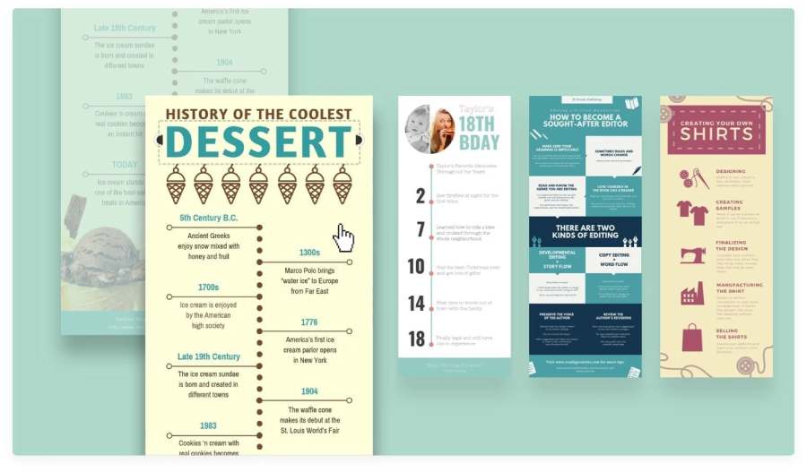
Infographics are a powerful tool to help turn dry data into visual images that are easy to access and attract viewers. However, designing a beautiful and simple infographic is not easy, especially for beginners. In the following article, SADESIGN will share the secrets to creating beautiful, impressive and simple infographics without requiring too many design skills.
1. The Importance of Infographics in Marketing
Infographics have become a popular tool in modern marketing campaigns, especially in creating easy-to-understand and accessible content. Presenting information in visual form not only helps viewers easily grasp the main points but also increases the ability to share and spread on social media platforms. Especially with the strong development of the internet and social networks, an attractive infographic can bring immediate attention from viewers.
In addition, Infographics help businesses easily explain complex concepts, providing information quickly and clearly, thereby improving consumers' ability to remember. Not only that, this visual content also helps build brands and increase brand recognition on online platforms.
2. Important Elements When Creating Infographics
To achieve optimal use and analysis of information, professionals need to consider many important factors, from technology to people. Building a successful Informatics platform requires a harmonious combination of technology, strategy, and a deep understanding of users' needs and goals. Let's take a look at the key factors that make Informatics beautiful and simple.
2.1. Identify Specific Purpose and Audience
Before you start designing, you need to clearly define the purpose of the infographic. Do you want to share knowledge, instructions, or simply convey statistical information? At the same time, who is your target audience? Understanding the purpose and audience will help you choose the appropriate presentation, color, style, and message.
2.2. Choosing the Right Topic
One of the most important elements in infographic design is the theme. Infographics need to have a clear, easy-to-understand theme and logical connections between sections. If your infographic does not have a clear theme, viewers will easily get lost and fail to achieve the information you want to convey.
@old
2.3. Use Color Wisely
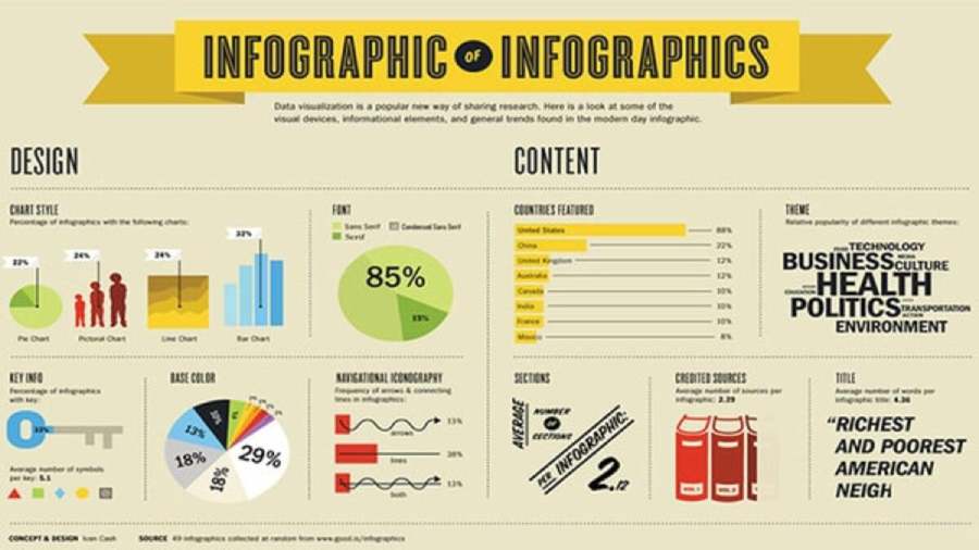
Colors can have a big impact on how viewers perceive your infographic. You should choose colors that are harmonious and consistent with your theme and brand. Don’t overdo it, as too many colors can be confusing and lose their aesthetic appeal. A good rule of thumb is to stick to a maximum of 3 to 5 primary colors in your infographic to maintain consistency.
3. Simple But Effective Infographic Design Techniques
To create a beautiful, impressive infographic, you need to know design techniques and use them flexibly to achieve the highest efficiency.
3.1. Focus on Main Content
A good infographic doesn’t always have to be full of data and information. In fact, it’s about selecting the important information and presenting it in a clear and understandable way. Avoid overusing data or unnecessary visual elements, as this will overload the infographic and make it ineffective.
3.2. Using Simple Charts and Graphs
Charts and graphs are powerful tools for presenting statistical information in an easy-to-understand way. However, keep them simple. Complex charts with too much detail will only confuse your audience. Choose chart types such as bar charts, pie charts, or flow charts to present your data in a clear and accessible way.
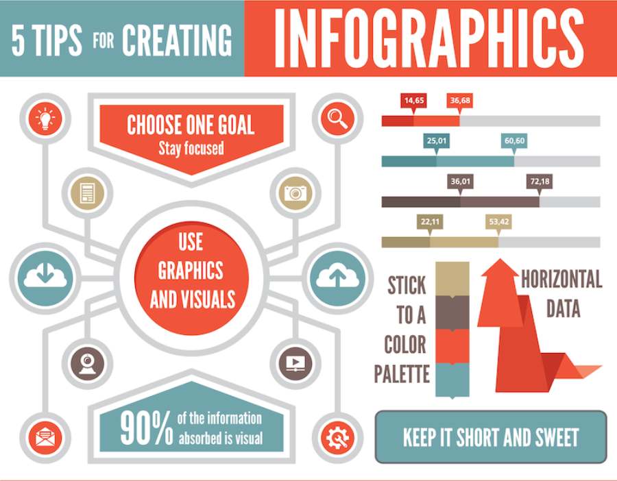
3.3. Font Must Be Simple And Easy To Read
A very important element when designing an infographic is choosing fonts. Choose fonts that are simple, easy to read, and not too complicated. Fonts that are too elaborate can distract the viewer from the main content. You should also use a maximum of 2 to 3 fonts in an infographic to keep the design clean and easy to read.
4. How to Use Images and Icons to Enhance Effectiveness
Images and icons are not just decorative tools but also strategic elements that can enhance the power of your message. When used properly, they not only help highlight content but also help viewers grasp ideas, feelings and actions more quickly and effectively. So how to optimize the combination of images and icons to improve the quality of information transmission? Let's explore the secrets below.
4.1. Choose High Quality Images
Images can make your infographic more dynamic and engaging. However, you need to make sure that the images you use are high quality and relevant to the content you are trying to convey. Blurry or unclear images will detract from your infographic and turn off viewers.
4.2. Using Icons to Illustrate Information
Icons are a great way to make information more meaningful. Instead of using long text, use icons to illustrate concepts. Simple, easy-to-understand icons will help viewers quickly grasp the content you want to convey without having to read too much text.
5. Choose the Right Infographic Design Tool
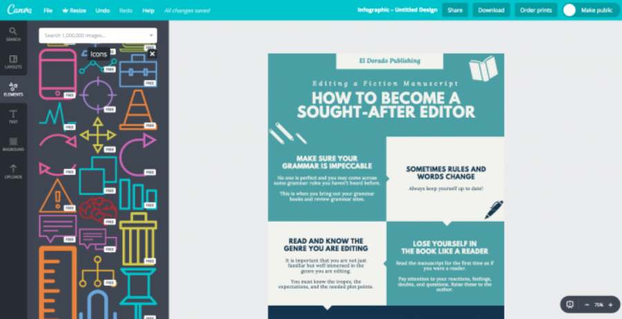
There are many free and paid online infographic design tools available today that you can use to create beautiful products without much design experience. Some popular tools include:
- Canva: An easy-to-use design tool, with a variety of infographic templates available for quick customization.
- Piktochart: This is a powerful tool for creating complex and beautiful infographics with simple drag and drop features .
- Venngage: Similar to Piktochart, Venngage offers a wide variety of easy-to-edit infographic templates.
However, if you have professional design skills, Adobe Illustrator or Photoshop are great options for creating unique and sharp infographics.
@old
6. Proofread and Edit Before Publishing
Once you’ve finished designing your infographic, be sure to review your entire product. Consider factors like clarity of text, color harmony, consistency of design style, and appropriateness to your target audience. If possible, ask others to review and provide feedback for further improvement.
Conclude
Infographics are not only a tool to help you convey information easily and vividly, but also an important part of your marketing strategy. Apply the updated tips in the article above to create impressive infographics, attract attention and convey your message to viewers in a powerful way. You can also refer to Illustrator software at SADESIGN to create beautiful and professional infographic products!

