Best Selling Products

Upgrade genuine Capture One account
120 USD

Capcut Pro 1 Year
39 USD

Upgrade Genuine Office 365
49 USD

Adobe Photoshop Copyright - Full App
120 USD

Autodesk All App Account Copyright
120 USD

Copyright Adobe Lightroom Account
59 USD

Upgrade Duolingo Super
29 USD

Genuine Adobe Illustrator account
99 USD

ChatGPT Plus Account (GPT-4)
16 USD

Plugin Retouch4me
69 USD

Windows 10 & 11 Pro Key
36 USD

Adobe Premiere Pro Account
99 USD

Freepik Premium Account
59 USD

MidJourney Account
29 USD

Genuine Cheap Canva Pro
39 USD
Top Color Combination Secrets to Create Shades in Design
Nội dung
- 1. Culture and Context Influence Color Perception
- 2. Visual Emotions Created by Color
- 2.1. Warm vs. Cool Colors: Creating Contrasting Emotions
- 2.2. Brightness – Darkness (Value) Affects Mood
- 2.3. Saturation: From Mild to Intense
- 3. The relationship between color and design
- 4. Common Color Mistakes and How to Avoid Them
- 5. Use color to create mood in design
- 6. Some related questions
Explore the principles of color coordination from basic to advanced, helping you master nuances in design and create products with strong emotions, personality and high aesthetics.
Each color is not just a color but also a powerful communication language that helps convey the spirit, culture and message of the brand to the viewer. Through understanding and applying colors properly , you can navigate the emotions of customers, create a deep impression and leave a brand mark in their minds. Let's start the journey to discover the power of color in design through the most basic concepts to build a solid foundation for practical applications.
1. Culture and Context Influence Color Perception
Not only the intrinsic color but also cultural and contextual factors play an important role in the perception of color. A color may have a positive meaning in one culture but a negative connotation in another.
In many Western countries, white often symbolizes purity, while in some Asian countries it is associated with mourning and loss. Therefore, before incorporating color into a design, designers need to carefully consider the target audience and the cultural context of the product or brand.
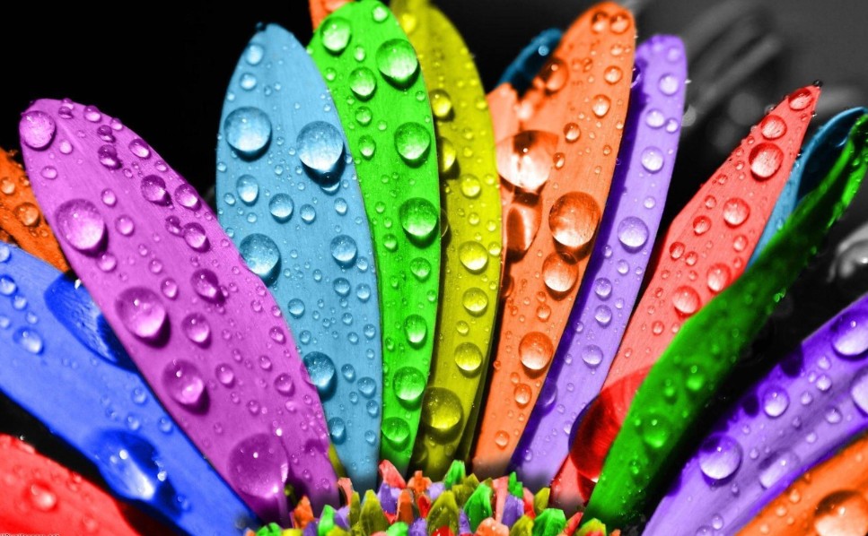
2. Visual Emotions Created by Color
.png)
2.1. Warm vs. Cool Colors: Creating Contrasting Emotions
One of the basic principles of creating shades is to divide colors into two groups: warm and cool colors.
Warm colors like red, orange, and yellow often evoke feelings of energy, enthusiasm, and friendliness. They are often used when creating a sense of excitement, excitement, or urgency.
Cool colors like blue, green, and purple give a calm, cool, and professional feel. These colors are suitable for designs that need to create a sense of stability, peace, or modernity.
The choice between warm and cool colors depends on the message and emotion the designer wants to convey to the audience.
.png)
2.2. Brightness – Darkness (Value) Affects Mood
Not only hue, the lightness and darkness of color also play an important role in shaping the viewer's emotions:
Light colors often bring a sense of lightness, positivity and open up space to the design.
Dark colors help create a sense of depth and mystery and are often used to express seriousness and sophistication.
The reasonable combination of light and dark colors is the factor that helps the design become lively and attractive.
2.3. Saturation: From Mild to Intense
Color saturation refers to how bright or pale a color is:
Pale Colors: With low saturation, these colors create a sense of elegance, lightness, and sophistication. Often used in minimalist, modern designs.
Bold Colors: When the saturation is high, the color becomes strong, bold, and vibrant. This is a good choice for designs that require immediate attention and prominence.
.png)
3. The relationship between color and design
Color has long been considered an indispensable emotional element in design. For example, people associate red with anger (or desire), blue with calmness, etc. Understanding that, designers have used color to create great effects to influence the emotions as well as the actual behavior of viewers.
Typically, warm colors (yellow, red, and orange) are considered yang, while cool colors (blue, green, and purple) are considered yin. However, these rules are not always exact. For example, red (a warm color) can evoke feelings of anger or danger, while green (a cool color) can evoke feelings of growth and new beginnings. This is one reason why color psychology and color theory are so complex. There are seemingly endless factors that can influence how people feel, behave, and think.
Cultural differences can also have a profound effect on the meaning of colors. In many Western cultures, white is primarily associated with purity and peace, however in some Asian countries, white is associated with death and mourning.
And it is important that designers pay attention to using colors in harmony with each other to create good effects for their work.
.png)
4. Common Color Mistakes and How to Avoid Them
Even experienced designers are not immune to some common mistakes when using color in design. Here are some common mistakes and tips to help you avoid them:
Using Too Many Colors Causes Eye Confusion
Using too many colors in a design can distract the viewer and make it difficult to focus on the main message.
No Contrast Check
Contrast is key to ensuring that all information on your design is legible and stands out. Using colors with low contrast can make design elements such as text, buttons, and icons difficult to recognize, especially in UI/UX design.
Inconsistency in Color System
An inconsistent color system can cause a loss of connection between design elements, resulting in a loss of brand recognition.
.png)
5. Use color to create mood in design
Warm colors tend to be energizing and lively. They are often full of life and can add life to a design. Instead of blending into the background, warm colors “pop” on the screen or page and tend to take the lead in a design. Cool colors are calm, soothing, and pleasing to the eye. Combining cool colors with black can make them more mysterious, while combining them with white can make them more gentle and relaxing.
Designers have long relied on color to influence consumers to take certain actions. That's why window signs to attract the attention of passersby are often yellow and sale prices are often indicated in red.
.png)
Here are some basic color guidelines for creating mood in design that you can refer to:
Orange can be used for calls to action but can also be annoying if overused. This is why it is not often seen outside of logos or accent colors.
Yellow attracts attention and grabs the attention of consumers.
Green is easily processed by the human eye, and is therefore often used to create a feeling of relaxation. It is also closely associated with money and luck.
Blue is a popular color, so it's no surprise that it's widely used in communications. It's also closely associated with loyalty, honesty, and authority, making it a popular choice for large corporations and businesses in industries like banking and insurance.
Purple is used a lot in the beauty industry, although it's also seen associated with luxury goods (like Asprey, which even named its signature perfume Purple Water).
Black is generally considered sophisticated and elegant when used in marketing. It is widely used in communications across most industries.
White is often associated with cleanliness, which is why it is popular in the healthcare industry. It is also used in the technology industry because of its association with simplicity.
Gray is also associated with simplicity, and is often used by marketers to calm and soothe consumers.
6. Some related questions
.png)
Why is color so powerful in design?
Color not only beautifies but also conveys emotions and messages, helping to define a powerful brand image and identity.
How to choose the right color palette for the message you want to convey?
Identify goals and audiences, understand color psychology, use color palette generation tools, and test on real designs to ensure fit.
How does the difference between warm and cool colors affect the viewer's emotions?
Warm colors (red, orange, yellow) stimulate and create feelings of enthusiasm and dynamism; while cool colors (blue, green, purple) bring calmness, professionalism and stability.
How to control the brightness, darkness and saturation of colors to achieve the desired shade?
Adjust the value to create depth or softness, and adjust the saturation to control the level of prominence, creating a balanced and clear design.
What is the importance of maintaining consistency in your brand's color system?
Consistency increases recognition, creates a professional impression and avoids confusion for customers when applied to all communication products.
On the creative path, every little detail contributes to the overall success of a work. Always remember that the core is not only having a beautiful design but also the ability to touch emotions, bringing a real experience to the viewer. With the knowledge you just gained, confidently step into the world of color nuances and conquer it in your own way.


VIP Products


Best Selling Products
Upgrade genuine Capture One account
120 USD
Capcut Pro 1 Year
39 USD
Upgrade Genuine Office 365
49 USD
Adobe Photoshop Copyright - Full App
120 USD
Autodesk All App Account Copyright
120 USD
Copyright Adobe Lightroom Account
59 USD
Upgrade Duolingo Super
29 USD
Genuine Adobe Illustrator account
99 USD
ChatGPT Plus Account (GPT-4)
16 USD
Plugin Retouch4me
69 USD
Windows 10 & 11 Pro Key
36 USD
Adobe Premiere Pro Account
99 USD
Freepik Premium Account
59 USD
MidJourney Account
29 USD
Genuine Cheap Canva Pro
39 USD