Best Selling Products

Upgrade genuine Capture One account
120 USD

Upgrade Genuine Office 365
49 USD

Windows 10 & 11 Pro Key
36 USD

MidJourney Account
29 USD

Adobe Premiere Pro Account
99 USD

Genuine Adobe Illustrator account
99 USD

Autodesk All App Account Copyright
120 USD

Freepik Premium Account
59 USD

Adobe Photoshop Copyright - Full App
120 USD

Plugin Retouch4me
69 USD

Upgrade Duolingo Super
29 USD

Copyright Adobe Lightroom Account
59 USD

ChatGPT Plus Account (GPT-4)
16 USD

Capcut Pro 1 Year
39 USD

Genuine Cheap Canva Pro
39 USD
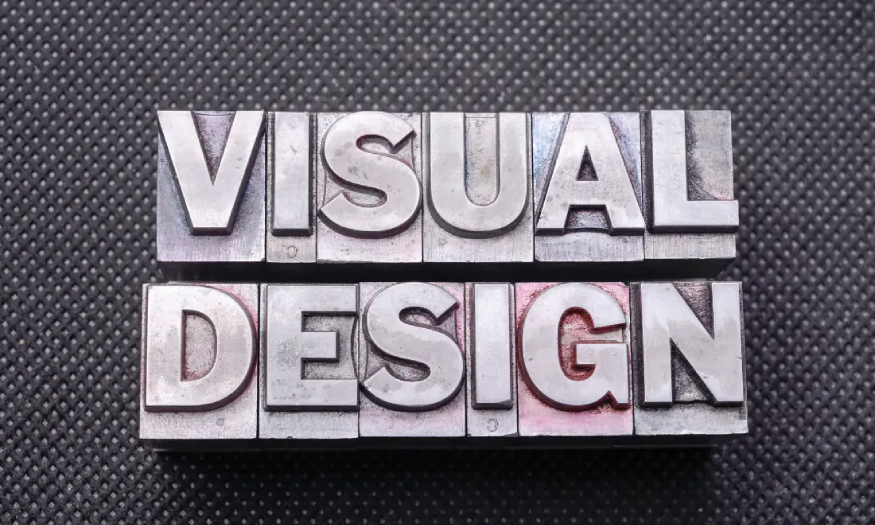
What is Visual Design? Principles and common mistakes in Visual Designer
Nội dung
- 1. What is Visual Design?
- 2. Characteristics of Visual design
- 3. Basic Principles of Visual Designer
- 3.1. Core Element - Words
- 3.2. Balance
- 3.3. Use size to create hierarchy and visual direction
- 3.4. Using color to convey messages
- 4. Common mistakes when applying Visual Design in design
- 4.1. Distorted image
- 4.2. Misaligned & Misaligned Objects
- 4.3. Too much text
- 4.5. Low quality images
- 4.6. Font mismatch
- 4.7. Too many bullet points
- 4.8. Bad photo gallery
- 5. What is the role of a Visual Designer?
- 6. What is the job of a Visual Designer?
With its high popularity, the question of what Visual Design is is of interest to many users. This is a popular and highly important type of design for web design, advertising, and other applications. So what are its characteristics and principles? Let's learn more about this topic with SaDesign through the following shares.
With its high popularity, the question of what Visual Design is is of interest to many users. This is a popular and highly important type of design for web design, advertising, and other applications. So what are its characteristics and principles? Let's learn more about this topic with SaDesign through the following shares.
1. What is Visual Design?
Visual design can be translated as visual design. This is a type of design that specializes in user experience and the ability of the product to interact with the viewer.
.jpg)
Visual design aims to improve the aesthetics and usability of a design/product using appropriate images, fonts, space, layout, and colors.
Visual design is more than just aesthetics. Designers carefully arrange elements to create interfaces that optimize the user experience and drive conversions.
Simply put, Visual design is a combination of graphic design and user interface (UI) design.
2. Characteristics of Visual design
.jpg)
To stimulate curiosity and attract viewers, Visual design needs to pay attention to the following factors:
Lines: The most basic visual design element is the line. It is the building block of other visual design elements such as shapes. They can also stand alone to create emphasis or divide elements. Although basic, lines can still have their own personality, they can be straight, wavy, curved and zigzag,... giving a distinct feeling. In addition, lines can also be smooth or rough, dotted or continuous, with different thicknesses. Overall, there are many creative ways to use lines to create an effective design.
Shape: Shape is another fundamental visual design element that forms the core of many design works. We often think of shapes as circles, squares, and rectangles, but they include every shape imaginable. In graphic design, there are three types of shapes: mechanical (shapes with sharp edges), organic (shapes that reflect the natural world), and abstract (unusual shapes).
Color: This is also a basic Visual design element. Color selection plays an important role in graphic design. In addition to setting the mode and tone to bring certain emotions, color also creates contrast, diversity, harmony,...
Value: Value describes the lightness or darkness of a color. It is important in visual design because the combination of light and dark values creates contrast. All colors have value. In addition to creating contrast, value can also add depth, create a pattern, or add emphasis.
Texture: Texture describes the look or feel of an object's surface. Tactile texture is the kind that can be felt, like soft fur or rough sandpaper. In visual design, we mainly use implied texture, which is the kind that can be seen.
.jpg)
Space: It is the area that surrounds or separates elements in a design. Many people think of space as “white space” in a design, but it doesn’t have to be white; it can be any color. Having space in designs is a must, unless the goal of the design is pure chaos. Space allows design elements to breathe. In addition to separating elements, space can also highlight elements and contribute to the balance of the design.
Contrast: In design, contrast refers to when adjacent elements have different characteristics that help them stand out. Contrast is created by color, size, or shape. The #1 important role of contrast in graphic design is to improve readability. If the contrast is too low, elements can blend together and become difficult to distinguish. Contrast can also be used to draw attention to specific visual design elements. For example, in web design, high color contrast is often used to highlight important buttons.
Scale: Scale refers to the relative sizes of elements in a design. When used appropriately, scale can create hierarchy, balance, or emphasis.
.jpg)
Consistency: Consistency creates a sense of unity and wholeness in a design. Without it, the design will look disjointed and confusing. Since the purpose of design is to visually communicate a message, consistency is essential.
Variety: This is an important Visual Designer principle because it makes the design look more interesting. Too much variety will be confusing and chaotic, but too little will be boring.
3. Basic Principles of Visual Designer
3.1. Core Element - Words
Looking at the way a designer arranges and chooses fonts, you will be able to judge many things about them, because fonts are the basic element in design.
You can create a design just by arranging letters together. You can also create designs that use letters as the main subject. To make typography more beautiful, we should start with the most basic things.
(1).jpg)
You need to know important (English) terms to be able to play with letters like “tracking”, “kerning” or “leading”. Otherwise, it is difficult to understand when reading typography documents.
Readers often expect familiar fonts, like Arial, Helvetica, or Roboto. Stick to two to three font families on a website at most, and even fewer for your ads and images.
3.2. Balance
Balance in Visual Design is created from white space - Negative Space. This is the empty area around a shape (positive).
We should know that when we design positive shapes, we are also designing negative space at the same time. Negative space is just as important as positive shapes, as it helps define the boundaries of positive space, helping to bring balance to the composition.
Some designs use negative space to create interesting visual effects.
3.3. Use size to create hierarchy and visual direction
.jpg)
When it comes to Visual Design, size is incredibly important. By using size to convey visual relationships between elements, you build the flow of your design.
Size is one of the reasons why grids are useful in design. Using a grid allows you to define the size of an element, which helps convey its importance.
Once you have determined the size of an element, keep that element the same size throughout the designs of the same project. “In Design, Consistency is king”.
3.4. Using color to convey messages
Color is an important element of good design. It is used to attract attention, convey meaning, and enhance aesthetics. We often judge whether things around us are professional, beautiful, or ugly based on their color.
The important thing to keep in mind when using colors is their contrast. Contrast is how much one color stands out compared to another. For example, you can use contrasting colors in an image to make text stand out against its background. Complementary colors, like yellow and purple, or blue and orange, also create maximum contrast with each other.
.jpg)
Colors also provide meaning to visual cues. For example, a green button often represents a positive action, like 'OK' or 'Accept'. But if you design a large, red 'Accept' button, it can be confusing to users and in some cases.
4. Common mistakes when applying Visual Design in design
4.1. Distorted image
A common design mistake is distorted images. Distorted images are caused by resizing them, which affects the aspect ratio.
To avoid image distortion, resize the image from the corners to maintain the image's aspect ratio. While dragging the mouse to resize the image, hold the Shift key to lock the aspect ratio.
.jpg)
4.2. Misaligned & Misaligned Objects
Arranging and distributing objects incorrectly will affect your design. Imbalance often comes from manual alignment and arrangement. It makes objects skewed, the design looks unattractive, sloppy, and uncomfortable for the viewer.
The best way to avoid object imbalance is to use the arrangement and placement tools available in designers. Display a grid or visual guide for the most accurate alignment.
4.3. Too much text
Too many paragraphs of text will make your design confusing and boring. Viewers will not read all of this information. So you should use less text; each sentence needs to be condensed to be short but still meaningful.
In addition to plain text, images, videos, audio, illustrations, etc. are also optimal solutions to convey messages without being boring. You can combine these elements with text to create a more optimal multimedia experience.
4.4. Unreasonable color selection
.jpg)
Each color has its own meaning and is associated with different emotions. And a common mistake of new designers is choosing the wrong color for their design. This makes the message confusing or makes the viewer misunderstand the message.
Another mistake that many designers often make is ignoring color theory and using a bad color palette, which makes the design look bad and unprofessional. Additionally, if you use too many bright colors without contrast, this will make your design difficult to read and not stand out. Instead, you need to learn about color theory to know how colors interact with each other to use the color palette correctly.
4.5. Low quality images
One of the worst graphic design mistakes? Using low-quality images. Blurry or pixelated photos or graphics make your brand look unprofessional.
Additionally, using generic stock images also prevents you from developing a brand identity. Customers may even doubt the authenticity of your product or service.
So when it comes to images, make sure they are high enough resolution for the medium you are presenting them in. Also, consider investing in some professional photography to showcase your business and what you do.
.jpg)
4.6. Font mismatch
A mistake many graphic designers make is using too many fonts in their design projects. This can make the message confusing because it doesn’t follow any of the font psychology. It also makes your design unfocused because there are too many distracting elements, making it look unprofessional.
Instead, you can limit yourself to one or two fonts that work well together, or if you want a pro tip, use the same font but in different weights. This will make your design look more professional and convey your message.
4.7. Too many bullet points
Too many bullet points in a design suggest that the designer didn’t take the time to refine the content and consider how it will be conveyed on screen. Bullet points make your design look sloppy and unpolished.
Avoid using too many bullet points by transforming them into a meaningful image, symbol, etc.
4.8. Bad photo gallery
Stock photos are essential for Visual Designers. But remember to avoid using bad photos. Not only does it not convey the message, it also reduces the effectiveness and creates a bad image in the eyes of the viewer.
Don't use generic stock photos, invest in taking beautiful, high quality, professional photos yourself.
5. What is the role of a Visual Designer?
.jpg)
Visual Designer is an important position in graphic design, enhancing user experience (UX). The Visual Designer position has the following tasks:
Graphic Design: Create graphic design elements such as banners, images, charts and other visual elements for digital products, publications, websites, mobile applications.
Collaborate with UX Designer: teamwork to ensure live elements are optimized to improve user experience and achieve design goals.
Use graphic design tools: use graphic software Photoshop, Illustrator, Sketch, Figure,... to create high quality graphic products.
Understanding of color & proportion: apply knowledge of color, proportion,... to create professional, engaging visual experiences.
Ensuring brand identity: the graphic design process must ensure correct analysis of the brand and product's identity and message.
6. What is the job of a Visual Designer?
.jpg)
Visual Designers do a lot of different things every day. It's a combination of what graphic designers do and what UI designers do, but with a more general set of skills.
Visual Designers must understand user experience, user interfaces, and web design. But, they don't need to know how to code.
Visual Designers rarely work on printed products, but they need to have a deep understanding of graphic design, identity design, and branding. They also need exceptional visual communication skills.
Visual Designers primarily work with web layouts and assets such as icons, infographics, logos, and presentations.
Finally, Visual Designers also need to know how UI developers work and what languages they use. While Visual Designers don’t need to know how to code, they should at least know how to communicate with the people who create the code.
Above is the summary information to answer the question of what is Visual Design. Hopefully, the above sharing can help you understand more about this field.


VIP Products


Best Selling Products
Upgrade genuine Capture One account
120 USD
Upgrade Genuine Office 365
49 USD
Windows 10 & 11 Pro Key
36 USD
MidJourney Account
29 USD
Adobe Premiere Pro Account
99 USD
Genuine Adobe Illustrator account
99 USD
Autodesk All App Account Copyright
120 USD
Freepik Premium Account
59 USD
Adobe Photoshop Copyright - Full App
120 USD
Plugin Retouch4me
69 USD
Upgrade Duolingo Super
29 USD
Copyright Adobe Lightroom Account
59 USD
ChatGPT Plus Account (GPT-4)
16 USD
Capcut Pro 1 Year
39 USD
Genuine Cheap Canva Pro
39 USD