Best Selling Products

MidJourney Account
29 USD

Autodesk All App Account Copyright
120 USD

Copyright Adobe Lightroom Account
59 USD

ChatGPT Plus Account (GPT-4)
16 USD

Genuine Adobe Illustrator account
99 USD

Adobe Premiere Pro Account
99 USD

Adobe Photoshop Copyright - Full App
120 USD

Upgrade Genuine Office 365
49 USD

Upgrade Duolingo Super
29 USD

Genuine Cheap Canva Pro
39 USD

Upgrade genuine Capture One account
120 USD

Capcut Pro 1 Year
39 USD

Freepik Premium Account
59 USD

Plugin Retouch4me
69 USD

Windows 10 & 11 Pro Key
36 USD
12 Hottest Website Design Color Trends in 2025
Nội dung
In 2025, the web design industry is witnessing a strong transformation with new and unique color trends. The combination of technology, color psychology and market demand has created diverse color palettes, from bright tones to muted shades, all of which bring a more vibrant and attractive online space. Designers are looking for new ways to express their brands and connect with users, from creating interesting user experiences to effectively conveying messages. In this article, Sadesign will explore with you the hottest website design color trends in 2025, helping you grasp the trends and apply them to your projects.
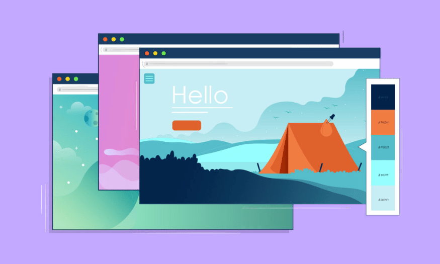
In 2025, the web design industry is witnessing a strong transformation with new and unique color trends. The combination of technology, color psychology and market demand has created diverse color palettes, from bright tones to muted shades, all of which bring a more vibrant and attractive online space. Designers are looking for new ways to express their brands and connect with users, from creating interesting user experiences to effectively conveying messages. In this article, Sadesign will explore with you the hottest website design color trends in 2025, helping you grasp the trends and apply them to your projects.
1. Neutral Color
Neutral colors, with shades like brown, gray, cream, gray, pastel pink and beige, have established themselves in web design. These colors not only easily coordinate with other colors but also bring balance, helping to create a harmonious and elegant look.
Neutral colors have the ability to create a solid foundation for any design project. By using neutral colors, you can easily highlight important elements on your website without overwhelming the viewer. Not just for corporate websites, neutral colors can be applied to many different design styles, from modern to classic. Choosing neutral colors will help you create a sophisticated yet striking online space.
In modern designs, neutral colors are often paired with brighter shades to create an interesting contrast. This not only helps to attract attention but also creates a smooth and pleasant user experience. Colors like light gray combined with bright green can create a fresh and modern space, which is great for youthful and dynamic brands.
.png)
2. Pastel Colors
Pastel color scheme is becoming a popular trend in 2025, with the gentleness and softness it brings. Pastel shades, divided into two main groups: warm pastel tones (avocado green, orange, yellow) and cool pastel tones (pink, mint green, lavender), create a relaxing and pleasant feeling for the viewer.
Pastel colors are not only soothing to the eyes but also easy to combine with other colors, creating attractive and trendy design products. This color scheme is perfect for websites related to fashion, beauty and art, helping to highlight the beauty of the product and create a cozy space. When using pastel colors, you can create soft color blocks, creating a peaceful and pleasant feeling for visitors.
Some brands are increasingly choosing pastel colors to express their sophistication and elegance. Pastel shades not only help highlight products but also create a warm and friendly space, thereby connecting more deeply with customers. Websites that use pastel colors often feel close and approachable, which is important in building a brand and creating trust with consumers.
3. Bright and Bold Color
If you are looking for a way to make your website stand out, the Bright and Bold color scheme is the perfect choice. With bright and bold colors like lime green, fire red, yellow, and teal, these colors not only attract the eye but also create a sense of fun and energy for the viewer. Using these colors in web design helps create a vibrant atmosphere, attracting and keeping visitors on the website longer.
Bright and Bold color schemes not only increase conversion rates but also express a strong brand personality. These colors are often used on websites introducing new products, events or entertainment platforms, where dynamism and appeal are key. When users see bright colors, they feel excited and want to learn more about the product or service you offer.
In addition, combining bright colors together can also create strong visual effects. For example, the combination of yellow and bright green can create a fresh and energetic feeling. This not only makes the website stand out but also creates a strong impression on customers.
.png)
4. Color Simple and Elegant Colors
An eye-catching color scheme that makes a difference for your website is simple and elegant. Although this color trend has a fairly simple structure, when combined with other colors, it brings a unique beauty and is not monotonous. This color scheme stands out with colors such as ash gray, brown, purple red, sea blue, teal and avocado green.
Using simple yet elegant colors in your website design not only creates a comfortable space but also shows professionalism. These colors are often favored in websites related to business, finance and high-end services. A clever combination of tones can create an elegant space while still maintaining the necessary attraction.
Choosing the right colors for your brand and the message you want to convey is important. Simple and elegant colors make it easy for users to recognize your brand and create a lasting impression. Especially in an increasingly competitive market, a well-designed website with elegant colors can help you stand out from the competition.
5. Retro
Retro is a color trend that evokes a classic feel, reminiscent of the 1950s. With low saturation and low brightness, this color scheme creates a nostalgic, old-fashioned feel. Shades of burgundy, turquoise, pale yellow, and earthy brown are often used in retro-style designs, bringing a sense of familiarity and warmth.
While retro colors are charming, their use in web design requires careful consideration. One of the biggest challenges is to avoid a cluttered and overwhelming feel. Therefore, you should pay attention to the number of colors you use. Instead of using too many colors, choose a few dominant colors to highlight important elements on the page.
When it comes to retro color schemes, there are two principles to consider: Analogous and Complementary . The Analogous principle encourages the use of colors that are adjacent to each other on the color wheel, creating harmony and comfort. The Complementary principle, on the other hand, uses opposite colors to create striking contrast, making design elements more dynamic and appealing. Applying both principles flexibly will help you create an online space that is both classic and modern.
6. Inspired by Nature
The Inspired by Nature trend has emerged recently, reflecting the impact of the Covid-19 pandemic and the growing concern about climate change. This trend brings a natural color scheme, with greens, earthy browns and other soft shades. These colors are not only beautiful to look at, but also have a strong social marketing meaning, showing concern for the environment and sustainable living.
A great example of this trend is Body Butters, which combines fresh green and warm brown. These colors create a sense of closeness and connection to nature, which is important in a context where consumers are increasingly aware of health and the environment.
Using the Inspired by Nature color scheme in your website design not only enhances aesthetics but also builds a responsible brand image. When users see colors that are close to nature, they feel more connected and friendly to the brand. This can promote customer loyalty and trust.
.png)
7. Dark Mode
Dark Mode has become a popular feature in many apps and operating systems, and now it’s taking over web design. The transition from light to dark colors not only creates a pleasant user experience, but also helps reduce eye strain caused by blue light emitted from screens.
The Dark Mode trend is becoming more and more popular because this feature not only brings a modern feel but also helps save energy for mobile devices. When designing a website with Dark Mode, you can create a luxurious and mysterious online space, suitable for many users.
However, the use of color in Dark Mode also needs to be carefully considered. Bright and bold colors create strong contrast against a dark background, making key elements easier to recognize. This not only improves the user experience but also increases the ability to interact with elements on the page.
8. Bright and Experimental
Bright and Experimental is a new trend in web design in 2025. This color group includes bright and bold shades that create a sense of fun and excitement. Colors like fuchsia pink, lemon yellow, and neon green not only attract the eye but also stimulate positive emotions in the viewer.
Individuals and businesses that use Bright and Experimental in their website design can easily impress users and keep them on their site for longer. These colors are often combined in bold ways, creating unique and creative visual effects.
Applying this trend not only helps the website stand out from the crowd but also shows the brand’s personality and style. A website that uses playful and creative color tones will easily attract attention, arouse curiosity and encourage users to explore more about the product or service.
9. Metallic
Metallic style has been around since the Renaissance and still holds a strong appeal in fashion design, interior design and especially website design. Metallic colors such as gold, silver and copper not only bring luxury but also show modernity and class.
Metallic design trends focus on creating sparkle and depth in online spaces. Metallic colors are often used to enhance the aesthetics of websites, creating a sense of luxury and attracting attention. When skillfully combined with other colors, metallics can create impressive visual effects, making websites stand out and deeply impressing viewers.
What’s special is that metallic colors are not only suitable for high-end brands but can also be applied to many different fields, from technology to art. Using metallic colors in website design can create an impressive online space, affirming the value and difference of the brand.
.png)
10. Primary
The primary color group, or Primary, is one of the indispensable color systems in website design as well as in daily life. This color system includes basic colors such as blue, red and yellow, which are the foundation for creating countless different shades.
Primary colors are not just the basic colors, but also the combination of other colors to create secondary and tertiary colors. For example, purple, orange, and green are secondary colors, formed by mixing two primary colors. This color trend brings freshness and approachability, creating a sense of fun for users.
Using primary colors in website design not only enhances brand recognition but also attracts attention from users. The Primary color system is very versatile and can be applied to many different fields, from education to entertainment. Websites that use primary colors often bring a friendly and approachable feeling, which is important in building relationships with customers.
11. Yellow and Black
Combining two tones of black and gold, the Yellow and Black trend has become a symbol of luxury and class in design. The strong contrast between the bright yellow and the mysterious black not only attracts the eyes but also creates a sense of power and elegance.
In web design, this color pair is often used to highlight important elements. Not only do they easily attract attention, but they also create a lasting impression on users. This trend is very popular in packaging and advertising design, where it is important to convey a message quickly and effectively.
Yellow and Black also have a classic and timeless feel, making them ideal for brands that want to convey luxury and class. Using these colors in design is not just a color choice but also a strategy to assert brand identity.
12. Minimalist
Finally, there is the Minimalist trend, a design style that stands out for its simplicity and sophistication. Minimalism is not only about minimizing colors but also about minimizing all design elements to create a natural and relaxing space for users.
This trend often uses light colors such as white, gray, beige and pastel tones, creating a comfortable and pleasant feeling. Minimalist design encourages focus on content and user experience, making it easy for them to find the information they need without distraction.
Minimalist color schemes are becoming increasingly popular in fields like technology, fashion, and art. Websites that use this style often have a modern and elegant feel, which is great for brands that want to show sophistication and creativity.
.png)
13. Conclusion
The 2025 web design color trends reflect not only the evolution of technology but also the change in the way consumers interact with brands. Choosing the right color not only enhances aesthetics but also creates a strong connection with users. By applying these trends, designers can create websites that are not only beautiful but also emotional and meaningful. Get ready to embrace and experiment with new color palettes and turn your creative ideas into reality in 2025!


VIP Products


Best Selling Products
MidJourney Account
29 USD
Autodesk All App Account Copyright
120 USD
Copyright Adobe Lightroom Account
59 USD
ChatGPT Plus Account (GPT-4)
16 USD
Genuine Adobe Illustrator account
99 USD
Adobe Premiere Pro Account
99 USD
Adobe Photoshop Copyright - Full App
120 USD
Upgrade Genuine Office 365
49 USD
Upgrade Duolingo Super
29 USD
Genuine Cheap Canva Pro
39 USD
Upgrade genuine Capture One account
120 USD
Capcut Pro 1 Year
39 USD
Freepik Premium Account
59 USD
Plugin Retouch4me
69 USD
Windows 10 & 11 Pro Key
36 USD