Best Selling Products

Genuine Adobe Illustrator account
99 USD

Adobe Photoshop Copyright - Full App
120 USD

Adobe Premiere Pro Account
99 USD

Plugin Retouch4me
69 USD

MidJourney Account
29 USD

Freepik Premium Account
59 USD

Upgrade Genuine Office 365
49 USD

Genuine Cheap Canva Pro
39 USD

Autodesk All App Account Copyright
120 USD

Copyright Adobe Lightroom Account
59 USD

Upgrade Duolingo Super
29 USD

ChatGPT Plus Account (GPT-4)
16 USD

Upgrade genuine Capture One account
120 USD

Capcut Pro 1 Year
39 USD

Windows 10 & 11 Pro Key
36 USD
12 Visually Captivating Color Design Trends for 2026
Nội dung
- 1. Transformative Teal – Transforming Blue
- 2. Universal Khaki – Be khaki for versatility
- 3. Sunset Coral
- 4. Healing Lavender – Purple Lavender for Healing
- 5. Earthbound Clay – Natural fired clay
- 6. Arctic Mist
- 7. Cosmic Indigo
- 8. Botanical Green
- 9. Retro Tangerine – Nostalgic Orange
- 10. Soft Graphite – Soft Charcoal Gray
- 11. Ocean Depth – Deep Ocean Blue
- 12. Digital Fuchsia
The year 2026 marks a significant shift in the color palette of modern design.
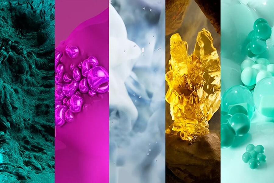
Entering 2026, color design will no longer revolve around shocking colors or purely visual effects. Instead, the new color trends carry more layers of meaning, linked to the need for mental healing, a balance between technology and nature, and the desire to build a sustainable personal and brand identity. This is a phase where color is not just for "looking," but for "feeling" and "connecting."
Designers worldwide are witnessing a clear shift: from cold, digital color palettes to emotionally rich tones, from minimalist color schemes to storytelling color combinations. 2026 will be the year when color becomes a strategic tool, enabling brands to communicate more subtly with consumers in an increasingly information-overloaded world. This article will analyze 12 prominent color design trends for 2026 , going beyond simply describing colors to delve into their meaning, context, and practical application in graphic design, branding, UI/UX, and visual communication.
Buy Genuine Licensed Software at Affordable Prices
1. Transformative Teal – Transforming Blue
Transformative Teal is a shade of blue that lies between blue and green, embodying a sense of movement and adaptability. It represents flexibility in a constantly changing world, where people must learn to balance stability and innovation.
.jpg)
In 2026, Transformative Teal was favored for its high adaptability in various design contexts. Standing alone, it conveyed a sense of reliability, intelligence, and professionalism. When combined with light or neutral tones, transformative blue represented modernity, technology, and a forward-looking perspective.
This trend clearly reflects the societal mindset following numerous global upheavals. Consumers seek sustainable yet flexible values, and Transformative Teal is a symbol of that balance. In brand design, this color often appears in the technology, education, healthcare, and digital finance sectors.
2. Universal Khaki – Be khaki for versatility
Universal Khaki is a neutral color with a natural feel, combining beige, light brown, and a touch of olive green. It represents durability, stability, and the ability to integrate into various design ecosystems.
.jpg)
2026 sees the strong rise of "understated" colors, and Universal Khaki is the perfect choice for brands pursuing a minimalist, sustainable, and humane style. This color easily serves as a backdrop, highlighting other main colors without creating visual conflict.
In graphic design and UI/UX, Universal Khaki provides a pleasant feel, reduces visual strain, and creates a more user-friendly experience. This is why this color is predicted to appear more frequently in technology products aimed at mental health and a slower-paced lifestyle.
3. Sunset Coral
Sunset Coral is a pinkish-orange shade inspired by the colors of the sunset, conveying warm, optimistic feelings without being overly bright. It represents emotional connection and moments of human connection.
After years of color trends leaning towards cool and neutral tones, 2026 marks the return of warm, deep hues. Sunset Coral isn't as intensely stimulating as pure orange; instead, it's gentler and more subtle, fitting the trend of design focused on emotions.
.jpg)
In branding and communications, sunset coral orange helps brands appear approachable, friendly, and full of positive energy. In particular, this color is predicted to appear frequently in fields related to community, education, healthcare, and lifestyle.
4. Healing Lavender – Purple Lavender for Healing
Healing Lavender is a soft, gentle, and relaxing shade of light purple. It's a color associated with the concept of mental healing, a major trend in design and media in recent years.
.jpg)
In 2026, Healing Lavender will no longer be limited to cosmetics or spas, but will spread to digital design, healthcare applications, and even technology brands. This color helps reduce stress and create a safe and comfortable environment for users.
In graphic design, healing lavender purple is often used to balance strong elements such as bold typography or complex layouts. It provides emotional depth without the somber feel of traditional purple shades.
5. Earthbound Clay – Natural fired clay
Earthbound Clay is a color palette inspired by terracotta, ceramics, and traditional handcrafted materials. It's a color associated with the trend of returning to nature, celebrating the value of craftsmanship and local identity.
.jpg)
In 2026, Earthbound Clay became a popular choice for brands pursuing sustainability and origin stories. This color palette evokes a warm, authentic, and intimate feeling, giving designs cultural depth.
For designers, Earthbound Clay is the ideal color to tell stories about people, the environment, and enduring values. When combined with paper, natural textures, or rustic typography, the impact of this message becomes even more pronounced.
6. Arctic Mist
Arctic Mist is a pale bluish-gray color, reminiscent of fog, ice, and the Arctic. It represents purity, minimalism, and tranquility.
.jpg)
This trend reflects the need for "noise reduction" in design, as users are increasingly tired of too many colors and information. Arctic Mist provides a light and airy feel, making the design feel more spacious and breathable.
In UI/UX, this color scheme is particularly suitable as a background for applications that require high concentration, such as reading, studying, or working. It helps users maintain alertness without causing visual strain.
7. Cosmic Indigo
Cosmic Indigo is a deep indigo shade, imbued with a mysterious and spatial depth. This color draws inspiration from the universe, high technology, and concepts that transcend familiar boundaries.
.jpg)
In 2026, Cosmic Indigo represents the aspiration for exploration, creativity, and innovation. This color is chosen by many technology, AI, and startup brands to express their long-term vision and distinctiveness.
In graphic design, Cosmic Indigo is often used to create a sense of sophistication, intelligence, and mystery. When combined with gradient lighting or color transition effects, this shade of indigo creates a powerful yet understated visual experience.
8. Botanical Green
Botanical Green is a vibrant yet subdued shade of green, inspired by lush flora and vibrant nature. It's a color associated with green living, sustainability, and environmental responsibility.
.jpg)
In 2026, Botanical Green will no longer be just a symbolic color, but will become the common language of many brands. This color helps create a feeling of trust, health, and balance.
In design, greenery is often used to build a sense of connection with nature, even in digital environments. This is evidence of the trend toward "naturalizing" the digital experience.
9. Retro Tangerine – Nostalgic Orange
Retro Tangerine is a deep orange shade with a vintage feel, reminiscent of designs from the 70s and 80s. This color represents nostalgia, warmth, and strong personality.
.jpg)
The return of Retro Tangerine in 2026 reflects the need for a sense of familiarity and security in a volatile world. This color palette helps designs stand out, be rich in identity, and highly personal.
This is an ideal choice for creative, artistic, and fashion brands, where color is not only used to convey information but also to express personality.
10. Soft Graphite – Soft Charcoal Gray
Soft Graphite is a deep gray that isn't too heavy, giving a sophisticated, modern, and professional feel. It's the perfect alternative to traditional black in many designs in 2026.
.jpg)
The soft charcoal gray color scheme helps the design maintain a strong yet friendly and approachable feel. In UI/UX, it reduces harsh contrast, creating a more comfortable user experience.
11. Ocean Depth – Deep Ocean Blue
Ocean Depth is a deep blue shade inspired by the ocean floor, conveying feelings of depth, stability, and strength. It's a color associated with emotional depth and resilience.
.jpg)
In 2026, Ocean Depth was widely used in strategic, high-end, and long-term design concepts. This color palette helped brands convey trust and intrinsic depth.
12. Digital Fuchsia
Digital Fuchsia is a vibrant shade of pink, embodying the spirit of digital technology and creative culture. It represents boldness, unconventionality, and strong personality.
.png)
In the context of 2026 design, Digital Fuchsia emerges as a rebellious accent amidst muted and natural color palettes. It is often used to create focal points, draw attention, and express a pioneering spirit.
2026 marks a mature phase in color design, where trends no longer chase fleeting glamour but focus on emotional depth, brand identity, and user experience. Each color on this list is not just an aesthetic choice, but a result of contemporary social context, technology, and human psychology.


VIP Products


Best Selling Products
Genuine Adobe Illustrator account
99 USD
Adobe Photoshop Copyright - Full App
120 USD
Adobe Premiere Pro Account
99 USD
Plugin Retouch4me
69 USD
MidJourney Account
29 USD
Freepik Premium Account
59 USD
Upgrade Genuine Office 365
49 USD
Genuine Cheap Canva Pro
39 USD
Autodesk All App Account Copyright
120 USD
Copyright Adobe Lightroom Account
59 USD
Upgrade Duolingo Super
29 USD
ChatGPT Plus Account (GPT-4)
16 USD
Upgrade genuine Capture One account
120 USD
Capcut Pro 1 Year
39 USD
Windows 10 & 11 Pro Key
36 USD