Best Selling Products

Genuine Cheap Canva Pro
39 USD

Genuine Adobe Illustrator account
99 USD

Copyright Adobe Lightroom Account
59 USD

Upgrade genuine Capture One account
120 USD

Windows 10 & 11 Pro Key
36 USD

ChatGPT Plus Account (GPT-4)
16 USD

Adobe Photoshop Copyright - Full App
120 USD

Adobe Premiere Pro Account
99 USD

Freepik Premium Account
59 USD

Autodesk All App Account Copyright
120 USD

Capcut Pro 1 Year
39 USD

Plugin Retouch4me
69 USD

Upgrade Genuine Office 365
49 USD

Upgrade Duolingo Super
29 USD

MidJourney Account
29 USD
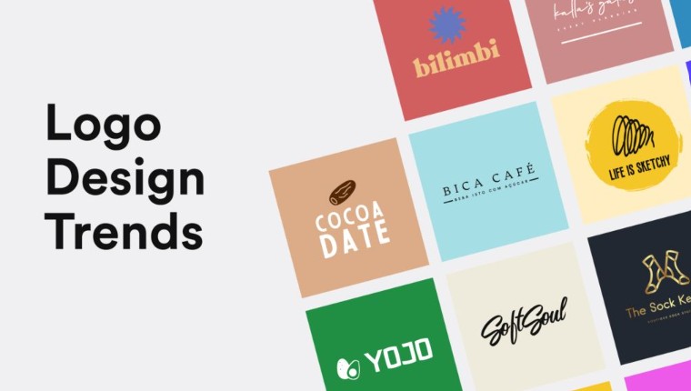
13 Elements of a Perfect Logo
Nội dung
- 1. The Importance of Research in Logo Design
- 2. Principles of logo design
- 2.1. Must have communication skills
- 2.2. Relevance
- 2.3. Make a memorable impression
- 2.4. Timeless
- 2.5. The logo should not have unnecessary details.
- 2.6. A logo needs to be flexible
- 2.7. Need to be carefully completed
- 2.8. Color harmony
- 2.9. Shape accuracy
- 2.10. Typography Style
- 2.11. Black and white
- 2.12. Basic elements of Vector source files
- 2.13. Formability
Whether you're a new designer or a creative expert, these 13 principles will guide you to creating professional and functional logos.
In the world of design, a logo is one of the fundamental elements that shape a brand’s identity. It is not just a representative image, but also a “graphic language” that helps a business communicate with the world. A successful logo must combine art, strategy and psychology, three elements that create a symbol that lasts forever. If a brand identity is likened to a business’s “clothes”, then the logo is the “face” of that brand.
Logo design is a job that requires a delicate combination of art and strategy. A beautiful logo not only makes people interested but also helps the brand make a strong impression, build trust and maintain sustainable recognition. Therefore, mastering and adhering to the basic principles of logo design is something that cannot be overlooked. Below, we will delve into 13 important principles, a guideline for every designer when starting the journey to create a lasting brand symbol.
1. The Importance of Research in Logo Design
Before any lines are drawn, research is the first step. Research not only helps the designer understand the brand, but also helps them shape the emotion, message, and position they want to convey. Every brand has its own story, its own “personality,” and its own “voice.” Understanding these elements is key to creating a logo that truly reflects the brand.
When researching, designers need to understand three key aspects: brand identity, target audience, and competitive landscape. For example, when designing a logo for a tech startup, studying minimalist design trends and observing how brands like Google, Microsoft, and IBM demonstrate flexibility in their identity systems will help you make the right design decisions. Similarly, when working with a luxury fashion brand, you need to understand the luxury, exclusivity, and personalization that customers expect.
Research also helps the logo avoid duplication or “accidentally” resembling competitors. There are millions of logos in the market today, so understanding the competitive landscape will help you create subtle differences while still ensuring relevance. A successful logo cannot just be beautiful, it must be “right”: right for the brand, right for the customer, and right for the times.
2. Principles of logo design
2.1. Must have communication skills
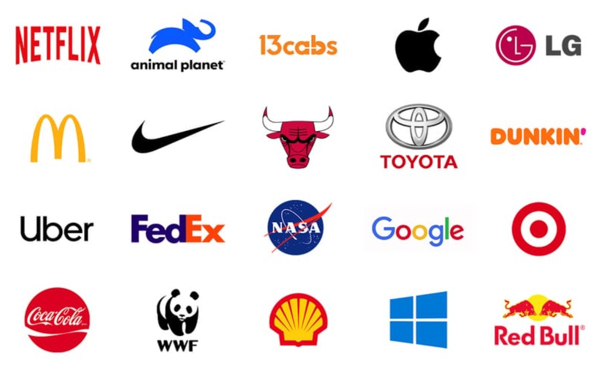
A logo is a visual communication tool. Every line, every color, every shape has its own meaning. A good logo can “speak” for the brand without any text. For example, the Nike logo with just the “swoosh” symbol, the viewer immediately feels the spirit of movement, speed and energy. That is the power of visual language.
In design psychology, circles often evoke feelings of friendliness and solidarity; while squares symbolize stability and reliability. Color is also an extremely powerful communication element: blue represents trust, red evokes intense emotions, yellow brings optimism. The Rolex logo with its golden crown perfectly represents the brand's luxury and power. When designing, always ask the question: "What is this logo saying to the viewer?" because if it doesn't convey anything, it is just a meaningless decoration.
2.2. Relevance
A logo should be closely linked to the industry, target audience, and corporate identity. Every industry has its own visual language. A law firm logo will be very different from a children’s game brand logo. One should be serious and professional, while the other should be playful, energetic, and colorful.

FedEx is a classic example. Between the “E” and “x” there is a hidden arrow that represents speed and precision. It’s a small detail but it packs a powerful design punch. The more relevant a logo is to the industry, the more memorable it will be. Cultural considerations also need to be taken into account, especially when the brand operates globally. A symbol or color may have a positive connotation in one country but an offensive one in another.
2.3. Make a memorable impression
A memorable logo is one that is easily remembered. This does not come from complexity, but from simplicity and simplicity of thought. Apple is a living example. The bitten apple is not only simple but also full of metaphors, evoking knowledge (from the story of Adam and Eve's forbidden fruit) and constant innovation.
To create a memorable logo, focus on a single element rather than cramming in too many details. Memorability comes from intentional simplicity. Amazon, with its smile stretching from A to Z, both represents customer satisfaction and product variety.
2.4. Timeless
Design trends change every year, but a good logo should be able to stand the test of time. Coca-Cola is a classic example. Its logo has barely changed since 1886, yet it has remained relevant for over a century. The longevity comes from focusing on the essence, without being tempted by effects, gradients, or extraneous details.

A timeless logo is one that relies on solid geometry and good proportions. The IBM logo, with its horizontal stripes designed by Paul Rand in 1972, is still in use today. It proves that consistency and clarity are timeless values. When designing, always think 10, 20, or 50 years from now: will this logo still be relevant?
2.5. The logo should not have unnecessary details.
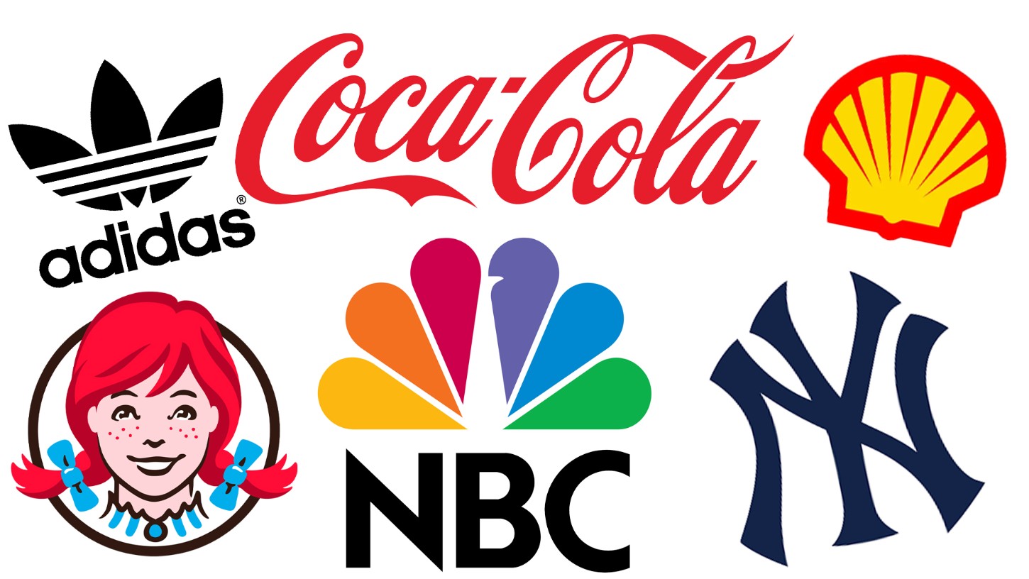
Minimalism does not mean sloppy simplification. Minimalism in logos is the art of removing all unnecessary elements, keeping only the core. Adidas with its three diagonal stripes is a typical example: just enough to be recognized, just enough to be remembered. A detailed logo requires the viewer to “read”, while a good logo requires only “seeing” to understand.
In design practice, ask yourself: “If I remove this detail, will the logo lose its meaning?” If the answer is “no”, then that detail should be removed. It is the moderation that creates class.
2.6. A logo needs to be flexible
The digital age requires logos to work well on everything from billboards to tiny icons on mobile apps. A logo that’s too complex will fall flat when scaled down. Twitter is a perfect example: the little bird is recognizable at any size.
A versatile logo should have multiple versions: full, shortened, monochrome and its own icon. It is also important to test on different materials: paper printing, woodcut, fabric embroidery or LED display. The logo should not only look good, but also “work” effectively in all circumstances.
2.7. Need to be carefully completed
A professional logo cannot have incorrect alignment, spacing, or proportions. Every curve, every space must be calculated. Logo design is a matter of detail and near-perfect precision. The BMW logo exemplifies this: a balanced four-part circular layout, consistent colors, and precise proportions all convey the sophistication and prestige of the German brand.
The finishing process is not just a technical phase, but also a step to fine-tune the visual feel. A softer curve, a more balanced white space, can make the difference between “good” and “great”.
2.8. Color harmony
Color is an emotional language. It can shape how people perceive a brand at first glance. McDonald's chooses red and yellow to evoke feelings of fun, energy, and appetite. Meanwhile, IBM chooses blue to represent trustworthiness, professionalism, and modernity.
A logo with a harmonious color scheme makes the brand easily recognizable in any context. Color psychology is a foundation that designers cannot ignore. When choosing colors, think about the message the brand wants to send. A poorly thought-out combination can make the logo lose its emotional appeal or even be counterproductive.
2.9. Shape accuracy
Proportion is key in any design. A well-balanced logo conveys a sense of comfort and trust. Mercedes-Benz, with its three-pointed star within a circle, is an example of perfect precision in composition. Applying the golden ratio or grid system ensures consistency between elements and brings harmony to the whole.

A very common mistake is to misalign the proportions between the icon and the text, causing the logo to be unbalanced. For professional designers, “finishing the last pixel” is never too much.
2.10. Typography Style
In many cases, the text is the soul of the logo. Choosing and handling typography requires subtle thinking. Fonts are not only readable, but also feelable. Google's logo with a clean and modern Sans-Serif font reflects the spirit of open and friendly technology.
A wrong font can ruin the entire design. Therefore, designers need to understand the relationship between text and symbol. In addition, custom fonts are a way to create exclusivity for the brand. However, don't be too greedy, one or two fonts are enough to maintain consistency and professionalism.
2.11. Black and white
A strong logo should work well in black and white. This is the test of the “core” of the design. If it only looks good in color, it’s not strong enough. Chanel is a perfect example, with its interlocking “Cs” that remain attractive on any background color.
The monochrome version helps the logo maintain its high usability in print, embossing or when displayed in color-limited environments. This is an important test that many young designers often skip.
2.12. Basic elements of Vector source files
A technical but extremely important principle is that the logo must be designed in vector format. Only vectors ensure that the logo can be scaled up or down without losing quality. This is a prerequisite for the logo to be able to be printed on everything from business cards to billboards.
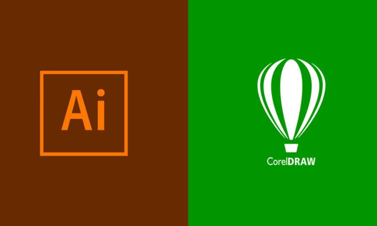
The ideal software for this job is Adobe Illustrator or CorelDRAW. Vector files not only preserve lines but also allow the designer to easily edit, restructure or export to other formats as needed.
2.13. Formability
Ultimately, a logo is not just a symbol, it is the “visual identifier” of a brand. It must be strong enough that when people see it, they immediately recognize the brand without having to read the name. Starbucks with its blue mermaid, Harley-Davidson with its iron shield, and Shell with its golden seashell have all become cultural icons.
A successful logo has the ability to “anchor” an image in the public’s mind. It represents the values, lifestyle and beliefs that the brand brings. That is the ultimate goal of every designer: to create a symbol that is not only beautiful, but also lives forever in the user’s memory.
Logo design is a journey that combines intelligence and emotion, science and art. Each of the 13 principles above is not a set of rules, but a foundation that helps designers gain a deeper understanding of visual language and how brands communicate with the world. A good logo not only helps identify but also evokes emotions, builds trust and becomes a symbol that lasts through time.


VIP Products


Best Selling Products
Genuine Cheap Canva Pro
39 USD
Genuine Adobe Illustrator account
99 USD
Copyright Adobe Lightroom Account
59 USD
Upgrade genuine Capture One account
120 USD
Windows 10 & 11 Pro Key
36 USD
ChatGPT Plus Account (GPT-4)
16 USD
Adobe Photoshop Copyright - Full App
120 USD
Adobe Premiere Pro Account
99 USD
Freepik Premium Account
59 USD
Autodesk All App Account Copyright
120 USD
Capcut Pro 1 Year
39 USD
Plugin Retouch4me
69 USD
Upgrade Genuine Office 365
49 USD
Upgrade Duolingo Super
29 USD
MidJourney Account
29 USD