Best Selling Products
6 basic rules about color combinations for design beginners
Nội dung
- 1. Learn the concept of color coordination principles in design
- 2. Summary of 6 color matching rules in design
- 2.1. Monochromatic Color Scheme
- 2.2. Analogous Color Scheme
- 2.3. Complementary Color Scheme
- 2.4. Triadic Color Scheme
- 2.5. Split-Complementary Color Scheme
- 2.6. Tetradic Color Scheme
- 3. Practical Applications Through Color Combinations
Summary of 6 basic color mixing rules for new designers. Sadesign shares specifically in the article content.
Color is more than just choosing colors, it’s the art of conveying emotion and meaning through images. If you’re a beginner, understanding the basics will help you create visually appealing products. Here’s a look at the basic principles of color and how to apply them.
1. Learn the concept of color coordination principles in design
The principle of color coordination in design is an important factor to ensure aesthetics and harmony in the product. Some basic principles include using the color wheel to determine the relationships between colors. Specifically: Contrasting color scheme, complementary color scheme, or analogous color scheme.
In addition, it is necessary to pay attention to the ratio of color use to create highlights and visual balance. Usually, the 60-30-10 rule will be applied (60% main color, 30% secondary color and 10% accent color). In particular, the choice of color must be consistent with the design purpose, target audience and the emotion to be conveyed. The harmonious combination of these elements will contribute to creating a professional and impressive design.
2. Summary of 6 color matching rules in design
Statistics of 6 specific color matching rules in design are summarized below:
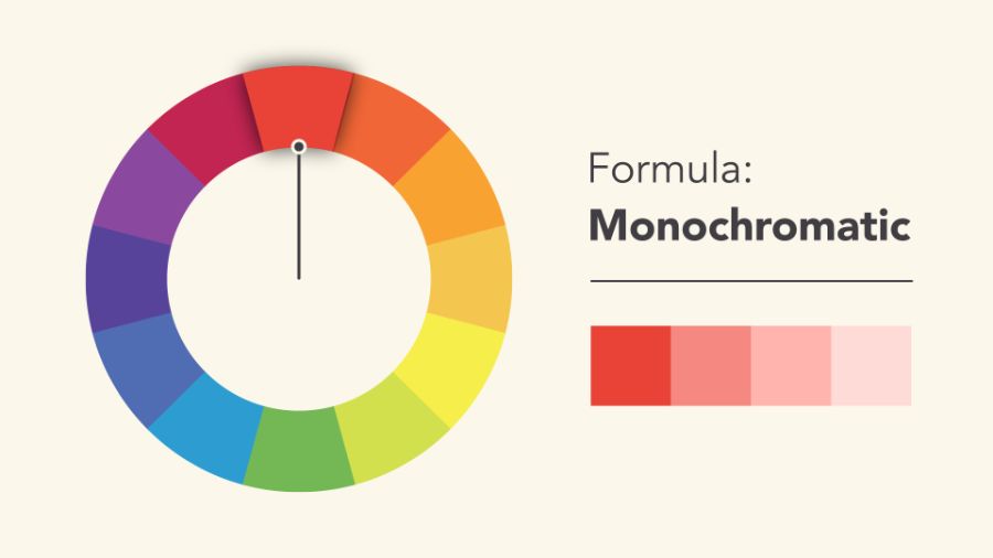
2.1. Monochromatic Color Scheme
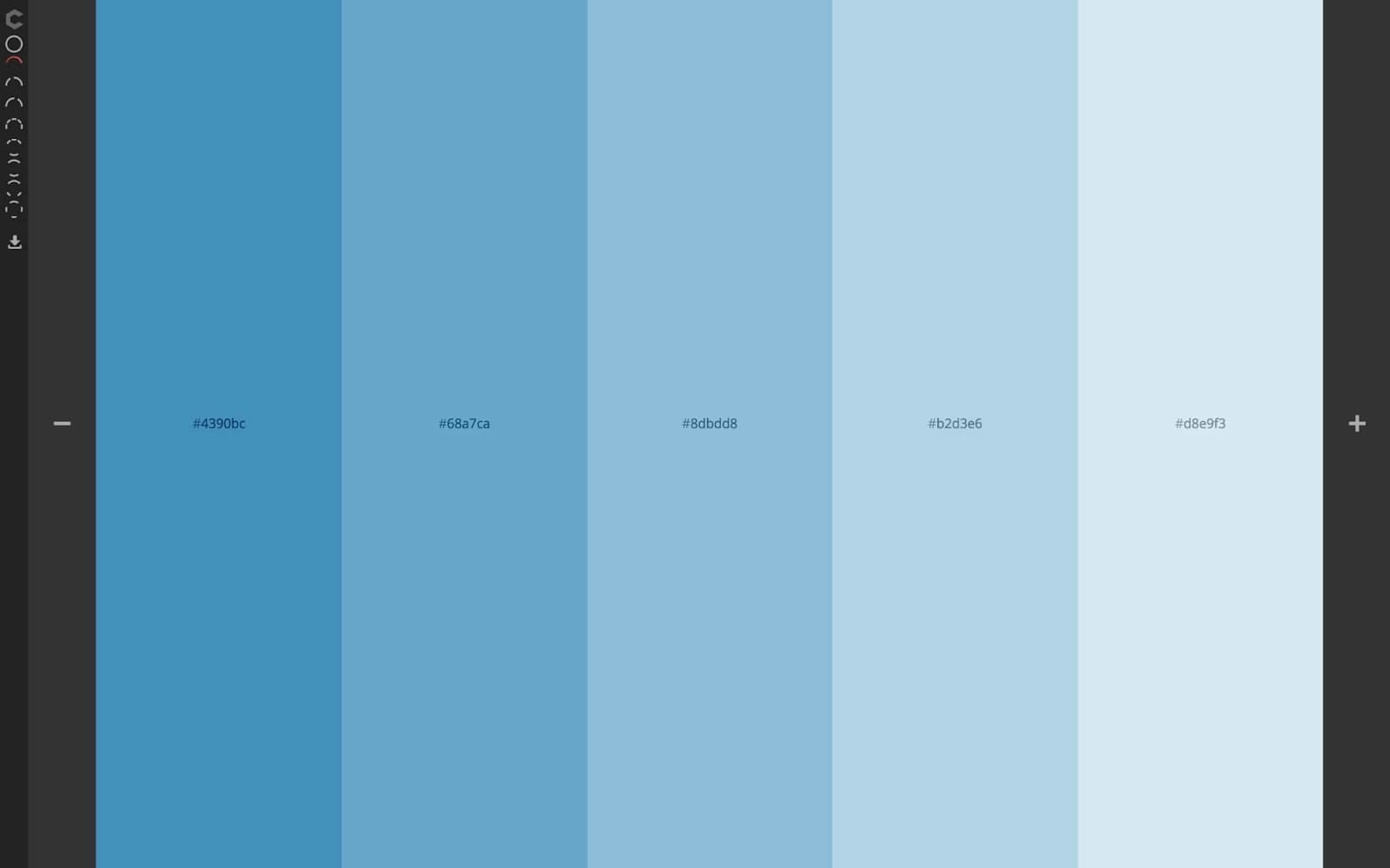
Monochromatic color schemes use different shades of the same color. This creates a unified and elegant look, suitable for minimalist designs. By simply changing the brightness or saturation, you can create a difference without losing the uniformity. Monochromatic color schemes are a color scheme based on using different shades of the same primary color.
This method creates harmony and uniformity in the design, while also giving it a sophisticated and professional feel. By adjusting the brightness, darkness, or saturation of the base color, the designer can create a diverse color palette while maintaining a strong connection. Monochromatic color schemes are often used in interior design, fashion, graphics, and many other fields.
Especially when the goal is to create a space or product that is elegant and minimalist. However, to avoid monotony, it is necessary to incorporate elements such as texture, shape or light to add vitality to the overall look.
2.2. Analogous Color Scheme
Analogous color schemes use colors that are close together on the color wheel. Typically, you choose a dominant color, a secondary color to highlight the content, and an accent color. This style creates a calming and harmonious look, which is great for relaxing or natural designs.
Analogous color scheme is one of the most popular and effective color schemes in design. It brings harmony and a pleasant feeling to the viewer. This method uses colors that are close to each other on the color wheel.
Usually consists of a dominant color combined with two or three adjacent colors. This creates a uniform color palette, suitable for conveying gentle, delicate and natural emotions. In the application process, considering the ratio and level of lightness and darkness between colors is an important factor to ensure balance and aesthetics in the design.
Analogous color schemes are often used in fields such as: Interior design, graphics, fashion and visual arts, helping to create creative and professional products.
2.3. Complementary Color Scheme
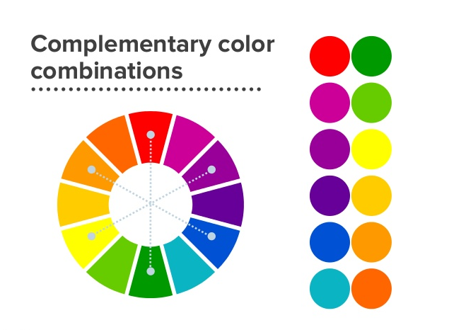
Direct complementary color schemes combine colors that are directly opposite each other on the color wheel. This creates a strong contrast and is often used to highlight important details. However, you need to be careful with the hues to avoid losing visual balance.
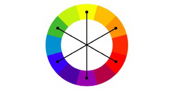
This is one of the basic and effective principles in design. It is widely used to create balance and visual emphasis. This principle is based on combining two colors that are opposite each other on the color wheel. Such as red and green, blue and orange, or yellow and purple. The strong contrast between direct complementary colors helps to highlight each element in the design. At the same time, it brings a sense of harmony and attracts the viewer.
However, to achieve optimal results, the use of this color scheme needs to be carefully considered in terms of proportion and context. This avoids creating a feeling of being too bright or unbalanced. Direct complementary color schemes not only show creativity but are also powerful tools to convey messages and create deep impressions in design products.
2.4. Triadic Color Scheme
Triadic color schemes use three colors that are evenly spaced on the color wheel, forming an equilateral triangle. This is a safe approach that maintains balance but can lack excitement. Choose one color as the dominant color and adjust the other two to create accents.
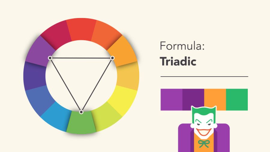
Triadic color scheme is an important principle in design, bringing balance and harmony to visual products. This method uses three colors that are evenly spaced on the color wheel, creating a rich color palette that is still aesthetically pleasing and pleasing.
When applying the triadic complementary color scheme, it is important to choose one color as the main color. The other two colors will play a supporting role to avoid confusing the viewer. This is a technique commonly used in graphic, fashion and interior design. It helps create impressive and professional products.
2.5. Split-Complementary Color Scheme
Complementary color schemes take a primary color and its two adjacent complementary colors. This maintains contrast but is more controlled than direct complementary color schemes. It is suitable for complex designs that require subtlety.
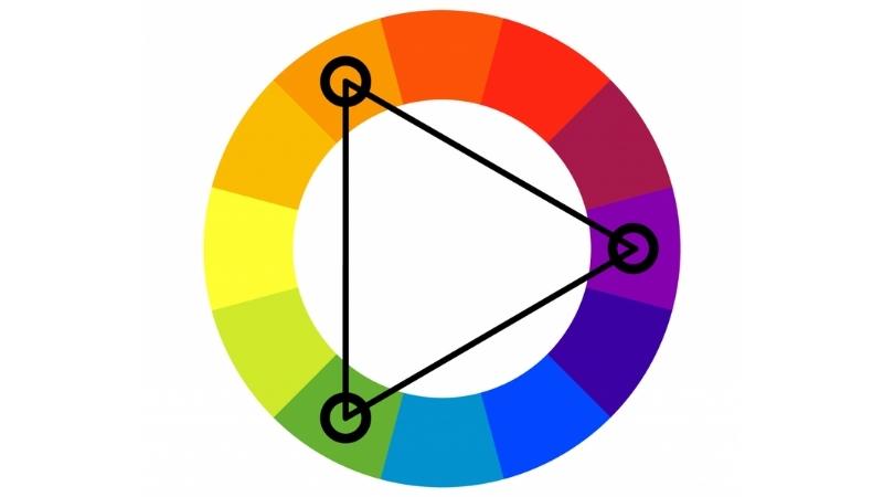
Split-Complementary color scheme is an effective color scheme in design. It provides a balance between harmony and contrast. This method is based on choosing a main color and two complementary colors located on opposite sides of the color wheel. This combination creates a diverse color palette, making the design lively but still maintaining a sense of sophistication.
To apply it successfully, designers need to pay attention to the proportion of colors used. This is to ensure that the main color dominates while the two complementary colors play a supporting role. This technique is often used in fields such as graphic design, interior design and fashion, bringing a high aesthetic feeling and attracting the viewer.
2.6. Tetradic Color Scheme
The rectangular color scheme uses four colors in two complementary pairs. It takes a lot of skill to maintain harmony, but if done correctly, you will have a rich and attractive color palette.
.png)
The tetradic color scheme is one of the more complex color schemes but brings high aesthetic efficiency in design. This method uses four colors chosen from the four corners of a rectangle on the color wheel. It creates balance and diversity in the color palette. To achieve harmony, it is important to consider the proportion of each color used. Usually, one or two main colors will be prioritized and the remaining colors will be used as accents. This color scheme is suitable for design projects that need to be prominent and vivid but still maintain professionalism and balance.
3. Practical Applications Through Color Combinations
The practical application of color schemes in design plays an important role in creating harmony and visual appeal. Choosing the right color not only helps to convey the message effectively. At the same time, it also shows the style and personality of the product or brand.
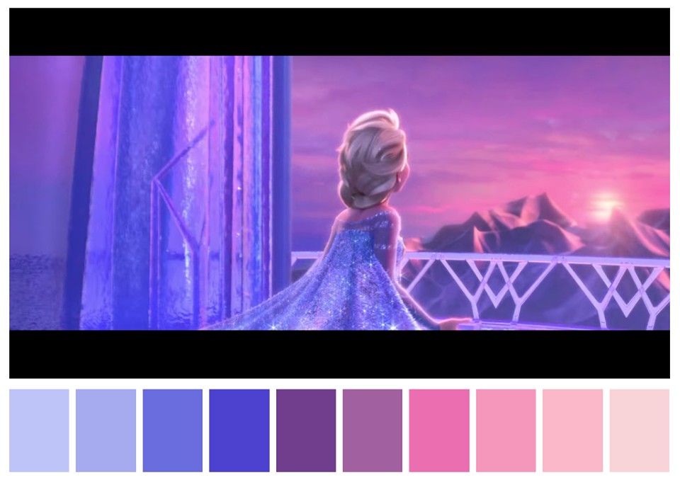
In design, color matching principles such as using the color wheel, balancing warm and cool colors, or applying the contrast rule all need to be carefully studied to ensure aesthetics and functionality. In addition, understanding color psychology also helps designers create products that can connect emotionally with users. Therefore, color matching is not only a decorative element but also a strategic tool in professional design.
The principles of color coordination are not only for graphic design. They are also widely applied in fashion, interior design and media. For example, Son Tung MTP's music videos often use contrasting color schemes to create highlights. Meanwhile, Disney's "Frozen" uses a blue and purple color palette to convey a cold but enchanting feeling.
Conclusion
Whether you are designing a logo, a media product or building a brand, the right color scheme will help you convey your message more effectively. Take the time to practice and explore the color wheel to create unique color palettes. Don't forget to learn from the experiences that Sadesign shares in the article to practice effectively.


