Best Selling Products

Capcut Pro 1 Year
39 USD

Adobe Photoshop Copyright - Full App
120 USD

Upgrade Duolingo Super
29 USD

MidJourney Account
29 USD

Upgrade genuine Capture One account
120 USD

Plugin Retouch4me
69 USD

Autodesk All App Account Copyright
120 USD

ChatGPT Plus Account (GPT-4)
16 USD

Genuine Cheap Canva Pro
39 USD

Upgrade Genuine Office 365
49 USD

Adobe Premiere Pro Account
99 USD

Copyright Adobe Lightroom Account
59 USD

Freepik Premium Account
59 USD

Windows 10 & 11 Pro Key
36 USD

Genuine Adobe Illustrator account
99 USD
6 Tips to Utilize Background Images in Design: Increase Aesthetics, Make an Impression
Nội dung
- 1.Introducing Background Images in Design: Increasing Aesthetics, Making an Impression
- 2. Use Blurred Background
- 3. Choose Images That Match the Overall Color
- 4. Use Simple, Not Too Detailed Images
- 5. Create Texture From Image (Texture Overlay)
- 6. Use Background Images to Tell a Story
- 7. Create Gradient Backgrounds
- 8. Conclusion
Learn 6 ways to use images as backgrounds in design to optimize aesthetics and create a strong impression. Read the article now to apply to your design projects.
1.Introducing Background Images in Design: Increasing Aesthetics, Making an Impression
Background images play an important role in graphic design, creating harmony between visual elements and content. A good background image not only brings high aesthetics but also contributes to improving the user experience, making your message clearer and more impressive.
.jpg)
Choosing the right background image not only helps highlight the main content but also contributes to effectively conveying the message. A design with a harmonious and balanced background image will create a professional feel, attract attention and evoke positive emotions from viewers. Therefore, designers need to carefully consider the color, layout and style of the background image to ensure consistency and enhance the visual value of the design product.
Whether you are designing a website, poster, banner or other media, using images as a background properly will help create an attractive work of art and easily attract the attention of viewers. In this article, we will share 6 ways to use images as backgrounds in design to optimize aesthetic effects and convey a clear message.
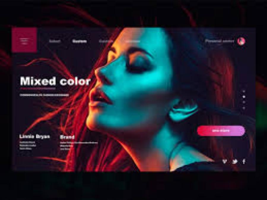
2. Use Blurred Background
One of the simplest yet effective ways to use an image as a background is to apply a blur effect to the background image. By blurring out the details in the image, you help reduce distractions and highlight the main content of the design. Not only does a blurred image make other elements like text or logos easier to see, it also gives a professional and modern feel.
.jpg)
When applying a blur effect, be sure to choose images that have high contrast with the elements on the interface, helping them stand out without blending into the background.
Benefit:
Reduce distractions, helping viewers focus on the main content.
Gives a deep and modern feel to the design.
Using a blurred background is a popular design technique in fields such as graphics, photography, and user interfaces. This technique not only helps to highlight the main content but also brings a sense of harmony and high aesthetics to the overall design.
When applied correctly, a blurred background can reduce visual distractions, helping viewers focus more on the main message or important elements in the layout. However, for optimal effect, attention must be paid to the appropriate level of blur, ensuring that the background image remains relevant to the overall content without losing the professionalism and clarity of the design.
3. Choose Images That Match the Overall Color
An important factor when using images as a background is color harmony. You should choose images that have a color tone that matches the main colors in your design. This helps create a visual connection, making the design look more elegant and pleasing to the eye.
For example, if your design uses cool colors like blue, gray, or white, choose a background image that is similar in tone, or at least does not clash with the main color. Conversely, if your design uses warm colors like red, orange, or yellow, you also need to choose a background image that matches to create balance.
.jpg)
Benefit:
Create harmony in the overall design.
Helps graphic elements and text stand out easily without clashing with the background.
Choosing images that match the overall color scheme plays an important role in creating visual harmony and impact. To achieve high efficiency, it is necessary to carefully consider factors such as the main color palette, consistency with the content conveyed and the emotions that the image brings. Reasonable color coordination not only helps to enhance aesthetics but also contributes to highlighting the message, ensuring professionalism and attracting attention from viewers.
4. Use Simple, Not Too Detailed Images
When using images as a background, sometimes too many details will make the design confusing and difficult to see. Therefore, choose simple images, not too complicated, so as not to lose the viewer's focus on the main content.
Simple images like nature scenes, skies, streets, or subtle patterns are ideal. The simpler the image, the more elegant it will be without distracting from other important elements like headlines, text, or buttons.
Benefit:
Create simplicity, easy to see.
Avoid distractions, keep focus on important content.
Using simple, uncluttered images is an important element in effectively conveying a message. These images help viewers focus on the main content, avoiding distractions or losing necessary attention. At the same time, they also contribute to creating professionalism and sophistication in the presentation, especially in areas such as graphic design, presentations or advertising.
5. Create Texture From Image (Texture Overlay)
One of the popular trends in design is using textured images to create depth and richness in the background. Textures can be wood grain, concrete, paper, fabric, or any surface that you think will add interest to the background.
.jpg)
Texture adds visual interest and life to a background without adding too much detail. By combining texture with a background image, you create a design space with depth while maintaining a minimalist look.
Benefit:
Adds life and depth to your design.
Keep the design simple but not too cluttered.
Texture overlay is a popular technique in graphic design and photo editing that adds depth and complexity to your work. The process typically involves applying a textured image layer over the original image, then adjusting parameters such as opacity and blending mode to achieve the desired effect.
Using Texture Overlay not only improves the aesthetics but also gives a more realistic and professional feel to the final product. However, to achieve the best effect, the practitioner needs to choose a texture that fits the theme and ensures that the elements in the image remain harmonious and do not lose the necessary clarity.
6. Use Background Images to Tell a Story
Using background images to tell a story is a creative and effective way to convey a message. Background images are not just an aesthetic element, but can also be used to tell the story of a brand or product. You can choose images that represent the message you want to convey, helping viewers feel the connection between the image and the content.
.jpg)
For example, if you are designing a website selling travel products, the background image could be a beautiful seascape or a romantic vacation. This will not only help attract attention but also stimulate the viewer's emotions, creating an inspiring experience.
Benefit:
Provide a visual, accessible story.
Connect viewers emotionally with the brand.
Background images are not only decorative, but also help create context, emotion, and deeper meaning for the content being presented. When carefully chosen and appropriate, background images can highlight key ideas, attract viewers’ attention, and help them connect with the story. For maximum effectiveness, consider color, layout, and compatibility with the content to ensure harmony and professionalism in every detail.
7. Create Gradient Backgrounds
Using gradients as a background is a great way to create a smooth, modern color transition. With gradients, you can blend colors from light to dark, from warm to cool, creating a smooth transition without making the viewer feel overwhelmed.
Gradients can be used in designs such as websites, banners, advertisements and many other forms. When using this effect, you can choose colors with soft contrasting tones or combine colors of the same group, creating an open and pleasant space.
Benefit:
Create depth and movement to the background.
Brings a modern, luxurious look to the design.
Cheap Canva Pro Upgrade
8. Conclusion
Using images as a background in your designs not only creates an aesthetic space, but also enhances the user experience and increases the effectiveness of your message. By applying methods such as blurring images, using harmonious colors, creating textures from images, or telling stories through images, you can optimize each design in a unique and impressive way.


VIP Products


Best Selling Products
Capcut Pro 1 Year
39 USD
Adobe Photoshop Copyright - Full App
120 USD
Upgrade Duolingo Super
29 USD
MidJourney Account
29 USD
Upgrade genuine Capture One account
120 USD
Plugin Retouch4me
69 USD
Autodesk All App Account Copyright
120 USD
ChatGPT Plus Account (GPT-4)
16 USD
Genuine Cheap Canva Pro
39 USD
Upgrade Genuine Office 365
49 USD
Adobe Premiere Pro Account
99 USD
Copyright Adobe Lightroom Account
59 USD
Freepik Premium Account
59 USD
Windows 10 & 11 Pro Key
36 USD
Genuine Adobe Illustrator account
99 USD