Best Selling Products

Genuine Adobe Illustrator account
99 USD

MidJourney Account
29 USD

Genuine Cheap Canva Pro
39 USD

Upgrade Duolingo Super
29 USD

Capcut Pro 1 Year
39 USD

Autodesk All App Account Copyright
120 USD

Upgrade Genuine Office 365
49 USD

ChatGPT Plus Account (GPT-4)
16 USD

Adobe Premiere Pro Account
99 USD

Freepik Premium Account
59 USD

Adobe Photoshop Copyright - Full App
120 USD

Copyright Adobe Lightroom Account
59 USD

Plugin Retouch4me
69 USD

Windows 10 & 11 Pro Key
36 USD

Upgrade genuine Capture One account
120 USD
6 "Traps" Newbie Designers Easily Fall Into When Editing Photos
Nội dung
Discover common photo editing mistakes and effective fixes to keep your designs shining.

New designers or those who are just starting out will easily make basic mistakes, unintentionally reducing the value of the design product. And don’t worry, even experienced designers sometimes rely on old habits and neglect, making very simple mistakes. The important thing is that we always learn and improve so that our products become more and more impressive every day!
1. Why is photo editing important?
Images are the “face” of your brand. A quality photo not only attracts customers’ attention but also conveys the message and value you want to share. However, if you edit photos incorrectly, your design can become messy, unprofessional and negatively affect your brand image. Therefore, it is extremely necessary to understand the mistakes when editing photos and how to fix them.
2. Common mistakes when editing photos
Mistake #1: Using the wrong color scheme in design
If you study and care about design, you must have heard the color terms RGB and CMYK. These are two popular color systems in design, allowing designers to create products with good color quality. However, not all new designers know how to use these two color systems correctly. This leads to fatal color mistakes when the design is finished. For example, the final product has a completely different color than the design in the picture.
.png)
Mistake #2: Ignoring the original image resolution and quality
Not everyone pays attention to the resolution of their photos before they start editing. Using low resolution photos will result in blurry, pixelated images and a poor quality photo will drag down the quality of your design, making it look unprofessional.
.jpg)
Mistake #3: Unscientific color coordination
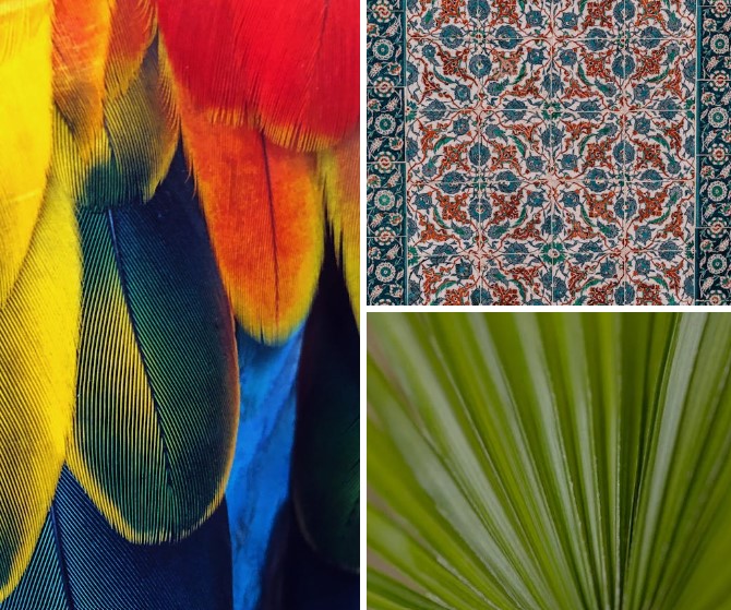
It can be said that color matching errors are the most common mistakes among new designers. Wrong color matching is when the overall color palette in the design is not harmonious, lacking highlights. Color also plays a role in expressing the design content. Choosing the wrong color combination can also affect the content that the design wants to convey to the viewer. For example, when you need to create a fresh summer banner, choosing dark colors combined makes the viewer not feel "fresh".
.png)
It is understandable because professional color matching is not easy. New designers are not yet proficient in choosing and combining colors. My suggestion is to learn and practice the common color matching rules in design first. These are the rules that have been applied by many generations of designers and easily produce good color matching effects. Once you have mastered them, you can freely change them with new and more unique combinations.
Mistake #4: Poor Cropping and Layout
This is a common mistake that is easy to make but few people pay attention to. When enlarging or reducing an image, you need to keep the correct ratio of the image to avoid distorting the image.
.png)
Mistake #5: Using too many fonts
Did you know that effective design often limits the number of fonts in the design? Typically, designers only use 2-3 fonts in a product. Many professional designs even use only one if the amount of information is not much.
.png)
Limiting the number of fonts allows designers to easily control the overall product. In addition to the text, they also have to pay attention to the shapes, colors, and images that need to be included in the product. Too many fonts can easily make the overall product confusing and affect the aesthetics.
Mistake #6: Over-reliance on technology while ignoring basic knowledge
In the digital age, many young people rely on photo editing software without mastering the basic knowledge of photography and design. Indiscriminate manipulation of computers without understanding the basic principles leads to many unnecessary errors.
3. General solutions to improve photo editing skills
Plan before editing: Clearly define the purpose of the photo, the message you want to convey, and sketch out a rough layout. This will help you stay on track and keep you in control of the editing process.
Use professional tools: Choose the software that suits your needs and stay updated with new versions. Learn about the software's features to optimize your workflow.
Continuously test and evaluate: Compare before and after each editing step to identify the strengths and weaknesses of the product. Don’t be afraid to get feedback from colleagues or customers to continuously improve.
Training and self-development: Always take time to learn, attend training courses and follow new design trends. Knowledge is an indispensable asset for every professional designer.
Above are common mistakes when editing photos that we often encounter, along with specific suggestions for overcoming them. Correctly editing photos not only helps your design products become more professional but also contributes to building a strong brand image in the hearts of customers. Hopefully the above advice will help you avoid "pitfalls" in the photo editing process and create top-notch designs. Remember, every mistake is a valuable lesson for us to grow and improve in our work.


VIP Products


Best Selling Products
Genuine Adobe Illustrator account
99 USD
MidJourney Account
29 USD
Genuine Cheap Canva Pro
39 USD
Upgrade Duolingo Super
29 USD
Capcut Pro 1 Year
39 USD
Autodesk All App Account Copyright
120 USD
Upgrade Genuine Office 365
49 USD
ChatGPT Plus Account (GPT-4)
16 USD
Adobe Premiere Pro Account
99 USD
Freepik Premium Account
59 USD
Adobe Photoshop Copyright - Full App
120 USD
Copyright Adobe Lightroom Account
59 USD
Plugin Retouch4me
69 USD
Windows 10 & 11 Pro Key
36 USD
Upgrade genuine Capture One account
120 USD