Best Selling Products

Windows 10 & 11 Pro Key
36 USD

Upgrade Genuine Office 365
49 USD

Plugin Retouch4me
69 USD

Genuine Adobe Illustrator account
99 USD

Genuine Cheap Canva Pro
39 USD

Upgrade genuine Capture One account
120 USD

Adobe Photoshop Copyright - Full App
120 USD

Capcut Pro 1 Year
39 USD

Autodesk All App Account Copyright
120 USD

ChatGPT Plus Account (GPT-4)
16 USD

Copyright Adobe Lightroom Account
59 USD

Freepik Premium Account
59 USD

MidJourney Account
29 USD

Upgrade Duolingo Super
29 USD

Adobe Premiere Pro Account
99 USD
9 Basic Color Tips In Design That Designers Need To Know
Nội dung
- 1. Why Designers Should Learn About 9 Basic Colors
- 2. List of 9 basic colors that Designers need to know before learning digital drawing
- 1.1. Red – Power and passion in every design detail
- 2.2. Orange - Positive energy and creativity
- 2.3. Yellow - Optimistic, outstanding and intelligent
- 2.4. Green - Symbol of Nature and Growth
- 2.5. Blue – Symbol of Trust and Peace
- 2.6. Purple – Symbol of Creativity and Nobility
- 2.7. Pink
- 2.8. Brown
- 2.9. White
- 3. Practical application tips for each color in design
- 4. Conclusion
Learn 9 basic color tips in design that designers need to know to master color when learning digital drawing. Basic knowledge helps you create impressive, professional works.
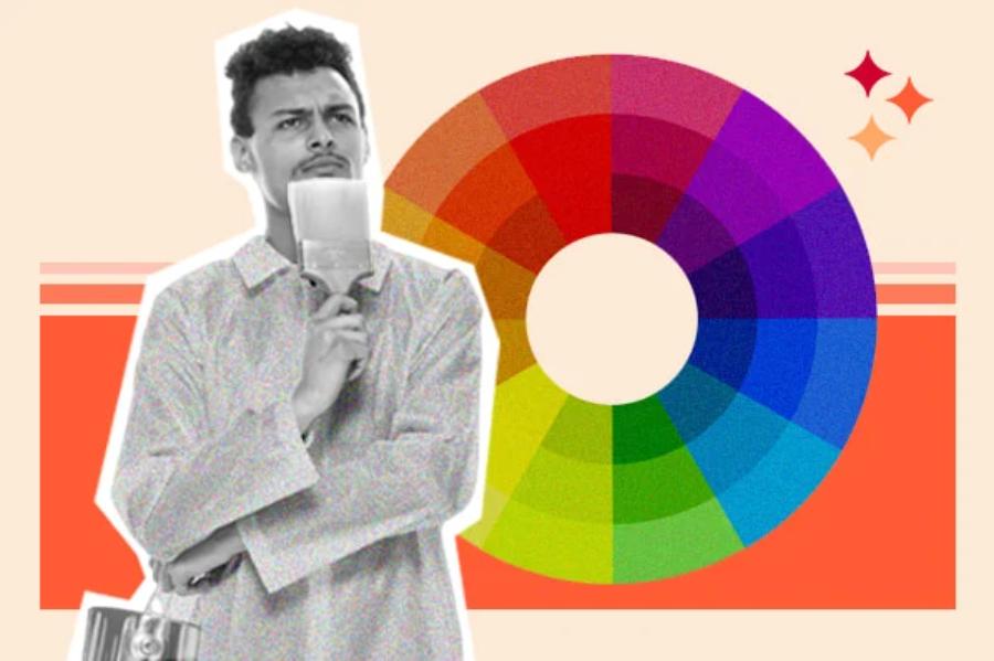
In the modern design world, mastering color is an indispensable factor to create eye-catching, professional products. Before delving into digital techniques and complex drawing tools, designers need to master basic colors. In this article, Sadesign shares 9 basic color tips in design that designers need to know, helping you create a solid foundation before embarking on a journey of in-depth creativity.
1. Why Designers Should Learn About 9 Basic Colors
In the journey of learning design, understanding and mastering color is a prerequisite. Before using graphic software or working with digital tools, you need to have a solid foundation in basic colors. Basic color tips in design that designers need to know not only help you control the color palette effectively, but also clearly orient your personal style from the beginning.
.jpg)
Colors directly affect the viewer's emotions. The ability to choose and combine colors appropriately will help the design product become more attractive, easier to leave an impression and convey a clear message. Understanding the 9 basic colors, as well as understanding the rules of mixing, contrasting and harmonizing colors will help you operate more accurately when learning to draw digitally.
Not only theoretical, the basic color tips in design that designers need to know also help you analyze professional design works, thereby learning faster and improving design skills at different levels. Understanding color is the bridge between art and technology, helping designs not only be beautiful in form but also effective in communication.
2. List of 9 basic colors that Designers need to know before learning digital drawing
To master the world of design, you need to start by getting familiar with the 9 basic colors. These are the basic colors, commonly used in all fields of design. Below are the basic color tips in design that designers need to know to master their color palette.
1.1. Red – Power and passion in every design detail
Red has always been considered a strong color, capable of attracting immediate attention. The correct application of red in design will create a distinct visual highlight, conveying strong emotions, from passion to decisive action.
Use red to emphasize CTA
When it comes to highlighting a Call to Action button, using red can motivate users to take immediate action. One of the basic color tips in design that designers need to know is to apply red in moderation to avoid creating visual pressure.
.jpg)
Combine red with neutrals to reduce stress
Red is a high-energy color that can easily cause eye strain if used too much. Combine it with gray, black, or white to neutralize the effect. This is one of the basic color tips in design that designers need to know to maintain balance in the layout.
Red for food, fashion, entertainment
Red stimulates the taste buds and emotions, making it perfect for restaurant posters, fashion banners, or entertainment media products. Capturing the right context is one of the basic color tips in design that designers need to know.
2.2. Orange - Positive energy and creativity
Orange is a combination of the power of red and the joy of yellow, creating a warm, friendly but still outstanding color. This is a color often used in promotional campaigns, youthful events and dynamic brands.
Use orange to create a sense of intimacy
One of the basic color tips in design that designers need to know is that orange makes the product more friendly and approachable. This is very important when building a brand aimed at young people or the creative community.
Combine orange with blue to create balance
Blue – a cool color – when combined with orange – a warm color – will create a harmonious contrast, attracting the eye without causing a dazzling feeling. This is one of the basic color tips in design that designers need to know to create depth in the design.
Orange stimulates action in commercial design
Sales banners, billboards, and e-commerce website interfaces favor orange because of its ability to evoke action. Controlling saturation is one of the basic color design tips that designers need to know when using orange.
2.3. Yellow - Optimistic, outstanding and intelligent
Yellow carries the energy of the sun – warm, creative and happy. In design, yellow is not only used to highlight but also to convey a positive message.
Yellow for logo and brand identity
Many big brands choose yellow because it is vibrant and memorable. One of the basic color tips in design that designers need to know is to choose the right shade of yellow to match the brand message.
.jpg)
Avoid using yellow on white background
Light yellow can be easily lost on a light background. To maximize contrast, place yellow on a dark background like navy blue or dark gray. This is one of the basic color tips in design that designers need to know to increase legibility.
Combine gold with black to increase luxury
Black and gold are a powerful duo that often appear in high-end designs, from fashion to expensive product advertising. Knowing how to combine these two colors is one of the basic color tips in design that designers need to know to create an impressive style.
2.4. Green - Symbol of Nature and Growth
The Meaning of Green
Green, also known as verdure, is a color that represents nature, life, and growth. It evokes images of lush forests, vast fields, and lush green trees. In design, green is often used to convey messages of freshness, health, and sustainability.
How to Use Green in Design
Branding: Green is suitable for brands related to health, environment, organic food and natural products. It helps to create a trustworthy and natural image.
Website Design: Using green as the background color or main color helps create a relaxing and pleasant feeling for users.
Packaging Design: Green is often used in packaging design for organic foods, natural cosmetics and health care products.
2.5. Blue – Symbol of Trust and Peace
The Meaning of Blue
Blue is the color of the sky and ocean, and it evokes feelings of vastness, depth, and peace. In design, blue is often associated with trust, professionalism, and responsibility. It is a popular choice in the financial, technology, and healthcare industries.
How to Use Blue in Design
Logo Design: Blue is an ideal choice for business logos, especially in the banking, insurance and technology industries where trust and professionalism are required.
Website Design: Blue helps create a peaceful and pleasant feeling for users, suitable for websites related to health, education and customer service.
Packaging Design: Blue is used in packaging design for beverage products, functional foods and health care products.
2.6. Purple – Symbol of Creativity and Nobility
Meaning of Purple
Purple is a combination of red and blue, bringing a balance of energy and tranquility. Historically, purple has been associated with royalty, power, and luxury. In design, purple is often used to convey messages of creativity, imagination, and nobility.
.jpg)
How to Use Purple in Design
Brand Design: Purple is suitable for brands related to art, high fashion and luxury products. It helps to create an image of luxury and uniqueness.
Website Design: Using purple in website design helps create highlights and attract users' attention, especially in art and fashion websites.
Packaging Design: Purple is used in packaging design for luxury products, perfumes and beauty products.
2.7. Pink
Creates a light and delicate feel
In the basic color system in design, pink often evokes gentle, romantic and feminine emotions. Using pink makes the work soft, friendly and suitable for projects aimed at women or children.
Combine pink with pastel tones to increase harmony
A simple tip for using primary colors in design is to combine pink with pastel colors such as light purple, mint green or cream white. This combination helps create a light, modern look that is suitable for beauty products, fashion or interior design.
Dark pink variation to increase personality
Not just a light color, dark pink brings a breakthrough and shows the creative ego of the designer. In the basic color set in design, dark pink is often used to create accents, attract attention or show spiritual strength.
Choose a pink background to increase the aesthetics of digital products.
In web interfaces or mobile applications, pink can be used as a background to highlight the main content. This usage is suitable for minimalist style but still ensures visual efficiency - one of the secrets to utilizing primary colors in design.
Avoid overusing pink to avoid confusing the layout.
While it can be sweet and dramatic, using too much pink in a layout can detract from the overall effect. It’s important to balance the color in a space – a skill every designer needs when applying primary colors in design.
2.8. Brown
Reminiscent of nature and rusticity
Brown is a color associated with wood, earth, and natural elements. It is one of the typical representatives of the primary color group in design, capable of evoking feelings of warmth, friendliness, and reliability.
Suitable for sustainable brands
Businesses pursuing a “green” and environmentally friendly image often prioritize brown in their identity. This is a smart choice in the basic color palette in design to emphasize their commitment to nature.
.jpg)
Create depth for design space
Dark brown when combined with neutral shades such as beige, cream or gray will add depth to the design. Using primary colors in this direction in design helps the layout become more solid, stable and accessible.
Apply brown color in packaging design to increase classicness
Many brands use brown in their packaging to evoke tradition, craftsmanship, or time-honored values. In high-end products, the combination of brown and gold is considered the ideal formula for basic color schemes in design.
Use brown as a versatile background color
Although not as prominent as red or yellow, brown is highly applicable when used as a background for designs that require balance and stability. Using basic colors in design such as brown provides moderate emphasis without distracting from the main content.
2.9. White
Bringing design to a minimalist and pure state
White is a symbol of cleanliness, minimalism and modernity. As one of the basic colors in design, white helps other details stand out more. White space also helps increase the airiness and comfort for the viewer.
Ideal background color for information-heavy designs
Especially in printing, white is often used as a background to ensure contrast with text and images. When applying primary colors in design, choosing a white background helps to naturally guide the viewer's eyes to the content.
Combine with black for added contrast
One of the strongest color pairs in the primary color system in design is black and white. This sharp contrast brings elegance, modernity and is extremely eye-catching, suitable for designs that need to be serious and classy.
Create emphasis with white space
White space is not just empty space, but also a tool to guide the viewer's eyes, helping the layout "breathe" better. This is the basic way to use basic colors in effective design that professional designers always prioritize.
Convey the message of elegance
White is used in many fields from fashion to technology because it evokes elegance, purity and refinement. In the basic color system in design, white is often used to build a high-end or sophisticated brand image.
3. Practical application tips for each color in design
Color matching according to color wheel
One of the basic color tips in design that designers need to know is to use the color wheel to find complementary, contrasting or similar color pairs. This helps to increase the harmony and aesthetics of the design.
Combining tones, tints, shades
Each color can be adjusted to suit the design purpose. Understanding tone, tint and shade are basic color tips in design that designers need to know to create depth and reasonable contrast.
Prioritize emotion and communication purpose
Choosing colors is not only based on preference but also depends on the emotions you want to convey. The basic color tip in design that designers need to know is to always put the design purpose first when choosing colors.
4. Conclusion
Understanding and mastering the 9 basic colors not only helps designers improve their color matching skills but also expand their creative expression. Before delving into digital tools, designers need to master the basic color tips in design that designers need to know to create a solid foundation for long-term development. This is an important stepping stone to help you feel more confident when entering the world of advanced digital drawing, where each color choice can determine the success of a design work.


VIP Products


Best Selling Products
Windows 10 & 11 Pro Key
36 USD
Upgrade Genuine Office 365
49 USD
Plugin Retouch4me
69 USD
Genuine Adobe Illustrator account
99 USD
Genuine Cheap Canva Pro
39 USD
Upgrade genuine Capture One account
120 USD
Adobe Photoshop Copyright - Full App
120 USD
Capcut Pro 1 Year
39 USD
Autodesk All App Account Copyright
120 USD
ChatGPT Plus Account (GPT-4)
16 USD
Copyright Adobe Lightroom Account
59 USD
Freepik Premium Account
59 USD
MidJourney Account
29 USD
Upgrade Duolingo Super
29 USD
Adobe Premiere Pro Account
99 USD