Best Selling Products

Genuine Cheap Canva Pro
39 USD

Upgrade Genuine Office 365
49 USD

MidJourney Account
29 USD

Windows 10 & 11 Pro Key
36 USD

Upgrade genuine Capture One account
120 USD

Upgrade Duolingo Super
29 USD

ChatGPT Plus Account (GPT-4)
16 USD

Capcut Pro 1 Year
39 USD

Plugin Retouch4me
69 USD

Adobe Premiere Pro Account
99 USD

Freepik Premium Account
59 USD

Copyright Adobe Lightroom Account
59 USD

Genuine Adobe Illustrator account
99 USD

Adobe Photoshop Copyright - Full App
120 USD

Autodesk All App Account Copyright
120 USD
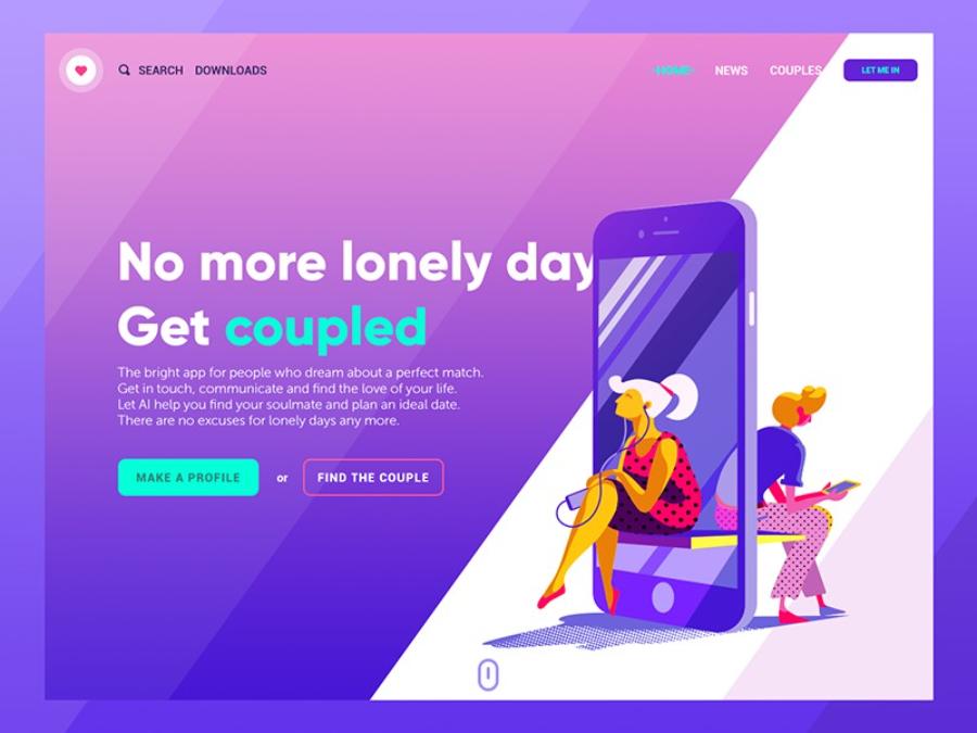
Choosing Website Fonts: 6 Tips for Optimizing User Experience
Nội dung
Choosing a font for your website is an important step to improve aesthetics and user experience. Let's refer to 6 tips for choosing the right font to design an effective website.

In web design, choosing the right font is as important as choosing colors or layout. Fonts not only affect the aesthetics but also help improve the readability and professionalism of the website. Here are 6 tips for choosing fonts when designing a website so you can optimize the user experience and improve work efficiency.
1. Understand the purpose of the website
Understanding the purpose of a website is an important factor in orienting the design, content and functionality to suit the needs of users. This not only helps businesses optimize the user experience but also contributes to improving operational efficiency and increasing competitiveness in the market. A website built with a clear purpose will easily convey messages, attract target customers and promote interactions effectively.
.jpg)
Beautiful Font Warehouse
Before you start choosing fonts for your website, you need to understand its purpose. What is your website? Is it a personal blog, an e-commerce site, or a professional service? Each type of website has different requirements for design style and fonts.
Personal website, blog: Simple, easy-to-read and comfortable fonts are ideal. Fonts like Open Sans, Lora or Roboto will create a sense of closeness and friendliness. The interface should be designed simply but professionally, ensuring fast page loading speed and optimization for both mobile devices and desktop computers. In addition, integrating features like a search bar, article categories or comment function will increase interaction and retain users longer. Always put yourself in the user's shoes to create an intuitive, useful and memorable experience.
E-commerce websites: E -commerce websites often need a combination of aesthetics and readability. Fonts should be clear, easy to read, and not too flashy. For example, Arial, Helvetica, or Poppins will help users find information easily.
Professional websites (businesses, organizations): For these websites, you should choose formal, polite fonts such as Times New Roman, Georgia or Merriweather. These are fonts commonly found in business environments or financial services.
2. Ensure readability
To optimize the user experience, ensuring readability is a top priority. Content should be presented clearly, using easy-to-read fonts and appropriate sizes. In addition, it is necessary to pay attention to the structure of the content, dividing it into short paragraphs, using headings and bullet points when necessary to increase visual appeal. The colors and spacing between elements on the interface should also be designed reasonably to avoid causing confusion. More importantly, the language used in the content should be simple, easy to understand but still maintain professionalism, helping users easily grasp information and interact effectively.
.jpg)
While some fonts may look great, if they are difficult to read, they can be frustrating to users and reduce the user experience.
Font size: Fonts that are too small or too large are not good for reading. Standard website fonts are usually around 16px for body copy and can be larger for headings.
Letter spacing: Appropriate letter spacing will prevent letters from overlapping, making the text easier to read. Typically, letter spacing from 0.5px to 1px is appropriate for the main content.
Line height: The spacing between lines is also important. You want to make sure that the line spacing is wide enough so that the reader doesn’t have trouble moving their eyes from one line to the next. The ideal line spacing is usually between 1.4x and 1.6x the font size.
3. Use a maximum of 2-3 fonts in one design
Using too many fonts on a website can create clutter and discomfort for users. Therefore, it is recommended to use only 2-3 fonts in each design project. One font for the title, one font for the content and one secondary font (if needed). This combination not only creates a sense of harmony but also helps users easily focus on the main content, avoiding confusion or losing the professionalism of the design product.
.jpg)
Title Fonts: In the design process, optimizing the user experience plays an important role in creating professionalism and appeal. One of the basic principles is to limit the use of too many fonts in a design. Specifically, only use a maximum of 2-3 fonts to ensure consistency and readability. The title font should be carefully selected to stand out and match the message, while other fonts should support and complement it harmoniously. This not only makes the design aesthetically pleasing but also creates a pleasant feeling for the viewer. Choose a strong font that easily attracts attention. Fonts such as Montserrat, Oswald or Playfair Display are suitable for the title because they have a prominent style.
Body Font: This font should be clear and easy to read. Fonts like Roboto, Lora, or Arial are popular choices for body text because of the balance between readability and aesthetics.
Secondary font: If needed, you can use a secondary font to highlight special elements like quotes or call-to-action buttons. However, make sure the secondary font remains consistent with the overall design.
4. Choose a font that suits your brand
Choosing the right font not only contributes to enhancing aesthetics but also helps to effectively convey the message and value of the brand to users. A harmoniously designed font, easy to read and suitable for the brand personality will create a sense of professionalism, while optimizing the user experience. To achieve this, businesses need to consider factors such as the characteristics of the target audience, the field of operation and the message they want to convey. Consistency in the use of fonts also plays an important role in building a strong and impressive brand identity.
Each font conveys a different message and emotion to your customers, so make sure the font you choose reflects your brand values and personality.
.jpg)
Modern, youthful brands: Sans-serif fonts like Roboto, Arial, or Avenir are often favored. These fonts feel modern, simple, and approachable.
Luxury, upscale brands: Serif fonts like Times New Roman, Georgia or Baskerville will help convey elegance and sophistication.
Creative, dynamic brands: Handwritten or display fonts (like Pacifico, Lobster) can be suitable to express creativity and uniqueness.
5. Ensure compatibility across all devices
To optimize the user experience effectively, ensuring compatibility across all devices is of utmost importance. This requires developers and designers to thoroughly test the interface and functionality across multiple platforms, from desktops, tablets to smartphones. In addition, it is important to pay attention to the responsiveness of the website or application, ensuring that the content is displayed clearly and is easy to use on all screen sizes. Investing in compatibility not only helps increase user satisfaction but also contributes to enhancing the reputation and brand value in the eyes of customers.
Web fonts: Use web fonts that are specifically designed to ensure high compatibility across different devices and browsers. Google Fonts is a rich resource with hundreds of free fonts that are easy to integrate into your website.
System fonts: System fonts like Arial, Times New Roman or Courier New will always display correctly on all devices and browsers, preventing your website from having display issues when users access it from different devices.
Test on multiple devices: Before finalizing your website design, make sure you test your fonts on multiple devices to ensure consistency and readability.
6. Avoid using too many fonts
To optimize the user experience, the use of typefaces should be carefully considered to ensure aesthetics and readability. Avoid overusing different typefaces in the same interface or document, as this can be confusing and reduce the effectiveness of information transmission. Instead, choose one or two main typefaces and combine them harmoniously to create consistency and professionalism. At the same time, pay attention to the size, spacing and color of the text to ensure the content is accessible and user-friendly.
Should use: Certain fonts like bold to emphasize important words, or italic to differentiate some short paragraphs.
Don'ts: Avoid using too many different fonts in the same paragraph. This will disrupt the flow of your text and confuse the reader.
Beautiful Font Warehouse
7. Conclusion
Choosing the right font for your website design is not just about aesthetics, it also directly affects the user experience. A suitable font will make your website easy to read, easy to access, and express your brand’s unique style. Always remember that simplicity, readability, and consistency in font usage are the keys to creating a professional and effective website.


VIP Products


Best Selling Products
Genuine Cheap Canva Pro
39 USD
Upgrade Genuine Office 365
49 USD
MidJourney Account
29 USD
Windows 10 & 11 Pro Key
36 USD
Upgrade genuine Capture One account
120 USD
Upgrade Duolingo Super
29 USD
ChatGPT Plus Account (GPT-4)
16 USD
Capcut Pro 1 Year
39 USD
Plugin Retouch4me
69 USD
Adobe Premiere Pro Account
99 USD
Freepik Premium Account
59 USD
Copyright Adobe Lightroom Account
59 USD
Genuine Adobe Illustrator account
99 USD
Adobe Photoshop Copyright - Full App
120 USD
Autodesk All App Account Copyright
120 USD