Best Selling Products
Christmas Color Palette: The Secret to Making Your Design Project Stand Out
Nội dung
- 1. Christmas Palette - Classic Colors
- 2. Christmas Color Palette - Warm Christmas Colors
- 3. Christmas Color Palette - Arctic Frost
- 4. Romantic Nordic Christmas Colors - Christmas Color Palette
- 5. Christmas Color Palette - Winter Sunset Colors
- 6. Candy Land color scheme
- 7. Palette - Earth Christmas Colors
- 8. Christmas Color Palette - Beige, Blue and Red
- 9. Red, Brown, Green - Christmas Color Palette
- 10. Mysterious Christmas Color Palette
- Conclude
In this article, we will suggest unique Christmas color palettes and the latest trends, helping you create impressive, Christmas-inspired designs!
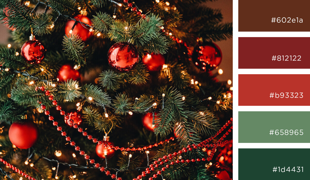
As Christmas approaches, designers are eager to find creative Christmas color palettes to highlight their design projects. From traditional reds and greens to modern shades like metallic gold or icy blue, each palette brings a warm and inviting feel typical of the festive season. In this article, we will suggest unique Christmas color palettes and the latest trends to help you create impressive designs that are full of Christmas spirit!
1. Christmas Palette - Classic Colors
Classic Christmas colors are the perfect combination of traditional shades such as bright red, dark green, snow white and metallic gold. These are familiar colors, evoking images of Christmas trees, warm candles and sparkling lights on Christmas Eve. Red symbolizes warmth and joy, green brings a feeling of freshness and vitality, while white and gold add sophistication and sparkle. This combination not only creates a complete festive atmosphere but is also easy to apply in any design. From greeting cards, gift packaging to space decoration, bringing a cozy, intimate but no less luxurious feeling.

2. Christmas Color Palette - Warm Christmas Colors
Warm Christmas Colors is an emotional blend of colors such as wine red, moss green, light beige and earthy brown. This is a color palette that brings a feeling of closeness and gentleness like an evening gathered around the fireplace with family during the festive season. Wine red evokes warmth and luxury, moss green symbolizes the quiet nature, while beige and brown create an elegant, nostalgic look. These colors are not only ideal for interior decoration but also suitable for card designs, gift packaging, or handmade products. Using this color palette is a great way to convey the warm and meaningful Christmas spirit.
3. Christmas Color Palette - Arctic Frost

Arctic Frost is a delicate blend of icy blue, pearl white, metallic silver and pale grey. This palette captures the magical beauty of cold winter, with icy skies and endless snow fields. Ice blue brings a fresh, clear feeling, pearl white evokes purity, while silver and grey add a modern, sparkling touch. This is the perfect choice for minimalist, luxurious designs, such as event invitations, winter fashion posters, or Arctic-inspired space decoration. Using this palette, you will convey the cold yet charming beauty of the holiday season.
4. Romantic Nordic Christmas Colors - Christmas Color Palette
The Nordic Romantic Christmas Color is a subtle combination of navy blue, light red, cream white and earthy brown, bearing the mark of minimalism, elegance and warmth. This color palette is inspired by the Nordic winter scene: deep blue sky, soft white snow covering wooden houses, and the firelight from cozy fireplaces. Navy blue creates mysterious depth, cream white evokes purity, while light red adds a gentle highlight and earthy brown brings rusticity and closeness. This is the ideal color palette for modern designs that still retain a romantic touch, from interior decoration, gift wrapping to greeting cards, conveying a peaceful and emotional Christmas.
5. Christmas Color Palette - Winter Sunset Colors
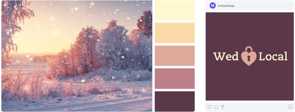
Winter Sunset is a captivating palette of burnt orange, earthy red, lavender and pale blue. Inspired by the winter sky changing in the sunset, this palette brings a warm yet dreamy feeling. Burnt orange and earthy red evoke a cozy feeling, like the warmth of a flickering fire in the cold, while lavender and pale blue add a gentle, slightly romantic touch of winter nature. This is the perfect choice for artistic, classic designs, from posters, greeting cards to decorative paintings, helping to convey a peaceful yet inspiring winter atmosphere.
6. Candy Land color scheme
Candy Land is a sweet blend of light purple, pastel blue, pink and pure white, bringing a joyful and lovely feeling like entering a fairytale candy world. Inspired by colorful candies, this color palette is imbued with a youthful and vibrant festive spirit. Light purple creates a dreamy look, pastel blue evokes a fresh feeling, pink highlights the warmth, while pure white balances everything with a gentle, elegant look. This color scheme is especially suitable for designs for children, gift packaging, greeting cards or Christmas decoration spaces, bringing joy and happiness to everyone.
7. Palette - Earth Christmas Colors
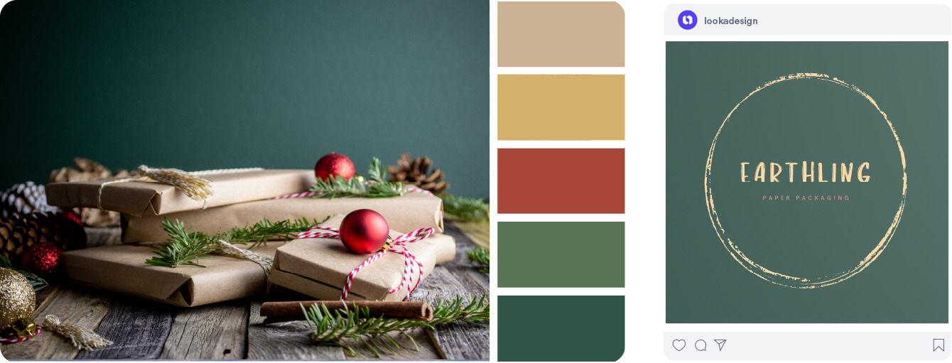
Earth Christmas is an inspiring color palette, bringing closeness and friendliness to nature. With the combination of moss green, wood brown, earth yellow and frost white, this color palette evokes the image of a peaceful Christmas season, full of nature and sustainability. Moss green represents trees, life and freshness, while wood brown symbolizes the cozy, rustic feeling of wooden houses in the middle of snow-covered forests. Earth yellow brings a feeling of warmth, like winter sunlight shining through the cracks of the door, and frost white gently covers everything, creating a fresh, pure space.
The Earth Christmas color is not only a combination of natural shades but also a reflection of modern design trends , where people seek to connect with nature and protect the environment. This is an ideal choice for designs that carry a message of sustainability and awareness of protecting the planet, from Christmas decorations, gift packaging, to handmade products and interior design. This color not only helps create a cozy, intimate atmosphere but also conveys the value of living in harmony with nature, bringing a peaceful and meaningful Christmas season.
8. Christmas Color Palette - Beige, Blue and Red
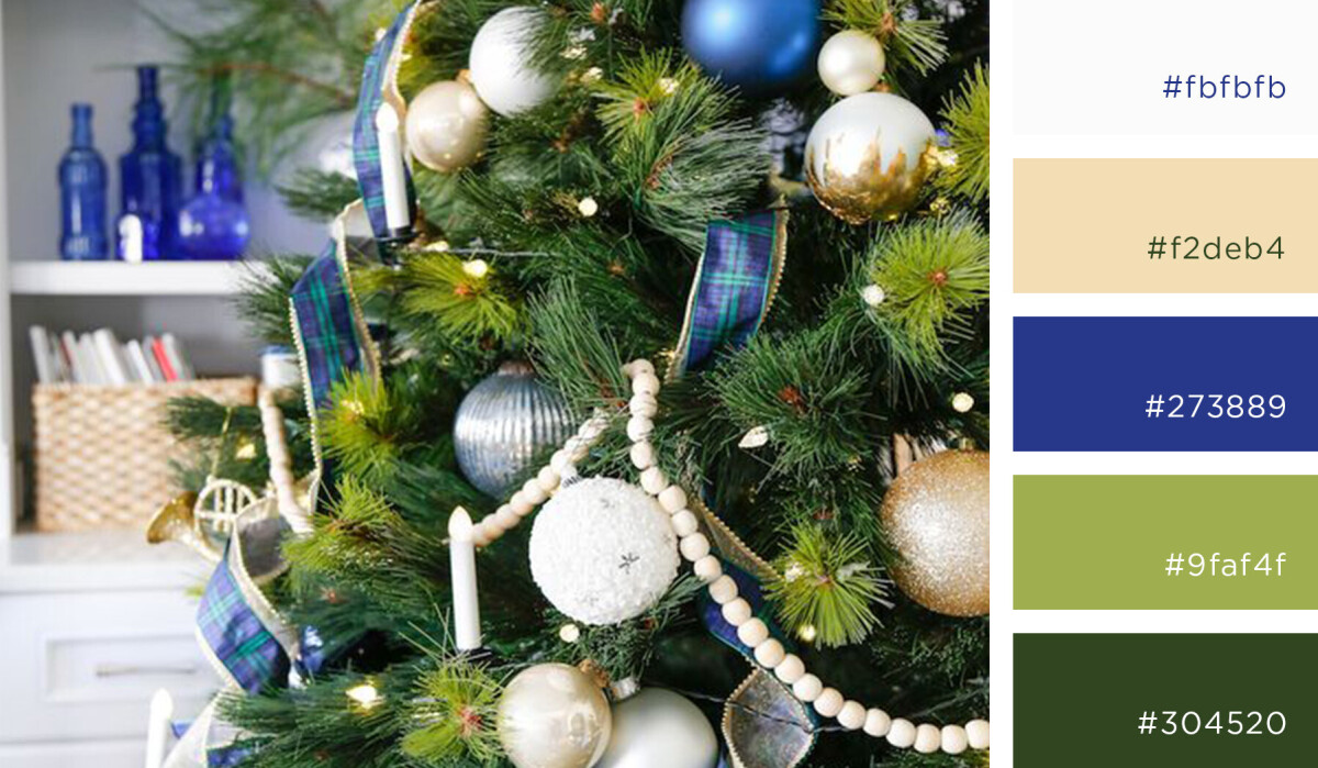
The beige, blue and red palette is a subtle blend of soft and dark tones, creating an overall look that is both elegant and vibrant. Beige, with its warmth and neutrality, forms a solid foundation for the palette, bringing a sense of comfort and lightness. Blue, depending on its shade, can bring a fresh, serene feeling (blue) or a natural, relaxing feeling (green). Meanwhile, red, especially bright red or wine red, creates a striking highlight and adds vibrancy to the entire design.
Combining these three colors, you can create a space or design that balances the gentleness of beige, the freshness of blue and the strength and passion of red. This is the ideal color palette for Christmas designs, greeting cards, interior decoration or gift packaging, as it brings warmth, highlights but is also sophisticated. The gentle beige softens the brilliance of red and blue, creating a harmonious and pleasant overall look.
9. Red, Brown, Green - Christmas Color Palette
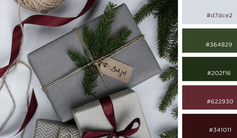
The red, brown and blue palette is a powerful and warm combination, bringing a classic and intimate feeling. Red is an energetic and joyful color, often reminiscent of the warmth of the festive season, love and passion. When combined with brown, this color brings a sense of stability, rusticity and nature. Wood and earthy browns create a warm, solid base for prominent details. Blue, depending on the shade, can be a fresh green, bringing relaxation and closeness to nature, or a deep blue, creating a strong and calm accent.
This palette is especially suitable for interior design, gift packaging, or winter and Christmas events, creating a warm, sophisticated and inspiring atmosphere. Red makes a striking highlight, while brown and green soothe the eyes and create overall harmony. It is a wonderful combination of warmth and peace, creating an artistic and emotional space.
10. Mysterious Christmas Color Palette
Mystic Christmas is a captivating and captivating color palette, bringing a sense of mystery and romance. The combination of black, navy blue, metallic silver and light gold creates a mysterious, luxurious and magical space. Black is the color of depth, of darkness and vast space, creating a solid foundation for outstanding details. Navy blue adds mystery, evoking the Christmas night sky with sparkling stars. Metallic silver and light gold bring a sparkling, delicate look, like the flickering lights and candles in the night, creating a sparkling but no less luxurious feeling.
This palette is perfect for high-end designs, Christmas Eve events, or invitations, gift packaging with a luxurious, mysterious style. It brings a dreamy and impressive feeling, like a mysterious Christmas night full of magic waiting. When using this palette, you can create a cozy but also impressive and attractive space, making people unable to take their eyes off its splendor and mystery.
Conclude
Combining creative and sophisticated Christmas color palettes is a great way to bring the festive atmosphere into your designs. From classic palettes like red and green to modern and luxurious colors like metallic gold and light silver, each color palette can create different emotions, from warm and intimate to mysterious and splendid. By choosing the right Christmas color palette , you not only highlight your project but also convey the spirit of the holiday season. Let these colors make your space more impressive and meaningful this Christmas season.
