Best Selling Products

Upgrade genuine Capture One account
120 USD

Windows 10 & 11 Pro Key
36 USD

Autodesk All App Account Copyright
120 USD

Freepik Premium Account
59 USD

Adobe Premiere Pro Account
99 USD

Capcut Pro 1 Year
39 USD

Copyright Adobe Lightroom Account
59 USD

ChatGPT Plus Account (GPT-4)
16 USD

Plugin Retouch4me
69 USD

Genuine Cheap Canva Pro
39 USD

Adobe Photoshop Copyright - Full App
120 USD

Genuine Adobe Illustrator account
99 USD

MidJourney Account
29 USD

Upgrade Genuine Office 365
49 USD

Upgrade Duolingo Super
29 USD
Color Psychology In Design Not Everyone Knows
Nội dung
- 1. When was color applied to design?
- 2. The meaning of color in design
- 2.1 In logo design
- 2.3 In website design
- 3. Psychology of color in design
- 3.1 Warm color tones
- 3.2 Cool tones
- 3.3 Neutral tones
- 4. Things to note about the meaning of color in design
- 4.1 Basic color wheel
- 4.2 Harmonious color coordination
- 4.3 Color context
- 5. Frequently asked questions about color in design
- 5.1 What factors determine color selection?
- 5.2 How many colors should be used when designing a logo?
- 5.3 What tools support standard color matching?
- 5.4 Is it difficult to learn about color in design?
Colors are not just simple tones, they also carry deep meanings and have a strong impact on human emotions and behaviors. In design, colors play a decisive role in conveying messages, creating first impressions and shaping user experiences. However, not everyone is aware of their full meaning and influence. In this article, Sadesign will help you discover interesting mysteries about colors in design that you may not have known.

Colors are not just simple tones, they also carry deep meanings and have a strong impact on human emotions and behaviors. In design, colors play a decisive role in conveying messages, creating first impressions and shaping user experiences. However, not everyone is aware of their full meaning and influence. In this article, Sadesign will help you discover interesting mysteries about colors in design that you may not have known.
1. When was color applied to design?
In 1666, scientist Isaac Newton conducted an interesting experiment with a prism, when white light was passed through and dispersed into a spectrum of brilliant colors. From then on, people realized that color is not only a physical phenomenon but also an indispensable part of life, affecting the emotions and psychology of each person.
Soon, research began to show that each color had its own meaning. Red, for example, could stimulate feelings of excitement and energy, while blue could induce calmness and creativity. The transition from these simple perceptions opened the door to the application of color in design, from rudimentary drawings to the sophisticated products of today.
In today’s web design world, color has become a key element. Designers not only choose colors but also think carefully about how to combine them to create unique visual experiences. Colors have evolved from simple shades to diverse combinations, bringing new life to design products.
.png)
2. The meaning of color in design
2.1 In logo design
A logo is the face of a business, and color plays an important role in expressing the characteristics of the product. For example, coffee shops often choose brown, black and white, not only to create a warm feeling but also to evoke positive associations in the minds of customers. Logo colors not only help customers remember the brand but also create a deep emotional connection.
Choosing the right color not only helps to deepen the brand image but also shows strength and dynamism. Colors should not overlap with brands in the same industry to avoid confusion, at the same time, using too many colors can be confusing and lose professionalism. An impressive logo needs a harmonious combination of color tones, helping the brand stand out and be memorable in the hearts of customers.
To convey the right brand emotion and style, designers need to pay attention to the connection between color and the target market. A logo is more than just an image, it is a story, a message that the brand wants to send to customers, and color is a powerful tool to do that.
2.2 In banner design
Banner design is one of the areas where color clearly shows its influence on consumer psychology. The color in the banner not only needs to attract the eyes but also needs to be suitable for the culture, gender and age of the target customers. The combination of color and the message conveyed can create great power in attracting the attention of the viewer.
To create a successful banner, the designer needs to understand the market and the audience they are trying to reach. This requires a close collaboration between the design and marketing departments to create products that are not only visually appealing but also highly effective in the advertising campaign. Colors can make viewers feel happy, excited, or sometimes even safe and trustworthy.
Successful advertising banners often cleverly combine colors to create a harmonious overall picture, thereby evoking emotions and actions from consumers. From there, brand attention and memory will be enhanced, contributing to the overall success of the business.
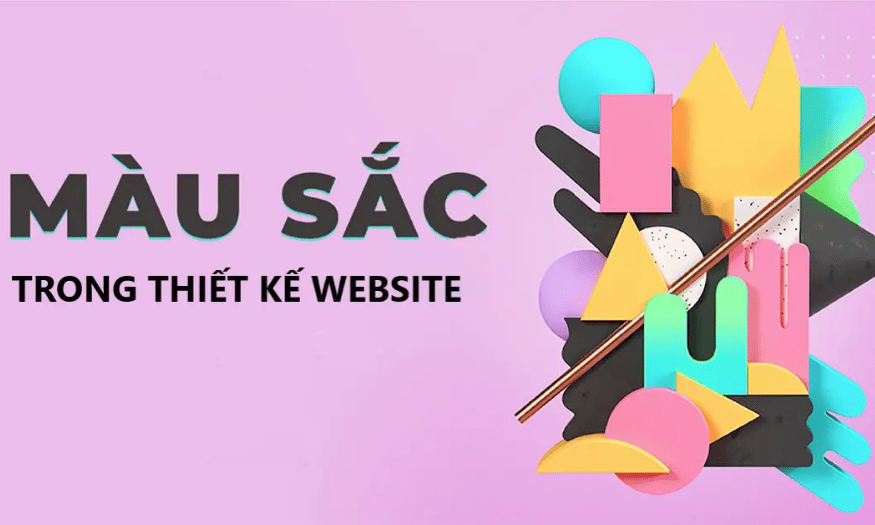
2.3 In website design
Color is not only a part of website design but also a decisive factor in the first impression of users. Research shows that 42% of consumers judge a website based on its design, in which color plays a key role. Color not only creates the atmosphere of the website but also reflects the ideas and messages that the designer wants to convey.
Color coordination in web design requires careful consideration. When used skillfully, color can awaken hidden emotions in viewers, thereby creating strong interactions. On the contrary, if applied incorrectly, color can detract from the value of content and irritate users.
A successful website requires not only quality content but also a well-designed color scheme. By using color wisely, designers can create great user experiences that increase customer retention and encourage them to return.
(1).png)
3. Psychology of color in design
Colors are not just decorative elements in design, they are powerful languages that can influence the psychology and emotions of viewers. Understanding the psychology of colors will help designers create products that are not only eye-catching but also bring positive experiences to users. Each color tone has its own characteristics, and when used properly, they can have a profound impact on human behavior and emotions.
3.1 Warm color tones
Warm colors include red, yellow, orange, and variations like pink. These colors evoke warmth due to their brightness and association with the sun. Their presence in a design can create a sense of intimacy and friendliness, making it easier for viewers to be drawn to the message the designer is trying to convey.
Warm colors are vibrant and playful. Not only do these colors convey passion, they also bring positive energy to viewers. Orange, for example, is often associated with warmth and fun, stimulating the appetite, making it a popular choice for food and beverage brands. However, if overused, these colors can be jarring and counterproductive, disrupting the harmony of the design.
.png)
3.2 Cool tones
Cool colors include green, blue, purple, and their variations. These colors are considered cool because they are commonly found in nature and are known for their calming effects. Using cool colors in design can create a calm and professional atmosphere, which is great for fields like healthcare, education, and technology.
Cool tones tend to convey a sense of trust and stability. A website or product design with a dominant cool color palette can feel independent and welcoming. However, if cool tones are used alone without a warm or neutral color, the design can come across as cold and unapproachable.
.png)
3.3 Neutral tones
Neutral tones, including brown, black, white and variations like grey, are strong and sophisticated colours. They are popular in design because of their ability to create balance and harmony in an overall look. Neutrals are often used as backgrounds or text colours, allowing other colours to stand out and create an accent in the design.
Neutral tones not only bring a minimalist feel but also create a peaceful space. They help reduce the redundancy in different color combinations, thereby creating a more pleasant and approachable overall look. When combined properly with warm or cool colors, neutral tones can bring elegance and professionalism to a design.
.png)
4. Things to note about the meaning of color in design
Colors are not just decorative elements, but also carry deep meanings and emotions that they can convey. In design, colors play an important role in creating first impressions and influencing the feelings of viewers. Understanding the meaning of each color helps you choose wisely, thereby creating attractive and effective design products.
4.1 Basic color wheel
The color wheel is a useful tool for designers to visualize and better understand the relationships between colors. The wheel is divided into 12 sections, each section representing a primary color. Each color has 8 levels, from dark to light, creating a total of 106 different colors. Mastering the color wheel not only helps you choose the right colors, but is also a basic principle for effective color coordination.
So, the color wheel is more than just a circle of colors; it is a valuable guide for developing color palettes. When you understand how colors interact with each other, you can create more attractive and harmonious designs. The color wheel is truly an indispensable tool in any designer’s toolbox.
.png)
4.2 Harmonious color coordination
As a designer, knowing how to combine colors harmoniously is one of the most important skills. Harmony here is not just the random use of colors, but the intentional combination, creating a pleasant and attractive feeling for the viewer. Color pairs such as blue-yellow, red-green or yellow-green, when properly coordinated, can create vitality and freshness for the design.
Harmonious design is not just about colors, but also how they interact with each other in space. The balance of colors, brightness, and contrast are all critical to the success of a design. When you master the art of color coordination, you will be able to create designs that are not only beautiful but also meaningful.
4.3 Color context
Color context refers to the effect a color has when placed next to another color. This refers not only to how the colors interact, but also to how the viewer perceives the color in a particular context. For example, red may stand out more and attract more attention when placed against a black or white background, but become less noticeable when placed against a pink or brown background.
Therefore, choosing the right context for color in your design is very important. You need to consider factors such as background, images and overall layout to ensure that the color you choose will maximize its value. A reasonable color context not only helps you create highlights but also helps viewers easily receive the message you want to convey.
5. Frequently asked questions about color in design
Color plays an important role in design, not only creating a first impression but also conveying a brand message. However, choosing the right color is not always simple. Many factors need to be considered to ensure that the color you choose will match the image you want to project. Here are some common questions that many designers ask.
5.1 What factors determine color selection?
There are many factors that go into choosing colors for a brand. One popular way is to choose colors based on feng shui, as many people believe that colors can influence fortune and destiny. Choosing colors that match the founder’s destiny can create harmony and attract customers.
You can also choose colors based on the nature of your industry. For example, food brands often use warm colors like red and orange to stimulate the taste buds, while the technology industry often favors blue to show trust and modernity. In addition, personal preferences are also a factor that cannot be ignored, because your favorite color will help you feel closer to your brand.
5.2 How many colors should be used when designing a logo?
To keep your logo simple and memorable, aim to use no more than three colors in your logo. One of those three should be black or white, as they help balance out the other colors and make them stand out. Using too many colors can make your logo look cluttered and difficult to recognize, which is especially important in today’s competitive world.
However, there are some special cases where you might consider using more colors, such as when designing for a children's brand or products that need to convey dynamism and playfulness. In these cases, using a wider range of colors will help you create a more vibrant and engaging brand image.
5.3 What tools support standard color matching?
There are many color design tools on the market today that can help you easily find the right color palette for your project. One of the popular tools is Adobe Color CC, which allows you to create and save color palettes as you like. Additionally, Color Hunt and Coolors are also great options for discovering new and beautiful color palettes.
Paletton and Happy Hues are equally useful, with their ability to show colors in real-world context, making it easy to visualize how colors will work together in your design. Using these tools not only saves you time, but also enhances your creativity, allowing you to be more confident in choosing colors for your logo, website or banner.
5.4 Is it difficult to learn about color in design?
Many people may find learning about color in design a challenge, but it doesn’t have to be. There are many online resources and courses that can help you master the fundamentals of color. A great way to practice is to use online color matching websites, where you can experiment with different color combinations before deciding on a final color scheme for your logo or banner.
With regular practice, you will become more sensitive to colors and how they affect consumer emotions and behavior. Colors are more than just an aesthetic element; they have the power to convey messages and create lasting impressions on customers.


VIP Products


Best Selling Products
Upgrade genuine Capture One account
120 USD
Windows 10 & 11 Pro Key
36 USD
Autodesk All App Account Copyright
120 USD
Freepik Premium Account
59 USD
Adobe Premiere Pro Account
99 USD
Capcut Pro 1 Year
39 USD
Copyright Adobe Lightroom Account
59 USD
ChatGPT Plus Account (GPT-4)
16 USD
Plugin Retouch4me
69 USD
Genuine Cheap Canva Pro
39 USD
Adobe Photoshop Copyright - Full App
120 USD
Genuine Adobe Illustrator account
99 USD
MidJourney Account
29 USD
Upgrade Genuine Office 365
49 USD
Upgrade Duolingo Super
29 USD