Best Selling Products

Adobe Premiere Pro Account
99 USD

Windows 10 & 11 Pro Key
36 USD

Plugin Retouch4me
69 USD

Upgrade genuine Capture One account
120 USD

Autodesk All App Account Copyright
120 USD

Upgrade Genuine Office 365
49 USD

Copyright Adobe Lightroom Account
59 USD

Adobe Photoshop Copyright - Full App
120 USD

ChatGPT Plus Account (GPT-4)
16 USD

Capcut Pro 1 Year
39 USD

MidJourney Account
29 USD

Upgrade Duolingo Super
29 USD

Genuine Cheap Canva Pro
39 USD

Genuine Adobe Illustrator account
99 USD

Freepik Premium Account
59 USD
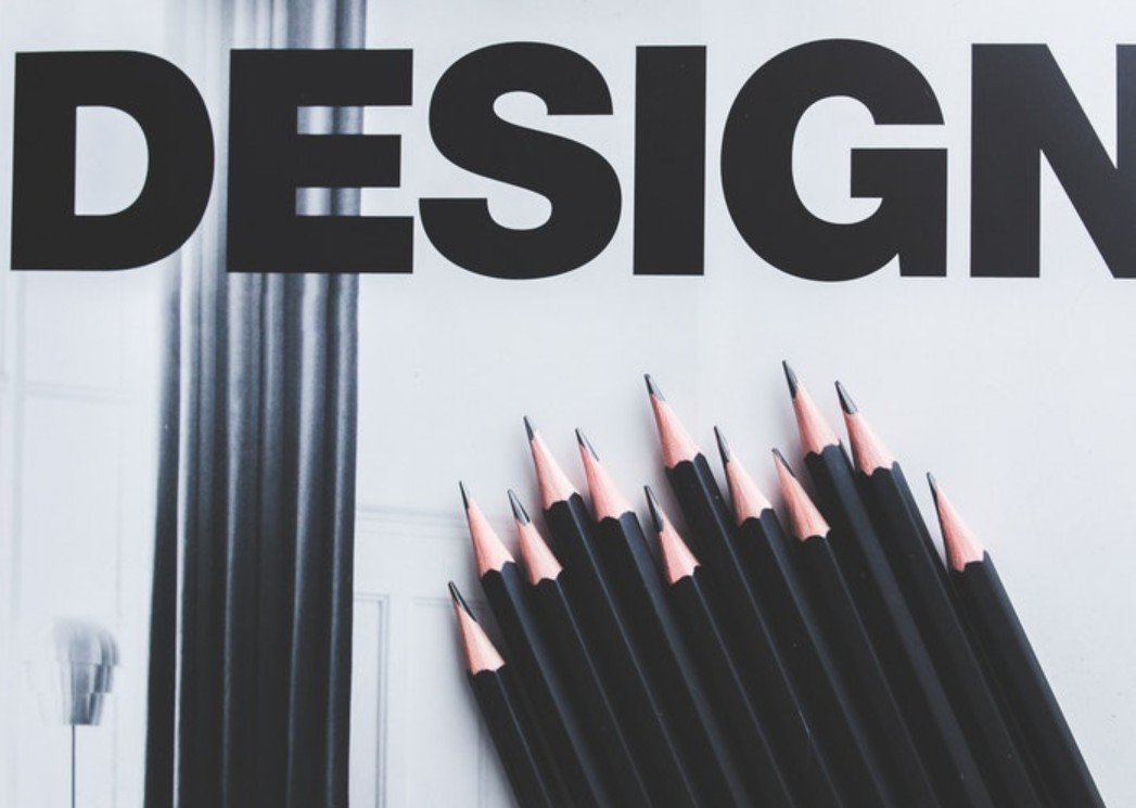
Color – The Language of Emotions: How to Connect Brands and Customers
Nội dung
- 1. The meaning of each color group in design
- 1.1. Warm colors: Enthusiasm, energy and attraction
- 1.2. Cool colors: Trust, professionalism and peace
- 1.3. Neutral colors: Balance and sophistication in every detail
- 2. The art of using color in design
- 2.1. Basic color matching rules: The foundation of harmony
- 2.2. How to choose colors according to emotions and design goals
- 2.3. Color trends in modern design
Learn how color can make your brand shine and make a lasting impression on your customers. This article breaks down the role each shade plays in building emotional connections, helping you create designs that are both beautiful and powerfully inspirational.
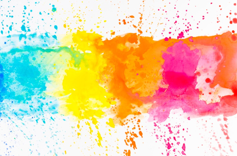
In the modern design world, color is not just a simple shade that creates an eye-catching image, but also a powerful language to communicate with users. You can imagine that every time you enter a store, website or any space, color is the first element that touches the mind, creating an initial feeling about the quality and value of the product or service.
In this article, we will explore the meanings of different color groups , from warm colors, cool colors to neutral colors, and learn the basic color matching rules and modern design trends to know how to apply colors in the most artistic way. Let's join SaDesign on a journey to explore colors - a journey of emotions and creativity!
1. The meaning of each color group in design
Understanding the meaning of color groups is the first step to choosing a color palette that fits your message and the audience you want to reach. Here is a detailed breakdown of the three main color groups: warm, cool, and neutral.
1.1. Warm colors: Enthusiasm, energy and attraction
Red
Red has always been considered a symbol of passion, enthusiasm and power. When we think of red, we often think of strong feelings, desire and fighting spirit. In design, red is used to create instant appeal, stimulate the eye and highlight important messages.
.png)
For example, many famous brands such as Coca-Cola or Netflix have chosen red as their main color to express dynamism and strength. However, it is important to note that using red should be considered so as not to cause a feeling of being too harsh or pressured for viewers.
Orange
Orange is a blend of the enthusiasm of red and the joy and optimism of yellow. This is a color that represents creativity, dynamism and friendliness. Orange is often used in designs aimed at young, modern and passionate explorers.
In industries such as technology, education or entertainment, orange not only helps stimulate creativity but also creates a warm, close feeling for users. When using orange, you are sending a message of innovation and the spirit of constant progress.
.png)
Yellow
Yellow is a symbol of optimism, joy and brightness. One of the most striking characteristics of yellow is its ability to create a feeling of warmth and friendliness. However, because yellow is so bright, its use should be carefully adjusted to avoid creating a feeling of glare.
In marketing, yellow is often used in advertising campaigns for children or food-related products, where the message of freshness and happiness is paramount. When choosing yellow, consider combining it with other colors to create harmony and ease for the eyes.
.png)
1.2. Cool colors: Trust, professionalism and peace
Blue
Blue has long been considered a symbol of trust, professionalism and peace. This is why many big brands in the financial and technology sectors such as Facebook, Samsung and LinkedIn choose blue as their main color. When using blue, your design will convey a message of stability, safety and professionalism.
Blue not only brings a cool, pleasant feeling but also helps users feel secure when approaching products or services. Therefore, in designs related to technology, finance or medicine, blue is always the priority choice.
.png)
Green
Green is a symbol of nature, growth and freshness. It brings a sense of balance and harmony, reminiscent of life, fertility and sustainability. In particular, green is often used in fields related to the environment, health and organic food.
By incorporating green into your design, you not only create a space that is close to nature, but also send a message of sustainability and commitment to the environment. This is especially important in an era where consumers are increasingly concerned about environmental protection and green consumption.
.png)
Purple
Purple has long been associated with creativity, mystery and luxury. This color is popular in designs related to cosmetics, art and fashion. Purple brings a distinct, different and somewhat mysterious feeling, helping to highlight the unique elements of the brand.
When using purple, pay attention to balance so as not to make the design too heavy. The right combination of purple with other neutrals or light colors can create a sophisticated, luxurious and inspiring color palette.
.png)
1.3. Neutral colors: Balance and sophistication in every detail
White
White is often seen as a symbol of purity, simplicity, and cleanliness. In design, white not only highlights other elements but also helps create a clean, modern space. Designs with white backgrounds often bring a sense of luxury, elegance, and professionalism, which is especially important in fields such as healthcare, high-tech, and fashion.
A design with a dominant white color is often combined with other color accents to create balance, avoiding a feeling of boredom and emptiness.
Black
In contrast to white, black evokes a sense of power, mystery and class. Black not only creates a strong contrast but also brings elegance and sophistication. High-end fashion brands such as Chanel or Nike have used black to affirm their position and value in the market.
.png)
In design, black is often used as a background for messages that need emphasis, creating a strong feeling and attracting the viewer's attention.
Grey
Gray is a harmonious combination of neutral shades, creating a balanced, modern and professional feeling. Gray is often used in corporate designs, technology and projects that require visual stability. The versatility of gray makes it easy to coordinate with many other colors, creating an elegant and classy space.
Brown
Brown brings a feeling of warmth, classicism and closeness to nature. This is a color often used in interior design, fashion and handmade products. Brown helps create a rustic, traditional but equally sophisticated space, emphasizing the value of authenticity and nature.
.png)
2. The art of using color in design
A successful design is not only about choosing the right colors, but also about combining them harmoniously to convey the desired message. In this section, we will explore the basic rules of color coordination, how to choose colors based on emotions and design goals, as well as prominent color trends in the current era.
2.1. Basic color matching rules: The foundation of harmony
To create an impressive design, mastering the basic rules of color coordination is essential. Here are four color coordination principles that are popular with many designers:
Monochromatic color scheme
Monochromatic color schemes are a technique that uses different shades of the same color. This color scheme helps create a harmonious, sophisticated, and unified space. For example, a design that uses variations of blue from light to dark will create a soft, pleasant, and professional feel. Monochromatic color schemes are often used in high-tech interfaces or minimalist designs, where uniformity creates visual strength.
.png)
Complementary color scheme
The rule of contrasting color schemes is based on combining colors that are opposite each other on the color wheel. This contrast creates a striking effect, attracting strong attention from the viewer. For example, when combining blue with orange or purple with yellow, you can create very impressive visual accents. Contrasting color schemes not only highlight important elements but also make the design lively and dynamic.
Analogous color scheme
Analogous color schemes rely on colors that are adjacent to each other on the color wheel. They are soothing, harmonious, and natural. A palette that uses shades of blue, green, and turquoise will create a cool, relaxing atmosphere. This method is especially useful when you want to create an interface that is friendly, approachable, and not too overwhelming.
.png)
Triadic color scheme
A triadic color scheme is the use of three colors that are evenly spaced on the color wheel. This rule helps create a unique balance between vibrancy and harmony. For example, the combination of red, blue, and yellow can bring a sense of energy and creativity while maintaining visual balance. Triadic color schemes are often used in designs that require impact while maintaining a high aesthetic.
2.2. How to choose colors according to emotions and design goals
One of the key elements of design is the ability to connect emotionally with users through color. Before you start designing, you need to clearly define the message you want to convey. This will not only help you choose the right color palette, but also guide the style, tone, and arrangement of elements in the design.
For technology or financial brands
Trust and stability are the top factors. Therefore, colors such as blue, dark green and gray are preferred. These colors not only create a professional appearance but also help users feel secure when accessing the service.
.png)
For brands related to food, entertainment or for children
Colors such as red, orange, yellow or light green are often used to bring a sense of dynamism, joy and friendliness. These colors stimulate curiosity and create a cozy, intimate space.
For art, high fashion or cosmetics projects
Minimalist colors such as black, purple or a combination of neutral colors with bright color accents will help express luxury, mystery and uniqueness. This contributes to creating a classy and attractive image for demanding customers.
Choosing the right color is not only about aesthetics, but also about the message your project is trying to convey. Once you have determined the emotion and message you want to convey, it becomes easier to combine colors, which will help create a design that has a strong impact.
.png)
2.3. Color trends in modern design
In recent years, color trends in design have undergone significant changes, reflecting the evolution of technology, digital culture, and even the lifestyle of young people. Here are some of the prominent trends that you can apply in your design projects:
Minimalism
Minimalism is a popular style due to its clean, neat and sophisticated look. Neutral palettes such as white, black and grey dominate, with pops of colour used in a minimal yet artistic way. This trend not only makes the design look modern but also makes it easy to convey the message in a direct and unmistakable way.
Gradient Effect
Gradients have become a prominent trend in user interface (UI/UX) design and digital media. The smooth transition between different shades not only adds depth to a design but also helps to bring a smooth, seamless feel. Gradients can be applied as a background layer or as accents to specific elements, creating a dynamic and eye-catching space.
.png)
Retro and Vintage Style
Nostalgia always has its own appeal in the hearts of users. Retro and Vintage styles with classic, soft colors have found their place in the world of modern design. The combination of classic colors with modern elements creates a unique blend, both bringing a sense of familiarity and expressing creativity and innovation.
Creative 3D and UI/UX design
In the ever-evolving digital landscape, 3D design and groundbreaking user interfaces (UI/UX) have become mainstream trends. Vibrant color palettes, unique combinations, and the play of light and shadow create visually stunning experiences. This trend not only increases interactivity but also showcases limitless creativity, helping brands stand out from the crowd.
Hopefully this blog has provided you with some insight and helpful tips on how to apply color artistically and effectively. Let’s share inspiration, innovate and experiment to create impressive design products that will help establish your brand in the eyes of your customers.


VIP Products


Best Selling Products
Adobe Premiere Pro Account
99 USD
Windows 10 & 11 Pro Key
36 USD
Plugin Retouch4me
69 USD
Upgrade genuine Capture One account
120 USD
Autodesk All App Account Copyright
120 USD
Upgrade Genuine Office 365
49 USD
Copyright Adobe Lightroom Account
59 USD
Adobe Photoshop Copyright - Full App
120 USD
ChatGPT Plus Account (GPT-4)
16 USD
Capcut Pro 1 Year
39 USD
MidJourney Account
29 USD
Upgrade Duolingo Super
29 USD
Genuine Cheap Canva Pro
39 USD
Genuine Adobe Illustrator account
99 USD
Freepik Premium Account
59 USD