Best Selling Products
Color Theory: The Golden Key To Every Perfect Color Scheme
Nội dung
- 1. HOW IMPORTANT IS COLOR IN DESIGN?
- 1.1 Make a Strong Impression at First Sight
- 1.2 Convey Emotions Subtly
- 1.3 Create a Connection with Your Viewers
- 1.4 Increase Brand Awareness
- 2. Types of colors for color schemes
- 2.1. Primary Colors
- 2.2. Secondary Colors
- 2.3. Tertiary Colors
- 3. Color wheel for color schemes
- 3.1. Hue
- 3.2. Shade
- 3.3. Tint
- 3.4. Tone or Saturation
Color is not only an aesthetic element but also a powerful “visual language” that helps convey emotions and messages in design. Choosing the right color can create a strong impression, connect emotions and enhance brand recognition.
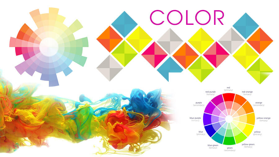
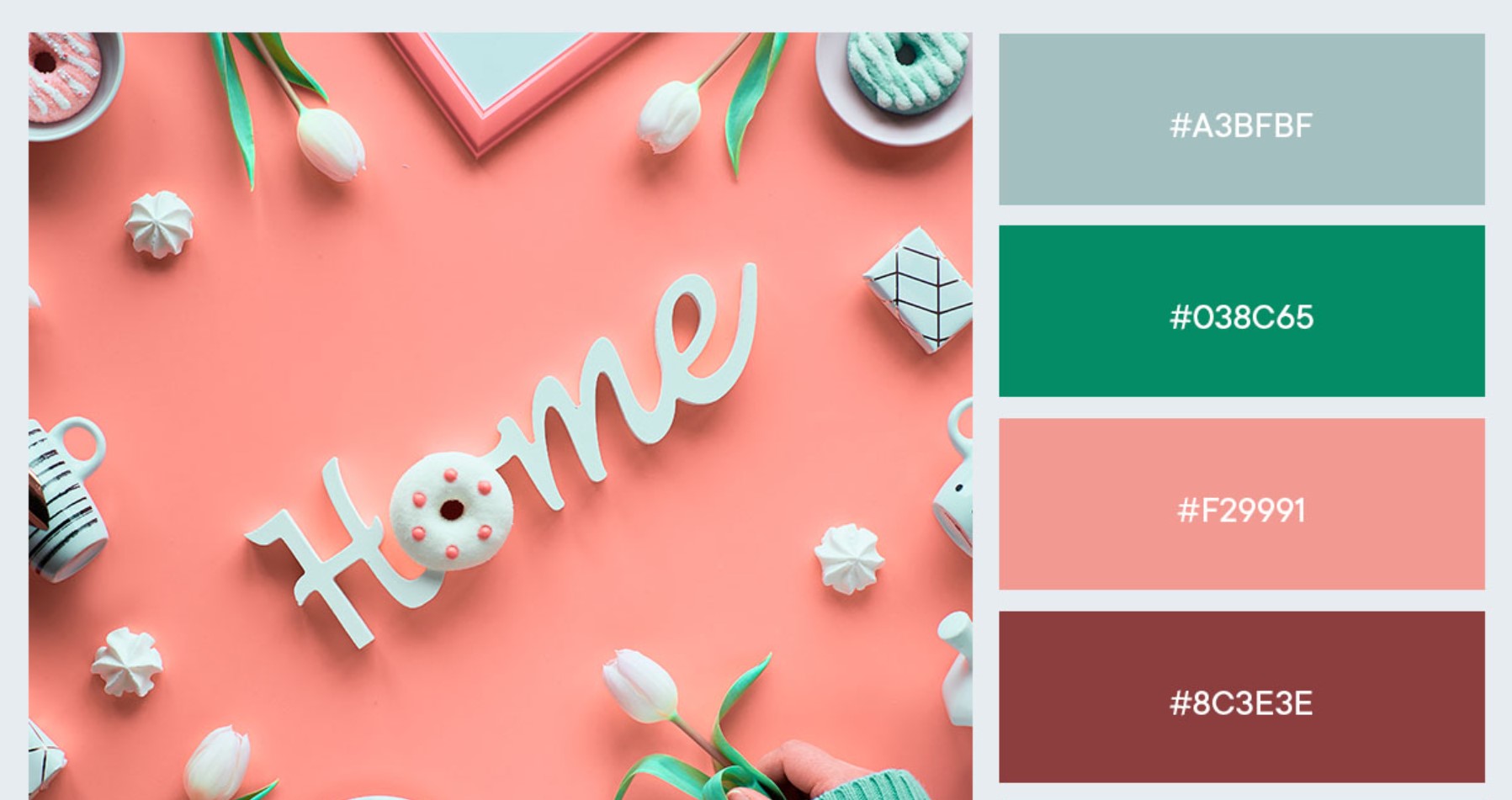
Have you ever looked at a design and wondered why it is so appealing? What is the secret? You may not know, but it all starts with… color. Let's explore with SaDesign the important color principles that will help you confidently create every perfect color scheme!
1. HOW IMPORTANT IS COLOR IN DESIGN?
Color is not just a decorative or aesthetic element, but a powerful “visual language” that conveys the emotions, messages and stories behind each design. Whether you are designing a logo, a website, a poster or a presentation, choosing the right color can make a huge difference.
1.1 Make a Strong Impression at First Sight
In the world of digital and graphic design, the first 3 seconds determine whether or not a viewer stays with your product. Color is the first element that attracts attention.
A bold red banner ad will quickly attract attention among hundreds of other images. An interesting fact is that 90% of purchasing decisions are based on color perception.
Bright, bold colors are often used in marketing and advertising campaigns to attract attention quickly.
.jpg)
1.2 Convey Emotions Subtly
Each color carries its own unique "emotional semantics". They have the ability to stimulate emotions and subtly impact the viewer's psychology.
Red: Represents energy, passion, and sometimes warning.
Blue: Brings a sense of trust and peace, suitable for brands related to finance and technology.
Yellow: Represents joy, dynamism, warmth and positivity.
1.3 Create a Connection with Your Viewers
Colors help create an emotional connection between a brand and its customers. When used correctly, colors can trigger memories, feelings of familiarity, and empathy in viewers.
1.4 Increase Brand Awareness
.jpg)
Color is an important factor in making a brand easily recognizable and memorable. A strong brand often has a consistent color system throughout all of their designs.
Each color is like a "silent storyteller", carrying deep meanings and messages. When you know how to combine colors and use colors effectively, you can tell great stories without using words.
2. Types of colors for color schemes
You’ve probably heard the terms primary colors, secondary colors, and tertiary colors. So what exactly are they? What role do they play in our color schemes?
Primary colors, secondary colors, and tertiary colors are all basic terms in color theory, just like the ABC alphabet that everyone must memorize before learning to spell. That is to say, beautiful color combinations must first come from understanding color.
2.1. Primary Colors
As the name suggests, primary colors are the original colors that you cannot create by mixing other colors together. You can think of primary colors as prime numbers - numbers that cannot be created by multiplying anything except 1 and itself.
.jpg)
The primary colors in the color wheel include:
Red
Yellow
Blue
When you mix primary colors together, your color scheme will contain new colors in different tones, tints, and shades (we'll talk about these terms below). So what are these colors called? The answer is below.
2.2. Secondary Colors
Secondary colors are the colors you get when you combine 2 or all 3 primary colors in your color scheme. Look at the color wheel below, how many secondary colors can you identify?
.jpg)
There are 3 secondary colors you can find on the color wheel:
Orange (Red + Yellow)
Purple (Blue + Red)
Green (Blue + Yellow)
When creating a color scheme, remember that the above combinations will only produce the correct results when you use the correct hue of the primary colors, because differences in the primary colors will lead to differences in the secondary colors in the color scheme.
2.3. Tertiary Colors
Tertiary colors are the colors you get when you mix a primary color and a secondary color. However, this color combination is not as simple as randomly choosing one color from the 3 primary colors and one color from the 3 secondary colors. At this point, you may have noticed that our color scheme has become a bit more complicated, right? So let's learn about the composition of tertiary colors to understand why colors are as picky as humans.
.jpg)
The pickiness of tertiary colors comes from the fact that not every primary color can be mixed with a secondary color to create a tertiary color. For example, red (a primary color) cannot be mixed with green (a secondary color), or blue (a primary color) cannot be mixed with orange (a secondary color).
In fact, you can absolutely mix red and green, or blue and orange in your color scheme. However, the resulting color will be a shade of brown. That’s why these color combinations don’t work (unless brown is what you’re looking for in your color scheme).
Tertiary colors can only be created when you mix a primary color with the secondary color next to it as shown in the image below.
.jpg)
So, there are a total of 6 secondary colors you can create for the color scheme based on the above conditions.
Lotus color (Red + Purple)
Orange Red (Red + Orange)
Violet (Blue + Purple)
Jade (Blue + Green)
Amber (Yellow + Orange)
Banana color (Yellow + Green)
3. Color wheel for color schemes
.jpg)
Now you know about primary, secondary, and tertiary colors. However, color in design doesn’t stop there. To create the perfect color scheme, especially on electronic devices, you can use more than the 12 pure colors we mentioned above.
All colors in their shades and hues are summed up in the color wheel. You must be familiar with this circular chart in color schemes, right? In the color wheel, you will find all the primary, secondary, and tertiary colors, represented in different tones, tints, and shades. If you pay attention, you will see the color bands arranged in the order of a rainbow (red, orange, yellow, green, blue, indigo, violet).
When you need to create a color scheme, the color wheel will help you create different shades, tints, and shades based on the base color by mixing them with white, black, and gray. This will make your color scheme much more diverse.
.jpg)
The terms hue, tint, shade and tone are what you need to remember for your color scheme. These are all terms that are used extremely commonly in design, however, not everyone can distinguish their meanings. This confusion is completely understandable because when translated into Vietnamese, we cannot express 100% of the meaning of the word.
So instead of focusing on vocabulary, let's learn about the nature of the terms hue, tint, shade and tone in the color scheme!
3.1. Hue
Hue is a hue, which is different from color. Strictly speaking, a color is made up of all its components such as hue, tint, shade, and tone. However, you can consider hue as the word that is closest to the concept of color that we often use. The reason is because hue corresponds to the 12 "primary" colors on the color wheel.
.jpg)
Hue is a term you must remember when combining colors in a color scheme. As I said above, if you do not use the correct hue of the primary colors, the resulting color mixture will not be the exact secondary color you need for the color scheme.
3.2. Shade
You might think of shade as referring to the lightness or darkness of a hue. Shade is essentially what you get when you mix a hue in a color wheel with black. So different shades are used to refer to the levels of black you add to a hue.
3.3. Tint
The opposite of shade is tint, however we cannot always distinguish between these two concepts when creating a color scheme. Simply put, if shade is a hue mixed with black, then tint is a hue mixed with white.
So, a color consists of a range of different shades and tints. You will see that clearly on the color wheel.
3.4. Tone or Saturation
You can add black to a color to create a shade, add white to create a tint, and add both black and white to get the tone of the color scheme. Tone and saturation actually refer to the same thing, but we usually use saturation when talking about color schemes in graphic design. Tone, on the other hand, is used in color schemes when painting.
Color is not just a decorative element, but also a powerful tool to tell your story. Understanding the principles of color and knowing how to apply them in practice will help you not only create beautiful designs but also be able to convey your message clearly and effectively. Thank you for reading this article. May you always be filled with creative inspiration!


