Best Selling Products

ChatGPT Plus Account (GPT-4)
16 USD

Upgrade Duolingo Super
29 USD

Autodesk All App Account Copyright
120 USD

Upgrade genuine Capture One account
120 USD

Genuine Cheap Canva Pro
39 USD

Adobe Premiere Pro Account
99 USD

MidJourney Account
29 USD

Plugin Retouch4me
69 USD

Windows 10 & 11 Pro Key
36 USD

Upgrade Genuine Office 365
49 USD

Adobe Photoshop Copyright - Full App
120 USD

Genuine Adobe Illustrator account
99 USD

Freepik Premium Account
59 USD

Copyright Adobe Lightroom Account
59 USD

Capcut Pro 1 Year
39 USD
Comic Sans Font – Unique Beauty Attracts All Eyes
Nội dung
Learn about Comic Sans, a font known for its unique design and widespread use in the world of graphic design.
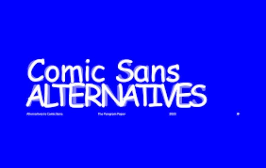
Comic Sans – a familiar name in the design community but also full of controversy. Known for its playful, innocent style, Comic Sans has been making a strong impression on users. Although there are many conflicting opinions about its suitability in design projects, it is undeniable that Comic Sans is the font that brings the most comfortable and friendly feeling. Let's explore with sadesign why Comic Sans is known as "the most beautiful font in the solar system" in the article below.
1. Comic Sans – History and origin
Comic Sans was designed by Vincent Connare in 1994, while he was working at Microsoft. Connare's original goal was to create a font that looked like handwriting, was easy to read, and could be used in software such as Microsoft Bob and Windows 95. The name "Comic Sans" comes from the style of comics, with soft, readable, and friendly strokes.
.jpg)
Since its inception, Comic Sans has quickly gained attention from the design community, but at the same time, it has received criticism for its unprofessionalism. However, Comic Sans still holds an important position in the graphic design industry, especially in conveying messages in an easy-to-understand and approachable way.
This font was inspired by illustrated typefaces in comic books, with the goal of conveying a friendly, approachable, and informal feel. Comic Sans was originally designed for use in Microsoft Bob, a cartoonish user interface. However, its popularity far exceeded expectations, and it was adopted in a wide range of fields. Despite receiving mixed reviews from designers due to its inappropriateness in formal contexts, Comic Sans holds a special place in the history of graphic design and is a testament to the influence of design on popular culture.
2. Outstanding features of Comic Sans
One of the reasons Comic Sans is one of the most popular fonts is because of its unique design features. These features not only make it easily recognizable, but also create a distinct, approachable, and inspiring style.
Rounded, soft letters : The letters in Comic Sans are designed with smooth curves, creating a soft and friendly feeling. This is an important feature that makes Comic Sans stand out from other fonts that have sharper edges.
Easy to read and friendly : Unlike many fonts with complex forms, Comic Sans has a simple, accessible and immediately understandable feel, which makes it an ideal choice for texts that need to convey information quickly.
Suitable for many contexts : Although many people criticize Comic Sans for its lack of formality, it is well suited for informal situations, such as personal emails, presentations, or children's publications.
(1).jpg)
With its soft, angular lines and uniform stroke weight, Comic Sans is often used in documents, content for children or contexts that do not require seriousness. However, due to its informal nature, this font has also caused controversy when used in the wrong context, especially in professional documents. This shows the importance of choosing the right typeface for the purpose and audience.
3. Comic Sans – The reason "The most beautiful font in the solar system"
Comic Sans isn’t everyone’s favorite font, but it certainly has made a big difference in the design community. Many consider it unprofessional, even a little naive, but for some reason, Comic Sans has maintained its popularity and appeal.
Accessibility : All the best fonts have one thing in common – accessibility. Comic Sans, with its simple and unfussy design, is comfortable and easy to recognize.
Ability to create an emotional connection : The rounded lines of Comic Sans help create a stronger emotional connection with the viewer. This is especially useful when you need to convey a message in a light, pleasant way.
Definitely makes a difference : In a world full of formal and elegant fonts, Comic Sans stands out as a bold choice. While many people hate it, there's no denying that Comic Sans always gets attention, which is why it's still called "the most beautiful font in the solar system".
Designed by Vincent Connare in 1994, Comic Sans was originally created for use in informal applications, especially for children or for humorous content. However, its misuse and inappropriateness in many contexts have led to mixed reviews from the design community. However, there is no denying that Comic Sans has left a significant mark on the design industry and popular culture, becoming a special icon when it comes to creativity and versatility in font use.
4. Practical applications of Comic Sans
.jpg)
Although not always used in professional projects, Comic Sans still has a strong place in many different fields, especially in the design of publications aimed at children or educational programs.
Educational Design : Comic Sans, although often controversial in the field of graphic design, has significant practical applications in educational environments. With its soft, easy-to-read and friendly typeface, Comic Sans is often used in teaching materials, notice boards and content for children or early readers. This typeface is especially suitable for students who have difficulty reading, such as those with dyslexia, thanks to the simple and easily recognizable structure of the characters. This helps create a more intimate and effective learning environment, supporting teachers in conveying knowledge in a more accessible and easier way for students of different ages.
Event decoration, banners, advertising : Comic Sans is also very popular in informal events such as birthdays, fairs or family programs. With a soft and friendly style, it is often used in many practical fields such as event decoration, banner design, and advertising. Thanks to its readability and the sense of closeness it brings, this font is especially suitable for creative activities or those aimed at children and families. In events, Comic Sans can create a playful accent, while in advertising, it helps to convey a message in a light and accessible way. However, the use of this font should be carefully considered to ensure it is appropriate for the context and target audience.
Website and app design : Some websites and apps choose Comic Sans for their interfaces because of its fun and approachable feel, especially when they want to create a pleasant user experience. This font can be used effectively in projects aimed at children or products that need to feel friendly and approachable. With its easy-to-read and soft characteristics, Comic Sans is suitable for highlighting messages that are not too serious, entertaining or educational. However, the use of this font should be carefully considered to ensure that it is appropriate for the context and does not detract from the professionalism of the product.
5. Controversies surrounding Comic Sans
.jpg)
Comic Sans has always been a hot topic in the design community. While it has clear advantages, there is no shortage of strong opposition, especially from professional designers.
Lack of professionalism : One of the biggest reasons Comic Sans is criticized is its lack of professionalism. It is often seen as inappropriate for formal documents or office environments, especially in companies or organizations that need to be more formal.
Contrast with modern fonts : While fonts like Helvetica or Arial are popular for their elegance and modernity, Comic Sans has a classic and somewhat "outdated" feel. This makes many people think that it is no longer suitable for today's era.
Difficult to use in serious designs : Using Comic Sans in serious or professional designs can come across as disrespectful to the viewer. This causes many designers to stay away from this font when working on large projects.
Some argue that this typeface is inappropriate in professional or formal contexts, leading to misuse and detracting from the aesthetic of the design. However, its proponents appreciate its friendliness, readability, and playfulness, especially in materials for children or entertainment. This controversy reflects not only aesthetic views but also the importance of choosing the right typeface for the context and purpose.
Beautiful Font Warehouse
6. Conclusion
Comic Sans may not be the right font for every situation, but there’s no denying that it’s comfortable and approachable. While there’s some controversy surrounding the use of Comic Sans in design, its presence in the typography world is undeniable. With its own history and style, Comic Sans is still rightly called “the most beautiful font in the solar system” – a friendly, approachable font that holds a lot of memories for design enthusiasts.


VIP Products


Best Selling Products
ChatGPT Plus Account (GPT-4)
16 USD
Upgrade Duolingo Super
29 USD
Autodesk All App Account Copyright
120 USD
Upgrade genuine Capture One account
120 USD
Genuine Cheap Canva Pro
39 USD
Adobe Premiere Pro Account
99 USD
MidJourney Account
29 USD
Plugin Retouch4me
69 USD
Windows 10 & 11 Pro Key
36 USD
Upgrade Genuine Office 365
49 USD
Adobe Photoshop Copyright - Full App
120 USD
Genuine Adobe Illustrator account
99 USD
Freepik Premium Account
59 USD
Copyright Adobe Lightroom Account
59 USD
Capcut Pro 1 Year
39 USD