Best Selling Products
Create Impressive Photos With Smart Use of Color in Photography
Nội dung
- 1. The importance of color in photography
- 2. Understanding the color wheel
- 3. Use color to guide the eye within the frame
- 4. Color and emotion
- 5. Applying color matching in different genres of photography
- 6. Post-production in color adjustment
- 7. Common mistakes when using color in photography
- 8. Conclusion
Discover the power of color in photography and how it affects the emotions of viewers. Learn how to combine colors intelligently to turn every photo into a captivating work of art.

In photography, light is the soul, but color is the emotion. A photo can be ordinary or attractive just by the way the photographer knows how to combine and handle colors. Understanding colors, how they affect visual perception and emotions is the key to helping photographers create true works of art. Color is not just something present in the frame, but a subtle storytelling medium, leading the viewer into the emotional world that the photographer wants to convey. Let's explore how to effectively apply color in photography through the article below.
1. The importance of color in photography
When most people think of photography, they immediately think of composition, lighting, and technique. But if we look closer, we realize that it is the color that makes the viewer stop, be impressed, and remember a photo. Color is not just a decorative element, but a powerful visual language that conveys emotions and messages.
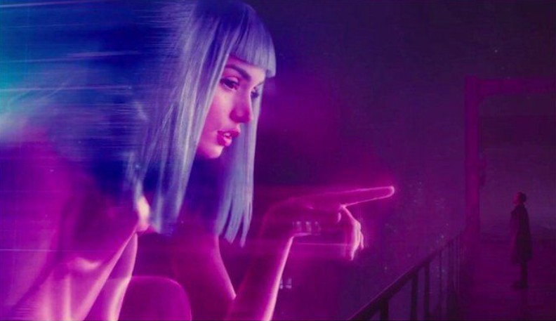
Each color has its own “story”. Red evokes passion, enthusiasm and strong energy. Blue brings a sense of peace and tranquility. Yellow symbolizes warmth and joy, while purple often evokes nostalgia, mystery or romance. When photographers know how to control color, they are no longer just “taking” pictures but “painting with light and emotion”.
.jpg)
A well-balanced color scheme can lead the viewer’s eye, creating a natural focal point without being over-the-top. Color helps direct the eye, emphasize the subject, and add depth to the space. A normal street photo can be brought to life with just a single pop of color; a quiet nature scene can become more magical with subtle color manipulation.
Good photographers understand that color is not just a technical tool, but an emotional language , a bridge between the outside world and the viewer's soul. When you understand this language, you will not only capture images, but also portray feelings.
2. Understanding the color wheel
To understand and master color, you cannot ignore the concept of the color circle . Whether you are an artist, designer or photographer, the color circle is the map that helps guide the emotions of your photo.
The color wheel is divided into 12 basic colors, belonging to three main groups: primary colors including red, yellow and blue; secondary colors are the result of mixing two primary colors (orange, green and purple) and finally tertiary colors , created from the combination of a primary color and a secondary color.
From this circle, photographers can apply many color matching rules to create visual effects such as:
Complementary color schemes use two colors that are opposite each other on the color wheel, such as blue and orange or red and green, to create a strong focal point. They are often used to draw attention or highlight a subject in a photo.
Analogous color schemes use colors that are adjacent to each other, such as yellow, orange, and red, to create a warm and harmonious feel. This type of scheme is often suitable for landscape or nature photos.
Monochromatic color schemes use the same color tone with varying brightness and saturation. This combination creates a subtle, minimalist feel, often seen in artistic portraits or minimalist fashion photography.
.jpg)
Understanding the color wheel not only helps you choose the right colors, but it also helps you control your visual emotions. When you choose colors with purpose instead of randomly, you will see more depth and “artistic intent” in your photos.
Imagine you want your photo to feel fresh and energetic. In that case, choosing warm tones like orange or yellow will be much more effective than cold blue or gray. If you want to create a feeling of loneliness and mystery, aim for cool tones or desaturated colors. The color wheel is the guide to help you express this purposefully.
3. Use color to guide the eye within the frame
In photography, every element in the frame has its own function and color is the most powerful tool to control the viewer's gaze. A well-composed photo with messy colors will confuse the viewer, not knowing where to focus. On the contrary, with just a single pop of color in the right place, you can make the viewer's gaze go where you want.
For example, in a smoky, gray-toned street scene, a single red umbrella in the center of the frame can be enough to create a focal point. Or in a portrait shot in a lush green field, the model wearing a yellow dress can make her the center of attention, making it impossible for viewers to look away.
A useful rule of thumb for color distribution is the “60–30–10 rule” : 60% is the dominant color of the scene, 30% is the supporting secondary color, and 10% is the accent color. This rule helps the overall look to be harmonious, not visually overloaded but still attractive.
.jpg)
Color can also be used to create depth. Cool colors (blue, purple) tend to make objects appear farther away, while warm colors (red, yellow, orange) make them appear closer. By mastering this principle, you can create three-dimensional space in your photos without having to use complicated techniques.
4. Color and emotion
Photography is the art of telling a story through images and color is the emotional voice in that story. Each color tone has its own language, conveying feelings that sometimes words cannot express.
Warm tones like red, yellow, orange often evoke feelings of happiness, energy, passion and vitality. That is why we often see them in photos of sunsets, festivals, or family moments. On the other hand, cool tones like blue, purple or green bring a feeling of calm, solitude or relaxation, suitable for natural landscapes, seascapes, or photos with deep inner thoughts.
Neutral tones like black, white, gray, and beige have their own nuances. They don’t evoke specific emotions, but create a balanced visual foundation that allows light, composition, and character expression to speak for themselves. Black and white photos often touch emotional depth because they strip away distractions, leaving only the essence of light and feeling.
A good photographer knows how to use color to tell a story. A sad rainy scene can be emphasized by gray-blue tones and soft lighting. A warm love story can be brightened by orange-yellow tones. When you understand the psychology of color, you don’t need any captions because the color speaks for itself.
5. Applying color matching in different genres of photography
Each genre of photography has its own “color language”, reflecting the goals and emotions the photographer wants to convey.
.jpg)
With portraits , colors should be used to enhance the beauty and charisma of the character. Choosing a background color that slightly contrasts with the skin color will help the face look brighter and more prominent. Pastel, light brown or monochrome colors often create a sense of sophistication and elegance. Meanwhile, if you want to convey a strong personality, you can use a dark background color or modern neon lights.
Landscape photography is where natural colors shine. Photographers need to learn how to “read” the colors of nature, from the yellow of rice fields, the blue of the sea, to the purple of sunset. Choosing the time of day (golden hour, sunset, sunrise) can completely determine the emotional tone of the photo.
With fashion photography , color is the most powerful weapon. Every brand, every collection has its own nuances and photographers need to understand how to combine colors to highlight the design. Strong contrasts or unconventional color combinations can turn a photo into a visual statement.
In product photography , colors should reflect the essence of the brand. Natural products often go well with earthy tones of green or brown, while high-end products go well with black, metallic gold, or pure white.
For architectural photography , color is closely related to materials and light. The combination of color blocks – walls, glass, light helps to highlight the lines and structure of the building. A well-processed color tone can make an architectural photo more profound and artistic than documentary.
6. Post-production in color adjustment
Even if you’ve captured the perfect shot, color post-production is still an essential step in perfecting your work. Tools like Lightroom, Photoshop, or Capture One help you fine-tune color parameters from white balance to saturation, hue, and contrast.
.jpg)
It’s important to know what you want before you edit. A photo can look too good or too unnatural with over-processing. The goal of post-production is not to “make it look good,” but to perfect the visual feel.
If you’re going for a vintage look, reduce saturation, add warm tones, and soften shadows. If you’re going for a cinematic look, increase contrast, reduce midtones, and add a touch of cool. For portraits, prioritize balance between skin tone and overall lighting.
Presets can be a time saver, but don't let them dictate your personal style. Every photo is unique, and sometimes just a small adjustment to hue or saturation can completely change the feel of it.
7. Common mistakes when using color in photography
One of the most common mistakes is overusing contrasting colors . When too many strong colors are placed next to each other in an image, the viewer loses focus and doesn’t know what the focal point is. Contrast is only effective when used intentionally and sparingly.
The second mistake is overdoing the color correction . Many people new to post-production tend to increase the saturation or clarity too much, making the image look artificial and unnatural. Remember that sometimes less is more, the best colors are natural and match the real light.
Another mistake is to ignore the lighting factor . Color is always related to light. Yellow light gives a warm feeling, white light gives a modern feeling, while blue light can easily make the frame become cold and distant. You can't have beautiful color if the lighting is wrong from the beginning.
.jpg)
Finally, many photographers forget that a series needs color consistency . When photos in the same series have different tones, the overall look will be disjointed and lack a story. Choose a dominant color palette for the series and keep that style throughout to create a seamless, professional feel.
8. Conclusion
Color is not just a decorative layer of photography, it is an emotional language, a way for the photographer to tell the world in his own way. When understood and applied correctly, color can turn a still frame into a vivid work of art, full of breath and soul. A beautiful photo does not necessarily have to be colorful; what matters is whether the color says what you want to say. Learn to feel color like you feel music when it blends, when it contrasts, when it is silent. Take time to observe color in life: the sunset on an old wall, the light gray tone of early morning, or the color of human skin under the streetlights. All are lessons about color, if you look with your heart. Because photography is not just about recording light, but the art of turning light and color into emotion. When you understand that, each click of the camera will no longer be random, but a purposeful creative act, where each color carries the breath of the artist's soul.


