Best Selling Products

Freepik Premium Account
59 USD

Upgrade Duolingo Super
29 USD

Genuine Adobe Illustrator account
99 USD

Upgrade Genuine Office 365
49 USD

Autodesk All App Account Copyright
120 USD

Plugin Retouch4me
69 USD

MidJourney Account
29 USD

Capcut Pro 1 Year
39 USD

ChatGPT Plus Account (GPT-4)
16 USD

Adobe Premiere Pro Account
99 USD

Upgrade genuine Capture One account
120 USD

Adobe Photoshop Copyright - Full App
120 USD

Copyright Adobe Lightroom Account
59 USD

Windows 10 & 11 Pro Key
36 USD

Genuine Cheap Canva Pro
39 USD
Discover 12 Ways to Arrange Layout in Design
Nội dung
Layout is one of the most important elements in design, determining the appeal and effectiveness of the product's message. A reasonable layout not only helps viewers easily access information but also creates harmony and aesthetics. In this article, we will explore 12 different layout arrangements, thereby improving your design ability and bringing better experiences to users.
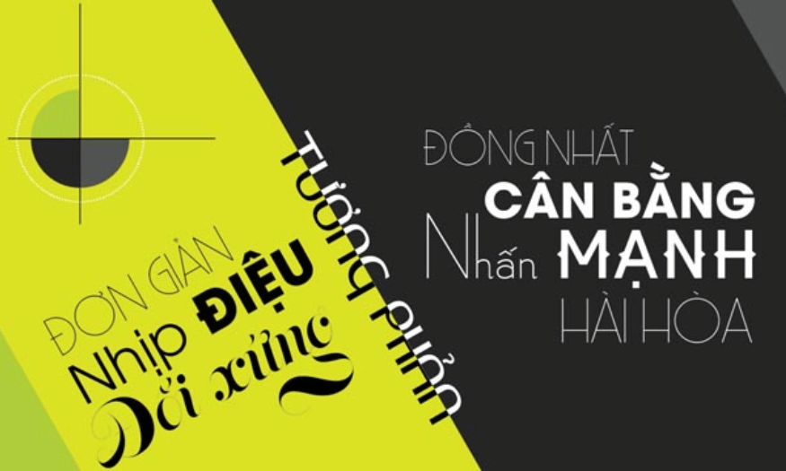
Layout is one of the most important elements in design, determining the appeal and effectiveness of the product's message. A reasonable layout not only helps viewers easily access information but also creates harmony and aesthetics. In this article, we will explore 12 different layout arrangements, thereby improving your design ability and bringing better experiences to users.
1. Motion layout
Motion composition is not just the arrangement of design elements, but the art of creating a sense of movement and depth in a work. By applying this composition, you will make the viewer feel that the objects are not just stationary but in a state of motion. This is very important in advertising designs, posters or works of art where conveying emotions is necessary.
To create the effect of movement, you can use elements such as size, position, and color in a clever way. For example, arranging objects of different sizes or diagonally will create the impression that they are moving or floating in space. Soft lines and dynamic shapes can also help create the movement you want.
Additionally, motion compositions enhance the viewer’s experience. When they feel the dynamism in the design, their minds are more stimulated, leading to higher attention and engagement with the work. Experiment with different elements to discover the power of motion compositions in your designs!
2. Rhythmic composition
Rhythmic composition is a unique arrangement method that brings life to a design work through repetition. When elements such as color, shape, or graphic details are intentionally repeated, they create a sense of continuous movement. This makes the viewer feel alive, as if the work is “dancing” before their eyes.
Repetition not only attracts attention, it also creates a memorable structure. Repeated images or colors are easier for viewers to remember, creating a deeper impression. A good design with rhythmic composition can turn a simple message into a memorable experience that keeps viewers coming back for more.
Rhythmic composition also has the ability to heighten the viewer’s emotions. Repetitive elements often bring a sense of security and familiarity, which makes it easier for them to immerse themselves in the work. Try applying rhythmic composition in your designs to create a space full of life and emotion.
.png)
3. Emphasis layout
Emphasis composition, also known as accent composition, is a powerful tool for drawing the viewer’s attention. When you need to draw attention to a key point in your design, it is essential to use this composition. Typically, emphasis is created through contrast in color, size, or shape of elements.
A clear focal point will draw the viewer’s eye at first glance. You can differentiate between objects by using a more prominent color or a larger size. This not only helps viewers recognize the important element, but also makes them more interested in the message you want to convey.
At the same time, emphasis can also create a sense of drama in a design. When a viewer sees an element that stands out from the rest, it creates curiosity and exploration. Be thoughtful about where you place emphasis in your design, as it will determine how your message is received and perceived.
4. Uniform layout
Uniform composition is the organization of design elements with a high degree of consistency in color, shape, and line. The goal of uniform composition is to create a harmonious and recognizable design. When all elements have similar attributes, they form a unified and orderly whole.
One of the benefits of a consistent layout is that it creates a sense of security and familiarity for viewers. When they see similar shapes and colors, their minds will easily remember and associate it with your brand or the message you are trying to convey. This is very important in branding and communication design.
Additionally, using a consistent layout can help create a professional and sophisticated look for your product. A consistent design not only attracts attention, but also shows respect for your audience and the message you want to convey. Consider using a consistent layout in your design projects to create memorable and memorable work.
.png)
5. Visual flow layout
Flow composition is a unique design method that creates imaginary paths that guide the viewer’s eyes from one point to another. It is not simply the arrangement of shapes or colors, but the art of guiding the viewer’s emotions and attention. By applying this composition, the designer can create a smooth and natural visual experience for the viewer.
Visual movement depends not only on the arrangement but also on the viewer’s habits and psychology. By using lines, colors and shapes intentionally, designers can create natural “flows” that make viewers feel like they are moving through the design space. This not only creates interest but also makes it easier for viewers to access and understand the message the work wants to convey.
A successful design with visual flow will make the viewer feel like they are on a journey. They will not stop at a single point of view but will continuously explore each detail and element of the work. Experiment with different elements to create a strong and engaging visual flow in your design.
6. Symmetrical balance layout
Symmetrical balance is a design approach that provides a sense of stability and security to the viewer. When elements in a design are arranged in a balanced manner around a central axis, they create a harmonious and pleasing whole. This is one of the most effective ways to create interest and highlight a product.
Repetition of elements in an image not only creates balance but also a sense of order. Symmetrical compositions are often used in logo designs, posters and artwork where perfection and order are valued. When viewers look at a symmetrical design, they feel secure and are more receptive to the message.
However, to avoid boredom, you can combine symmetrical elements with some small accents to create interest. Symmetrical balance not only provides stability but can also become the basis for more creative ideas. Experiment with this layout to create works of art that are both subtle and impressive.
.png)
7. Asymmetrical Balance Layout
Asymmetrical balance is a fun and dynamic design approach that allows you to arrange elements unevenly in weight and size. Instead of creating perfect symmetry, this layout relies on contrast and uneven distribution between elements, giving the design a free and modern feel.
The beauty of an asymmetrical layout is its ability to create interaction and energy. Elements like color, size, and shape can be used to create balance, even though they are not symmetrical. This evokes a sense of movement and liveliness, making the viewer feel like they are entering a space filled with energy and creativity.
When applying asymmetrical balance, pay attention to how the elements interact with each other. A good asymmetrical design will make the viewer think and explore every detail. Try this layout to bring uniqueness and freshness to your design products.
8. Contrasting layout
Contrast composition is one of the most powerful design techniques, using the opposition between elements to attract attention. By combining different colors, images or typography, you can create a piece that stands out and makes an impression. Contrast not only helps clarify the message but also brings out strong emotions in the viewer.
When using contrasting layouts, it is important to create distinction between elements. For example, a bright color can be placed next to a dark color to create emphasis, or large type can be used to emphasize key messages. Contrast not only helps to draw the eye, but also creates interesting points in the design.
Contrasting compositions are often used in advertising, posters, or any design that requires difference or contrast. Not only does it help attract attention, it also creates a sense of depth and dimension in the work. Experiment with contrasting compositions to create unique and engaging designs that will leave a lasting impression on your viewers.
.png)
9. Grid layout
Grid layout is a method of arranging design elements in a grid pattern, creating organization and consistency in the work. This method is popular in web and graphic design, where information needs to be presented in a clear and accessible way. Grid layouts make it easy for viewers to follow and find information, thereby improving the user experience.
Grid layouts not only create uniformity but also allow designers to express their ideas creatively. You can resize the grid cells or combine different elements to create unique designs. Grid layouts also make it easy to adjust and change elements without losing the overall aesthetic.
One of the biggest benefits of grid layouts is the flexibility they provide. When your design needs to change or update information, you can easily replace elements without having to rebuild the entire layout. Try using grid layouts in your projects to create designs that are both streamlined and elegant.
10. Hierarchical layout
Hierarchical layout uses elements such as size, color, and position to create a clear hierarchy between elements in a design. By identifying which elements are most important, you can easily guide the viewer’s attention to the main message. This method is often used in poster, flyer, and website design.
When applying a hierarchical layout, you can use larger sizes for headings and gradually decrease the size of secondary text. Color is also a powerful tool for creating emphasis. A bright color can be used for main elements, while lighter colors for secondary information. This way, the viewer can easily identify important information.
Hierarchical layouts not only help organize information effectively, but they also make designs more appealing. When viewers know the order of elements, they are more likely to explore and learn more about the content. Consider using hierarchical layouts in your design projects to optimize your message.
.png)
11. Circular layout
Circular composition uses circular shapes or circular elements to create balance and harmony. This method often creates a sense of unity and comfort, making the viewer feel comfortable when looking at the work. Circular composition can be applied in many fields such as logo design, posters or interior decoration.
When using circular composition, you can arrange elements in such a way that they form a circle or a swirling shape. This not only creates interest but also helps to guide the viewer’s eye in a certain direction. Circles also often symbolize wholeness and perfection, which adds to the aesthetic value of the design.
One of the great benefits of circular layouts is their ability to create connections between elements. When elements are arranged in a circle, they create a sense of connection and interaction, making it easy for viewers to feel the connection between them. Experiment with circular layouts to bring something new and unique to your designs.
12. Free layout
Freeform layout is a design method that allows you to express your creativity without being bound by any set rules or templates. This means you can arrange elements in any way you see fit, creating a piece that is truly your own. Freeform layout is often used in modern art, graphic design, and creative projects.
By using free-form compositions, you can create unique and individual pieces that stand out from the crowd. The randomness in the arrangement of elements can give the piece a fresh and interesting feel. This not only attracts attention but also stimulates the viewer's imagination.
However, freeform composition also requires you to have an overall view and the ability to adjust appropriately to avoid a feeling of clutter. You need to carefully consider how the elements interact with each other and ensure that the work still has a certain harmony.
.png)
13. Conclusion
Choosing the right layout not only enhances the aesthetic value but also optimizes the effectiveness of message transmission. Each method has its own advantages, and understanding how to apply them will help you become an excellent designer. Experiment with different layouts to find your own style and create impressive design products that bring the best experience to users.


VIP Products


Best Selling Products
Freepik Premium Account
59 USD
Upgrade Duolingo Super
29 USD
Genuine Adobe Illustrator account
99 USD
Upgrade Genuine Office 365
49 USD
Autodesk All App Account Copyright
120 USD
Plugin Retouch4me
69 USD
MidJourney Account
29 USD
Capcut Pro 1 Year
39 USD
ChatGPT Plus Account (GPT-4)
16 USD
Adobe Premiere Pro Account
99 USD
Upgrade genuine Capture One account
120 USD
Adobe Photoshop Copyright - Full App
120 USD
Copyright Adobe Lightroom Account
59 USD
Windows 10 & 11 Pro Key
36 USD
Genuine Cheap Canva Pro
39 USD