Best Selling Products
Discover 15 Unique Logo Color Combinations That Inspire Design
Nội dung
- 1. Strong contrasting color scheme
- 2. Use simple but sophisticated colors
- 3. Soft pastel color scheme
- 4. Combination of cool and warm colors
- 5. Yellow and black
- 6. Natural colors – Green and brown
- 7. Use neon colors
- 8. Create accents with metallic colors
- 9. Blue and white
- 10. Orange and green color scheme
- 11. Take advantage of bright color combinations
- 12. Purple and silver
- 13. Jade green and gold
- 14. Red and gray
- 15. Monochrome color
- 16. Conclusion
Discover 15 creative and inspiring logo color combinations to enhance your branding. Learn how to choose the right colors to make a strong impression.
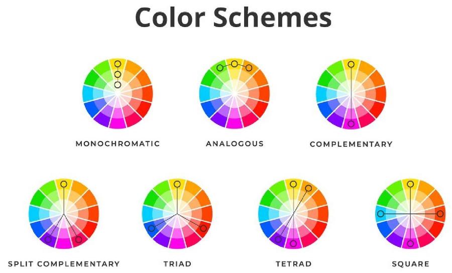
Colors have great power in building brand identity. Especially when combined subtly, colors can convey strong emotions, creating connections and easy identification with customers. In this article, we will share with you 15 unique logo color combinations and inspire all your designs. Let's explore with sadesign to elevate your brand through impressive colors.
1. Strong contrasting color scheme
When you combine contrasting colors, your logo will immediately attract attention. Pairs like red and blue, yellow and green, or orange and black can create a strong and recognizable impression. This contrast creates dynamism, strength, and presence.
.jpg)
Strong contrasting color schemes are one of the most effective ways to make your logo stand out and make an impression. By combining opposing colors such as blue and orange, red and green, or purple and yellow, you can convey a strong message and attract the viewer's attention at first sight. However, to achieve optimal effectiveness, it is necessary to ensure balance in the design, avoiding making the logo too confusing. Contrast not only helps the logo stand out, but also contributes to increasing brand recognition, making your brand memorable and different in the minds of customers.
2. Use simple but sophisticated colors
Sometimes, simplicity is the key to creating a memorable logo. Monochromatic colors like black, white, or gray can create a clean, modern, and memorable look. You can add drop shadows or a matte finish to make your logo stand out without too many colors.
Color coordination in logo design plays an important role in conveying messages and building brand identity. Using colors in a simple yet sophisticated way not only makes the logo stand out but also creates a sense of professionalism and is easy to remember. By choosing harmonious or contrasting tones appropriately, you can create designs that are aesthetically pleasing and consistent with the core values of the brand. Don’t forget to consider the psychology of color to ensure that each color contributes to highlighting the meaning and personality of the logo.
3. Soft pastel color scheme
One of the prominent trends today is to use a gentle pastel color palette, bringing a sense of sophistication, elegance and modernity. Pastel tones such as light pink, mint green, light yellow or lavender not only create harmony but also make the logo more recognizable and approachable. Combining pastel colors such as pink, mint green, light purple will create a sense of closeness and approachability, suitable for brands related to children's products, cosmetics, or clean food.
.jpg)
When applying this color scheme, you need to pay attention to the balance between the colors to ensure consistency and professionalism for the design. It is important to choose a color palette that matches the core values and message that the brand wants to convey, thereby creating a unique and lasting impression in the minds of customers.
4. Combination of cool and warm colors
Cool and warm color combinations can create a great balance in your logo. Cool colors like blue or green can create a cool, trustworthy feeling, while warm colors like red or orange create a warm, energetic feeling.
A harmonious combination of cool and warm tones not only makes your logo stand out, but also brings a sense of balance and appeal to the viewer. Cool colors, such as blue or green, often evoke trust, professionalism and tranquility, while warm colors, such as red, orange or yellow, express dynamism, enthusiasm and creativity. When used correctly, this combination can create an inspiring design that will help your brand make a strong impression on customers.
5. Yellow and black
Yellow stands out for its brightness, dynamism and excitement, while black represents strength and luxury. The combination of gold and black can create a logo that is both noble and dynamic and creative.
6. Natural colors – Green and brown
If your brand is closely tied to nature, the combination of green and brown will help create a sense of closeness and trust. Green represents freshness and growth, while brown represents stability and sustainability.
.jpg)
7. Use neon colors
Neon colors, with their strong prominence, are perfect for brands that want to be different, dynamic and modern. This color is suitable for the fashion, technology and entertainment industries. Although eye-catching, the use of neon colors must be careful to avoid overloading the logo.
When it comes to color schemes, it’s important to strike a balance between boldness and harmony to ensure your logo remains professional and recognizable. Neon colors are especially well-suited to brands that target a youthful, dynamic audience or creative industries like technology, entertainment, and fashion.
8. Create accents with metallic colors
Metallic colors like gold, silver or copper not only add luxury to your logo but also show nobility and class. Combining metallic colors with neutral colors like black or white will create a perfect logo design for high-end brands.
9. Blue and white
The combination of blue and white creates a sense of professionalism, reliability and stability. Especially for companies operating in the fields of finance, banking or technology, blue and white will bring credibility from customers.
10. Orange and green color scheme
Orange represents creativity and energy, while green represents freshness and nature. This combination is suitable for brands in the food, travel, or products related to health and the environment.
.jpg)
11. Take advantage of bright color combinations
Color coordination in logo design is not just about combining colors, but also the art of conveying messages and emotions to customers. Using bright colors skillfully can help your logo stand out, create a strong impression and evoke positive feelings.
For best results, consider color harmony, ensuring that they not only fit your brand, but are also visually appealing and memorable. Experiment with creative color combinations, but remember to keep balance and professionalism in every detail of your design.
12. Purple and silver
Purple and silver are a sophisticated and luxurious combination that will bring a modern and classy feel to your logo design. Purple is often associated with creativity, mystery and power, while silver represents elegance, professionalism and technology.
Combining these two colors can create a striking yet harmonious color palette, suitable for brands that want to express their uniqueness and distinction. For maximum effect, consider using purple as the main color, accented with silver details to add depth and visual interest.
13. Jade green and gold
Emerald green can represent freshness and relaxation, while gold brings a luxurious, mysterious beauty. When combined, they create a subtle yet striking effect, which is perfect for brands in the jewelry, fashion or high-end interior industries.
.jpg)
When combined harmoniously, these two colors not only create an aesthetic design but also help your brand stand out and leave a strong impression in the minds of customers. Applying this color scheme requires sophistication and careful consideration to achieve optimal effectiveness in logo design.
14. Red and gray
Red represents strength and dynamism, while gray represents sophistication and modernity. This combination is very suitable for brands that want to build a strong image but still maintain elegance and luxury.
15. Monochrome color
Monochrome is a safe but effective choice. Using a single shade of color, such as black, white, or another color in varying shades, will create a simple yet striking logo.
This style focuses on using different shades of a single color, from dark to light, to create visual harmony and a sense of consistency. Choosing monochrome colors not only brings a minimalist beauty but also helps increase brand recognition, especially suitable for businesses that want to show modernity, luxury and focus. When applied correctly, monochrome color schemes can be powerfully inspiring, highlighting the core values of the brand in the eyes of customers.
Cheap Canva Pro Upgrade
16. Conclusion
Choosing the right colors for your logo design is one of the most important factors that determine the success of your brand. The above logo color combinations not only help you create outstanding designs but also reflect the message and values that your brand wants to convey. Carefully consider each color when designing your logo, and don't be afraid to experiment with new, creative combinations to create a unique impression in the hearts of customers.


