Best Selling Products

Genuine Adobe Illustrator account
99 USD

Upgrade Genuine Office 365
49 USD

Upgrade genuine Capture One account
120 USD

Copyright Adobe Lightroom Account
59 USD

Adobe Photoshop Copyright - Full App
120 USD

Freepik Premium Account
59 USD

Adobe Premiere Pro Account
99 USD

MidJourney Account
29 USD

Autodesk All App Account Copyright
120 USD

Capcut Pro 1 Year
39 USD

Plugin Retouch4me
69 USD

ChatGPT Plus Account (GPT-4)
16 USD

Upgrade Duolingo Super
29 USD

Genuine Cheap Canva Pro
39 USD

Windows 10 & 11 Pro Key
36 USD
Discover the Unique Fonts That Make Up BLACKPINK's Brand
Nội dung
- 1. Introduction to BLACKPINK and the importance of fonts in branding
- 2. BLACKPINK and brand strategy
- 3. The main fonts BLACKPINK uses
- 3.1. BLACKPINK Logo Font
- 3.2. Fonts for albums and music products
- 3.3. Fonts in promotional and advertising campaigns
- 3.4. Fonts in posters and events
- 3.5. Some commonly used fonts
- 4. Analysis and importance of fonts in BLACKPINK's branding strategy
- 5. Conclusion
Discover the Unique Fonts That Make Up BLACKPINK's Brand
BLACKPINK, the popular K-pop group, is not only famous for their great music but also for their fashion style and unique brand image. Part of BLACKPINK's success is the way they use fonts in their promotional campaigns, albums, and brand images. In this article, sadesign will explore with you the fonts BLACKPINK is using and why they create a unique mark for the group.
1. Introduction to BLACKPINK and the importance of fonts in branding
BLACKPINK, an internationally renowned K-pop group, has not only made an impression with their hit songs but also with their unique and sharp brand image. The group’s style is clearly expressed not only through their music but also through their visual elements, including their logo, colors, and especially their fonts. Although fonts may seem like a small element in the overall branding strategy, they play an important role in building BLACKPINK’s identity and enhancing their global recognition.
.jpg)
Beautiful Font Warehouse
In branding, fonts play an important role in conveying the group’s message and identity. Fonts are not only an aesthetic element but also create a distinctive identity, helping the audience easily associate with BLACKPINK’s image. Careful selection of font style, size and color helps to reinforce brand value, create a sense of professionalism and attract attention in all of the group’s media products. This shows the importance of paying attention to every small detail in building a comprehensive brand image.
2. BLACKPINK and brand strategy
BLACKPINK’s brand has been meticulously crafted, from their music to their visuals, all working together to create a perfect whole. The members of the group each have their own distinct personalities, but when combined, they form a unified group with a common signature style. This is also evident in the way BLACKPINK uses fonts in their music products, posters, advertisements, and more.
One of the important factors in building a brand for BLACKPINK is the choice of fonts. Fonts are not simply the style of the letters, but they also convey the message, emotions and personality of the group. Therefore, BLACKPINK's font choice is not only based on aesthetics but also must be suitable for the message the group wants to convey.
3. The main fonts BLACKPINK uses
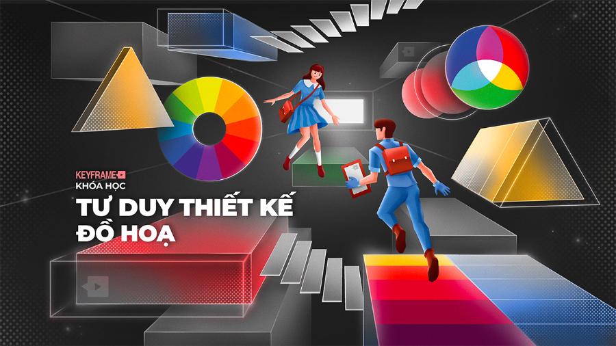
Fonts play an important role in conveying messages and building brand image. BLACKPINK has cleverly chosen fonts that are suitable for each product, from logos, albums, posters to other media publications. Analyzing and learning about these fonts not only helps fans better understand the group's design style but also provides useful knowledge for those interested in the field of graphic design.
3.1. BLACKPINK Logo Font
The BLACKPINK logo and group name are often designed with a special font, which is unique and reflects the group's personality. This font is often a combination of modern and classic features, creating a harmonious and unique whole. However, the exact name of this font has not been widely announced.
(1).jpg)
BLACKPINK's logo is a signature symbol of the group, and the font in this logo is very recognizable. The name BLACKPINK is written in a sans-serif font, sharp and strong. This font gives a modern, youthful but also very luxurious feeling, suitable for the image of an international music group.
The prominent feature of the font in the BLACKPINK logo is the straight and decisive lines, expressing the group's determination and strong energy. The combination of boldness and spacing between letters creates a balanced, strong but not too rigid feeling. This helps BLACKPINK express their confidence and unique personality.
3.2. Fonts for albums and music products
BLACKPINK always pays attention to choosing fonts for their albums. Each album usually has one or more different fonts, expressing its own theme and style. For example, in the album "Square Up", the group used the font Exocet for the title, creating a strong and individual look.
In addition to their logo, BLACKPINK also uses different fonts in their music products. In their albums, singles, and promotional images, BLACKPINK uses modern fonts that are easy to read but also very stylish. These fonts often have a combination of classic and modern styles, both contemporary and reminiscent of nostalgic elements.
A great example is on “The Album,” where the group uses a subtle sans-serif font that easily highlights the album title and songs. The mix of uppercase and lowercase letters makes the design interesting and easy to catch the viewer’s attention.
3.3. Fonts in promotional and advertising campaigns
When BLACKPINK participates in promotional campaigns for major brands, they often use modern and luxurious fonts. These fonts help increase brand recognition and create a difference. They are not simply a tool to convey information but also help create a visual space that shows class, class and is suitable for promotional campaigns.
(2).jpg)
BLACKPINK's advertising campaigns often feature a combination of simple fonts that are extremely effective in attracting public attention. This is the reason why every time BLACKPINK appears in campaigns, their image is always remembered and easily recognized.
3.4. Fonts in posters and events
BLACKPINK posters are designed with aesthetics in mind, and fonts are an integral part of that design. The fonts chosen are often highly expressive, from soft, curvy fonts to sharp, bold fonts. Each font used in BLACKPINK events or posters carries a unique message, making the group's image more special and easily stand out.
BLACKPINK's posters and media publications also use a variety of fonts, from bold, sans-serif fonts to serif fonts, from modern fonts to classic fonts. The choice of font depends on the content and purpose of each publication.
3.5. Some commonly used fonts
In addition to specially designed fonts, BLACKPINK also often uses some popular fonts in their products, including:
Helvetica : One of the most popular sans-serif fonts in the world, known for its simplicity, clarity and readability.
Arial : Another popular sans serif font, similar to Helvetica but with some slight differences.
Times New Roman : A serif font, commonly used in printed documents and publications.
Garamond : A classic serif font that exudes formality and elegance.
4. Analysis and importance of fonts in BLACKPINK's branding strategy
Every K-pop group has its own unique branding elements, and BLACKPINK is no exception. Fonts are one of the important elements that help the group build its own unique style, while also easily distinguishing them from other groups. The choice of font is not only based on personal preference but also must reflect the message the group wants to send to the audience.
.jpg)
Create a unique style
BLACKPINK doesn't limit themselves to a single font style. The group constantly experiments and changes fonts in their products, creating diversity and freshness.
Enhance brand awareness
The fonts chosen by BLACKPINK are all highly aesthetic, suitable for the style that the group pursues. They are not only easy to read but also bring strong emotions and impressions to the viewer.
Fonts help BLACKPINK create consistency across their products and promotional campaigns. When fans see a specific font in their products, they immediately recognize it as BLACKPINK. This consistency helps the group maintain a strong image and influence among fans.
Combine with other design elements
Fonts cannot be separated from other design elements such as colors, images and symbols. The combination of fonts and these elements creates a complete whole, helping BLACKPINK express their own personality and style. Fonts not only help convey messages but also act as an introduction to each product, thereby attracting the attention of the audience.
Harmonious combination
BLACKPINK often combines many different fonts in the same product, creating harmony and balance. This combination requires sophistication and understanding of design, making the group's products more unique and impressive.
Consistency
Despite using a variety of fonts, BLACKPINK still maintains consistency in their design style. This helps the audience easily recognize and remember the group's brand.
Beautiful Font Warehouse
5. Conclusion
BLACKPINK is not only a group with great musical talent but also an icon of fashion and style. The strategic use of fonts has contributed to creating a strong and recognizable brand image for the group. Fonts are not only a tool to convey messages, but also an important part in building a BLACKPINK with a unique and impressive style around the world.


VIP Products


Best Selling Products
Genuine Adobe Illustrator account
99 USD
Upgrade Genuine Office 365
49 USD
Upgrade genuine Capture One account
120 USD
Copyright Adobe Lightroom Account
59 USD
Adobe Photoshop Copyright - Full App
120 USD
Freepik Premium Account
59 USD
Adobe Premiere Pro Account
99 USD
MidJourney Account
29 USD
Autodesk All App Account Copyright
120 USD
Capcut Pro 1 Year
39 USD
Plugin Retouch4me
69 USD
ChatGPT Plus Account (GPT-4)
16 USD
Upgrade Duolingo Super
29 USD
Genuine Cheap Canva Pro
39 USD
Windows 10 & 11 Pro Key
36 USD