Best Selling Products

Plugin Retouch4me
69 USD

Upgrade genuine Capture One account
120 USD

ChatGPT Plus Account (GPT-4)
16 USD

Upgrade Genuine Office 365
49 USD

Windows 10 & 11 Pro Key
36 USD

MidJourney Account
29 USD

Adobe Photoshop Copyright - Full App
120 USD

Autodesk All App Account Copyright
120 USD

Adobe Premiere Pro Account
99 USD

Copyright Adobe Lightroom Account
59 USD

Genuine Cheap Canva Pro
39 USD

Upgrade Duolingo Super
29 USD

Freepik Premium Account
59 USD

Capcut Pro 1 Year
39 USD

Genuine Adobe Illustrator account
99 USD
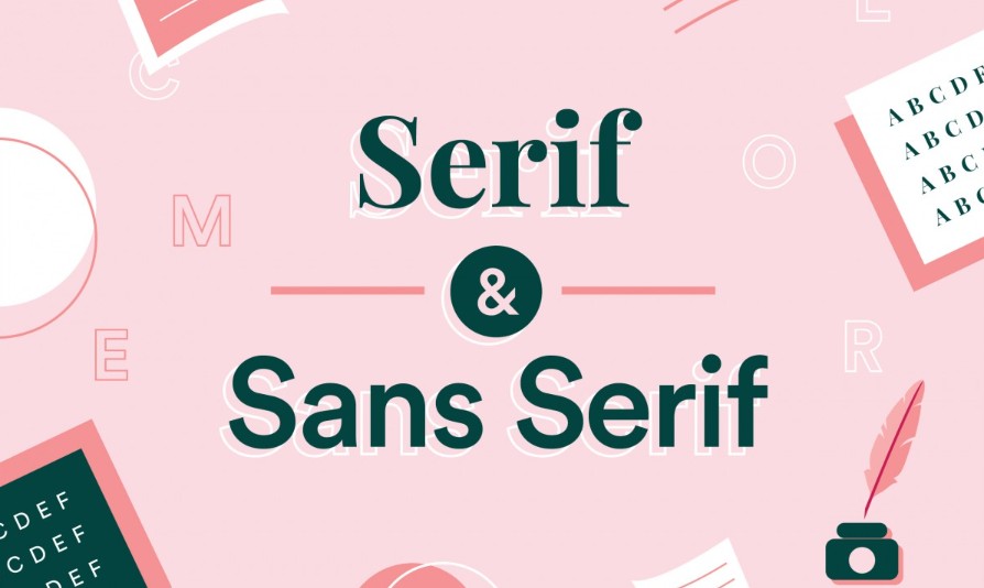
Distinguish Serif And Sans-Serif At A Glance
Nội dung
Serif and Sans-serif are the two most basic subclasses that any designer must master. Choosing the right one will directly affect whether or not readers are interested in receiving information, especially when you have to consider between traditional printing and modern digital design.
In any publication from posters, brochures, websites, apps to books, e-books, typography plays a key role in conveying messages, building emotions and creating visual experiences. A suitable font not only makes the content easier to read but also contributes to expressing the personality and values of the brand. Among the sea of fonts with thousands of options, Serif and Sans-serif are the two most basic subclasses that any designer must master. Choosing the right one will directly affect whether readers are interested in receiving information or not, especially when you have to consider between traditional printing and modern digital design.
1. Definition of Serif
Serif, commonly known as “foot lettering”, is a straight line or small stroke on a letterform and is often placed on the directional and stable lines for the letterform structure.
1.1. Serif font classification
Old Style
The serif old-style typeface was introduced in 1465, and soon after, the movable type printing method was introduced by the goldsmith Johannes Gutenberg. Italian printers created a typeface suitable for this printing method, inspired by Renaissance calligraphy. The old-style typeface was born and was favored and used by many printers because of its simplicity, rusticity and readability when printed on paper.
.jpg)
The most prominent feature of this typeface is the contrast between the light and dark strokes, in which the thinnest part of a letter is located at the corner instead of the top or bottom of the letter. For Old-style, people keep the same form as the handwritten italic, so this typeface is usually tilted along an axis of about 9 to 16 degrees and will use curved strokes to connect the serif to the main letter.
Transitional
Transitional serif, also known as Baroque, first appeared in the late 17th century. The name Transitional was inspired by the combination of two old-style typefaces and modern serif typefaces.
The characteristic of transitional serif fonts is the high contrast between the light and bold strokes of the letters, but compared to modern serif fonts, these lines are still not as clear. Unlike old-style fonts, the letters of transitional fonts are written vertically, the beginning of each letter will be replaced by rounder and softer strokes. Thanks to that, this font is also popular and widely used until now.
(1).png)
Dido
Didone, also known as modern serif, was actually born in the late 1700s and 1800s. This typeface was born and developed by Italian, German and French printers Giambattista Bodoni, Firmin Didot, Justus Erich Walbaum respectively. Thanks to that, the printed text later had a more elegant design thanks to the use of this modern serif typeface.
The most distinctive feature of this modern serif font Didone is the extremely high contrast between the light and bold strokes of the letters. Therefore, the printing and paper production technology was subtly expressed at that time when using this font. In addition, Didone also has basic characteristics such as:
The letters have thick vertical strokes and are oriented vertically instead of tilted like Old-style fonts.
There is not much difference when comparing the length and width of a letter.
Extremely high contrast between light and dark strokes of the letters.
Serifs in letters are often represented by soft, round or teardrop-shaped strokes that are easily recognizable.
.png)
Slab Serif
Slab Serif is a typeface that appeared in 1817 to meet the needs of posters to attract the attention of viewers. This is a typeface that has many variations with different styles of expression.
Some slab serif fonts are constructed in a geometric style with strokes that do not vary much within the same letter. Others are similar in structure to regular serif fonts and are recognized by their bolder, more defined serifs.
.png)
1.2. Applications of Serif fonts
With the diversity and richness of Serif fonts, they are widely used in daily life. Some typical applications of Serif fonts are as follows:
In printing, publishing
As seen above, most of the Serif fonts have a history of birth and development associated with the printing industry. Therefore, the most popular application of this font is certainly in printing and publishing for books, newspapers or magazines. This font is highly appreciated by printers as well as designers and is often chosen to use in their products. So if you have designs that use a lot of text, Serif fonts are a great choice to help your products look more beautiful and attract viewers.
In brand identity
Serif fonts are considered to bring elegance, sophistication and reliability in design. Therefore, applying them in brand recognition is extremely correct and important. If your brand aims for seriousness, luxury, high-end or even traditional (newsroom, law office, ...) then serif fonts are the most reasonable choice to highlight your brand. In addition to images and logos, fonts are also extremely important to create the face of your brand. Therefore, the right font will help customers better identify the brand and convey the content and characteristics of the brand.
.png)
2. What is Sans-serif?
In contrast to serif fonts, sans serif in Latin means “without feet”. In other words, sans serif fonts are typefaces that do not add “serif” elements such as small strokes or straight lines to the letterforms.
2.1. Classification of Sans-serif fonts
Grotesque
Grotesque typefaces include almost all sans-serif fonts and were created around the late 19th and early 20th centuries. Grotesque was also inspired and influenced by the Didone serif typeface and the expressionist drawing styles of the time. The most characteristic feature of this typeface is its solid construction and is suitable for use in headlines or billboards at that time. In addition, this font can also be recognized by the characteristics such as the height between the top of the uppercase and lowercase letters being relatively close and often used in the form of capital letters.
.png)
Neo-grotesque
Neo-grotesque was born around 1950 along with the International Typographic Style (also known as Swiss Style). If you don’t know, Helvetica – the most popular typeface used in the following decades is a neo-grotesque typeface. The characteristic of this font is its simple, rustic design, but it is more popular than Grotesque fonts thanks to its diversity and flexibility. Typefaces in this typeface are often fonts with different strokes and can be easily applied to many types of text.
.png)
Geometric
Geometric sans serif typeface is inspired by basic shapes such as squares and circles. It was born and developed in 1920 in Germany, Herbert Bayer and Jakob Erbar are considered to be the inventors of this typeface at that time. The most prosperous period when Geometric was used was in the 20s and 30s of the 20th century thanks to its neatness and modern design.
The most distinctive feature of the Geometric font design is the letter “O” which looks like a circle with a perfect curve. With Geometric, people often use it in text titles or short paragraphs instead of applying it when writing long texts.
Humanist
In general, the Humanist typeface has a more diverse design and letter structure than previous typefaces. These include typefaces with clear contrast between strokes within the same letter, or typefaces with a slightly different geometric feel, others are modeled after old-fashioned handwriting or calligraphy.
With such richness and diversity in typeface, Humanist is often used on screens or at long distances to be easily followed thanks to the relatively large distance between strokes. This is also the distinguishing feature between Humanist and the 2 Grotesque and Neo-grotesque typefaces.
2.2. Applications of Sans-serif
Besides serif fonts, Sans-serif is also popular and applied in many different fields, most typically in UI design and brand identity.
.png)
UI Design
For Designers, sans-serif fonts are the most suitable and favorite choice when used on phone or computer screens. Sans-serif fonts have a simple design, are easy to see and do not cause confusion for viewers.
Brand Identity
Both Serif and Sans-serif are widely used to support brand recognition. However, using Sans-serif will help your brand identity become gentle, simple but more sophisticated and modern than ever. This is a font type that is loved by brands and trademarks targeting young users. In addition, Sans-serif is also widely used in logo design or brand identity slogans.
3. Distinguish between Serif and Sans-serif
So how to distinguish these two fonts, below are the outstanding features to help you identify the right font in the design process:
.png)
Serif is only suitable for print design
In fact, Serif and Sans-serif fonts when applied in website design often confuse users because the resolution on the computer screen is not as large as printed products, so it is difficult for viewers to distinguish between these two fonts on electronic devices. However, Serif fonts are often used more because they help the text not be confusing and easier to follow. With the current rapid development of technology, the quality of computer screens is improved, so you can completely read and detect serif fonts easily.
Serif is a very difficult font to read.
Many studies have shown that serif fonts are easy to read thanks to the structure of the foot of each letter, which helps separate and impact the viewer's eyes, making it easier for them to follow. Not only that, the serif part of the letter also helps to better direct the reader's eyes, making the process of following the entire article or text easier.
Sans-serif should only be used for interface design.
Sans-serif fonts are used by many designers in interface design. However, this font is not limited to this field but is also tested for print design and they really work and become more popular. The best application of Sans-serif is in children's book print design because this font helps children easily recognize and remember the font.
Serif and Sans-serif each have their own advantages and personalities, playing a key role in conveying the message and image of the brand. Experiment with font pairs, adjust the spacing and size accordingly, you will find a unique typographic style that makes your design more impressive and memorable than ever.


VIP Products


Best Selling Products
Plugin Retouch4me
69 USD
Upgrade genuine Capture One account
120 USD
ChatGPT Plus Account (GPT-4)
16 USD
Upgrade Genuine Office 365
49 USD
Windows 10 & 11 Pro Key
36 USD
MidJourney Account
29 USD
Adobe Photoshop Copyright - Full App
120 USD
Autodesk All App Account Copyright
120 USD
Adobe Premiere Pro Account
99 USD
Copyright Adobe Lightroom Account
59 USD
Genuine Cheap Canva Pro
39 USD
Upgrade Duolingo Super
29 USD
Freepik Premium Account
59 USD
Capcut Pro 1 Year
39 USD
Genuine Adobe Illustrator account
99 USD