Best Selling Products
Easily made mistakes in design by Design Newbies
Nội dung
Understanding common mistakes in design will help you improve the quality of your work, optimize user experience, and create a professional impression. Let's explore common design mistakes and practical solutions to fix them.
In the field of design, whether you are a beginner or a veteran designer, making mistakes is inevitable. Design errors not only affect the aesthetics but also reduce the effectiveness of conveying messages to viewers. Understanding common design errors will help you improve the quality of your work, optimize the user experience, and create a professional impression. Let's explore common design errors and practical solutions to overcome them.
1. Error 1: Distorted image
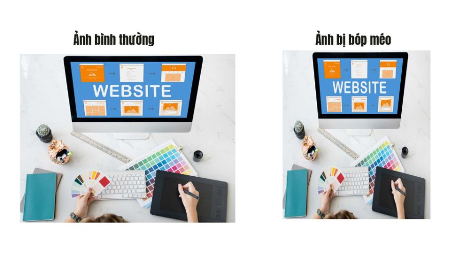
Distorted images in design are a common but serious mistake that can make a piece look less authentic and professional. When images are enlarged or reduced without maintaining proper proportions, or when they are cropped carelessly, they become distorted, reducing their aesthetic value and losing the original message. This not only makes the viewer feel uncomfortable, but also reduces the credibility of the design, as images are an important element in conveying information and creating an impression. To overcome this, it is important to maintain the original image proportions and use editing tools correctly, helping to ensure that the image is always clear and sharp, while also fitting into the overall layout.
2. Error 2: Inappropriate design color system
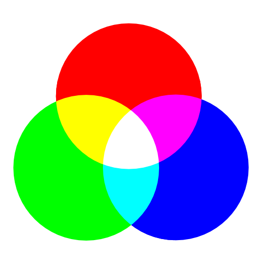
Inappropriate color schemes are a common mistake in the creative process, especially when the colors are not harmonious or do not match the intended message. When using the wrong color scheme, the design can become difficult to see, confusing or not evoke the intended emotion. For example, colors that are too bright, too contrasting or lack of connection between elements can make the viewer lose focus on the main content, or not be able to understand the message of the work. To overcome this error, it is necessary to pay attention to the color coordination so that it is reasonable, creates a pleasant feeling and conveys the message effectively. Using a color palette that is appropriate for the industry or target audience and ensuring that the colors have good contrast will help the design stand out while still maintaining harmony.
3. Error 3: Unscientific and unaesthetic color scheme
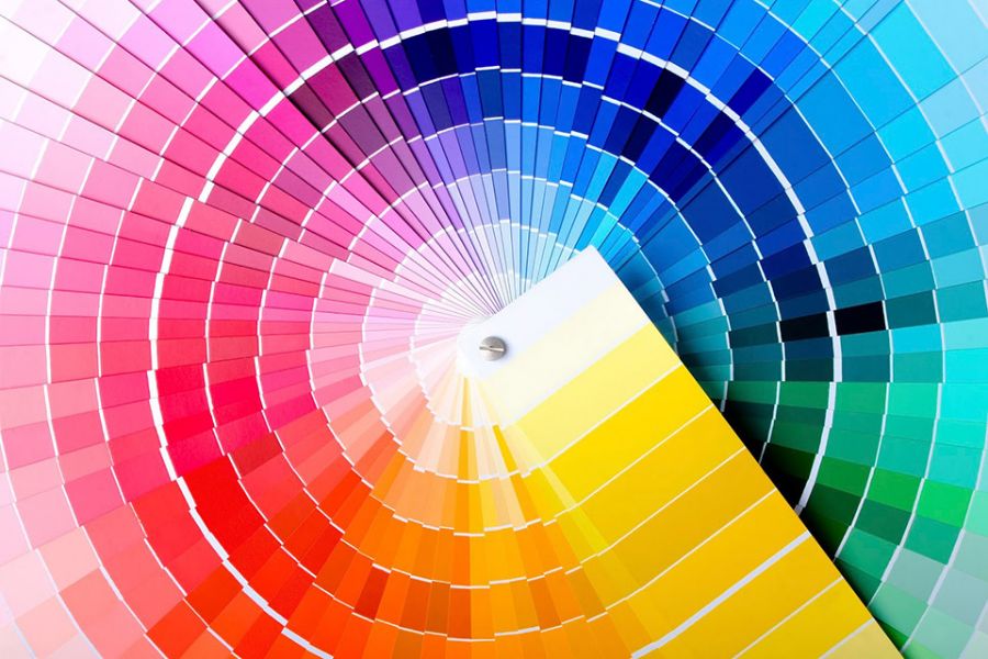
Unscientific and unscientific color matching is one of the serious design errors that can significantly reduce the quality and impact of a product. When colors are not selected and combined properly, the design can become confusing, unpleasant or unbalanced, thereby negatively affecting the viewer's perception. This error often occurs when using colors that are too contrasting, too bright or inharmonious, causing the elements in the design to be incompatible with each other and not creating harmony.
To overcome this problem, designers need to apply basic color matching principles, such as using a color palette that is connected, creating reasonable contrast or choosing complementary and similar colors. Using symmetrical color systems, warm and cool tones or monochrome tones (a single color with different shades) are all color matching techniques that help the design become sophisticated and highly aesthetic. In this way, viewers will feel the harmony and easily receive the message that the design wants to convey.
4. Error 4: Using too many fonts in one design
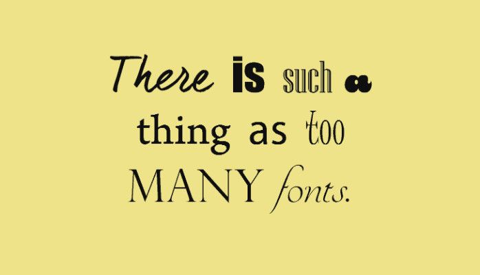
Using too many fonts in a design is a common mistake, but it can detract from the aesthetics and professionalism of the work. When using too many fonts, the design can easily become chaotic and difficult to read, causing the viewer to lose focus. Each font has its own style and characteristics, and when combining too many fonts without consistency, it will create a sense of inconsistency and lack of sophistication in the design.
To fix this, limit your use of fonts to no more than three in a design. A simple rule of thumb is to use one font for the headline, one font for the body copy, and one font for secondary elements (if needed). It’s important to choose fonts that are similar in style or weight so they complement each other without looking confusing. Additionally, using tools like font pairings can help you choose fonts that work well together, creating consistency and readability in your design.
5. Error 5: Unbalanced image layout

Asymmetrical image composition is a common design mistake that can reduce the aesthetic appeal and effectiveness of a piece of work. When images or design elements are not arranged properly or are not balanced, it can create a sense of clutter, disharmony, and discomfort for the viewer. This is especially evident in graphic design, websites, or posters, where balance helps to attract the eye and create a pleasant feeling for the viewer.
To fix this, you need to pay attention to the principles of balance in design, you can apply methods such as grid or golden ratio to divide the space reasonably. Symmetrical and asymmetrical layouts can both be used effectively, but the important thing is to ensure that the elements in the design are connected, creating a sense of stability and easy on the eyes. You can consider distributing elements (such as text, images, and icons) so that they create visual harmony without being confusing or too focused on one area.
6. Mistake 6: Design is too abstract and unfriendly

Design that is too abstract and unfriendly to the user is a common mistake, especially in creative projects where the artistry and originality of the idea are important. However, when the design is too complex or unclear, users will have difficulty accessing and understanding the message or purpose of the product. A design that is too abstract can make the viewer feel lost, have difficulty finding the interaction points, or easily miss important information.
To overcome this problem, it is important to strike a balance between creativity and understanding. The design needs to be clear, accessible and easy to use, especially in highly functional products such as websites, mobile applications or advertising publications. You can use simple graphic elements, harmonious colors and intuitive icons so that users can easily recognize and interact with them. A successful design not only attracts the eye but also creates a sense of closeness, understanding and brings a smooth experience to the user.
Conclude
Common design mistakes can have a huge impact on the quality and effectiveness of your final product. Identifying and correcting mistakes like using too many fonts, unbalanced layouts, or unscientific color schemes will help you create professional, aesthetic, and accessible designs. Always pay attention to the basic principles of design and apply them flexibly to enhance the user experience and convey messages clearly and impressively. From there, you will be able to create more effective and complete design products. For more interesting and useful information, visit https://sadesign.ai/.


