Best Selling Products

Freepik Premium Account
59 USD

Genuine Cheap Canva Pro
39 USD

Copyright Adobe Lightroom Account
59 USD

ChatGPT Plus Account (GPT-4)
16 USD

Plugin Retouch4me
69 USD

Upgrade Genuine Office 365
49 USD

Genuine Adobe Illustrator account
99 USD

Windows 10 & 11 Pro Key
36 USD

Capcut Pro 1 Year
39 USD

Autodesk All App Account Copyright
120 USD

Upgrade genuine Capture One account
120 USD

MidJourney Account
29 USD

Upgrade Duolingo Super
29 USD

Adobe Photoshop Copyright - Full App
120 USD

Adobe Premiere Pro Account
99 USD
Enhance Design With Color Mixing Techniques In Digital Painting
Nội dung
- 1. Why is color coordination important in Digital Painting?
- 2. Basic principles of color to master
- 3. Effective color combinations in Digital Painting
- 4. Factors affecting the choice of color scheme
- 5. Tips to improve color mixing skills in Digital Painting
- 6. Color matching support tools in Digital Painting
- 7. Conclusion
Comprehensive understanding of color combinations in Digital Painting to enhance your design thinking. You will create more professional, emotional works of art.
Enhance Design With Color Mixing Techniques In Digital Painting
24/05/202548
Comprehensive understanding of color combinations in Digital Painting to enhance your design thinking. You will create more professional, emotional works of art.
Content
1. Why is color coordination important in Digital Painting?2. Basic principles of color to master3. Effective color combinations in Digital Painting4. Factors affecting the choice of color scheme5. Tips to improve color mixing skills in Digital Painting6. Color matching support tools in Digital Painting7. Conclusion
Enhance Design With Color Mixing Techniques In Digital Painting
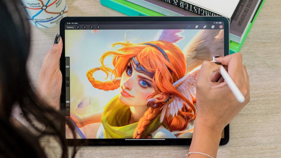
Digital Painting is not only a tool for expressing emotions, it is also a form of aesthetic design. In which, color plays a role as the backbone in creating visual space and directly affects the viewer's perception. Mastering the principles and techniques of color coordination in Digital Painting is the key to elevating the work, creating a professional mark and expressing the artist's own creative personality. Let's find out more details with sadesign in the article below.
1. Why is color coordination important in Digital Painting?
Mastering the art of color mixing brings countless benefits to Digital Painting artists, contributing to the difference and uniqueness of the work:
(1).jpg)
Creating depth and space: Color has the ability to create the illusion of depth and three-dimensional space on a flat screen surface. Using different shades of the same color or colors with different brightness and saturation can help differentiate spatial layers and create a sense of distance.
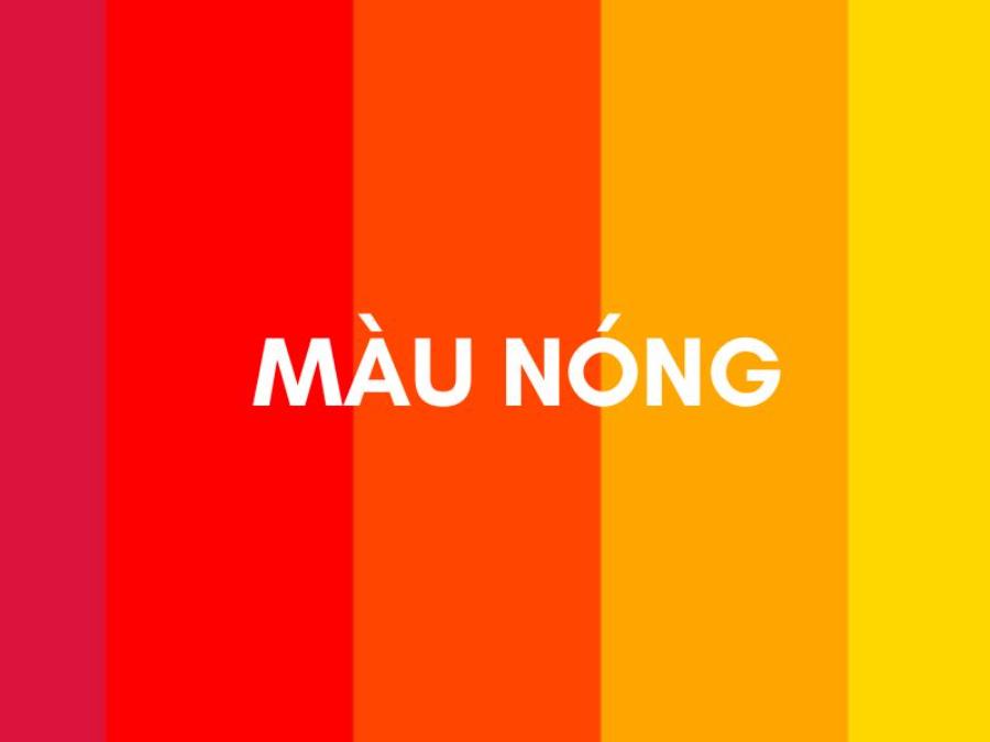
Conveying Emotions and Atmosphere: Each color has its own associations and emotions. For example, red often evokes passion, energy, or danger, while blue often evokes feelings of peace, tranquility, or sadness. Choosing the right color palette can help to effectively convey the atmosphere and emotions that the artist wants to convey in his work.
Directing the viewer’s eye: Bold colors and strong contrasts tend to attract the eye first. Artists can use color contrast strategically to direct the viewer’s attention to important details or create an interesting visual path within the piece.
Developing Your Own Artistic Style: Unique color schemes can become a personal signature that distinguishes an artist's work from others. Experimenting with and developing a signature color palette can help create a unique and recognizable artistic style.
Enhance the aesthetics and professionalism of the work: A harmonious and carefully selected color palette will bring a high aesthetic sense and demonstrate the professionalism of the artist. On the contrary, careless and uninformed color combinations can reduce the aesthetic value of the work, no matter how good the painting technique is.
2. Basic principles of color to master
To mix colors effectively, it is extremely important to master the basic principles of color:
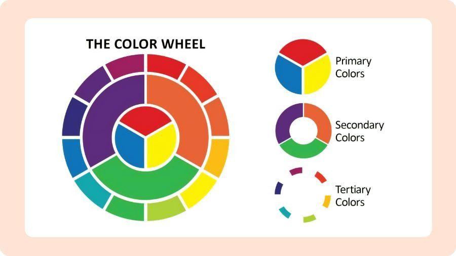
Color Wheel and Basic Color Relationships: The color wheel is a visual tool that helps us understand the relationships between different colors. It is usually arranged in a circle, with primary, secondary, and triadic colors placed in specific positions.
Primary Colors: Red, Yellow, Blue are the three primary colors that cannot be created by mixing other colors. They are the foundation for creating all other colors.
Secondary Colors: Created by mixing two primary colors in equal proportions. These are:
Red + Yellow = Orange
Yellow + Blue = Green
Blue + Red = Violet
Tertiary Colors: Created by mixing a primary color with an adjacent secondary color. They are often named by combining the names of the two mixed colors (e.g. red-orange, yellow-green, blue-violet).
Color Properties: Each color can be described by three basic properties:
Hue: This is the name of the color (e.g. red, blue, yellow). It determines the color's position on the color wheel.
Saturation/Chroma: This is the purity or intensity of a color. A highly saturated color will be vibrant and vivid, while a low saturation color will be paler and closer to gray.
Value/Brightness: This is the darkness or lightness of a color. Adding white to a color increases the brightness (creating a tint), adding black decreases the brightness (creating a shade), and adding gray changes both the saturation and brightness (creating a tone).
3. Effective color combinations in Digital Painting
Based on the color wheel and basic principles, there are many effective color combinations that Digital Painting artists can apply:
(1).jpg)
Monochromatic color scheme:
Use different hues, saturations, and lightnesses of the same color (hue).
Pros and cons: Creates harmony, unity and a sense of peace. However, if not done carefully, it can become monotonous and lack contrast.
How to use it effectively in Digital Painting: Choose a dominant color and use its light and dark variations to create depth and richness in your work. Focus on adjusting the value to create variation.
Example: A seascape painting uses different shades of blue and cyan.
Analogous color scheme:
Definition and basic principles: Use colors that are next to each other on the color wheel (usually three or four colors in a row).
Pros and cons: Creates harmony and is pleasing to the eye, giving a warm or cool feeling depending on the color family chosen. Can sometimes lack strong contrast.
How to apply effectively in Digital Painting: Choose a main color and use neighboring colors to create soft and natural transitions.
Example: A sunset painting uses yellow, orange, and red-orange colors.
Complementary color scheme:
Definition and basic principles: Use two colors that are opposite each other on the color wheel.
Pros and cons: Creates a strong contrast, attracts attention and creates a sense of dynamism. However, if used improperly, it can cause glare and discomfort.
How to apply effectively in Digital Painting: Use one dominant color and a complementary color to create emphasis or contrast. Adjust the saturation and brightness of both colors to achieve a harmonious balance.
Example: The combination of blue and orange in a character design.
Split-Complementary color scheme:
Definition and basic principles: Use one primary color and two colors adjacent to its complementary color.
Pros and cons: Still creates contrast but softer than direct complementary color schemes, providing more variety and interest.
How to apply effectively in Digital Painting: The primary color can play the leading role, while two alternating complementary colors are used to create accents or secondary details.
Example: Combination of green, orange red and purple red.
Triadic color scheme:
Definition and basic principles: Use three colors that lie at the vertices of an equilateral triangle on the color wheel.
Pros and cons: Creates balance and harmony, feels lively and playful. Can sometimes be difficult to control without a clear dominant color.
How to apply effectively in Digital Painting: Choose one color as the main color and use the other two colors sparingly to create accents or variety.
Illustrative example: The combination of red, yellow and blue in an abstract piece.
Tetradic/Rectangular color scheme:
Definition and basic principles: Use four colors that form a rectangle on the color wheel (two pairs of complementary colors).
Pros and cons: Provides a rich color variety, creating many creative possibilities. However, it can become complex and difficult to harmonize if not managed well.
How to apply effectively in Digital Painting: Choose one main color and use the remaining colors in a balanced way, maybe focusing on one pair of complementary colors more than the other pair.
Example: Combination of yellow, purple, orange and blue.
Square color scheme:
Definition and basic principles: Use four colors that lie at the tops of a square on the color wheel.
Pros and cons: Creates balance and harmony between colors, giving a dynamic and exciting feel.
How to apply effectively in Digital Painting: Similar to the tetradic color scheme, you need to choose a main color to create emphasis and unity.
Example: Combination of red, orange, green and blue-violet.
Neutral color scheme:
Definition and basic principles: Use neutral colors such as white, black, gray and earth tones (brown, beige, cream).
Pros and cons: Creates a sense of calm, elegance and sophistication. Often used as a background or to highlight other colors. Can sometimes lack vibrancy without a pop of color.
How to apply effectively in Digital Painting: Use neutral colors as the background and add one or two bright colors to create highlights and attract attention.
4. Factors affecting the choice of color scheme
Choosing the right color palette for your Digital Painting is not only based on basic color matching rules but is also influenced by many other factors:
The theme and story of the piece: The color palette should match the theme and story you are trying to tell. A painting of a fierce battle will require a different color palette than a calm portrait or a peaceful landscape.
Atmosphere and emotion you want to convey: As mentioned, colors have a powerful ability to evoke emotions. Consider the atmosphere you want to create (happy, sad, mysterious, dramatic...) and choose colors accordingly.
Personal Art Style: Your personal art style may have its own color preferences. Some artists prefer bright and vibrant color palettes, while others prefer the subtlety of muted or neutral tones.
Audience: Think about the target audience of your work. A color palette that is appropriate for children may be different from one aimed at adults or professional art enthusiasts.
Light and Shadow: How you handle light and shadow will greatly affect how colors appear in your work. Warm light will highlight yellows and oranges, while cool light will enhance blues and purples.
Time and place: A color palette can evoke a specific time of day (dawn, dusk, late night) or a certain location (hot desert, lush jungle, vast ocean).
5. Tips to improve color mixing skills in Digital Painting
To become a master of color matching in Digital Painting, you can apply the following tips and tricks:
(1).jpg)
Use online and in-software color matching tools: Tools like Adobe Color, Coolors, Paletton... help you easily create and explore harmonious color palettes based on different color matching rules. Many drawing software also integrate similar tools.
Look at the color palettes and work of other artists: Study how artists you admire use color in their work. Analyze their color palettes and how they create contrast and harmony.
Practice color matching regularly with different themes: Don't be afraid to experiment with different color palettes for the same theme. This helps you discover new possibilities and develop your color sense.
Create personal color palettes for specific projects: Before starting a piece, take the time to create a personal color palette that fits the theme, mood, and style you want to achieve.
Don't be afraid to experiment and break the rules: While color scheme rules are useful, sometimes consciously breaking them can yield unique and unexpected results.
Pay attention to value rather than just hue: Value (lightness or darkness) is important for creating depth and shape. Make sure you have enough value contrast in your color palette.
Use adjustment layers to fine-tune color: Adjustment layers in painting software (e.g. Hue/Saturation, Color Balance, Curves) allow you to change the color of all or part of your work non-destructively.
Learn how to use blending modes: Blending modes can create interesting color effects when combining different color layers. Experiment with modes like Multiply, Screen, Overlay, etc.
Observe colors in nature and life: The world around you is an endless source of color inspiration. Pay attention to how colors interact with each other in landscapes, objects, and natural light.
Get feedback on your color palette from others: Sometimes an outside eye can spot color issues that you might have overlooked. Don’t be afraid to share your work and listen to constructive criticism.
6. Color matching support tools in Digital Painting
There are many online and built-in tools in drawing software that can help you with the color matching process:
Adobe Color (formerly Kuler): A powerful online tool that lets you create, explore, and save color palettes based on different color rules. You can also explore community-created palettes.
Coolors: A quick and easy to use color palette generator. You can lock selected colors and randomly generate the rest, or upload an image to extract a color palette.
Paletton: A tool focused on creating harmonious color palettes based on a dominant color and color relationships on the color wheel.
Color Hunt: A large collection of beautiful color palettes created by the community. This is a great source of inspiration for finding new color scheme ideas.
Online Courses and Resources: There are many online courses and resources that provide in-depth knowledge of color theory and effective color mixing in digital art.
Plugins and extensions in drawing software: Some drawing software have plugins or extensions that support color management and mixing, helping you work more efficiently.
7. Conclusion
Color mixing is an essential and fun skill in Digital Painting. Mastering the fundamentals, discovering effective color combinations, and practicing will help you become more confident in choosing and combining colors. Remember, color mixing is not just a technical skill, but also a form of artistic expression. Explore, experiment, and develop your own personal color mixing style.


VIP Products


Best Selling Products
Freepik Premium Account
59 USD
Genuine Cheap Canva Pro
39 USD
Copyright Adobe Lightroom Account
59 USD
ChatGPT Plus Account (GPT-4)
16 USD
Plugin Retouch4me
69 USD
Upgrade Genuine Office 365
49 USD
Genuine Adobe Illustrator account
99 USD
Windows 10 & 11 Pro Key
36 USD
Capcut Pro 1 Year
39 USD
Autodesk All App Account Copyright
120 USD
Upgrade genuine Capture One account
120 USD
MidJourney Account
29 USD
Upgrade Duolingo Super
29 USD
Adobe Photoshop Copyright - Full App
120 USD
Adobe Premiere Pro Account
99 USD