Best Selling Products

Upgrade Genuine Office 365
49 USD

Capcut Pro 1 Year
39 USD

Adobe Photoshop Copyright - Full App
120 USD

Plugin Retouch4me
69 USD

Upgrade Duolingo Super
29 USD

Adobe Premiere Pro Account
99 USD

ChatGPT Plus Account (GPT-4)
16 USD

MidJourney Account
29 USD

Copyright Adobe Lightroom Account
59 USD

Upgrade genuine Capture One account
120 USD

Autodesk All App Account Copyright
120 USD

Genuine Adobe Illustrator account
99 USD

Windows 10 & 11 Pro Key
36 USD

Genuine Cheap Canva Pro
39 USD

Freepik Premium Account
59 USD
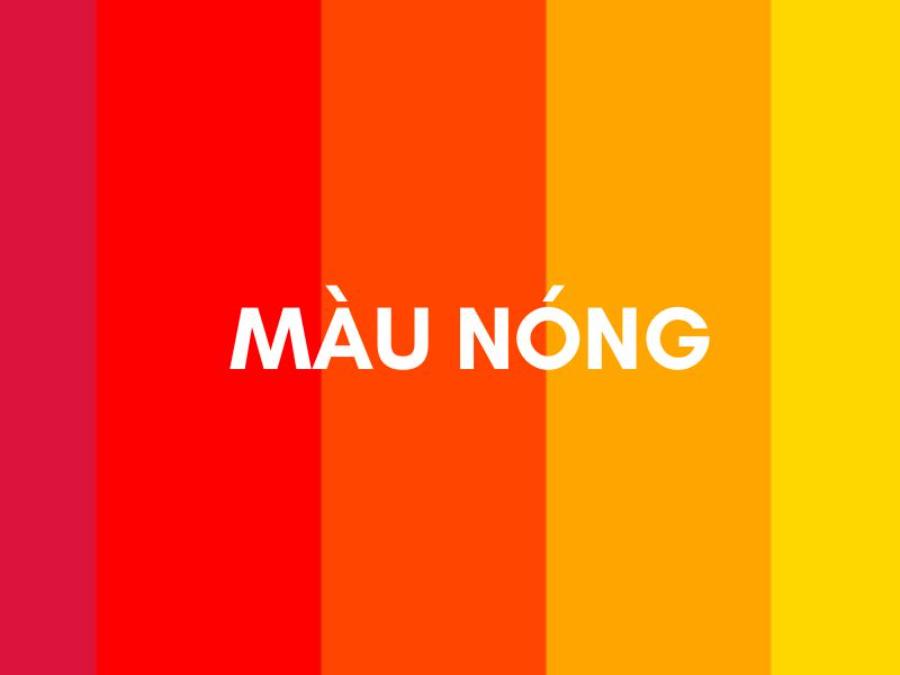
The Importance of Warm Colors in Big Brand Design
Nội dung
- 1. Warm colors in design: Not only stand out but also create strong emotional responses
- 2. How have big brands used warm colors as a strategic tool?
- 3. Color psychology: Why do warm colors easily trigger consumer behavior?
- 4. Red - orange - yellow in logo design: Long-term impact on brand recognition
- 5. Applying hot colors in packaging design: Evoking desire and immediate purchase
- 6. Warm Colors on Digital Platforms: Enabling Engagement in the Digital Age
- 7. The Art of Balance: Notes When Using Warm Colors in Design
- 8. Note when using hot colors in design: Strong but need to be moderate
- 9. Hot color trends in modern design
- 10. Conclusion
Red, orange, and yellow are not only prominent colors in design but also strategic choices of many big brands. Find out why hot colors are always "popular" with marketing giants and how you can effectively utilize them in your brand identity design.
In the world of branding and visual communication, color is not only an aesthetic tool but also a powerful psychological strategy. In particular, warm colors such as red, orange and yellow always appear in the identity of the "big guys" in the consumer goods, technology, food service and even finance sectors. The presence of these bright tones is not simply a choice of taste, but the result of in-depth research on human emotions, behaviors and visual responses.
1. Warm colors in design: Not only stand out but also create strong emotional responses
Warm colors in design not only play a role in highlighting visual elements but also have the ability to strongly stimulate emotional responses from viewers. Colors such as red, orange, and yellow often evoke feelings of dynamism, enthusiasm, and warmth, while creating a natural attraction to the eyes. Using warm colors appropriately in design not only helps to convey messages effectively but also creates a deep emotional connection with the target audience. However, it is important to balance warm colors with other elements to avoid overwhelming or losing the overall aesthetic.
(1).jpg)
Red, orange, and yellow — three of the warm colors — instantly grab the human eye’s attention. They have long wavelengths, which stimulate the retina, causing the brain to respond more quickly than cool or neutral colors. This is especially important in advertising and branding, where attention spans are split-second.
Red represents passion, energy, urgency, and power. Orange is creative, friendly, and encourages action. Yellow evokes optimism, joy, and a sense of prosperity. When used correctly, warm colors not only attract attention, but also motivate action, stimulate visual memory, and help brands stay in the minds of consumers.
2. How have big brands used warm colors as a strategic tool?
Coca-Cola, McDonald's, Shell, DHL, YouTube, Ferrari — they all have one or more warm colors in common in their branding. This is no coincidence, but the result of careful strategic planning. These brands don't just choose colors to stand out, but to convey a specific emotion associated with their services, products, and brand positioning.
Coca-Cola uses red to stimulate thirst, while also creating feelings of energy, connection and passion.
McDonald’s uses red and yellow to evoke fast, fun, and hunger. Yellow is also a color that increases visibility from a distance — an important factor for fast food chains.
YouTube chose red as a way to evoke action: press the play button, press the subscribe button, and at the same time express a sense of breakthrough, strength, suitable for the field of content creation.
These brands prove that color is not just a decoration but a sharp market positioning tool.
3. Color psychology: Why do warm colors easily trigger consumer behavior?
Research on color psychology has shown that warm colors stimulate the sympathetic nervous system, increase heart rate, increase blood pressure and increase alertness. These physiological effects make people more alert, more easily attracted and make decisions faster. That is also the reason why sale signs often use red letters, or CTA (Call to Action) buttons on websites are often orange or red.
.jpg)
Warm colors not only make your brand stand out on a shelf or billboard, but they also increase conversion rates in marketing campaigns. When combined properly with typography and imagery, these colors help users remember your content longer, increase dwell time on your publications, and make it easier to share your content.
To understand the appeal of red, orange and yellow, we need to explore their nature and the psychological meanings they convey. Warm colors are located on the “warm” half of the color wheel, evoking feelings of heat, sunshine and fire. They are often associated with energy, enthusiasm and strong emotions.
Red:
Characteristics: It is the strongest and most prominent color, attracting immediate attention. It has the longest wavelength in the visible spectrum, making it easily recognizable to the human eye.
Psychological meaning: Red symbolizes passion, love, urgency, energy, strength, courage, and sometimes danger or anger. It stimulates the heart rate and blood pressure, creating a feeling of excitement and the urge to act. In marketing, red is often used to attract attention for promotions, discounts, or calls-to-action.
Orange:
Characteristics: A harmonious combination of the strength of red and the brightness of yellow, orange brings a feeling of warmth, friendliness and energy.
Psychological meaning: Orange evokes enthusiasm, creativity, fun, optimism, confidence, and communication. It is often associated with youthfulness, energy, and sociability. Orange is less overpowering than red, but still stands out enough to attract attention. Brands that use orange often want to project an image of friendliness, approachability, and innovation.
Yellow:
Characteristics: As the color of sunshine, yellow brings a feeling of brightness, joy and optimism. It has the ability to stimulate the spirit and intellect.
Psychological meaning: Yellow represents happiness, intelligence, wisdom, wealth, positive energy, and attention (though not as strongly as red). However, too much yellow can feel glaring or cheap. Brands that use yellow often want to convey optimism, trustworthiness, and sometimes luxury or value.
4. Red - orange - yellow in logo design: Long-term impact on brand recognition
A logo that uses warm colors will always be clear, easily recognizable, and convey strong emotions. When consumers look at logos of brands that use red, orange, or yellow, they usually do not need much time to remember or describe them. Color becomes a visual symbol that is just as important as the brand name or symbol.
(1).jpg)
The preference of big brands for red, orange and yellow is not just about eye-catching appearance. Behind it are strategic calculations based on the ability to strongly influence consumer perception and behavior:
Create Strong Attention and High Brand Recognition: In a fiercely competitive market, standing out from the crowd is vital. Warm colors, with their vibrant and easily recognizable nature, help brands attract attention immediately. A bright red logo on a shelf, a bright orange banner on a website or a bright yellow sign on the street all have the ability to “catch” consumers’ eyes, increasing the chance of being noticed and remembered. Brands such as Coca-Cola (red), Amazon (orange) or McDonald’s (yellow) have proven the power of warm colors in creating global brand recognition.
Conveying Energy and Excitement: Warm colors carry a lot of energy, evoking positive feelings and excitement. Brands that want to create a youthful, dynamic and vibrant image often prioritize using these colors. For example, Red Bull (blue and red) conveys strength and explosive energy, Fanta (orange) evokes freshness and fun, and Ferrari (red) symbolizes speed and passion.
Stimulates Action and Creates a Sense of Urgency: Red, in particular, has a strong ability to stimulate action. It is often used in promotions, discounts, or “Buy Now” or “Sign Up Now” buttons to create a sense of urgency and encourage users to make quick decisions. E-commerce platforms and marketing campaigns often take advantage of this power of red.
Evokes Positive Emotions and Warmth: Orange and yellow, while not as strong as red, still have the ability to create positive and warm emotions. Orange is often associated with friendliness, openness, and creativity, helping brands build close relationships with customers. Yellow brings feelings of optimism, joy, and trust. Brands that want to build a friendly, trustworthy image often use these colors.
Expressing Confidence and Power: Red, in certain contexts, can also convey confidence, power and class. Luxury brands or brands that want to assert their leadership position in the market sometimes use red subtly to create a strong and luxurious impression.
Logos with warm colors are often designed with simple lines and easy-to-read shapes to highlight the effects of color and create a memorable effect.
5. Applying hot colors in packaging design: Evoking desire and immediate purchase
One of the areas where the power of warm colors is most exploited is product packaging design. In crowded supermarkets, where thousands of products compete for every centimeter on the shelves, packaging with red, orange, and yellow colors has the ability to "cut in" directly into the minds of consumers.
Food packaging, cosmetics, technology products, and even books can all use warm colors to convey messages instantly. Red shows attraction, orange stimulates curiosity, and yellow evokes a sense of satisfaction and radiance. Brands like Lay's, Heinz, Tide, and Nikon are prime examples of using color on packaging to dominate the market.
6. Warm Colors on Digital Platforms: Enabling Engagement in the Digital Age
In digital interface design (UI/UX), warm colors also play a key role in guiding user behavior. Action buttons such as “Buy Now”, “Sign Up”, “Share” are often designed with red, orange or yellow backgrounds to increase interactivity. Platforms such as Netflix, YouTube, TikTok all use red not only in their logos but also throughout the user experience.
For e-commerce sites, red-orange tones are especially popular during promotional periods. The color not only creates a strong visual impression but also evokes a sense of urgency, of running out of stock, and a need to act immediately — a significant factor in stimulating purchases.
7. The Art of Balance: Notes When Using Warm Colors in Design
While warm colors have many benefits, using them carelessly can backfire. Here are some important things to keep in mind when incorporating red, orange, and yellow into your branding:
Balance: Warm colors tend to overwhelm other colors. Therefore, it is important to combine them with neutral colors (white, black, gray, beige) or cool colors (blue, green, purple) to create harmony and avoid feeling overwhelming or uncomfortable.
Target Audience: Color choices should be appropriate to the characteristics and preferences of the target audience. For example, red may be suitable for brands targeting a young and dynamic audience, but may not be suitable for brands aiming for luxury and sophistication (unless used skillfully).
Cultural Context: The meaning of colors can vary across cultures. Global brands need to carefully research the cultural meanings of colors in their target markets to avoid unnecessary misunderstandings.
Consistency: The chosen colors need to be used consistently across all brand communication channels, from logo, website, mobile app to marketing collateral, to build strong brand recognition.
Testing and Evaluation: Before making a final decision, brands should test different color schemes and evaluate their effectiveness through market research and customer feedback.
8. Note when using hot colors in design: Strong but need to be moderate
While warm colors can stir emotions and create emphasis, overuse can lead to visual overload or turn off the senses. Too much red, too much orange, or too much yellow can be distracting, distracting from the overall harmony, or detract from the professional feel needed.
.jpg)
Effective design is a balance between emphasis and breathing room. Warm colors should be cleverly combined with neutrals or cool colors to create a pleasing contrast. Additionally, each color tone should be adjusted to suit each industry and target customer group.
For example:
Bright red is suitable for entertainment, food and sports industries.
Orange is suitable for health care, beauty and natural products.
Metallic gold is suitable for finance, luxury, fashion.
9. Hot color trends in modern design
In recent years, designers have been moving away from monochromatic colors to warm gradient palettes – where reds transition smoothly to oranges and yellows. This trend feels more modern, multidimensional, and dynamic, especially suitable for digital platforms and Gen Z products.
In addition, the combination of hot colors and motion effects, 3D or minimalism is opening up many creative directions for brand design. The flexibility in using hot colors is a testament to the unlimited ability to "transform" while still maintaining strong recognition.
10. Conclusion
Warm colors are not simply an aesthetic choice, but a branding strategy that is closely linked to consumer psychology, customer memorability and action. The use of red, orange and yellow in design has been proven to be highly effective by many major global brands. However, to maximize the benefits of this powerful color palette, designers need to understand the nature of color psychology, industry characteristics and target audience.


VIP Products


Best Selling Products
Upgrade Genuine Office 365
49 USD
Capcut Pro 1 Year
39 USD
Adobe Photoshop Copyright - Full App
120 USD
Plugin Retouch4me
69 USD
Upgrade Duolingo Super
29 USD
Adobe Premiere Pro Account
99 USD
ChatGPT Plus Account (GPT-4)
16 USD
MidJourney Account
29 USD
Copyright Adobe Lightroom Account
59 USD
Upgrade genuine Capture One account
120 USD
Autodesk All App Account Copyright
120 USD
Genuine Adobe Illustrator account
99 USD
Windows 10 & 11 Pro Key
36 USD
Genuine Cheap Canva Pro
39 USD
Freepik Premium Account
59 USD