Best Selling Products
Explore Calligraphy Fonts: The Art Hidden in Every Line
Nội dung
- 1. Learn about Calligraphy fonts
- 1.1. Definition
- 1.2. History of Calligraphy fonts
- 1.3. Identification features
- 2. Advantages and disadvantages of Calligraphy fonts
- 2.1. Advantages of Calligraphy fonts
- 2.2. Disadvantages and limitations of Calligraphy fonts
- 3. Notes when using Calligraphy fonts
- 4. Applying Calligraphy fonts in practice
- 4.1. Using Calligraphy fonts
- 4.2. Cases to avoid
The article will open a journey of discovery about Calligraphy fonts, decoding the source of artistic inspiration and how each stroke carries creative value, turning each design into a unique work of art.
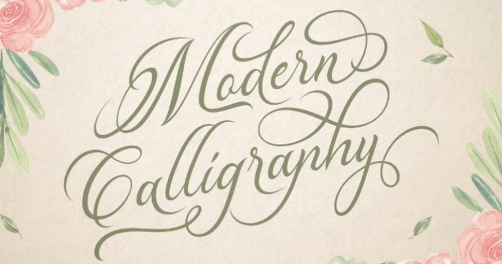
Fonts are not only a tool to convey messages but also an artistic element that contributes to creating emotions and strong impressions. Among the many font styles today, Calligraphy - also known as artistic calligraphy has occupied a special position, both expressing sophistication and bringing elegance to designs. The following article will explore Calligraphy fonts with you to create impressive and professional designs. Let's find out!
1. Learn about Calligraphy fonts
1.1. Definition
Calligraphy fonts, also known as artistic calligraphy, are handwritten fonts with soft, graceful and elegant lines. The characteristic of Calligraphy is the naturalness in the way of drawing letters, often inspired by the traditional handwriting art of different cultures. Each letter created is not completely uniform like traditional numeric fonts, but bears the personal mark of the artist, showing sophistication, creativity and art.
Compared to other font types such as sans-serif or serif, Calligraphy stands out with its own artistic style. While sans-serif fonts are often used for modern, clean information, Calligraphy fonts tend to be soft, lyrical and handmade. This difference makes Calligraphy an ideal choice for projects that need to create a sense of luxury and sophistication, such as wedding invitations, high-end brand logos or titles for art publications.
.png)
1.2. History of Calligraphy fonts
Originating from the traditional handwriting art of great cultures such as China, India or the West, Calligraphy has long been honored as an art form that requires sophistication and patience. In the East, the art of calligraphy has existed for thousands of years, with graceful and flexible strokes considered to be an expression of the writer's soul. Famous people, philosophers, and traditional artists not only stopped at conveying information but also conveyed profound spiritual values through each stroke.
On the contrary, in the West, Calligraphy fonts also developed strongly through the periods from the Middle Ages to the Renaissance and modern times. Artists have transformed simple handwriting into vivid art, imbued with personal style and unique creative inspiration. The intersection of Eastern and Western cultures has created many diverse Calligraphy styles, from classical to modern, from lyrical, gentle to bold, unconventional.
1.3. Identification features
Notable features that help identify Calligraphy fonts include:
Soft lines: Each stroke is carefully rendered with curves, creating a soft and natural feel.
.png)
Artistry: Each line and each small detail brings its own artistic value, making the letters unique and different.
Diverse variations: Unlike numeric fonts, Calligraphy always shows small differences in each letter, creating an "imperfect" but emotional beauty.
Special applications: Since the letters are often created with a strong artistic flavor, Calligraphy is suitable for designs that need to highlight a message of elegance, sophistication and uniqueness.
2. Advantages and disadvantages of Calligraphy fonts
2.1. Advantages of Calligraphy fonts
When used correctly, Calligraphy fonts offer many benefits to a design. Here are some of the most notable advantages:
Create luxury and uniqueness:
Calligraphy fonts help create a strong impression at first sight. Soft, delicate and artistic strokes make designs luxurious, suitable for high-end brands or special occasions such as weddings and anniversaries.
Bring high artistry:
With its origins in traditional calligraphy, Calligraphy is not just a font but also a work of art. The sophistication in each stroke helps convey a message about the designer’s creativity, spirit and even emotions.
.png)
Suitable for header and highlight designs:
Thanks to the beauty and prominence of Calligraphy, designs using this font as a title or highlight will quickly attract the attention of the viewer. This is especially beneficial when you want to convey a message or create a memorable first impression for the recipient.
2.2. Disadvantages and limitations of Calligraphy fonts
Although it has many strengths, Calligraphy fonts also have some limitations that need to be considered when applying:
Poor readability:
Due to the softness and artistry of the strokes, Calligraphy fonts are often not suitable for long passages of text or at small sizes. Using them in smooth text can be difficult for the viewer, especially when the contrast is not high enough.
Heterogeneity:
One of the characteristics of Calligraphy is the “imperfections” of computer symmetry – each letter has its own character, creating diversity but sometimes lacking consistency. This requires the designer to be able to coordinate colors, spacing and other elements meticulously to ensure the overall look is not confusing.
.png)
Not suitable for all contexts:
Calligraphy fonts are a symbol of artistry and sophistication, but in some cases where a modern, clean or highly professional look is needed, they may not be appropriate. For example, in application interfaces or business reports, the “flashy” nature of Calligraphy can reduce the seriousness and effectiveness of the message.
3. Notes when using Calligraphy fonts
Calligraphy fonts are one of the great tools for designers to create art for their works. Obviously, we do not have any rules in using Calligraphy fonts, it all depends on your creativity. However, despite being highly artistic, this makes handwritten Calligraphy fonts quite difficult to read if used to write a long paragraph. Therefore, you should avoid using them when you want users to read the content quickly and clearly.
In addition, overusing Calligraphy fonts is also not recommended because they are not always suitable for the design context. With designs that have a modern feel, youthful, minimalist fonts will still be a much more reasonable choice. 4. Practical examples and case studies
4. Applying Calligraphy fonts in practice
4.1. Using Calligraphy fonts
Luxury wedding invitations:
Many wedding invitations today use Calligraphy fonts for the invitation or the title of the card. The soft and delicate lines create a romantic, artistic space, helping the recipient immediately feel the solemnity of the important occasion.
.png)
Unique brand logo:
Some high-end brands, especially in the beauty, fashion or art industries, have used Calligraphy fonts as the text in their logos to express individuality and luxury. Calligraphy logos not only make a strong impression but also help to instantly identify the brand through the distinct style of the letters.
4.2. Cases to avoid
Use for long text:
Some web interface designs or long articles using Calligraphy fonts for the entire content can make it difficult to read due to the high artistic nature of the writing. This makes users easily confused, reducing focus on the main message.
Heterogeneous coordination:
When Calligraphy fonts are combined with other graphic elements without careful consideration of color, spacing, or contrast, the end result can become confusing and unprofessional.
In short, Calligraphy fonts bring a special artistic beauty that makes the design product luxurious and sophisticated. However, to optimize its benefits, you need to consider factors such as readability, harmonious combination with other elements in the design, and especially ensuring legal rights of use. Calligraphy, although having certain limitations, if handled skillfully, will be the "secret" to help you conquer today's competitive design market.


