Best Selling Products

Windows 10 & 11 Pro Key
36 USD

Upgrade Duolingo Super
29 USD

Plugin Retouch4me
69 USD

MidJourney Account
29 USD

Genuine Cheap Canva Pro
39 USD

Copyright Adobe Lightroom Account
59 USD

Upgrade Genuine Office 365
49 USD

Freepik Premium Account
59 USD

Upgrade genuine Capture One account
120 USD

Capcut Pro 1 Year
39 USD

Adobe Photoshop Copyright - Full App
120 USD

ChatGPT Plus Account (GPT-4)
16 USD

Genuine Adobe Illustrator account
99 USD

Adobe Premiere Pro Account
99 USD

Autodesk All App Account Copyright
120 USD
Get a smoother Gmail experience on Android with two new updates
Nội dung
- 1. Gmail can mark emails as read right from the notification
- 1.1. Practical benefits of the "Mark as read" button
- 2. Material 3 Expressive Interface
- 2.1. Meaning of change
- 2.2. Perspective from Material 3 Expressive design language
- 3. Google is optimizing Gmail in two parallel directions
- 4. What is the future of Gmail?
In the latest update to the Gmail app on Android, Google introduced two small but valuable changes.
For over a decade, Gmail has been an indispensable email management tool for billions of users worldwide. Since its launch in 2004, Gmail has been constantly innovating with a series of groundbreaking features: superior free storage capacity, smart search capabilities based on Google technology, integrated artificial intelligence to effectively filter spam, and recently, improvements in security and interface design.
At present, Gmail is not just a regular email. It is also a platform for managing work, exchanging information, integrating with Google Workspace, supporting businesses in internal communication and with customers. Therefore, any change to Gmail, no matter how small, will have an impact on millions of users, directly affecting daily work productivity.
In the latest update to the Gmail app for Android, Google introduced two small but valuable changes. The first is a convenient “Mark as read” button right on the notification, allowing users to deal with incoming messages without opening the app. The second is a continuation of the Material 3 Expressive interface, with a redesigned search bar that’s cleaner and more focused.
These two updates, while different in nature, share the same goal: to optimize the user experience, making Gmail faster, more intuitive, and easier to use in an increasingly digital world. In this article, we’ll take a closer look at these two important updates, understand why they’re useful, and put them into the larger picture of Google’s product design and development strategy.
1. Gmail can mark emails as read right from the notification
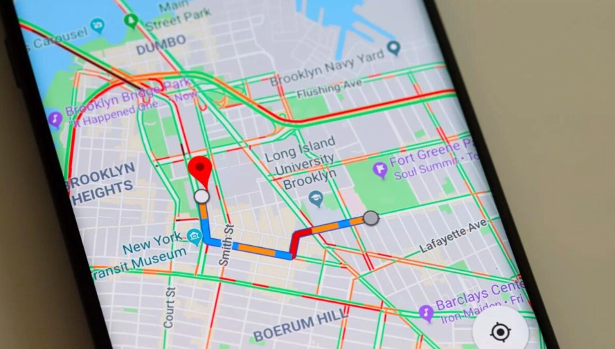
One of the common habits of mobile users is to check email as soon as a notification comes in. Previously, when Gmail sent a notification about a new email, users could quickly review the content, select "Delete" to delete, or "Archive" to archive, or immediately reply with "Reply". However, there was a simple but extremely useful option missing: "Mark as read".
.png)
This has caused quite a bit of trouble. If you want to mark an email as read, you have to open the Gmail app, access your inbox, and then do it. In reality, many emails don’t need to be opened to read the details. For example, bank notifications about known transactions, promotional emails from familiar brands, or notifications from social networks. It’s enough for users to acknowledge that they’ve seen the information.
After a period of testing, Google has officially released the "Mark as read" button from Gmail version 2025.08.04.x. Now, this function button will appear right in the notification box, located between the "Delete/Archive" and "Reply" options. With just one touch, the email will be marked as read without any other operations.
1.1. Practical benefits of the "Mark as read" button
This addition may seem small, but the value it brings is huge:
Save time: Instead of spending seconds opening the app, finding the email, and taking action, users only need one tap. Given that many people receive hundreds of emails a day, this saves a lot of time.
Reduce interruptions: When you're working or on the go, opening the Gmail app just to mark an email can be distracting. Now, you can take action right from the notification.
More seamless experience: Gmail already has "Archive", "Delete" and "Reply" options right in the notification. The addition of "Mark as read" completes the system, covering most basic situations when handling emails.
Personalization: Not every email needs to be read in detail. With this option, users can quickly decide how important each message is.
.png)
1.2. Perspective from user experience design (UX Design)
From a design perspective, this is a testament to the philosophy of “reducing friction” in the digital experience. Every extra action, every extra touch can slow down the experience and cause discomfort. Google understands that users don’t want to spend more time on trivial tasks, so they gradually refined Gmail to become an effective support tool, rather than a burden.
It is worth noting that the "Mark as read" button is placed in an intuitive position, among the already familiar options. This makes it easy for users to access without having to relearn how to use it, ensuring seamlessness in operating habits.
2. Material 3 Expressive Interface
Along with the functional improvements, Google is also rolling out a notable change in terms of interface: Gmail continues to be refreshed with the Material 3 Expressive design language.
Material Design is a design system developed by Google since 2014, aiming to create consistency, intuitiveness and beauty across products. Through each stage, Material Design has been continuously upgraded: from Material You (emphasizing personalization with dynamic colors according to the background) to Material 3 Expressive, the most modern version with greater flexibility, while focusing more on the ability to express emotions and individuality.
In this update, Gmail focuses on refreshing the search bar, a central element of the app. Previously, the search bar contained both a menu button and a user profile icon, making the layout a bit confusing. With the new update, Google has moved the menu button and profile icon out of the way, leaving a cleaner, cleaner, and more focused search bar.
.png)
2.1. Meaning of change
The search bar in Gmail is more than just a tool for finding emails. With the vast troves of emails that users have accumulated over the years, it’s a “map” for quickly locating information. So it makes sense to emphasize the central role of search in the interface.
The new layout helps:
Reduce visual distraction, users look and focus immediately on the search box.
Speed up operations, when the most important element is placed in the most visible position.
Bringing in sync with other apps in the Google ecosystem, like Google Keep, which is also getting the same change.
2.2. Perspective from Material 3 Expressive design language
Material 3 Expressive is described by Google as a design language that is "more emotional, more personal, and more intuitive." It's not just about changes in color or spacing, but about how the entire interface communicates information, bringing a sense of closeness and lightness to the user.
In Gmail, the new, clean search bar is a step in this direction: instead of cramming too many elements, Google opted for minimalism, letting the interface breathe, allowing users to focus on what they really need. It's a prime example of the "less is more" principle in modern design.
3. Google is optimizing Gmail in two parallel directions
Looking at these two updates, we clearly see Google's product development philosophy: improving features while refining the interface.
.png)
The “Mark as read” button shows that we’re listening to our users, a need that’s been there for a long time and is finally being met. The Material 3 Expressive interface change shows a long-term vision, building Gmail as part of Google’s consistent design ecosystem.
Together, these two approaches create a harmonious experience: Gmail is both functionally powerful and visually pleasing. This is important in an age where users are glued to their mobile phones all day long. An email client needs to be not only efficient, but also feel effortless, avoiding the stress of constantly processing information.
This update should also be seen in the context of Gmail competing with many other email services. In the business segment, Microsoft Outlook is the biggest competitor, with the advantage of deep integration into the Office ecosystem. In the personal segment, many iOS users are familiar with the default Mail app. In addition, there are specialized services such as ProtonMail (which focuses on security) or Yahoo Mail (which still holds a significant market share in some regions).
Gmail stands out in that competition thanks to three factors: search power, Google Workspace integration, and a constantly improving user experience. The two new Android updates are small but Google's way of solidifying that third advantage, ensuring Gmail remains ahead in terms of usability.
4. What is the future of Gmail?
Looking at the recent development roadmap, we can predict that Gmail will continue to evolve along three main axes:
.png)
Optimize performance and operations: Small features like "Mark as read" can continue to appear in many other aspects, to reduce redundant operations.
Consistent design with Material 3 Expressive: Gmail will increasingly sync with other Google apps, providing a seamless experience for Android users.
Artificial Intelligence: Google has experimented with integrating AI into Gmail several times, from "Smart Compose" to intelligent filtering. In the future, AI could help Gmail become a more comprehensive "email assistant" instead of just an inbox.
The two latest changes on Gmail for Android, the "Mark as read" button right on the notification and the Material 3 Expressive style search bar, are not revolutionary but they hit the right practical needs and modern design trends.
At the personal level, users are saving time, reducing frustration, and getting a cleaner experience. At the strategic level, Google continues to affirm its commitment to continuously improving Gmail, even though it is already one of the most powerful email platforms in the world.
In an era where email remains the backbone of digital communication, small improvements like these help shape the way we work, communicate, and manage information on a daily basis. With these new updates, Gmail once again proves why it remains the top choice for billions of users worldwide.


VIP Products


Best Selling Products
Windows 10 & 11 Pro Key
36 USD
Upgrade Duolingo Super
29 USD
Plugin Retouch4me
69 USD
MidJourney Account
29 USD
Genuine Cheap Canva Pro
39 USD
Copyright Adobe Lightroom Account
59 USD
Upgrade Genuine Office 365
49 USD
Freepik Premium Account
59 USD
Upgrade genuine Capture One account
120 USD
Capcut Pro 1 Year
39 USD
Adobe Photoshop Copyright - Full App
120 USD
ChatGPT Plus Account (GPT-4)
16 USD
Genuine Adobe Illustrator account
99 USD
Adobe Premiere Pro Account
99 USD
Autodesk All App Account Copyright
120 USD