Best Selling Products

Upgrade genuine Capture One account
120 USD

Autodesk All App Account Copyright
120 USD

Windows 10 & 11 Pro Key
36 USD

Genuine Cheap Canva Pro
39 USD

Capcut Pro 1 Year
39 USD

Upgrade Genuine Office 365
49 USD

MidJourney Account
29 USD

Plugin Retouch4me
69 USD

Upgrade Duolingo Super
29 USD

Adobe Premiere Pro Account
99 USD

Copyright Adobe Lightroom Account
59 USD

ChatGPT Plus Account (GPT-4)
16 USD

Freepik Premium Account
59 USD

Genuine Adobe Illustrator account
99 USD

Adobe Photoshop Copyright - Full App
120 USD
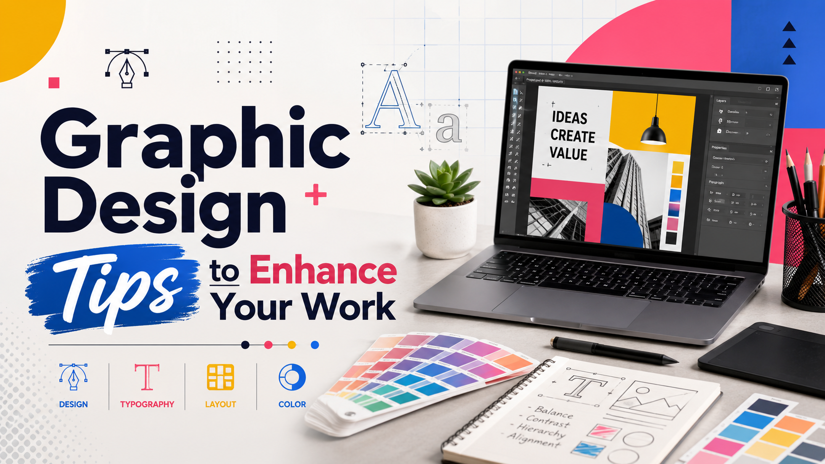
Graphic Design Tips to Enhance Your Work
Nội dung
- 1. Limit the number of fonts you use.
- 2. Adjust the size and height of the text to make it perfectly fit your design.
- 3. Use contrasting fonts to draw attention.
- 4. The older they get, the more attention they attract.
- 5. Use contrasting colors.
- 6. Use whitespace whenever possible.
- 7. Be consistent in your design.
- 8. Use flat design to your advantage.
- 9. Learn how to use a grid.
- 10. Choose the right design software.
- 11. Conclusion
In the modern world of graphic design, creating impressive works relies not only on artistic talent but also on appropriate design techniques and tips.
1. Limit the number of fonts you use.
One of the most important design tips that many designers recommend is limiting the number of fonts in a piece. Using too many fonts can lead to visual clutter and make your design difficult to understand. Instead of trying to show creativity through the use of many different fonts, focus on creating harmony. A simple rule is to use only two to three fonts in the same design. This not only makes your work look more professional but also ensures that the message is conveyed clearly.
When choosing fonts, pay attention to how they interact with each other. Fonts should have a similar style or feel to create a cohesive design. You can experiment with available fonts, but remember to check their feasibility. If you want to refresh your design, don't hesitate to search for free fonts from online libraries. This not only saves time but also gives you many unique options.
Finally, once you've chosen a font, make sure it's easy to read and suits the purpose of your work. An overly complex font can make it difficult for viewers to grasp the information. Conversely, a simple yet striking font will help you attract attention and convey your message more effectively.
2. Adjust the size and height of the text to make it perfectly fit your design.
Another important design tip is to customize the size and height of the text so that it harmonizes with the overall design. This not only helps create balance but also highlights the message you want to convey. You can change line height and spacing between letters to create a visually appealing effect. For example, reducing line height can create a more compact feel, while increasing font size can make the content stand out more.
Experiment with the placement and layout of text in your design. An easily visible position will make it easier for viewers to absorb the information. Sometimes, adjusting the opacity of the text can also create an interesting effect. By reducing transparency, you can make the background image stand out more, while also creating a harmonious feel for the entire design.
Additionally, remember that lighting and shadows can greatly affect how text is displayed. Using appropriate shading or lighting can make text stand out more, while also adding depth to the artwork. All of these elements contribute to a professional and engaging graphic design.

3. Use contrasting fonts to draw attention.
One of the most effective ways to create emphasis in design is by using contrasting fonts. Combining different font types can create a strong visual impact, drawing the viewer's attention to important parts of the design. For example, you could use a bold sans-serif font for the main title and a soft script font for the description. This contrast not only creates visual interest but also helps differentiate the various sections of the content.
When using contrasting fonts, pay attention to size and style. Bold fonts are often suitable for headlines or main messages, while lighter fonts can be used for secondary content. This helps viewers easily identify important information immediately, while also creating a pleasant reading experience.
Finally, don't forget to check the interaction between the fonts. Make sure they not only contrast visually but also harmonize in content. This combination will help you create a more impressive and impactful design for the viewer. Regular practice and experimentation with different font pairings will help you find your own unique style.
4. The older they get, the more attention they attract.
In graphic design, the size of objects greatly influences how viewers perceive information. A fundamental principle is that larger elements attract more attention than smaller ones. This isn't simply a visual fact; it's explained by the concept of visual hierarchy. When designing a piece, ensure that the main object stands out and is larger than the surrounding elements. This way, you can naturally and effectively guide the viewer's gaze.
Using large font sizes not only helps attract attention but can also highlight the importance of the message you want to convey. For example, if you're designing an advertising poster, make the headline larger and more prominent than the supporting information. This will make it easier for viewers to identify what's most important in your design. Remember, this attention-grabbing element also creates a sense of credibility and trustworthiness for your brand or product.
However, it's not always necessary to make everything big. Effective design often combines large sizes with smaller elements to create contrast. Experiment with different sizes to find the perfect balance. This not only helps highlight the main message but also creates a visually engaging experience for the viewer.
5. Use contrasting colors.
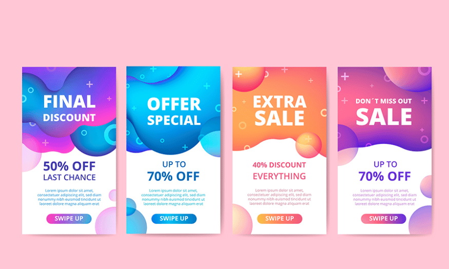
Color is one of the most powerful tools in graphic design. Using contrasting colors can create a strong visual impact and make your design stand out. When you combine opposing colors, you not only make your work eye-catching but also help viewers easily distinguish different elements within the design. This contrast creates a dynamic feel, attracting attention and evoking emotions.
When choosing contrasting colors, you should consider how they interact with each other. Lighter colors are generally more eye-catching than darker ones, but combinations of light and dark colors can create depth and richness in a design. For example, using bright red against a white background will create a strong and striking feel, while a combination of deep blue and bright yellow can create a harmonious and pleasant atmosphere.
Furthermore, don't forget that colors can evoke different emotions and associations. When using contrasting colors, consider the message you want to convey. Colors can influence the viewer's mood and feelings, so choose colors that are not only eye-catching but also appropriate for your message. A well-chosen color scheme will not only attract attention but also create a lasting impression.
6. Use whitespace whenever possible.
Whitespace, also known as negative space, is a crucial design element that many often overlook. Using whitespace effectively can give your design an elegant and professional look. Instead of cramming too many elements, colors, or fonts into a small space, leave some empty areas to make your message clearer. This not only avoids confusion but also creates a comfortable viewing experience.
When you use whitespace, you're creating focus on the important elements in your design. These spaces help viewers easily identify the main messages without being distracted by unnecessary elements. A design that uses whitespace effectively creates balance and helps objects stand out, thereby enhancing the overall viewer experience.
Additionally, whitespace can create a sense of luxury and modernity in your design. In a world overflowing with information and images, using whitespace is not only a smart design strategy but also demonstrates confidence. By leaving empty space, you show that you're not afraid to express subtlety and simplicity in your work. Remember, sometimes less is more, and whitespace can become an indispensable part of your design.

7. Be consistent in your design.
Consistency is a core element in graphic design. It not only helps different elements within a piece work harmoniously together but also creates a clearer brand identity. When you maintain consistency in color, typography, spacing, and layout, viewers will easily recognize and remember your work. This is especially important in large projects where many elements are combined.
When choosing a color palette, stick to the shades you've selected. Using the same color scheme not only helps your design look cohesive but also creates a professional feel. The same goes for fonts; choose two to three typefaces and use them consistently throughout the design. This will create harmony and make your work easier to read and understand.
Consistency applies not only to visual elements but also to spatial elements. Pay attention to the spacing between objects and their placement within the layout. A consistent design will provide a sense of security and comfort to the viewer, making it easier for them to absorb the information you want to convey. Thus, consistency is key to creating impressive and effective design work.
8. Use flat design to your advantage.
Flat design has become a popular trend in the modern graphic design world. In contrast to complex 3D elements, flat design offers simplicity, sophistication, and accessibility. You don't need to spend hours creating elaborate 3D effects; instead, you can focus on using shapes and colors to create visually appealing works. This is especially helpful for beginner designers who might feel overwhelmed when working with complex tools.
One of the major benefits of flat design is its versatility in applying it to a wide variety of projects, from websites and mobile apps to advertising. The simplicity of flat design not only makes information easily accessible to viewers but also creates a sophisticated and modern visual experience. Elements such as bright colors, clear shapes, and sharp lines will help your design stand out to the viewer.
Furthermore, flat design saves resources and time, allowing you to quickly create quality products without much effort. This makes it an ideal choice for designers who want to convey their message effectively while maintaining visual appeal. With flat design, you can easily create impressive works without investing too much time in intricate details.

9. Learn how to use a grid.
Grids are an incredibly useful tool in graphic design, helping you create a harmonious and organized layout. Using grids, you can easily align elements in your design, creating a balanced and pleasing overall effect for the viewer. Grids not only help divide space but also assist in identifying focal points and creating interaction between design elements.
There are many types of grids you can apply, from simple grids to more complex ones, depending on the needs of your project. Understanding each type of grid and how to use them will help you improve your design skills. You can start with basic grids like the 12-column grid, commonly used in web design to create balance and flexibility in layout.
Another benefit of using grids is that it helps you maintain consistency in your design. Once you have a clear grid framework, arranging elements becomes easier, minimizing clutter and creating a better visual experience for the viewer. Learn how to apply grids to your designs, and you'll find that it not only makes your work more professional but also saves you time during the workflow.
10. Choose the right design software.
When embarking on your graphic design journey, choosing the right software is one of the most important decisions you'll need to make. Among the many options on the market, Adobe Photoshop stands out as a powerful and versatile tool, suitable for both beginners and seasoned professionals. With its ability to edit photos, design graphics, and create digital artwork, Photoshop has become the gold standard in the design industry.
One of the reasons Photoshop is so popular is its rich features and high level of customization. You can easily manipulate layers, apply effects, and use its powerful drawing tools to create unique designs. Furthermore, Photoshop offers numerous plugins and filters to expand your creative possibilities. This allows you to do everything from simple photo editing to complex design.
However, to optimize performance and take advantage of all the new features, regular software upgrades are essential. At Sadesign , we offer advanced Photoshop software to help you develop your design skills most effectively.
11. Conclusion
In summary, upgrading your graphic design work is not just a creative process, but also a continuous learning journey. By applying the tips shared, you can improve your design skills and create works that are not only visually appealing but also highly impactful. Remember, innovation and exploration never stop in this field. Good luck on your creative journey!





















VIP Products








Best Selling Products
Upgrade genuine Capture One account
120 USD
Autodesk All App Account Copyright
120 USD
Windows 10 & 11 Pro Key
36 USD
Genuine Cheap Canva Pro
39 USD
Capcut Pro 1 Year
39 USD
Upgrade Genuine Office 365
49 USD
MidJourney Account
29 USD
Plugin Retouch4me
69 USD
Upgrade Duolingo Super
29 USD
Adobe Premiere Pro Account
99 USD
Copyright Adobe Lightroom Account
59 USD
ChatGPT Plus Account (GPT-4)
16 USD
Freepik Premium Account
59 USD
Genuine Adobe Illustrator account
99 USD
Adobe Photoshop Copyright - Full App
120 USD