Best Selling Products

Upgrade Genuine Office 365
49 USD

Plugin Retouch4me
69 USD

Upgrade genuine Capture One account
120 USD

Genuine Cheap Canva Pro
39 USD

Capcut Pro 1 Year
39 USD

Adobe Photoshop Copyright - Full App
120 USD

Genuine Adobe Illustrator account
99 USD

MidJourney Account
29 USD

Upgrade Duolingo Super
29 USD

Autodesk All App Account Copyright
120 USD

Copyright Adobe Lightroom Account
59 USD

Adobe Premiere Pro Account
99 USD

Windows 10 & 11 Pro Key
36 USD

Freepik Premium Account
59 USD

ChatGPT Plus Account (GPT-4)
16 USD
Distinguishing Different Types of Logo Icons
Nội dung
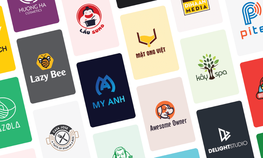
The icon symbol of a logo plays an important role in conveying the message and values of a business. However, not everyone clearly understands the difference between different types of logo icons. Each type has its own characteristics and functions, from wordmark logos to image symbols, from simple logos to complex ones. This article by Appvip will help you distinguish different types of logo icons, learn how they interact with each other, and understand their role in building an effective brand.
1. Abstract Logo Icon
As its name suggests, an abstract logo icon carries the ability to convey many different concepts and emotions in just one single symbol. These symbols are often designed from geometric shapes, using unique lines and patterns to create a strong impression of the brand. Combining an abstract icon with a wordmark can create clarity and flexibility, helping the audience easily recognize and connect with the values that the brand wants to convey.
In particular, this type of logo icon is very suitable for brands that have many messages to communicate. If the core value of your business is excellent customer service, a smiley face symbol may not be enough to express that. Instead, an abstract design with a reasonable combination of colors and shapes can elevate your brand to a completely new level. Creating a unique logo, different from other brands, will help you leave a strong mark in the minds of consumers.
1.1 Pepsi
Pepsi is a typical example of applying an abstract logo icon. Their current logo has a round shape, with red and blue waves interrupted by a white strip in the middle. This design is not only aesthetic but also creates a familiar and friendly feeling for consumers. The globe is tilted to one side, combined with bright colors, creating a negative space effect that evokes a smile, making consumers feel comfortable and positive when thinking of the brand.
Pepsi’s designers applied the Golden Ratio to determine the perfect angle for the globe, helping the logo become harmonious and easy to look at. Although the comparison with the Mona Lisa painting may be controversial, it cannot be denied that Pepsi’s logo has built a recognizable and memorable brand experience. This logo is not simply a symbol, but also a part of popular culture, creating a strong connection with consumers.
.png)
1.2 Huawei
Huawei’s logo is also highly abstract and shows creativity in design. The image of this logo does not stop at one specific shape but opens up many different interpretations. Some people think the logo looks like the sun with radiant rays, while others see it as electromagnetic radiation emitted from an antenna. This shows the ability of abstract design to inspire the viewer’s imagination.
Moreover, some people see the flower shape as symbolizing the word “Hua,” which means “petal” in Chinese, showing refinement and luxury. This diversity in interpretation is exactly the strength of abstract design, as each person can find a meaning of their own. Huawei’s logo is not simply an identification symbol but also a work of art, reflecting the philosophy and values of the brand.
.png)
1.3 Nike
Nike’s logo, the Swoosh symbol, has become legendary worldwide and is one of the most recognizable logos. Although this symbol does not contain any image related to sports, it still conveys a strong message about dynamism and determination. The simple but meaningful design of the Nike logo shows that power does not necessarily have to come from complexity.
Nike has built a brand based on trust and recognition, showing that an abstract logo may take time to become recognizable, but once successful, it will leave an indelible mark in the hearts of consumers. Moreover, this logo is not only a symbol but also an indispensable part of sports culture and lifestyle, encouraging people to pursue their dreams and constantly strive.
2. Geometric Logo Icon
Geometric logo icons, from circles to squares and more complex shapes, have become a popular choice in many industries. The outstanding characteristic of these shapes is their precision and consistency, bringing a feeling of stability and reliability to the brand. However, that precision does not make geometric logos cold or soulless. On the contrary, a circle can symbolize eternity and flexibility, while a square can convey solidity and safety.
Geometry is not simply shapes, but also a design language. Brands can use these shapes to express their core values, from innovation to sustainability. This makes geometric logos a powerful tool in building brand identity, helping to easily impress and attract consumers.
2.1 Reebok
The sports product brand Reebok has gone through many changes in its logo design over the years. In 2014, Reebok introduced the red delta logo with three lines forming a triangular symbol, representing the three major challenges that every athlete must overcome: physical, mental, and social. This design is not only aesthetic but also conveys a strong message about perseverance and the constant effort of athletes.
However, in 2019, Reebok decided to return to the original symbol created in 1993. The new logo with four trapezoids under the “Reebok” wordmark is like a restructured version of the previous red triangle, showing a connection with the brand’s heritage. This transformation not only helps Reebok affirm its own identity but also shows flexibility in design, proving that the brand is always ready to change to match new trends while still maintaining its core values.
2.2 Spotify
Spotify, the popular music application, chose a simple but very effective geometric logo design. Their logo is a simple circle containing sound waves, creating an easily recognizable and attractive image. The prominent neon green color not only helps the logo stand out on the screen but also brings a modern and youthful feeling, suitable for their target audience.
The minimalism in Spotify’s logo design reflects the brand’s philosophy about music and user experience. The shape and color of the logo not only make it easy to recognize but also connect well with listeners, creating a consistent and powerful brand experience. The Spotify logo is not only a symbol but also an important part of modern music culture, reflecting innovation and user interaction with music.
.png)
2.3 National Geographic
National Geographic’s logo, introduced in 1997, has become one of the most recognizable symbols in the television industry. With a yellow rectangular portrait frame, this logo is often considered to represent the sun, symbolizing the channel’s global reach. The simple but powerful design of the National Geographic logo not only helps it stand out but also creates a strong attraction for viewers.
The geometric shape of the logo is not only easy to remember but also shows a connection with nature and exploration. National Geographic has built its brand based on providing knowledge and images about the natural world, and this geometric logo is an important part of expressing their mission. It is not only an identification symbol but also a symbol of exploration, education, and love for nature, attracting millions of viewers around the world.
3. Image Logo Icon
An image icon, often called a brand mark or logo symbol, is an image that illustrates a real object. This is the type of symbol you often think of when mentioning logos, and it has the ability to reinforce the brand name, helping to leave an impression in customers’ minds. Image logos are often easy to create from your business name, bringing a direct connection between the image and the brand, thereby creating strong recognition.
This type of icon is not simply an image but also an essential part of building brand identity. An image logo can convey the personality and values of the brand, helping customers easily remember and recognize it. When designed skillfully, an image symbol can become an indispensable part of brand culture, connecting emotions and creating loyalty from consumers.
3.1 Apple
Apple is one of the typical examples of using an image icon, with the famous apple logo that everyone knows. This symbol not only represents the company name but also contains deep messages about innovation and creativity. The image of the apple with a bite is designed delicately, showing the difference and unique personality of the brand.
By using an image symbol, Apple has been able to flexibly bring its brand personality into the image, something they could not achieve with just a name. This logo has become a symbol of advanced technology and sophistication, helping Apple easily position itself in customers’ minds. Every time consumers see the apple logo, they not only think of the product but also feel a modern and luxurious lifestyle.
3.2 Twitter
Twitter has also succeeded in building its brand through an iconic image icon, which is the image of the bird. Although not as obvious as Apple’s logo, the Twitter bird has become a representative of tweets, accurately reflecting the nature of this social media platform. With a simple but memorable design, the blue bird does not need to be accompanied by the company name, because the image itself is enough for users to immediately recognize the brand.
The success of the Twitter logo lies in the fact that it is not only a symbol but also a part of online culture. The bird not only represents the sharing of information but also symbolizes freedom of speech and connection between people. This has helped Twitter build a strong community and easy brand recognition in users’ minds.
.png)
3.3 Puma
Puma’s logo, with the image of a jumping puma, has become an indispensable symbol in the sports industry. First introduced in 1948, the jumping puma is not only an image representing the brand but also conveys strength, dynamism, and speed. The initial design had the image of a puma jumping over the letter “D,” standing for founder Rudolf Dassler, but over time, this symbol was refined and became easier to recognize.
The image of the puma is not simply a logo; it symbolizes an active and powerful lifestyle. Any sports fan or athlete can connect with the characteristics of the Puma cat, from agility to strength. The Puma logo has become an indispensable part of sports culture, helping the brand leave a strong mark in the hearts of consumers and express their commitment to performance and quality.
4. Crest Icon
Historically, crests and badges are two of the earliest forms of brand marks. These symbols are not only aesthetic but also convey a feeling of reliability and prestige. With designs that seamlessly combine symbolic images and text, crest and badge symbols have become a popular choice for many brands that want to affirm their heritage and own identity.
Crest symbols are often used by brands with a long history, showing respect for tradition and commitment to quality. These companies have taken advantage of the power of imagery to connect consumers with their core values, creating a feeling of attachment and trust from customers.
4.1 Stella Artois
The beer brand Stella Artois, with a history dating back to 1366 in Leuven, Belgium, is one of the oldest symbols in the world. The Stella Artois logo was first used when the brewery was founded, and although hundreds of years have passed, the original horn symbol has remained unchanged. This badge is not simply a brand image; it also speaks of the brand’s 600-year brewing heritage.
The decorative frame surrounding the company name reflects the characteristic architectural style of the city of Leuven, creating a deep historical connection with the product’s origin. With a white, gold, black, and red color palette, the logo conveys luxury and class, making consumers feel proud when enjoying the product. The Stella Artois badge not only leaves an impression on customers but is also a symbol of excellence and tradition in the beer industry.
4.2 Harvard University
Harvard University’s logo is a distinctive symbol that not only represents one of the world’s leading universities but also carries prestige and heritage. The logo design is a shield painted in deep red, symbolizing excellence and strength. The angular shape of the shield not only conveys authority but also shows solidity in knowledge and education.
The shield contains three open books, each book carrying the university’s motto engraved on it, with the Latin word “Veritas” (truth) written clearly. This not only emphasizes the importance of learning but also shows Harvard’s commitment to conveying knowledge and values. Harvard’s logo has become a symbol of excellence in education, contributing to building the reputation and prestige of the university.
.png)
4.3 Harley Davidson
The Harley Davidson logo is one of the most recognizable symbols in the motorcycle industry. Founded in 1903 in a shed, Harley Davidson quickly became one of the largest motorcycle manufacturers in the world. The logo design combines orange and black to create a powerful image, matching the company’s iconic motorcycles.
The shield in the logo not only means protection but also conveys a feeling of strength and authority that motorcycle riders experience. This logo is not simply a brand symbol; it also expresses a lifestyle, freedom, and adventurous spirit, attracting those who are passionate about speed and freedom. Harley Davidson does not only sell motorcycles, but also sells a living experience, and their logo is an indispensable part of expressing that.
5. Conclusion
Distinguishing different types of logo icons not only helps you understand more clearly about brand design but also supports choosing the right option for your business. Each type of symbol has its own advantages and disadvantages, and using them properly will contribute to enhancing brand recognition. Hopefully, through this article, you will have a deeper view of the diverse world of icons and logos, thereby applying this knowledge in practice to build a stronger and more impressive brand.





















VIP Products








Best Selling Products
Upgrade Genuine Office 365
49 USD
Plugin Retouch4me
69 USD
Upgrade genuine Capture One account
120 USD
Genuine Cheap Canva Pro
39 USD
Capcut Pro 1 Year
39 USD
Adobe Photoshop Copyright - Full App
120 USD
Genuine Adobe Illustrator account
99 USD
MidJourney Account
29 USD
Upgrade Duolingo Super
29 USD
Autodesk All App Account Copyright
120 USD
Copyright Adobe Lightroom Account
59 USD
Adobe Premiere Pro Account
99 USD
Windows 10 & 11 Pro Key
36 USD
Freepik Premium Account
59 USD
ChatGPT Plus Account (GPT-4)
16 USD