Best Selling Products

Genuine Cheap Canva Pro
39 USD

Freepik Premium Account
59 USD

Capcut Pro 1 Year
39 USD

Upgrade Genuine Office 365
49 USD

Adobe Premiere Pro Account
99 USD

MidJourney Account
29 USD

Adobe Photoshop Copyright - Full App
120 USD

Autodesk All App Account Copyright
120 USD

Windows 10 & 11 Pro Key
36 USD

Copyright Adobe Lightroom Account
59 USD

Upgrade Duolingo Super
29 USD

Genuine Adobe Illustrator account
99 USD

ChatGPT Plus Account (GPT-4)
16 USD

Upgrade genuine Capture One account
120 USD

Plugin Retouch4me
69 USD
Decoding Why the Logos of Major Brands Are Simple?
Nội dung
- 1. What a simple Logo needs to have
- 2. Famous brands with simple Logos
- 2.1 Coca-Cola
- 2.2 London Underground
- 2.3 Apple
- 2.4 FedEx
- 2.5 Nike
- 3. Simple logo design tips
- 3.1 Create a unique wordmark
- 3.2 Explore geometric shapes
- 3.3 Limit the color palette
- 3.4 Ensure easy recognition
- 3.5 Keep the design clean and refined
- 3.6 Test and adjust
- 4. Conclusion
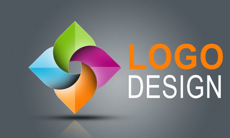
In the modern world, a logo is not only an identification symbol but also the soul of a brand. Major brands such as Apple, Nike, or McDonald's all choose logo designs that are simple, memorable, and easy to recognize. This is not accidental but the result of a careful research and testing process. Simplicity in logo design brings many benefits, from attracting customers to building trust and sustainability for the brand. So why has simplicity become a popular trend in the logo design of major brands? Let’s explore with Appvip the key factors that create the power of a simple logo.
1. What a simple Logo needs to have
When it comes to logo design, the philosophy of "less is more" is the guiding principle for many successful brands. Minimalism is not only a design trend but also a profound approach to conveying a brand message. Simple logos often use minimalist forms, removing unnecessary elements to create sophistication and memorability. Think of concepts such as negative space, where emptiness can also say a lot. A minimalist logo not only meets aesthetic needs but also delivers high effectiveness in brand recognition across many different platforms.
A simple logo can be a brand symbol, a design with only the business name without complex imagery, or an emblematic icon. By removing "irrelevant" elements, you can create a beautiful, flexible logo that is suitable in every situation. However, for your logo to truly create impact, it must follow several basic principles. First, the logo must be memorable; this means it must be distinctive enough that the audience cannot forget it. Second, it needs to resonate with customers; the style of the logo must reflect what they find appealing and familiar. In addition, the logo also needs to be versatile, able to be used in different formats such as digital advertising or print. Finally, the logo must reinforce the brand’s characteristics and message, helping to create a strong connection with the audience.
.png)
2. Famous brands with simple Logos
In an era where consumers are surrounded by millions of advertisements and marketing messages every day, building an influential logo has become more important than ever. A logo not only needs to be beautiful but also must quickly attract attention and be easy to remember. A simple logo helps reduce the "mental energy" customers need to spend to recognize a brand. Major brands are aware of this and have designed logos that are not only easy to see but also have a strong subconscious effect, connecting well with customers. Below are some typical examples of brands that have succeeded with simple yet impressive logos.
2.1 Coca-Cola
Coca-Cola is one of the most famous brands in the world, and its logo is proof of the power of simple design. Without needing complex imagery, Coca-Cola’s logo mainly relies on a unique typeface, called Spencerian script, developed by Frank Mason Robinson in 1885. This typeface, with its soft curves combined with a striking red color, creates a friendly and recognizable feeling.
What is special about the Coca-Cola logo is its ability to create a strong impression from the very first glance. It not only represents a beverage brand but has also become a cultural icon, associated with many memories of consumers. This logo image has appeared in millions of advertisements, products, and events, making it an indispensable part of the daily lives of billions of people around the world.
2.2 London Underground
The London Underground logo, with its simple yet effective design, has become the symbol of the public transportation system in London. The red circle together with the blue bar is not only easy to recognize but also expresses inclusiveness and welcome. This design not only creates a friendly feeling but also emphasizes the idea of free movement within the city.
One of the important factors that helps this logo remain enduring is its high visibility. Even if you are walking on the streets of London in bad weather conditions, the logo still easily catches your attention. The perfect combination of color and shape helps it stand out in any situation. Not only an identification symbol, the London Underground logo also contains within it a part of the city’s history and culture, making it special and memorable.
.png)
2.3 Apple
When mentioning simple but impressive logos, Apple cannot be ignored. The bitten apple symbol has become an indispensable part of modern technology culture. This logo not only represents a brand but also symbolizes innovation and refined design. Apple has built a strong image around its logo, making it synonymous with high-quality products and excellent user experience. Every time consumers see this logo, they immediately feel the luxury and superior features that Apple products bring.
However, the journey of the Apple logo was not always as simple as it is today. Initially, Apple’s logo was an image of Isaac Newton sitting under an apple tree, representing creativity and discovery. Over the years, as the brand gradually became clearer, the logo also went through many changes to become more minimalist. Currently, with a flat design and using only three basic colors, Apple’s logo can be recognized immediately, whether on product packaging or electronic devices. The simplicity in design not only helps this logo become easy to recognize but also allows it to blend perfectly into any platform, from websites to advertisements.
What is special about the Apple logo is the way it reflects the company’s design philosophy: "Simple is best." Every time a new product is launched, the logo appears with confidence, conveying the message of quality and constant innovation. Thanks to the combination of minimalist design and far-sighted vision, the Apple logo has become a global icon, affirming the brand’s position in the hearts of consumers.
.png)
2.4 FedEx
Another outstanding example of a simple yet effective logo is the FedEx logo. With the use of two main colors, purple and orange, this logo not only attracts the eye but is also easy to recognize from a distance. Purple brings a feeling of trust and professionalism, while orange shows dynamism and youthfulness. This combination creates a strong impression, making customers feel secure when choosing FedEx delivery services.
What is interesting about the FedEx logo is the way it cleverly uses negative space to create an arrow image between the letters "E" and "X". When you notice this arrow, it not only increases the aesthetics but also conveys the message of speed and movement—which are core elements in the shipping service industry. This subtlety shows that a logo is not merely a symbol but also a part of the brand story, reflecting the values that the company wants to convey.
The FedEx logo also clearly shows that simplicity does not mean lacking power. On the contrary, simplicity in design can bring high effectiveness in creating brand awareness. When seeing the FedEx logo, consumers immediately associate it with fast and reliable delivery services. This proves that a well-designed logo can create a long-lasting and powerful impact in customers’ minds.
2.5 Nike
The Nike logo, with its simple checkmark-like image, is one of the most recognizable symbols in the sports industry. Called the "Swoosh", this logo not only represents movement but also brings a feeling of energy and determination. The shape of the Swoosh recalls running steps, development, and progress—all of which are very suitable for Nike’s brand philosophy: "Just Do It".
Although the design seems simple, the Swoosh has made a big impact in the branding world. It is not only an identification symbol but also a part of global sports culture. Whenever consumers see this logo, they not only think of a sports product but also feel the spirit of overcoming challenges and the desire to reach success. Nike has skillfully turned its logo into a symbol of strength and inspiration, encouraging people to pursue their dreams.
Notably, the Nike logo is not merely an image; it is also a symbol of lifestyle. Whether you see it on a pair of shoes, a T-shirt, or in television advertisements, the Swoosh always brings a familiar and trustworthy feeling. Therefore, this logo has contributed greatly to the development of the brand, affirming Nike’s position in the hearts of consumers and in the global market. The simplicity of the logo not only makes it easy to recognize but also allows it to exist sustainably over time, proving that good design can create great changes in the industry.
3. Simple logo design tips
Are you ready to start designing your own simple logo? To help you create a symbol that is not only beautiful but also memorable, refer to the top tips below.
3.1 Create a unique wordmark
First, consider using a wordmark. This is one of the easiest ways to build a logo, as Google or Coca-Cola have done. By focusing on text, you can choose an impressive font and a suitable color palette to convey your brand message. A wordmark helps create strong recognition and is easy to adjust for many different platforms.
A unique and readable font can make your logo stand out from the crowd. Famous brands such as Disney and The New York Times have also succeeded thanks to this approach. Remember that simplicity in design does not mean lacking power; on the contrary, it can be the highlight that helps your brand shine.
3.2 Explore geometric shapes
Next, use shapes in your design. Geometric shapes such as circles, squares, and triangles not only bring visual beauty but also help reinforce your brand message. Circles are often associated with movement and connection, very suitable for brands that want to express unity and friendliness.
In contrast, squares symbolize stability, reliability, and professionalism, ideal for brands in the finance or technology sectors. If you want to convey inspiration and dynamism, consider using triangles; this shape can point to different meanings depending on how you design it. Do not hesitate to explore other shapes, but always keep your overall design clean and simple.
.png)
3.3 Limit the color palette
When creating a color palette for a logo, the rule "less is more" is always the guiding principle. Using 1-2 colors with specific meanings and good visibility will help your logo become more prominent in customers’ minds. Make sure the colors you choose have good contrast to create a strong and memorable impression.
A limited color palette will help your logo be easier to recognize and remember. This also helps avoid clutter in the design, allowing consumers to easily connect with your brand. One important thing is that the colors you choose need to correctly reflect the nature and values of the brand.
3.4 Ensure easy recognition
An effective logo needs to be easy to recognize. When designing, consider how the logo will appear on different platforms, from product packaging to online advertising. A clear and easy-to-see logo will make it easier for customers to remember your brand.
Easy recognition does not only come from form but also from the way you convey the message. Make sure your logo can be seen and understood even when at a small size or in different situations. This helps your brand become more familiar in the hearts of consumers.
3.5 Keep the design clean and refined
Refinement in design is very important. Avoid cramming in too many details, because this can make the logo confusing and difficult to understand. A simple and refined design will easily create a strong impression and be remembered longer in consumers’ minds.
A clean logo not only brings a modern feeling but also shows the professionalism of the brand. Make sure every element in the design has a reason and matches the message you want to convey. The balance between elements will help create a harmonious and approachable logo.
3.6 Test and adjust
Finally, do not be afraid to experiment with many different styles and designs. Collect feedback from friends, colleagues, or customers to get a multidimensional view of your logo. Adjusting and improving the design based on feedback will help you create a more perfect logo that correctly reflects your brand identity.
The testing process can help you discover new and creative ideas that you may not have thought of. Be open to feedback and do not hesitate to change if necessary. A good logo is the result of continuous creativity and openness to feedback from others.
.png)
4. Conclusion
In summary, simplicity in logo design not only helps a brand be easily recognized but also creates a strong and lasting impression in consumers’ minds. Simple logos are often memorable, easy to recognize, and capable of conveying the brand message in the most effective way. This proves that, in today’s fiercely competitive context, a simple and streamlined logo can be the decisive factor that helps a brand stand out and maintain its position in customers’ minds. Contact Appvip now to upgrade your software and create perfect videos!





















VIP Products








Best Selling Products
Genuine Cheap Canva Pro
39 USD
Freepik Premium Account
59 USD
Capcut Pro 1 Year
39 USD
Upgrade Genuine Office 365
49 USD
Adobe Premiere Pro Account
99 USD
MidJourney Account
29 USD
Adobe Photoshop Copyright - Full App
120 USD
Autodesk All App Account Copyright
120 USD
Windows 10 & 11 Pro Key
36 USD
Copyright Adobe Lightroom Account
59 USD
Upgrade Duolingo Super
29 USD
Genuine Adobe Illustrator account
99 USD
ChatGPT Plus Account (GPT-4)
16 USD
Upgrade genuine Capture One account
120 USD
Plugin Retouch4me
69 USD