Best Selling Products

ChatGPT Plus Account (GPT-4)
16 USD

Upgrade Duolingo Super
29 USD

Capcut Pro 1 Year
39 USD

Copyright Adobe Lightroom Account
59 USD

Upgrade Genuine Office 365
49 USD

Genuine Adobe Illustrator account
99 USD

Upgrade genuine Capture One account
120 USD

Genuine Cheap Canva Pro
39 USD

MidJourney Account
29 USD

Windows 10 & 11 Pro Key
36 USD

Plugin Retouch4me
69 USD

Autodesk All App Account Copyright
120 USD

Freepik Premium Account
59 USD

Adobe Photoshop Copyright - Full App
120 USD

Adobe Premiere Pro Account
99 USD
Discover How to Set Up Layouts to Improve Design
Nội dung
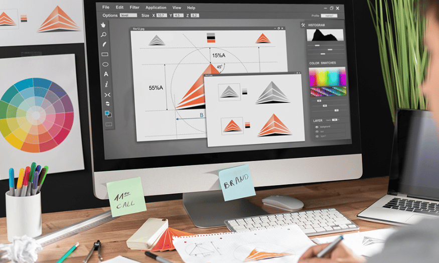
In the world of design, setting up a layout is not simply about arranging visual elements and text on a page. An effective layout has the ability to attract attention, create harmony, and easily guide viewers through the message you want to convey. Discovering how to set up layouts to improve design is not only a necessary skill but also an art, from clearly understanding basic principles to applying them creatively and flexibly. In this article, Appvip will go deep into useful methods, principles, and tips so you can improve your design skills and create impressive products
1. Rule of thirds
The rule of thirds is one of the most basic and famous principles in photography and design. This principle helps you divide the frame into nine equal parts by drawing two horizontal lines and two vertical lines. The intersections of these lines, also known as “golden points,” are where the human eye is usually most attracted. When you place the subject at one of these points, or near the lines, your photo will become more balanced and attractive.
Applying the rule of thirds is very simple, but the effect it brings is very great. You can easily use the grid display feature on a camera or phone to support the shooting process. Placing the subject outside the center will help create a more dynamic and interesting feeling for the photo. This also helps viewers more easily receive the message you want to convey.
However, the rule of thirds is not a rigid rule. You can flexibly adjust and experiment to find your own style. Sometimes, breaking this rule can also bring unique and impressive photos, creating a personal mark in each work.
.png)
2. Central composition and symmetry
Placing the subject in the center of the frame can be very effective, especially in photos with high symmetry. Symmetry creates a harmonious and pleasant feeling for viewers. For example, in photos of nature or architecture, arranging symmetrical elements helps create a tight composition and attract the eye.
When you use symmetry, reflected elements in water or symmetrical structures will highlight the subject. The balance between parts of the photo not only helps highlight the subject but also creates an interesting visual story. When combining the rule of thirds and symmetry, you can create photos with more depth and appeal.
However, it is not always necessary to keep everything completely symmetrical. Sometimes, adding a bit of surprise by offsetting some elements can also create interest and drama for the photo. This allows you to explore many different ways of expression in your design.
3. Foreground composition and depth
Foreground composition is an effective technique for creating a sense of depth in a photo. Adding foreground elements helps viewers feel space and depth, making the photo become more vivid and attractive. This technique is especially useful in landscape photos, where the contrast between foreground and background can create a strong three-dimensional feeling.
When using foreground composition, elements such as rocks, grass, or other objects can create depth for the frame. These elements not only help guide the viewer’s eyes into the photo but also create a more complete picture. This technique is often used with wide-angle lenses, helping expand the view and create space for the image.
However, it is important to consider choosing foreground elements so that they do not distract from the main subject. These elements need to support the story you want to tell, creating harmony in the overall photo. When you become proficient in using foreground composition, you will see that your photos become much more vivid and attractive.
.png)
4. Frame within a frame
Frame within a frame is a powerful design technique that helps create depth and appeal for your photo. By using natural elements such as windows, tree branches, or any object that can surround the subject, you can create a visual “frame.” This technique not only highlights the main subject but also helps viewers feel the surrounding space, thereby creating a more lively and vivid picture.
Using frame within a frame brings a feeling of closeness and familiarity. For example, a window can be not only a viewpoint but also a gateway guiding the viewer’s eyes into the inner space. The combination of light and shadow through the window frame creates depth and complexity for the photo. For portraits, finding natural framing elements will help highlight the personality and emotions of the character.
Besides, a frame within a frame does not necessarily have to surround the entire scene. A partial frame can also create a powerful effect, guiding the eye without losing attention on the main subject. Try experimenting with many different shooting angles to find the best way to enhance depth and create unique photos.
5. Straight lines
Straight lines play an important role in guiding the viewer’s eyes in a photo. They can come from many different sources such as roads, walls, or natural shapes. These leading lines not only help organize space but also create emphasis for important elements in the frame. When arranging straight lines properly, you can create a direction for the viewer’s eyes, thereby helping them easily access the message you want to convey.
Leading lines do not necessarily have to be perfectly straight; curves can also bring interest and appeal to the photo. For example, a winding road can guide viewers from one point to another, creating a sense of discovery and excitement. In some cases, combining straight lines and curves can create a diverse and rich composition, attracting the viewer’s attention.
When using straight lines in composition, remember to apply the rule of thirds to optimize effectiveness. Placing leading lines in strategic positions not only helps create balance but also highlights the main subject, thereby enhancing the appeal of the photo.
.png)
6. Diagonals and triangles
Diagonals and triangles are two powerful design elements capable of creating “drama” for a photo. Diagonal lines bring a sense of movement and dynamism, while triangles often evoke stability and balance. When combining these two elements, you can create photos that are not only eye-catching but also full of emotion and meaning.
In photography, diagonal lines are often used to create tension and momentum. For example, a photo with a person standing on a slope will create a feeling of instability, making viewers feel the tension in the frame. In contrast, straight lines and triangles bring a feeling of firmness and safety. When you skillfully combine these elements, you will create a photo full of vitality and meaning.
A typical example is the image of the Samuel Beckett Bridge in Dublin, where many triangles and diagonal lines are combined to create a unique scene. The bridge is not only a physical structure but also a work of art, with triangles hidden in the surrounding scenery. These leading lines and triangles not only create harmony but also direct the viewer’s eyes to interesting highlights in the photo, thereby creating a deep and impressive visual experience.
7. Patterns and texture
Patterns and texture play an important role in creating visual appeal for a photo. Humans tend to be attracted to patterns and structures because they evoke a sense of harmony and richness. Integrating patterns into the composition not only makes the photo more vivid but also brings depth and richness to the image. Elements such as spreading flower petals, rough ground, or patterns on walls can all become interesting highlights, adding aesthetics to the photo.
When you use patterns in design, pay attention to balance and harmony. A photo with complex patterns can create a lively atmosphere, while simpler patterns bring elegance and refinement. This technique can be applied to many genres of photography, from portraits to landscapes or architecture. Choosing suitable patterns will help you convey the message more effectively.
In addition, using texture can also bring contrast and depth to the photo. Surfaces such as wood, stone, or fabric can create interesting elements, making the photo not simply an image but also an emotional experience for viewers. Try experimenting with different patterns and textures to discover new aspects in your photography art.
.png)
8. Rule of odds
The rule of odds is an interesting principle in design and photography, saying that a photo will become more attractive when there is an odd number of objects in the frame. The reason for this is the natural feeling that odd numbers bring, because it creates a harmonious and easier-to-view feeling. In contrast, an even number can make viewers feel distracted, not knowing which object to focus on. This is especially important in photos with many characters or different elements.
Although this rule does not always have to be followed rigidly, it can be a useful guide in many situations. For example, if you are taking a family photo, having three or five members will create a more visually attractive composition than four or six people. Similarly, in works of art, using an odd number can help create balance naturally.
However, it is important to remember that this rule is only one of many methods to create appeal for a photo. Sometimes, breaking this rule will create unexpected and interesting results. Feel free to explore and find what best suits your style and ideas.
9. Fill the frame
Filling the frame with the main subject is a powerful technique in photography, helping viewers focus completely on the object you want to emphasize. By reducing the surrounding space, you can remove all distracting elements, thereby creating a sharper and more impressive photo. This technique is especially effective when you want to highlight details, such as in the case of close-up shots of an animal’s face.
When applying this technique, pay attention to how you arrange the subject in the frame. Cutting out unnecessary parts will help viewers easily identify and feel the outstanding characteristics of the object. A close-up photo of a lion, for example, can make viewers deeply feel its beauty and strength through its eyes and skin texture.
However, filling the frame is not always the best choice. In some cases, leaving space around can also bring a similar effect and even more. It will be very interesting when you experiment with both approaches to find the best style and composition for each photo.
.png)
10. Create wide space
Creating wide space around the subject can be a powerful technique, creating a simple and elegant feeling for the photo. When you leave a lot of empty space, this not only helps highlight the subject but also creates a sense of freedom and comfort. This simplicity can make the photo more accessible and help viewers easily focus on the main content without being distracted.
Space can create a peaceful and elegant atmosphere, especially when you photograph natural scenes or still subjects. For example, a photo of a lonely boat on a vast water surface will bring a feeling of loneliness but also very peaceful. This not only creates a beautiful picture but also evokes strong emotions in the viewer’s heart.
Similar to filling the frame, creating space also needs to be carefully considered. Depending on the idea and message you want to convey, you can choose the most suitable approach to create appeal and aesthetics for your work. Experiment and discover to find the method that best suits your own creative style.
11. Conclusion
Setting up a layout is a decisive factor in the success of any design. When you master the basic principles and apply them flexibly, you not only improve design quality but also enhance the viewer’s experience. Always remember that a good layout is not only a reasonable arrangement but also the connection between elements, creating an attractive and easy-to-understand story. By continuously exploring and practicing, you will become a designer capable of creating unique and impressive works, turning your ideas into reality.





















VIP Products








Best Selling Products
ChatGPT Plus Account (GPT-4)
16 USD
Upgrade Duolingo Super
29 USD
Capcut Pro 1 Year
39 USD
Copyright Adobe Lightroom Account
59 USD
Upgrade Genuine Office 365
49 USD
Genuine Adobe Illustrator account
99 USD
Upgrade genuine Capture One account
120 USD
Genuine Cheap Canva Pro
39 USD
MidJourney Account
29 USD
Windows 10 & 11 Pro Key
36 USD
Plugin Retouch4me
69 USD
Autodesk All App Account Copyright
120 USD
Freepik Premium Account
59 USD
Adobe Photoshop Copyright - Full App
120 USD
Adobe Premiere Pro Account
99 USD