Best Selling Products

Upgrade Genuine Office 365
49 USD

Copyright Adobe Lightroom Account
59 USD

Upgrade Duolingo Super
29 USD

Genuine Cheap Canva Pro
39 USD

Adobe Photoshop Copyright - Full App
120 USD

Windows 10 & 11 Pro Key
36 USD

ChatGPT Plus Account (GPT-4)
16 USD

Capcut Pro 1 Year
39 USD

Freepik Premium Account
59 USD

Autodesk All App Account Copyright
120 USD

Adobe Premiere Pro Account
99 USD

Plugin Retouch4me
69 USD

MidJourney Account
29 USD

Upgrade genuine Capture One account
120 USD

Genuine Adobe Illustrator account
99 USD
Common Terms Every Designer Must Know
Nội dung
In the world of design, there are many terms that designers need to master in order to communicate effectively and clearly understand the workflow. These terms not only help improve professional ability but also build confidence when working with clients and colleagues. In this article, let’s explore with Appvip the common terms that every designer should know, thereby helping you improve your skills and knowledge in the field of design.
1. What is Element?
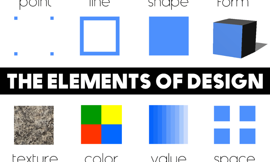
Element in design, also known as design elements, are the basic components that make up a complete design work. These elements include text, images, colors, shapes and many other components, all of which contribute to forming the structure and content of the design. Each element has a specific role and affects how viewers perceive the work, thereby creating a rich visual experience.
When designing, combining these elements harmoniously is very important. A good design is not simply about arranging elements but also about how they interact with each other. For example, using suitable colors can highlight an image or a piece of text, while shapes can help convey messages more clearly and effectively. Therefore, understanding design elements clearly will help designers create unique and impressive products.
Design elements are not only decorative in nature but also contribute to conveying the message and emotions of the work. For example, a design using bright colors and soft shapes can create a cheerful and friendly feeling, while a design with dark colors and sharp shapes can bring a serious and professional feeling. This shows that mastering and applying design elements effectively is essential for any designer.
.png)
2. What is Composition?
In design, composition is the visual arrangement of design elements to create a complete image. Composition is not simply the position of elements on the page but also relates to how they interact and support each other. A good composition can elevate the design, helping viewers easily access and understand the message that the work wants to convey.
There are many composition principles that designers can apply, such as circular composition and the rule of thirds composition. Circular composition often brings a sense of harmony and balance, while the rule of thirds composition helps create emphasis for the main elements. Applying these principles can help create a design that is not only attractive but also easier for viewers to access.
The reasonable arrangement of elements in the composition can also create momentum and guide the viewer’s eye. When elements are placed in strategic positions, they can lead viewers to explore the work naturally. This not only increases aesthetics but also helps convey the message more effectively.
3. What is Balance in design?
Balance in design refers to the distribution of the weight of elements on the page. Each element, whether large or small, has its own weight, depending on form, size, color and texture. To create balance, designers need to consider how these elements interact with each other, thereby creating a stable and harmonious composition.
There are two main types of balance in design: symmetrical balance and asymmetrical balance. Symmetrical balance often creates a sense of stability and order, while asymmetrical balance can bring more dynamism and interest. Using balance effectively can help create comfort for viewers, while making the design more attractive.
Designers need to pay attention to proportions and spacing between elements to achieve ideal balance. A design with good balance is not only easy to look at but also helps viewers feel more comfortable when engaging with the message that the work conveys. Balance is not only a design principle but also an important factor in creating a positive user experience.
.png)
4. What is Alignment?
Alignment in design refers to the position of components in the layout and how they are arranged so that they line up. Alignment can be left, right, justified or centered, depending on the purpose and message of the design. Alignment not only creates consistency but also helps build connections between elements on the page.
Many new designers often make the mistake of placing components randomly, without connection to each other. This can make the design become messy and difficult to understand. According to the principle of alignment, elements need to be arranged intentionally to create harmony and unity. This not only makes the design more attractive but also helps viewers easily receive the message.
A good design will have careful consideration of alignment, helping create a coherent and pleasant user experience. When elements are aligned effectively, viewers will feel more comfortable when interacting with the design, thereby improving the ability to convey the message clearly and effectively.
5. What is Misaligned?
In design, "misaligned" means a lack of alignment or synchronization between elements. This phenomenon can cause discomfort, or even make viewers feel visually confused. Elements such as text, images and other components, if not aligned properly, can create a disorganized layout, reducing aesthetics and the effectiveness of conveying the message.
Some examples of "misaligned" in design include: text and image elements not being aligned with each other, making the design page look messy; size elements not being synchronized, such as text with different sizes or images that are disproportionate; and color elements not being synchronized, such as using colors that do not contrast or are not in the same tone. These issues not only affect aesthetics but can also reduce accessibility and understanding of information from viewers.
To avoid the "misaligned" situation, designers need to pay attention to several factors. Using basic design principles such as balance, proportion and contrast can help create harmonious designs. In addition, using design tools to check and adjust elements in the design is also very important. Finally, getting feedback from others can help detect issues that you may have overlooked, thereby improving design quality.
6. What is Contrast?
Contrast, also known as degree of contrast, is the level of difference between design elements. This can be shown through form, color, texture and size. The main purpose of contrast is to create attraction and interest for viewers when they come into contact with the design. A design with high contrast will easily attract attention, while clarifying important elements in the layout.
Contrast is a powerful tool that helps create visual hierarchy in design. When elements have different levels of contrast, viewers will easily recognize important parts and the priority order of information. For example, a large title with prominent color compared to smaller text will easily attract the eye and convey the message more effectively.
In addition, contrast also helps organize objects in the design into clear groups. This not only creates coherence but also helps viewers easily follow and understand the message that the design wants to convey. In short, applying contrast reasonably can enhance the aesthetics as well as the effectiveness of any design work.
.png)
7. What is Contrast Color?
Contrast Color in design refers to contrasting colors, an important term in design, photography and art. Contrasting colors indicate two colors that are opposite each other on the color wheel. When placed next to each other, contrasting colors will create prominence and attract attention, helping the design become more lively and easily make an impression on viewers.
There are two main types of contrasting colors. The first is complementary contrasting colors, which are two colors located opposite each other on the color wheel, such as red and green, yellow and purple, or orange and blue. These color pairs, when combined, will create a strong effect, highlight design elements and easily attract the eye.
The second type is related contrasting colors, which are two colors located next to each other on the color wheel, such as red and orange, yellow and green, or blue and purple. Although not as strong as complementary contrasting colors, these colors also create harmony and can increase the aesthetics of the design. Using contrasting colors effectively can help create prominence and easily convey the message of the work.
.png)
8. What is Negative Space?
Negative Space, or empty space, is the blank area around a design element. Unlike positive space, the main design elements, negative space is very important in emphasizing certain parts of the layout. It helps divide areas and clarify elements, thereby enhancing the ability to convey the message.
A design without negative space will become too cramped and uncomfortable. The viewer’s eyes will be scattered everywhere and cannot focus on the main point that the designer wants to communicate. Negative space not only creates openness but also helps viewers easily recognize and clearly understand the message of the design.
When using negative space reasonably, designers can create more eye-catching and effective design works. For example, in a logo or poster, creating negative space can form images or symbols without needing to add many details, bringing sophistication and class to the design.
.png)
9. What is Hierarchy?
Hierarchy in design, or visual hierarchy, is the way elements are arranged according to their level of importance. This helps viewers easily recognize the main and secondary parts in a design work. This hierarchy system is not only based on size but also relates to how colors, fonts and positions of elements are used.
Important elements will often be larger and more prominent in the design, attracting viewers’ attention from the first glance. For example, the main title of an article will usually be larger and have a more prominent color than the supporting text paragraphs. This helps readers easily identify important content and decide whether to continue reading or not.
Applying visual hierarchy effectively not only helps organize information but also makes the design more accessible and attractive. By creating a clear hierarchy system, designers can guide viewers to follow content in a coherent and natural way.
10. What is Symmetry?
Symmetry in design is the perfect balance between elements, creating a sense of harmony, order and stability. Symmetry can be arranged in many different ways, including axial symmetry, central symmetry and reflective symmetry.
Axial symmetry is when elements are arranged in balance across an imaginary axis. For example, a design may have two sides perfectly symmetrical through a middle line, creating a sense of balance and stability.
Central symmetry is when elements are arranged around a central point. Designs in this style often bring a sense of uniformity and attraction, making viewers feel comfortable when looking at them.
Finally, reflective symmetry is when elements are reflected across an imaginary plane, creating a perfectly symmetrical image. This type of symmetry is often used in logo design and artworks to create strong appeal and impression. Symmetry not only increases aesthetics but also helps viewers easily access and better understand the message that the design conveys.
11. Conclusion
Understanding and applying design terms is not only an advantage but also an essential thing in the journey to becoming a professional designer. These terms not only help you communicate more effectively but also open up many new opportunities in your career. Hopefully, with the terms presented, you will feel more confident in applying them to your work and developing yourself in this creative design industry.





















VIP Products








Best Selling Products
Upgrade Genuine Office 365
49 USD
Copyright Adobe Lightroom Account
59 USD
Upgrade Duolingo Super
29 USD
Genuine Cheap Canva Pro
39 USD
Adobe Photoshop Copyright - Full App
120 USD
Windows 10 & 11 Pro Key
36 USD
ChatGPT Plus Account (GPT-4)
16 USD
Capcut Pro 1 Year
39 USD
Freepik Premium Account
59 USD
Autodesk All App Account Copyright
120 USD
Adobe Premiere Pro Account
99 USD
Plugin Retouch4me
69 USD
MidJourney Account
29 USD
Upgrade genuine Capture One account
120 USD
Genuine Adobe Illustrator account
99 USD