Best Selling Products

Plugin Retouch4me
69 USD

Freepik Premium Account
59 USD

Adobe Photoshop Copyright - Full App
120 USD

Windows 10 & 11 Pro Key
36 USD

Autodesk All App Account Copyright
120 USD

Genuine Adobe Illustrator account
99 USD

Upgrade Duolingo Super
29 USD

Upgrade genuine Capture One account
120 USD

Copyright Adobe Lightroom Account
59 USD

Capcut Pro 1 Year
39 USD

Genuine Cheap Canva Pro
39 USD

MidJourney Account
29 USD

ChatGPT Plus Account (GPT-4)
16 USD

Upgrade Genuine Office 365
49 USD

Adobe Premiere Pro Account
99 USD
Color Theory Knowledge Every Designer Needs to Know
Nội dung
- 1. Discover color concepts
- 1.1 What is color?
- 1.2 Color attributes
- 1.3 Color wheel
- 2. Types of colors in color theory
- 2.1 Primary colors
- 2.2 Secondary colors
- 2.3 Tertiary colors
- 2.4 Color temperature
- 2.5. Neutral colors
- 3. Types of color combinations in color theory
- 3.1 Monochromatic
- 3.2 Analogous
- 3.3 Complementary
- 3.4 Split-Complementary
- 3.5 Triadic
- 3.6 Tetradic
- 4. Perfect color combination software
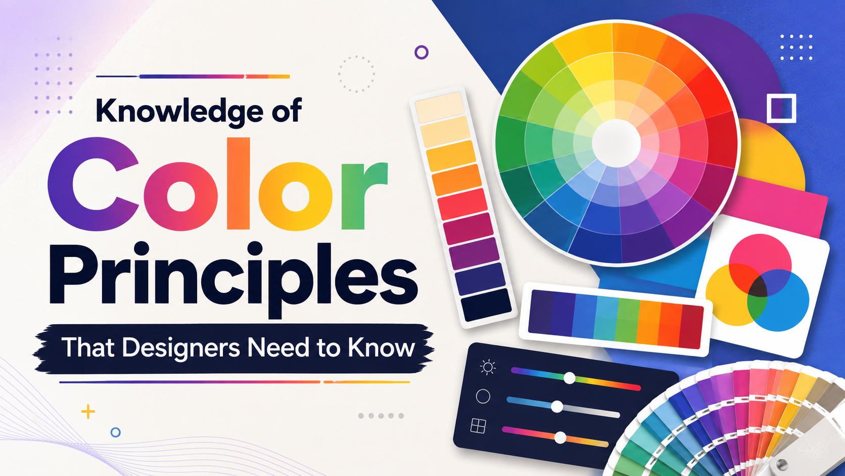
Color theory is one of the most important factors in design, deeply affecting the perception and behavior of viewers. Understanding color not only helps designers create attractive products, but also helps them convey messages more effectively. From choosing the right color palette to applying color combination principles, color knowledge will make a big difference in creative work.
1. Discover color concepts
1.1 What is color?
Color is an indispensable part of our daily life. For designers, color is not simply a decorative element but also a powerful tool to convey emotions and messages. The perfect combination of color and layout creates a beautiful and attractive design product, capturing the attention of viewers. Suitable colors not only make the design more vivid but also evoke positive emotions, affecting consumers’ decisions and preferences.
The history of color spans thousands of years, but until now, there has still not been a completely precise definition of color. Humans, thanks to eye structure and recognition ability, can perceive millions of different colors. These colors change continuously depending on light and viewing angle, creating a rich and diverse world of color. In design, color not only creates attraction but also expresses style and psychology, allowing designers to convey ideas without using words.
Color not only has external beauty but also brings deep layers of meaning. It is this magic that makes color able to touch the hearts of viewers. However, color is not always perfect or harmonious. The art of color coordination, therefore, becomes an important part of design, helping overcome flaws and create balance in every work.
.png)
1.2 Color attributes
Color is determined through three basic attributes: hue, intensity, and value. Each of these attributes creates diversity and richness in the color experience.
Hue is the term that describes the specific color we recognize. It answers the question “What color is it?”. Hue includes basic colors such as red, blue, yellow, and their variations. Meanwhile, intensity reflects the saturation of color, showing whether that color is vivid or pale. Finally, value refers to the lightness or darkness of color, allowing us to create different shades by adding white or black to the original color.
In addition to the three main attributes, color can also be further adjusted through tints, shades, and tones. Tints are created when mixing a color with white, while shades appear from combination with black. Tones, on the other hand, are formed when both white and black colors are mixed, creating a more natural look for the color.
1.3 Color wheel
The color wheel is a useful tool that helps us better understand the relationship between colors. Built from primary colors, secondary colors, and tertiary colors, the color wheel shows how colors can combine with each other. According to color theory, harmonious combination occurs when two colors opposite each other on the color wheel are used, or when three colors form a triangle.
On the color wheel, we also distinguish between warm colors and cool colors. Warm colors often bring a feeling of energy and liveliness, suitable for designs that need to convey joy and personality. In contrast, cool colors evoke stillness and peace, suitable for spaces that need relaxation and focus. Understanding how colors work on the wheel will help designers create harmonious color schemes, bringing high effectiveness in communicating with viewers.
2. Types of colors in color theory
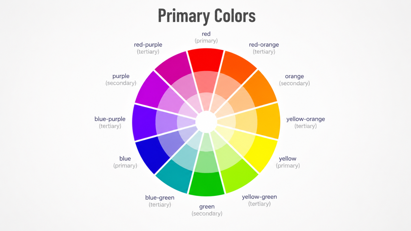
When exploring color theory, everything starts from the color wheel, a visual tool that helps us clearly understand the relationship between different types of colors. The color wheel is not simply a circle of colors, but also the foundation for classifying and coordinating colors in design.
2.1 Primary colors
In traditional color theory, primary colors include three main pigments: red, yellow, and blue. These are colors that cannot be created from the combination of any other colors. All other colors originate from these three primary colors. Therefore, they play a foundational role in building color palettes and are the starting point for all creativity in design.
Primary colors are not only theoretical but also have practical applications in art and design. When combining them properly, we can create many rich and diverse shades, thereby opening countless creative possibilities for designers.
2.2 Secondary colors
Secondary colors are formed by mixing two primary colors. The result of this process creates three main colors: green, orange, and purple. Each of these secondary colors is not simply a mixture but also carries the unique characteristics of the primary colors that create them.
Mastering how to create secondary colors helps designers expand their color palettes, thereby creating works that are richer in emotion and imagery. Secondary colors are often used to create emphasis and contrast in design, making the product stand out more.
2.3 Tertiary colors
Tertiary colors are the result of mixing a primary color and a secondary color. Examples include yellow-orange, red-orange, red-purple, blue-purple, blue-green, and yellow-green. These names are not simply combinations but also clearly show the relationship between colors in the color wheel.
Tertiary colors bring richness and diversity to a designer’s color palette. They are often used to create subtle shades, helping enhance the aesthetics and depth of design products.
2.4 Color temperature
In color theory, colors are also classified by temperature, reflecting their warmth or coolness. The color wheel can be divided into two halves: the left side is cool colors, starting from purple and ending at yellow-green; the right side is warm colors, starting from yellow and ending at red-purple.
2.4.1 Cool colors
Cool colors mainly include blue tones. The closer the colors are to blue on the color wheel, the colder and more peaceful they feel. Cool colors are often used to create relaxing spaces, suitable for designs that need stillness and calmness.
2.4.2 Warm colors
In contrast, warm colors include yellow and red tones. The closer the colors are to yellow on the color wheel, the more they bring a feeling of warmth and dynamism. Warm colors are often applied in designs that need to convey energy, joy, and liveliness.
.png)
2.5. Neutral colors
Finally, neutral colors include colors such as black, white, and gray. These colors do not really belong to the warm or cool color groups, but they have the ability to create wonderful balance in design. Neutral colors not only help highlight other colors but also create elegant and refined works without needing bright colors.
The flexibility of neutral colors helps designers easily combine them with other colors, creating harmonious and eye-catching designs.
3. Types of color combinations in color theory
When it comes to combining colors, the color wheel plays an important guiding role, helping us clearly understand how colors interact with each other. There are five main types of color combinations, each bringing a different effect in design. Below are the basic color combination types that every designer should master.
3.1 Monochromatic
Monochromatic color is the simplest combination method, using a single color but with different variations in saturation and value. By choosing one color on the wheel and adjusting light and dark shades, you can create a rich color palette while still maintaining harmony.
The appeal of this combination lies in the fact that it brings a sense of consistency and elegance. For example, a monochromatic palette with blue tones can create a peaceful and professional space, while orange tones can bring warmth and energy. Through the use of gradients, you can enrich the color palette and create depth for your design.
3.2 Analogous
Analogous color combinations use colors that are next to each other on the color wheel. For example, you can combine red, red-orange, and orange or blue, green, and yellow-green. This combination creates a natural and pleasant feeling, often used to build a harmonious atmosphere for designs.
The interesting thing about this combination type is that it allows you to explore the richness of shades without losing consistency. You can create unique and interesting color sets, bringing inspiration to design products such as interior decoration, fashion, or graphics.
3.3 Complementary
Complementary colors are colors opposite each other on the color wheel, such as blue and orange or red and green. The strong contrast between complementary colors creates a prominent effect, attracting viewers’ attention. However, to avoid an overly dazzling feeling, you can add variations by using darker or lighter tones.
Complementary color combinations are often applied in advertising and graphic design, where prominence and attraction are very important. For example, a design using purple and yellow not only creates strong contrast but also brings a fresh and impressive feeling.
.png)
3.4 Split-Complementary
Split-complementary color combination uses one main color and two colors located next to its complementary color. This combination creates contrast that is not too strong, while also opening up more color choices for the design.
This combination type is suitable for those who want to experiment with multiple colors without losing harmony. By using two supplementary colors, you can create rich and interesting works, bringing depth to your designs.
3.5 Triadic
Triadic combination uses three colors evenly spaced on the color wheel, forming an equilateral triangle. This combination often brings a dazzling and dynamic effect, especially when using primary or secondary colors.
To use this combination effectively, you should be careful with the saturation and value of the colors. By balancing bright and dark colors, you can create a design that is both eye-catching and harmonious, perfect for products that need prominence such as advertising or book covers.
3.6 Tetradic
Tetradic combination uses two pairs of complementary colors, forming a rectangle on the color wheel. This combination allows you to play with more colors, but it also requires you to choose one dominant color as the base for the remaining colors.
This combination often brings richness and diversity to design, but you need to pay attention to balance so that the product does not become too confusing. When used properly, this combination can create vibrant and impressive works of art.
.png)
4. Perfect color combination software
Photoshop is one of the leading graphic design software programs, widely used by designers around the world. With a rich set of tools and flexible features, Photoshop allows users to easily create impressive color palettes and coordinate colors professionally. From using the color wheel to tools for adjusting hue, saturation, and brightness, Photoshop provides maximum support for creativity and bringing design ideas to life.
However, to optimize workflow and improve design efficiency, designers should consider upgrading to the latest version of the software. Improvements in the new version often include additional features, a more user-friendly interface, and better integration with other tools. In particular, features such as Artificial Intelligence (AI) in Photoshop help automate many processes, from color selection to effect creation, shortening time and effort for users. Contact Appvip now to upgrade at a special price today.
5. Conclusion
In summary, mastering color theory is not only a necessary skill but also an art in the field of design. Understanding color can help designers not only improve product quality but also create unique visual experiences for users. By applying color combination principles and clearly understanding the impact of color on human psychology, designers can create works that are both attractive and meaningful. Always remember that color is not simply an aesthetic choice, but also a powerful communication language in the world of design.





















VIP Products








Best Selling Products
Plugin Retouch4me
69 USD
Freepik Premium Account
59 USD
Adobe Photoshop Copyright - Full App
120 USD
Windows 10 & 11 Pro Key
36 USD
Autodesk All App Account Copyright
120 USD
Genuine Adobe Illustrator account
99 USD
Upgrade Duolingo Super
29 USD
Upgrade genuine Capture One account
120 USD
Copyright Adobe Lightroom Account
59 USD
Capcut Pro 1 Year
39 USD
Genuine Cheap Canva Pro
39 USD
MidJourney Account
29 USD
ChatGPT Plus Account (GPT-4)
16 USD
Upgrade Genuine Office 365
49 USD
Adobe Premiere Pro Account
99 USD