Best Selling Products

Plugin Retouch4me
69 USD

Genuine Adobe Illustrator account
99 USD

Upgrade Genuine Office 365
49 USD

Upgrade Duolingo Super
29 USD

ChatGPT Plus Account (GPT-4)
16 USD

Adobe Premiere Pro Account
99 USD

Autodesk All App Account Copyright
120 USD

Windows 10 & 11 Pro Key
36 USD

Upgrade genuine Capture One account
120 USD

MidJourney Account
29 USD

Genuine Cheap Canva Pro
39 USD

Capcut Pro 1 Year
39 USD

Adobe Photoshop Copyright - Full App
120 USD

Copyright Adobe Lightroom Account
59 USD

Freepik Premium Account
59 USD
Detailed Exploration of Typography for Designers
Nội dung
- 1. What is Typography?
- 2. Text Typography and Display Typography
- 3. Requirements for Typography Designers
- 3.2 Creativity and Sophistication
- 3.3 Patience and Seriousness
- 3.4 Investment and Focus
- 4. Elements That Create Beautiful Typography
- 4.1 Lines
- 4.2 Leadings
- 4.3 Tracking
- 4.4 Kerning
- 4.5 Hierarchy
- 4.6 Alignment
- 5. Tools for Creating Perfect Typography
- 5.1 Introduction to Figma
- 5.2 Upgrade Figma at Appvip
- 6. Conclusion
Typography is not simply the arrangement of written text but also a delicate art, playing an important role in conveying messages and emotions. In the world of modern graphic design, clearly understanding typography is essential to create products that are not only visually appealing but also effective. This article will go deep into different aspects of typography, from history, basic components, to how to apply them in practice. Let’s explore with Appvip the secrets and techniques that help you improve your design skills through typography.
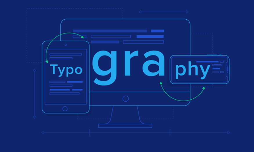
1. What is Typography?
We begin again with the eternal question: What is Typography? From Greek, “typography” is formed by the word τύπος (typos), meaning “form”, and γράφειν (graphein), meaning “to write”. Simply understood, Typography is the art and technique of arranging letters. This is not merely placing characters onto paper, but also a creative process, where each letter is carefully selected to convey meaning and emotion to the reader.
Typography is not only an art discipline; it is also a powerful tool that helps designers express messages clearly and attractively. Through the use of elements such as typeface, size, color, and spacing, typography has the ability to create a visual "graphic image", helping consumers easily approach and feel the message that the product brings.
Depending on the purpose of use, Typography is divided into two main types: Text typography and Display typography. Each type has its own characteristics and applications, thereby creating diversity and richness in design, contributing to improving communication effectiveness.
.png)
2. Text Typography and Display Typography
Text typography is usually text that contains many words, used in documents, books, and newspapers. This is a traditional type of typography, where designers focus on the readability and coherence of the text. Typefaces such as Times New Roman are often favored in state documents or contemporary books, because they help optimize readability and bring a professional feeling.
For designs that need more optimization, newspapers and magazines often choose serif typefaces, allowing them to maximize reading speed and effectively use page space. In contrast, sans-serif typefaces are often used for large headings or short introductory paragraphs. The current trend is to combine a sans-serif typeface for headings and a serif typeface for the content, in order to create a balance between aesthetics and readability.
Display typography, on the other hand, allows designers to fully exploit the power of images and emotions. Not bound by readability requirements like Text typography, Display typography is often used in book cover designs, logos, posters, and billboards. It creates a rich communication space, where words and images blend together to tell a story or convey a powerful message.
.png)
3. Requirements for Typography Designers
Typography design today is not simply the arrangement of letters but is also considered a delicate art discipline. To create truly impressive and professional products, designers need to possess many essential elements. From aesthetic thinking to patience, every aspect plays an important role in creating perfect typography.
3.1 Aesthetic Thinking
Aesthetic thinking is a solid foundation for every typography designer. It is no coincidence that design is classified as an art form; it requires a sharp eye to distinguish between beauty and ugliness, between closeness and distance, as well as the size of elements. Designers need to know how to combine separate components into a harmonious whole, thereby creating works that are not only attractive but also easy to read and easy to understand.
Moreover, a good designer will always seek balance between elements such as color, shape, and spacing. This not only helps increase aesthetics but also highlights the message that typography wants to convey. Sensitivity in choosing typefaces and arranging them will determine the success of the design.
3.2 Creativity and Sophistication
In a highly competitive field like typography design, creativity is a vital factor. Designers must always seek innovation and continuously create, avoiding falling into rigid patterns. Unique and different products will attract viewers’ attention, making them feel interested and want to explore more. However, creativity needs to be integrated subtly, without losing readability and clarity of the message.
Sophistication in typography design lies not only in choosing typefaces but also in the way the elements interact with each other. A good design will not only make an initial impression but also leave a lasting mark in the viewer’s mind. This requires designers to have the ability to observe and deeply feel what is happening in their work.
3.3 Patience and Seriousness
In the design industry, patience and seriousness are two indispensable qualities. Developing an idea can face many difficulties and challenges, and it does not always receive positive feedback. Designers need to learn how to accept rejection and continue adjusting their ideas until they achieve the best result. Patience in every stage of design will help create higher-quality and more refined products.
Moreover, seriousness toward every small detail in the design is also an important requirement. Every letter, every spacing needs to be carefully cared for, because they contribute to the overall work. Attention to detail not only shows professionalism but also helps designers develop their skills and improve their working ability.
3.4 Investment and Focus
Investing time and effort in typography design is necessary to create beautiful and effective products. Design is not simply a job but also a creative process that requires high concentration. Only when you truly immerse yourself in the work can you clearly understand what you are creating and feel its value. Every minute you spend on design can bring unexpected results.
This investment is not only in using software or design tools but also in researching and learning new trends, as well as modern techniques. When you spend time improving your skills and expanding your knowledge, you will see that your efforts will be worthily rewarded with beautiful and unique products.
.PNG)
4. Elements That Create Beautiful Typography
It is agreed that art has no framework and is constantly creative. However, to have beautiful and professional typography, you need to pay attention to implicit rules, like unwritten laws. These elements will help your product not become naive or lack aesthetics.
4.1 Lines
Lines in typography design are very diverse and rich. They not only help create the shape of letters but also affect emotions and the way viewers receive the message. Lines can be classified in many different ways, from the upper parts of letters (ascenders) to the lower parts of letters (descenders), from capital letters to lowercase. Clearly understanding how to use and combine these lines will help you create works that are not only beautiful but also easy to read.
For example, choosing appropriate lines can create strong contrast, helping highlight the main content. If you know how to use lines skillfully, you not only create an impressive picture of letters but also guide readers along the emotional flow you desire.
.jpg)
4.2 Leadings
The distance between lines, also called leadings, is an important element for harmonious typography. Adjusting the distance between lines not only affects the layout but also the feeling of comfort when viewers read. If the distance is too close, readers may feel uncomfortable and lose focus; conversely, if it is too wide, it can create an empty feeling and lack connection.
A reasonable line spacing not only helps increase aesthetics but also creates a better reading experience. Try experimenting with different leadings until you find the perfect balance between the elements. Sometimes, just a small adjustment in spacing can create a big difference in the reader’s perception.
4.3 Tracking
The distance between letters, also called tracking, also plays an important role in creating beautiful typography. Tracking not only affects aesthetics but also the readability and comprehension of the text. A reasonable spacing density will help readers easily identify each word and sentence, while spacing that is too dense or too sparse can cause eye strain and discomfort.
When designing, pay attention to the spacing density between letters. If the spacing is too dense, readers will have difficulty following the content; meanwhile, if it is too wide, it will create a feeling of lacking connection. Carefully considering tracking will help you create typography that is easier to read and more impressive.
4.4 Kerning
Kerning is the adjustment of spacing between specific letter pairs to create balance and harmony in design. If your typography has many letters, adjusting kerning is extremely necessary. Although it seems like a small detail, kerning can create a big difference in the viewer’s overall perception.
Reasonable kerning not only helps letters connect closely but also makes the text look neat and more professional. Pay attention to each letter pair and adjust the spacing appropriately, because these small elements are often what create perfection in your design.
4.5 Hierarchy
Hierarchy is an essential element in typography design, helping viewers identify highlights and the important order of the message. Creating a clear structure will help avoid visual disorder, while emphasizing the content you want to convey. When designing, clearly identify the important elements and arrange them in the order you want readers to receive.
Use different font sizes, typefaces, and colors to create clear hierarchy between content sections. This not only helps increase effectiveness in conveying the message but also creates a coherent and more interesting reading experience for viewers.
.jpg)
4.6 Alignment
The alignment of lines of text is an important element in typography layout. Arranging text reasonably will help create a lively and easy-to-view design. Avoid bulkiness or carelessness in alignment, because this can reduce the professionalism of the work. A clear and neat layout will help viewers easily approach the message you want to convey.
When designing, consider alignment methods such as left align, right align, center align, or full justification. Each method will bring a different feeling to the layout. The appropriate choice will not only create harmony but also help strengthen the effectiveness of your message delivery.
5. Tools for Creating Perfect Typography
In the world of modern design, creating beautiful and professional typography cannot lack the support of sophisticated design tools. One of the most outstanding and most favored tools today is Figma. With online design capability, Figma not only helps you easily create impressive typography templates but also improves teamwork efficiency.
5.1 Introduction to Figma
Figma is an online user interface (UI) and user experience (UX) design tool, allowing users to create rich graphic designs, including typography. With a friendly and easy-to-use interface, Figma provides many powerful features such as real-time collaboration, a diverse typeface library, and flexible editing tools. This helps designers easily experiment and fine-tune typography elements, from size, spacing to typeface, quickly and effectively.
In addition, Figma also supports integration with many useful plugins, helping you expand creative capabilities and optimize the workflow. With Figma, creating typography works is not only simple but also becomes an interesting and creative experience.
5.2 Upgrade Figma at Appvip
To make the most of Figma’s features, you should consider upgrading your account at Appvip. Appvip not only provides Figma upgrade packages with many attractive offers but also supports you in exploiting design tools in the most effective way. With these offers, you will have the opportunity to access premium features, helping improve your design capacity.
6. Conclusion
Typography is an indispensable part of graphic design, deeply affecting the way messages are received. Mastering the principles and techniques of typography will help you create optimal products, attract viewers, and convey messages clearly. By applying the knowledge explored in this article, you will be able to improve not only your design skills but also contribute to creating better user experiences. Continue to explore and create with typography in every project of yours!





















VIP Products








Best Selling Products
Plugin Retouch4me
69 USD
Genuine Adobe Illustrator account
99 USD
Upgrade Genuine Office 365
49 USD
Upgrade Duolingo Super
29 USD
ChatGPT Plus Account (GPT-4)
16 USD
Adobe Premiere Pro Account
99 USD
Autodesk All App Account Copyright
120 USD
Windows 10 & 11 Pro Key
36 USD
Upgrade genuine Capture One account
120 USD
MidJourney Account
29 USD
Genuine Cheap Canva Pro
39 USD
Capcut Pro 1 Year
39 USD
Adobe Photoshop Copyright - Full App
120 USD
Copyright Adobe Lightroom Account
59 USD
Freepik Premium Account
59 USD